In the Midst of Chaos . . .

Sketch!

These past few weeks have been crazy and the craziness continues until the end of May. Two more weeks. Visits hither and thither to do the things needing doing, none of which are especially exciting. Too many things to do means little time to really focus on anything except the easier stuff. So, ink and watercolor and quick sketches from past visits to Summerland and Malibu Creek State Park.

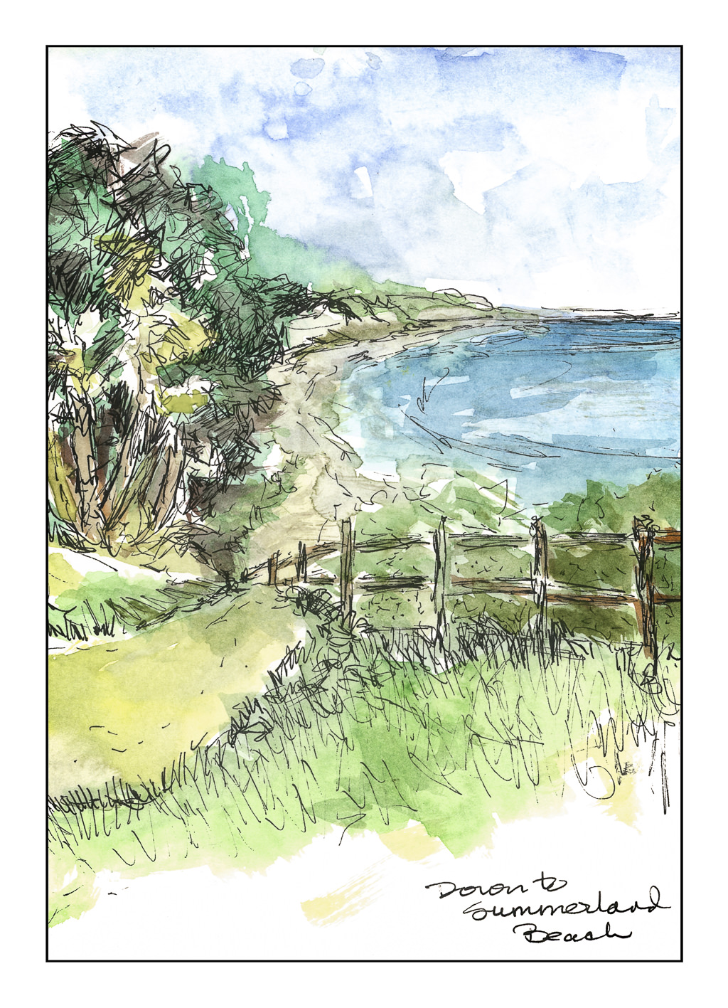
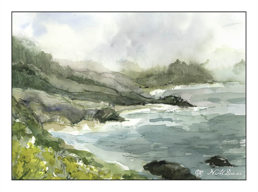
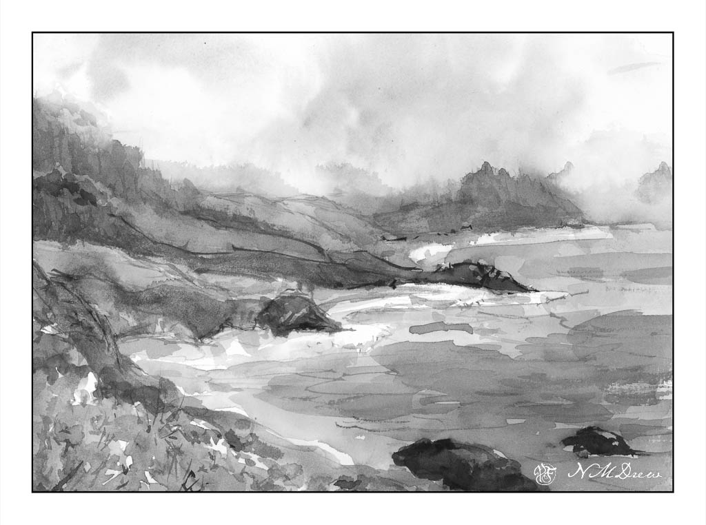
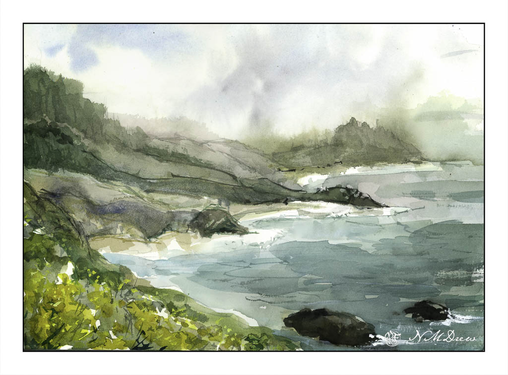
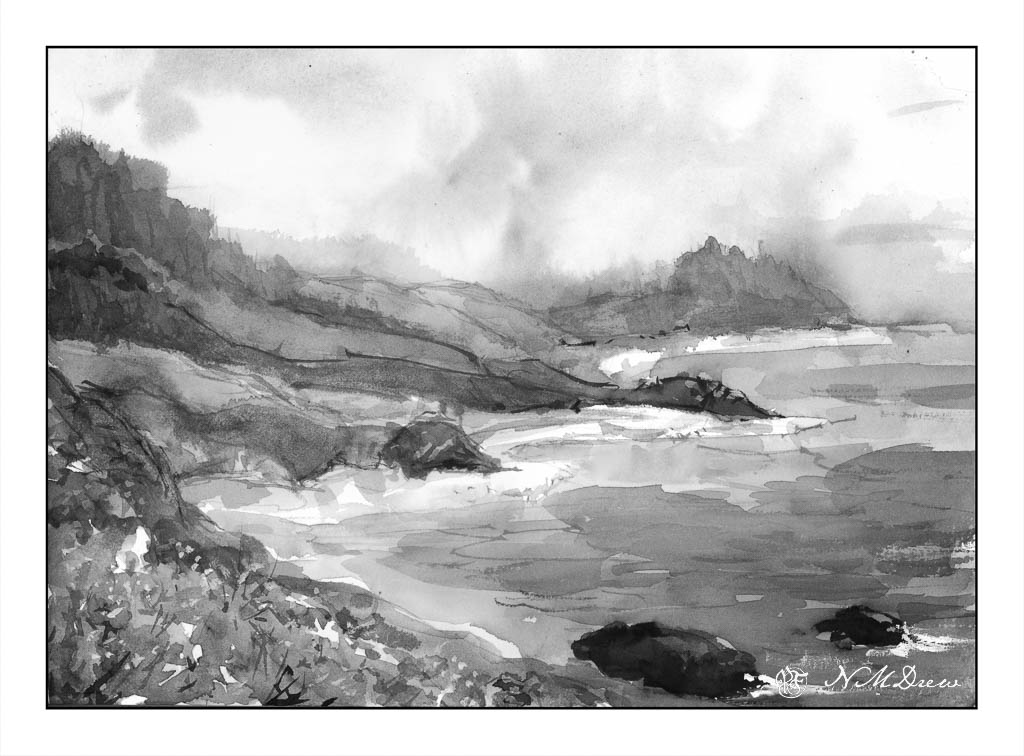
Summerland is a little community in Santa Barbara County, between Carpinteria and Montecito, both south of Santa Barbara. A number of old houses, clapboard, and new, climb up the hill east of the 101 and west, above the Pacific, is a park with a path to the beach below. I have always loved this area, and this section of the California coast is always a pleasure any time of year. The cliffs sequester beach-goers from civilization which can be gotten to readily. In the fog it is rather eerie, but in the sunshine or June Gloom, it is quite lovely.

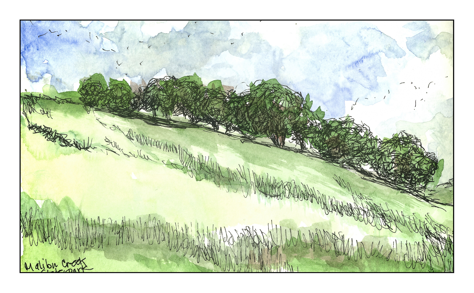
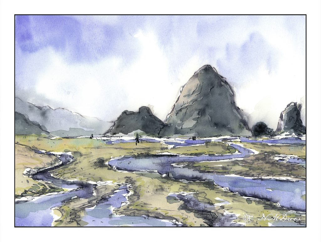
Malibu Creek State Park holds a number of fond memories, one being with a very good friend on photo safaris. It is about 15 miles south of me, in a canyon which winds through the Santa Monica Mountains and into the coastal town of Malibu. The park is a bit of a treasure as Malibu Creek winds through it and the canyon widens and narrows and branches off in various areas.

The ruggedness of the California mountains always amazes me – as do mountains in general. I grew up in the Midwest farm country where gentle hills are the norm, as are trees and endless green in the summer.

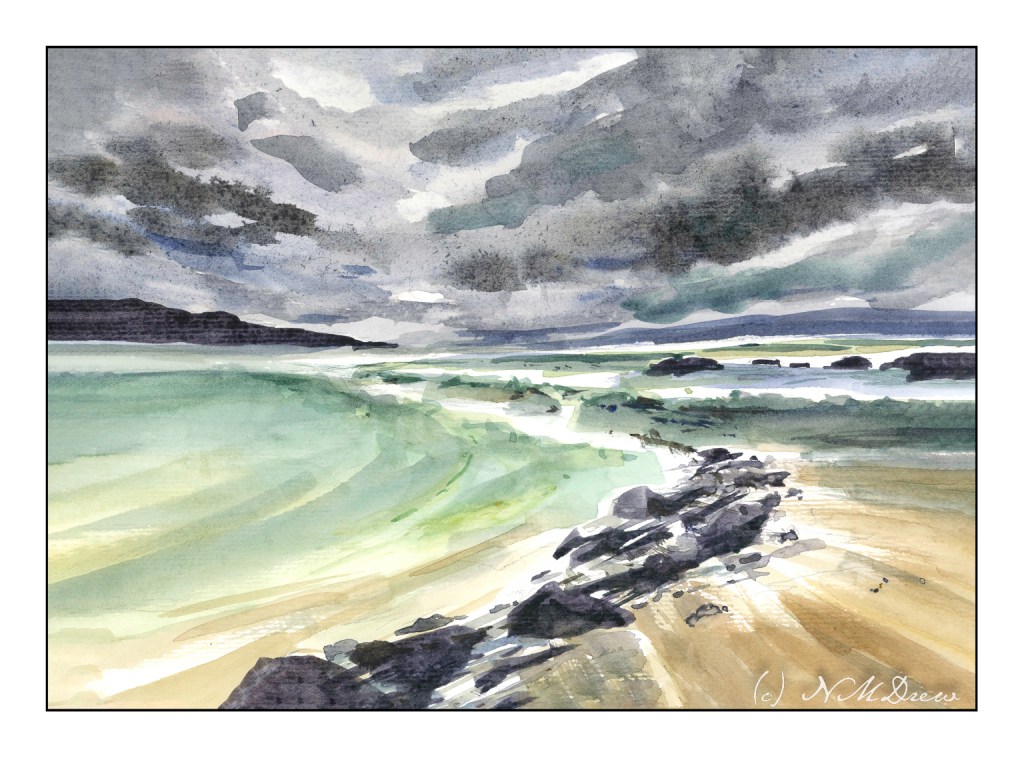
The same for beaches – I never saw the ocean until we moved to New Jersey and my family went to the beach just weeks after a major hurricane. Beach houses were upside down and wrecked. I was terrified of the waves, but my father, having grown up in Fort Lauderdale, swam in and out of the crashing waves like a dolphin. The rest of the family built sand castles and waded in the shallows.

And now, on to a visit to the vet as the gardener arrives and I get the house decluttered so the cleaners can have an easy time. Yeah, gardener? Cleaners? I have no McMansion here, but these tasks would never get done by us if we ever want to have a life. Luxury for us so we can do other forms of drudgery!

And the weekend cannot arrive soon enough.

Misty Coast – 2 Versions

Seldom are my watercolors subtle in color. Instead, they tend to be bright and rather garish. Today, I focused on a softer color while painting, meaning more delicate colors, more muted tones. The reason for this is I was driving down to the Valley for an appointment, and I was noticing the soft, hazy qualities of the air. Greens were light and delicate, flowers alongside the roads, while strong, were not a brilliant yellow. In the distance hills and mountains were soft, blurring into the distance – still clear, but very, very soft.

This motivated me to see if I could accomplish something a bit more subtle. I looked at a picture of the northern California coastline, which can be rugged and foggy, with mists rolling in and out, obscuring and revealing at any given time.

Below, is the first painting. I used a lot of water to paint with as well as dilute my colors. This makes them more pale. It seems to have worked fairly well.

To test my theory of a softer, more grey image – longer grey scale – I turned the painting into a black and white image by both desaturating the same image above, as well as removing all vibrancy.

As you can see, there are a few areas which are very dark, but there are a lot of shades of grey, most of which fall into the arena of middle values.

Below is the “revised” version of the first. Here I added some white gouache to the rocks on the lower right, helping define them and to give a sense of breaking water. I cleaned up – removed – the turquoise streak sitting in the middle of the painting. Finally, I mixed some bright yellow and gouache to add dots of color to the lower left of the painting, creating a bit more defined foreground and to break up some of the edges.

I prefer the second version. However, you will note that the values remain the same for the most part below.

To tell the truth, delicate watercolor frighten me! They require a more delicate approach to the paint and water combinations. This was really a good exercise for me and I can see some more follow up paintings along this line. They do not even need to be misty, but just perhaps more pale but still with good contrast.

Where I live, it is quite dry, so those of you who live in more wet and damp climates have more water vapor in your atmosphere than we do. You can see this when you compare watercolorists’ work from other parts of the world, such as Britain or Holland.

Haystack Rock

More of the northern coast along the Pacific Ocean. Here, Cannon Beach in Oregon, possibly one of the most dramatic beaches I have ever seen. Sea stacks, tide pools, sand, mist and fog. When the fog lifts and the sky brightens, there is a glare that cannot be explained. It’s not a summer day brightness as we have in SoCal, but a brightness that is cold but not like on a snowy day. There is a lot of moisture in the air, from sea and fog, and perhaps that is what magnifies the light to such a degree.

If you look closely, you will see some of my ink bled into the paint. I used my iron gall in, not my waterproof micron pens, and a stub nib to draw. From there, I wet the sky, dropped in colors, and then let things dry to dampness. I wanted to create soft edges for the mist in the distance which blurs and softens edges. The rocks themselves were painted wet-in-wet initially, and then other colors applied to either dry or damp paper. The sand and the rivulets were painted in the same manner. In the end, I drew again with my iron gall ink to add texture or detail.

Keeping this sketchbook is so much fun! I have room to paint as the sheets are big, the paper is strong so I can use both sides, and I can paint with a lot of water should I wish. It is proving to be one of the best decisions I have made of late!

The Strange Edges of the Sea

I got a few painterly goodies for Christmas, and one was a new tablet of watercolor paper, one which I have never heard of before. Of course, it needs checking out. How does it handle wet paper and washes? Dry brush? Bleeding? Etc. It is not an expensive paper – $20 for 32 pages of 9×12 pure cotton paper – but it is actually a decent one. I can lift colors from it pretty easily, too! It is a rather nice bit of paper overall, and while not Arches or Fabriano, I think it will do quite well for studies, and probably gouache as well.

Besides playing with new paper, I have also attempted to lead the eye in the composition to a small area of white. Rocks, waves, clouds, land masses, sand, whatever are all designed to catch your eye. I think it worked out pretty good. I also am rather pleased with the movement of the sand in the lower right hand corner.

9×12, CP 140# paper, watercolor.