The Forest Track

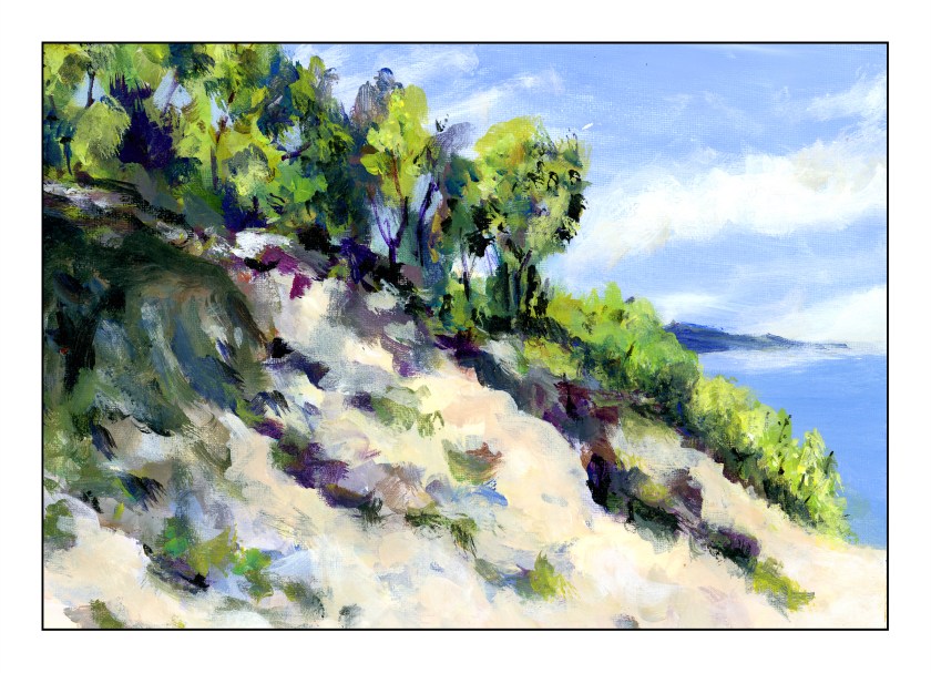
Today is my fifth painting with acrylics. I felt confident enough to choose a more complex subject, using (of course) another YouTube video. I am learning a lot by following videos, especially ones that suggest brushes and colors, as well as explain techniques.

This painting is done on Fredrix canvas pad paper, 11×14. The canvas, though already gessoed, was gessoed by me. I like that step and feel it is a good way to begin a painting, much like grinding ink prior to doing sumi-e. There is a meditative element to it.

Murray Stewart, whose video I followed, painted his underlying canvas with burnt sienna. I used red ochre and found that the color is just yummy! I live where red soil is known, so it was like seeing an old friend. That said, from there I pretty much followed through the video. About half way, Stewart mentions that the basic work was done, and details were what were needed to finish the painting. I agreed, but watched through to the end.

I have been using titanium white for mixing colors, but decided to use zinc white, as I do with gouache. For gouache, and mixing colors, it is great, but the titanium is a much better choice for mixing colors in acrylics. I am not quite sure where I will use zinc white in acrylics, but I am sure I can do some research.

This video presented me with a lot of material I enjoyed learning: making sun beams, using a fan brush for foliage, dark against light and light and against light effects. More, too, simply by doing. While painting, I found that dipping my brush in water prior to picking up paint made for better painting. The brush wasn’t sopping, and the water in the brush gave enough moisture to allow pure pigment to be spread around. I also found that this helped with glazes.

So, here is Stewart’s video – he did a good job, and he is pretty darn funny, too!

Poison Apples

Today I followed along with a YouTube video by Will Kemp. I rather like his online presence and instructions – what I have done so far. He’s low key, explains, demos. What more could you ask for?

Kemp’s apple is much nicer than mine. He paints his apple over a series of 2 short videos, beginning with laying in a background, upon the gessoed canvas, of yellow ochre and cadmium yellow light. From there, the painting begins, with the colors in the study being raw umber, ultramarine blue, white, burnt sienna, cadmium yellow light, and cadmium red light at the very end.

Here is my study, following along with Will. I think the yellow ochre – cadmium yellow underpainting adds a nice warmth to the painting. Two brushes, a filbert and a small round, were used to create this painting. Only water was used to thin the paint.

After doing Will’s study, I decided to do it again, but without using the underpainting colors.

No underpainting made for a different sense of color. By accident, I pickedup some of the cadmium red when mixing the upper background, so I just kept it. The lower part, upon which the apple rests, is burnt umber, white, and ultramarine. I made this apple more green than yellow, and applied the paint heavily, mixing it with matte medium. At the end, I used my finger tip to mush the colors together as the brush kept picking up the colors beneath, even though I had dried it.

My hair dryer may or may not be the best thing to use for acrylics, but these are studies, so not important! Both of these are painted on Arteza primed 8×10 canvas panels.

I deliberately chose to use only water, as Kemp did, in the first painting, and then only matte medium in the second. Both had their plus and minus points. Making a glaze out of the paint with either media is not easy – the colors are not really easy to blend well before applying. That is why I mushed things together with my finger on the second painting. I will need to study glazing a bit – read up on it to learn more.

Simple but effective studies to learn more about paint, as well as various techniques, such as underpainting, glazing, and so on. Of course, just doing and not setting out with the goal of a masterpiece, to have fun, makes it all worth while.

Carpinteria Bluffs

Another attempt at acrylic painting. This time I used a sheet from a Fredrix linen pad. I gessoed it and then used, initially, the Open medium with the paints, but I didn’t like the way it was working, and so switched to regular matte medium to dilute the paints. I tried to use the paints fairly straight out of the tube, blending with white and matte medium. The result was a fairly thick paint that behaved well.

The Carpinteria Bluffs are located in the southernmost section of Santa Barbara County, just above the border of Ventura County, where I currently live. Carpinteria was home for many years and always enjoy returning, especially in summer when the light shifts and everything has a glow of its own. Eucalyptus trees and other plant life make for a wonderful walk along the cliffs above the Pacific, and across the Santa Barbara Channel are the various islands that make up the Channel Island National Park. This might be San Miguel Island, but I can never remember which one is which!

Slow Summer River

Several weeks ago I started thinking more and more about what I am doing in my spare time. It is then I realized that, for me, the best way to spend my time is to learn new things, in particular, new art techniques. Thus, colored pencils; I signed up for an in-person class with masks and social distancing. I plan to continue this summer with the class.

At the same time, I thought it about time I learned to paint with acrylics, something I always avoided because I just didn’t like the idea of painting with plastic! Add to that, years ago, acrylic paints were not as good as they are now. I was also a considerably more impatient person, and less experienced painter, than I am now. Thus, I enrolled in “Intermediate” painting – I’ve been using gouache, so I have experience!

The first class was yesterday afternoon. I always wonder about teachers and how “good” they are. It takes time to become a good teacher, and honestly, I have found the quality of teachers for arts and languages at adult schools a mixed bag. However, I know I am going to enjoy this painting class. Students I spoke to said they have been coming to the class for 4 years – that says something for the teacher.

I totally enjoyed this first class. People paint what interests them. The teacher helps when asked, offers appropriate and spot on suggestions, and has a really fun personality that doesn’t become overwhelming. Teacher and fellow students are pleasant, delightful, and fun. Can’t go wrong with that, I say.

Because I didn’t know what to expect in class, I decided to bring a kit of paints I’d boughten several years ago, one with about 10 colors, to play with. I used this same kit to begin a painting – after all, play and doing are the best ways to learn. Along with paints and tentative beginnings of a painting, journeying in my cart were rags, water containers, dish soap, brushes, paper palette, an apron, and other bits and pieces.

Above is the underpainting I had done prior to arriving in class. Then days went by – about a week – and I got too busy to do anything with it until I arrived in class.

This is where the painting was at the end of class – nearly there. The sand on the left bank was re-shaped after the river was moved (ah! I feel like God when I get to change geography!) and relocated. And since we are mentioning God, there are two rather eyelike things up in the upper left sky that definitely need removing.

This morning I finished the river, refining this and that. Altogether, I am not displeased for a first acrylic in 40 years. The final painting is the one at the very top. Below you can see them in progression.

The process of learning is often best by doing. By doing, you know what it feels like, you have experience. I struggled here and there, such as with the sky, with the viscosity of the paint, with the shadows and coloring of the sand on both banks. I rather think I like the river in the 2nd version, but decided to change it by adding reflections and ripples for the final version. I took out the “eyes” in the second version, added more fluffy and high-altitude clouds, and worked to create a sense of sand and shadows on the left, along with that wonderfully mucky sand in still water.

This was painted on 11×14 Canson XL, gessoed, and taped to frog board. The kit is by Daler-Rowney, which provides good basic colors for the beginner.

And now?

Onward!