I have a habit of giving things, especially animals, honorifics. Mr. Frog. Mrs. Giraffe. Mr. Happy Pants. Mr. Grumpy Britches. Lady Dilly Dally.
Yesterday was the last of the colored pencil classes, and I signed up for more. I have totally enjoyed this class because we are not taught “how” but, instead, explore. Different techniques, tools, paper, colors, and so on. That is what has made this class particularly fun, besides the fact that the teacher is very nice, positive, and comfortable to be around.
This is a giraffe (obvious?) done on Pastelmat sanded paper by Clairfontaine. The surface has a bit of grit on it, but it is really, really fine grit. If you have used Uart 800 paper, this is finer. We drew our giraffes, then used Gamsol (odorless mineral spirits) to refine the giraffe by blurring the colored pencil and softening the edges. From there, a bokeh background with squiggles of color and more Gamsol. Finally, I decided to add some leaves and branches straight to the image, no Gamsol.
This image is a straight Epson V600 scan without color adjustment. Unlike Mr. Frog, this one is not layers and layers of colors, paint, and who knows what else. Fun and easy to do, and to scan.
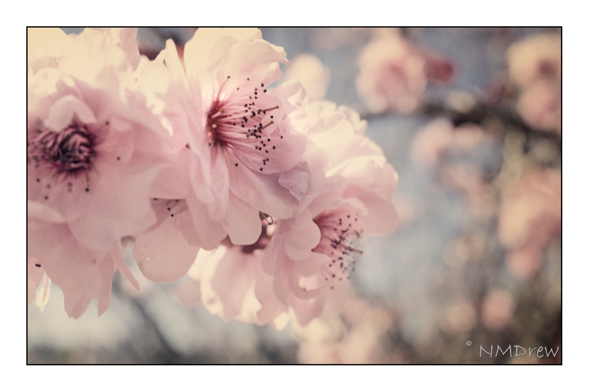
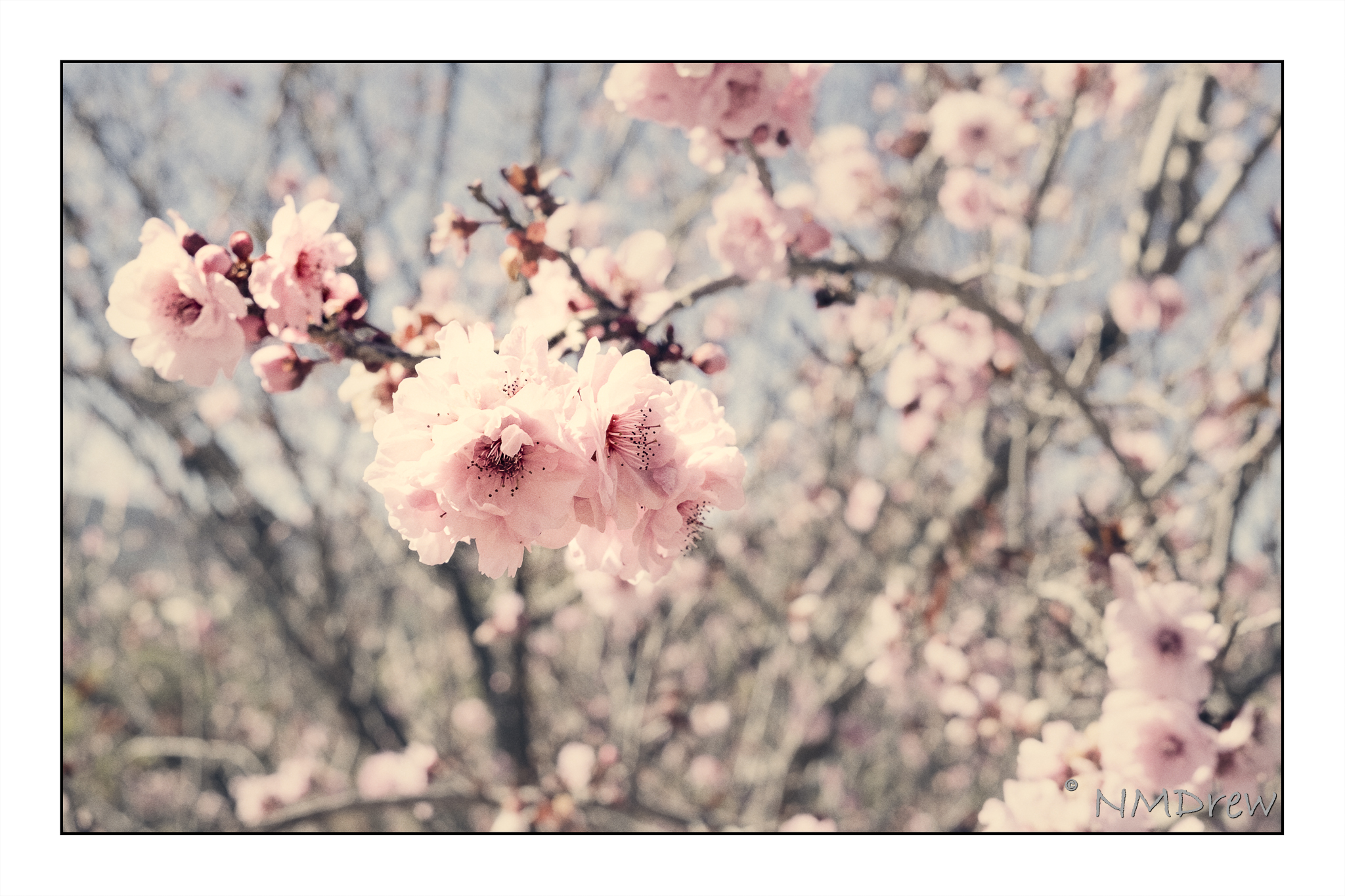
Oh glory be to things that grow! That burgeon, blossom, bud and blow In Springtime’s light and airy breeze, Which ruffles softly new sprung leaves.
What tongue there be to justly praise The wonders wrought by Vernal days? These beauties bright which turn, indeed, Each frozen heart to flaming glede.
O Daffodil! O Daffodil! That covers well each downy hill— E’en Solomon was not arrayed In splendour such as you displayed.
Ah! Lovely Tulip, what to you Is all the wealth of Timbuktu? What, then, the gain of dye from Tyre— When Gladdons blaze with purple fire?
Thou Cowslip and thou Daisy fair— Thou Foxglove, Rose, and Lily rare— Much more is your surpassing worth Than all the gems throughout the earth!
Consider well what ecstasy Lies cloistered in each Peony— That dormant wait until the hour Their chains are loosed, then start to flow’r.
Oh Spring, indeed, thou teachest well That man, though wise, knoweth not the spell Which makes all things by beauty bound— That Mystery which none hath found.
Above is the final work on Mr. Frog. But who is Mr. Frog?
I bought a book on colored pencils back when it first came out, back when I had no time, no studio, little experience, and the aforementioned attitude. The book is Creative Colored Pencil Workshop by Carlynne Hershberger and Kelli Money Huff. In 2007, it didn’t teach me what I wanted simply because I was not ready for it. Today is another story, and to be truthful, I am so glad I kept this book. It is opening my eyes to other ways of creating a drawing or a painting by demonstrating, though clear exercises, what can be done beyond a “pure” medium.
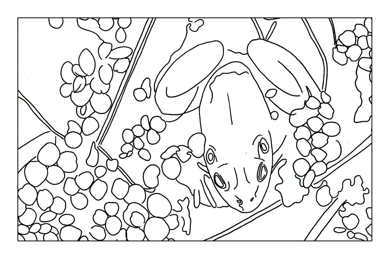
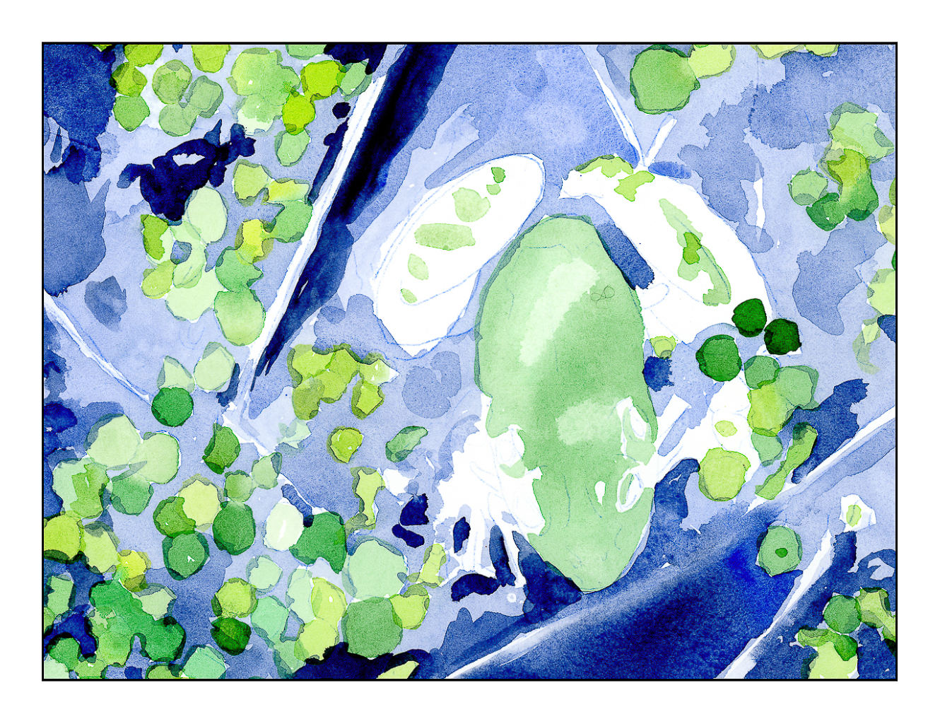
I started their exercise using watercolor and colored pencil. The study is a frog in a bit of shallow water. Step-by-step instructions. I did this exercise years ago, liked the result, but the purist in me was not happy with mixing the two together. Now, having started using colored pencil on a “serious” level, I appreciate the underpainting of the watercolor before the surface addition of detail in colored pencil. Below are the varying stages the final iteration of the picture about had to go through . . .
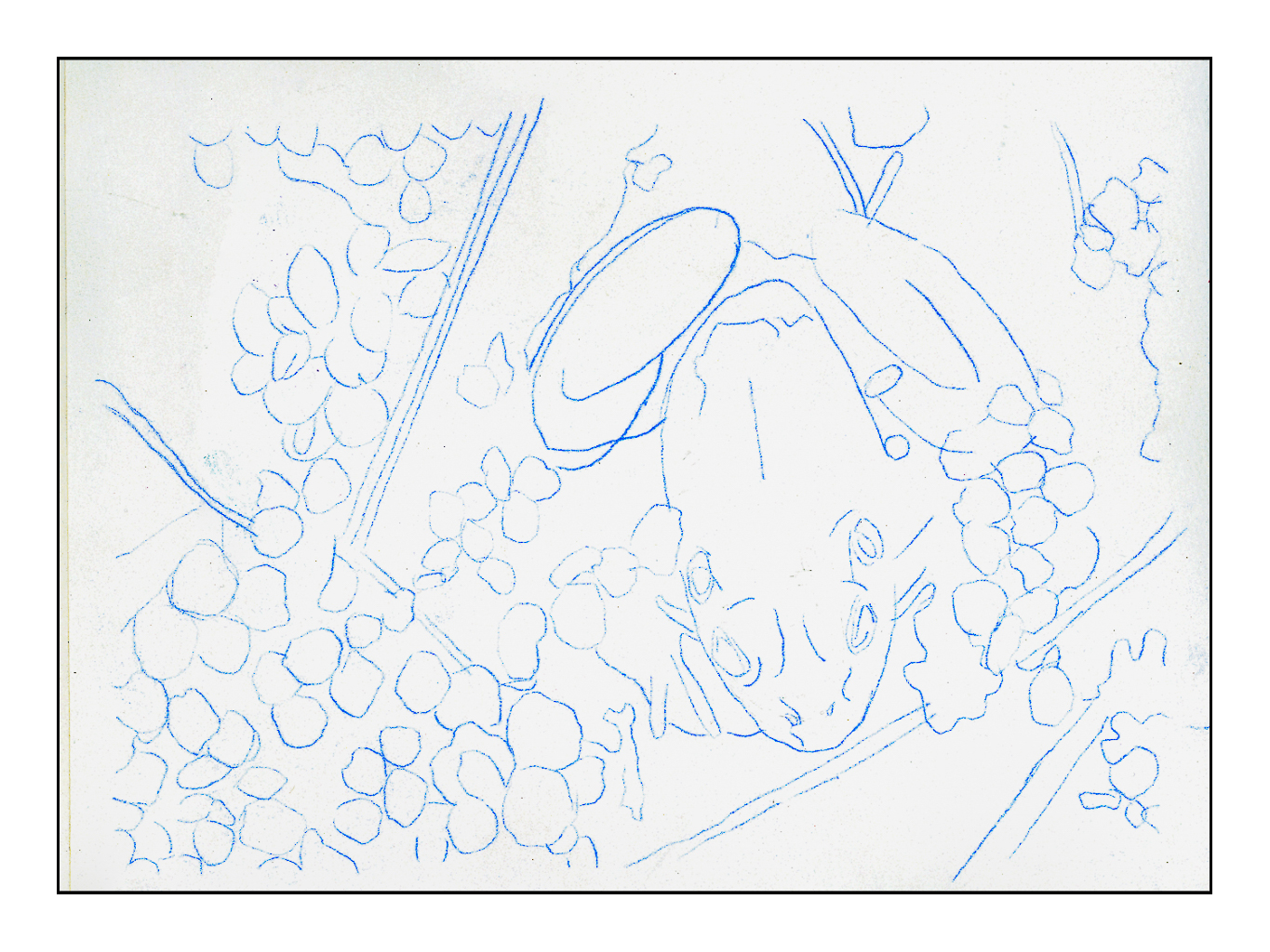
I scanned the original line drawing from the book, enlarged it, and then used Saral transfer paper to draw it onto a piece of Arches CP 140# paper. Initially I thought of using HP 140#, but changed my mind. The third picture shows the green watercolor laid in on frog and water plants, as well as varying blue watercolors for the pond. From there, browns and reds were added to the frogs body. These were all the watercolors used, essentially providing an underpainting for the colored pencils.
Scanning this picture, in its final rendition, was a disaster. You can see what it looks like below.
Scanned on Epson V600 Scanner
I use the Epson scanner for all my artwork shown on this blog. However, this picture is much different than a pencil drawing or painting. Instead, this picture is made of multiple layers – first watercolor, then a lot of layers of wax-based color pencil, and finally a blurring of the pencil with Gamsol (odor-free mineral spirits). I think the reflective nature of a scanner cannot handle the layers and made them excessively dark. The picture at the very top is a digital photo I took with my Fuji X100V and edited in LR. It is close to the original, but still not accurate.
Technology helps us to a point, but it also is important to think about why it fails or succeeds, just as with a drawing or painting or anything else you do. Analyzing a problem helps you work it out. Doing this painting /drawing / whatever made me realize that hot press paper is probably a better choice for such work. The cold press just had too much texture and it required a lot of layers to make the pigment fill in the valleys of texture. I used the Gamsol to smooth it out. I may do another painting, or this one again, to see how it works on hot press paper.
Anyway, fun in the sun with one of my favorite critters. I just love frogs!
Having worked in the medical field, roaming through the emergency room and surgery, on and off varied floors, I am always interested in learning something I don’t know about things medical. Today I came across this video on YouTube, from the channel “Townsends” – purveyors of re-enactment clothing and utensils, and just a wonderful channel for learning all sorts of things.
Today, I watched and learned all about the St. Augustine, Florida, Spanish Military Hospital of 1784. View the video to find out just what amazing things were going on in 18th century medicine . . . if you were Spanish, you were lucky. Doctors had to be educated, licensed, and show they were still competent every 5 years to maintain their right to practice. Elsewhere, your life was at risk if a “doctor” touched you. Learn about bullet removal, amputation, trepanning, patient care, sterile and antiseptic bandages, post-op care, and more!
We all have prejudices for or against something. For me, my prejudice is what is labeled “mixed media” in artwork. It brings to mind things I don’t like, much less understand, to be “art” – and that is pretty narrow-minded, I admit. I think of “art” as being pictures of things I can relate to, things I love, and bring a visual beauty with them, even if a bit disturbing. For instance, I find Picasso’s “Guernica” to be quite disturbing – it’s not a pretty painting. The subject matter and colors are not “nice.” But, what is said and expressed in paint is the point.
Truthfully, I would rather look at a landscape versus a bloodscape any day. Google “landscape” and all sorts come up – sadly, in my opinion, many of them are really gaudy and unattractive. I prefer ones with more natural colors, ones which play with light, ones that catch a mood, such as fog or bright sun and a whipping breeze.
Fine Arts Museums of San Francisco, Public domain, via Wikimedia Commons
Above is a painting by Lucy Bacon, an American artist. I’ll put her paintings up on my wall any day.
So, back to the “purist” in me. Merriam-Webster defines a purist as “a person who adheres strictly and often excessively to a tradition” – and that is me in the world of art. (It also applies to usage of language, but I am all for its development and change – but that is another story!) For me, this means if you use watercolor, you only use watercolor. Oil paints? Only oil paints. A painting is a painting, and not a mish-mash of collage, ink, paint, etc. Pretty limiting view, eh?
So, enter a book I bought back when it first came out, back when I had no time, no studio, little experience, and the aforementioned attitude. The book is Creative Colored Pencil Workshop by Carlynne Hershberger and Kelli Money Huff. Back in 2007, it didn’t teach me what I wanted simply because I was not ready for it. Today is another story, and to be truthful, I am so glad I kept this book. It is opening my eyes to other ways of creating a drawing or a painting by demonstrating, though clear exercises, what can be done beyond a “pure” medium.
I started their exercise using watercolor and colored pencil. The study is a frog in a bit of shallow water. Step-by-step instructions. I did this exercise years ago, liked the result, but the purist in me was not happy with mixing the two together. Now, having started using colored pencil on a “serious” level, I appreciate the underpainting of the watercolor before the surface addition of detail in colored pencil.
I scanned the original line drawing from the book, enlarged it, and then used Saral transfer paper to draw it onto a piece of Arches CP 140# paper. Initially I thought of using HP 140#, but changed my mind. The third picture shows the green watercolor laid in on frog and water plants, as well as varying blue watercolors for the pond. From there, browns and reds were added to the frogs body. These were all the watercolors used, essentially providing an underpainting for the colored pencils.
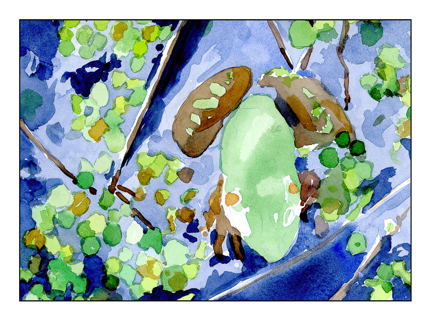
After the watercolor was done, the blues of the watercolor were covered with blue pencils. The same for the water plants, but greens instead. The frog itself remains untouched by colored pencils – that is for later! The pencils I have used so far are Prismacolor Premiers that I chose to meet my own taste. The book suggests colors for pencil and for watercolor, but after having given up the desire to create an exact duplicate of a study, I felt free to choose my own!
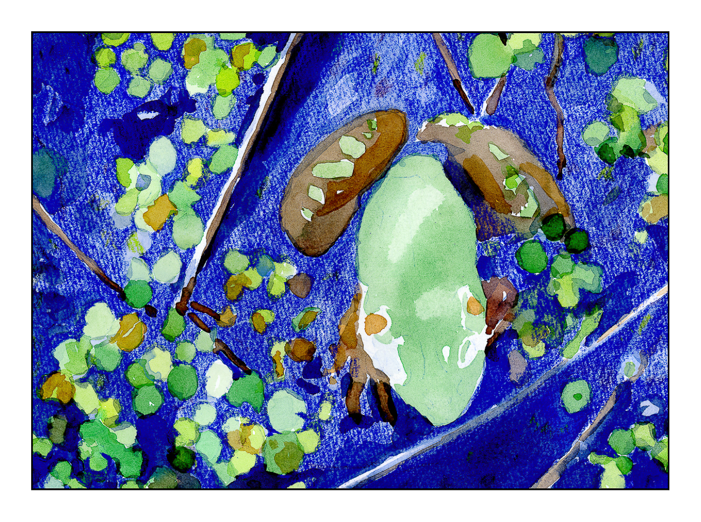
Current status of frog painting in watercolor and colored pencil. More to come!
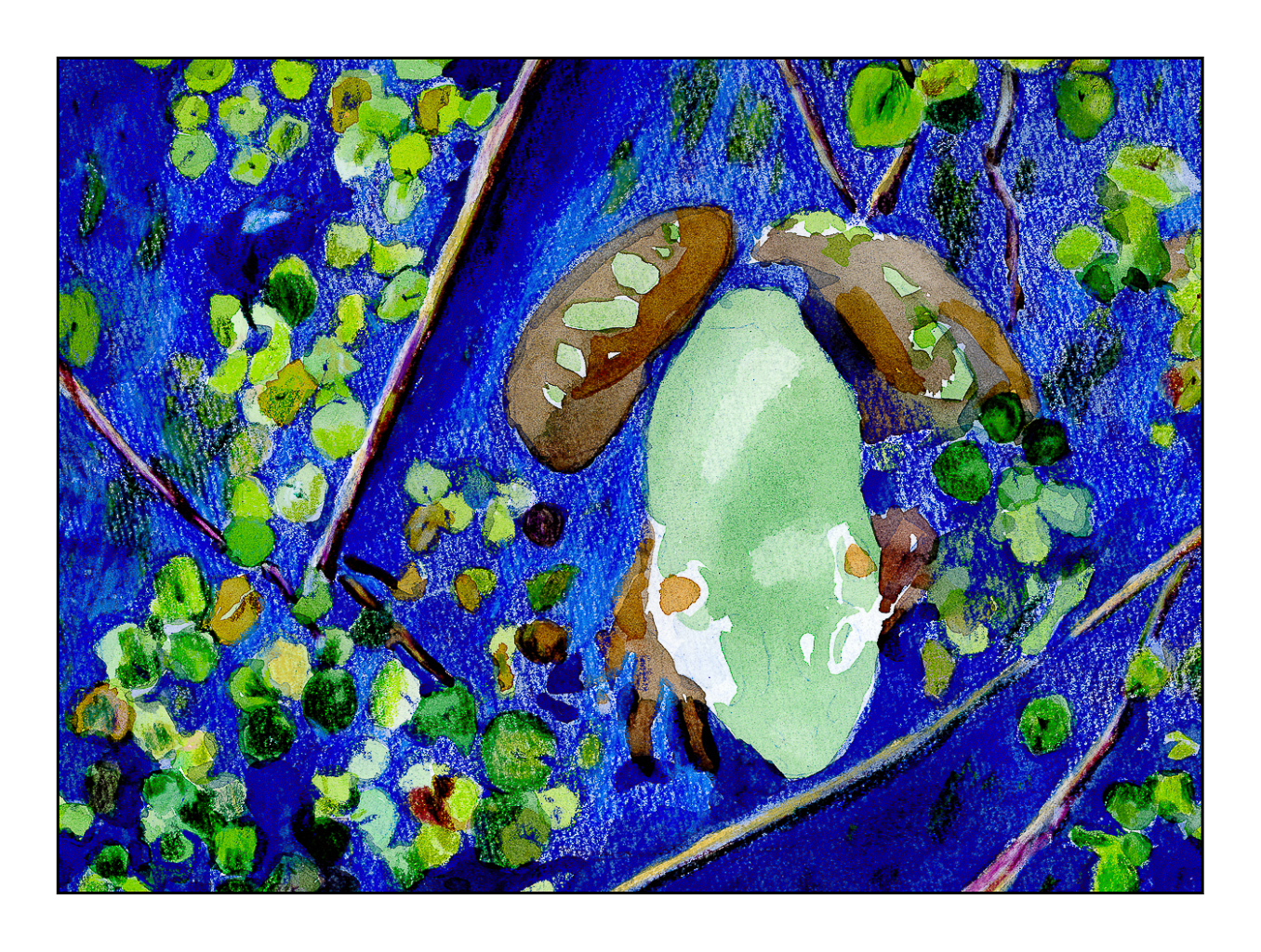
The final picture in today’s post is the last one. Obviously, more work needs to be done. I hope to finish this fine fellow soon, but over the next couple of days other activities call.
Meanwhile, the purist is leaving town. The perfectionist has already left.