Wet Work

I read too many spy novels!

So, if this isn’t about the darker sides of life, what is this about?  It is about watercolor painting.  As you may recall, I have been trying to work on my drawing and painting, between other life activities.  While I try to do one or the other daily, it doesn’t happen.  The thing that is happening is a beginning of focusing on various elements of watercolor.  Rather than just paint, I began to focus on retaining white space.  White space in watercolor is the paper itself – that is the only way to get a “true” white when painting, unless you put in white paint, such as a white gouache.  Many people frown on this.  So, retaining white means you paint around white areas, which have to be considered as you lay down color, or using a rubber-based frisket.  The frisket is great as you can paint right across it once it dries.  Both methods have their advantages and disadvantages.

In addition to retaining white space, I have added another focus in my painting.  Watercolor paper is painted on when wet or dry.  Painting wet-on-dry means applying paint to a dry paper.  Wet-in-wet means prewetting the paper, or painting onto paper where a wash is still wet.  Wet-in-dry allows for hard edges.  Wet-in-wet allows the paint to blur and blend, and how much it does this is dependent on the wetness of the paper and the slope of the easel.

The above picture was from a photo I took at the Monterrey Bay Aquarium of jellyfish floating around in their water.  The aquarium is backlit, and the light shines through the diaphanous membranes of the fish.  This was simply ink, followed through with a bit of color.  Drawing the jellyfish was fun – and in the lines of the tentacles, it almost became a dance with the jellyfish.

The jellyfish were drawn with a very fine point pen.  The Joshua Tree was done with a thick, permanent ink pen, about 0.5 in diameter (I think).  Here, the ink was used to create texture, with watercolor being secondary.

This is the point at which watercolor, ink, and white space became a focal point. I think these are a variant of snowbells, and they are found in the shade beneath trees. In such dim light, the white flowers are strikingly in contrast to the mulchy undergrowth, and in photos often are rather flat in appearance. This drawing demonstrates that flatness, but with the whiteness of the flowers preserved.

From the flatness of the line and watercolor drawing, I now worked on creating white in a dark painting. The flowers themselves look very flat because the paint I used to create – try to create – a 3D effect just pooled. The white is now filled with flat paint, which creates a flat picture. Here, the paint was applied wet onto dry paper, and the result is a bunch of hard edges. It is this realization that made me move into working a lot with wet-in-wet.

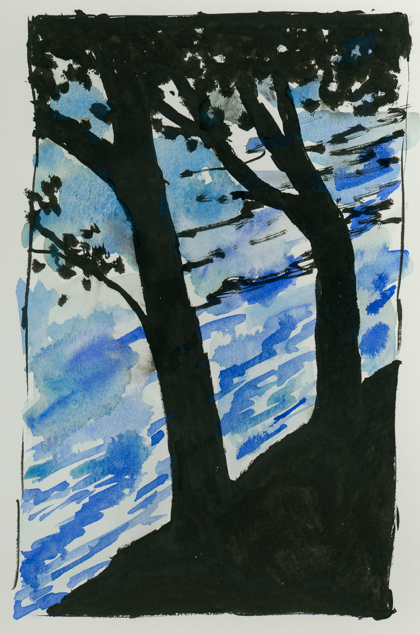
The pictures above are more attempts at preserving white, and working wet into wet. Probably the most successful one is the painting of the winter sky with the silhouetted tree.  Click on one of the paintings to cycle through the images in a slide show.

From the deliberate paintings I moved to wetting the paper thoroughly with water for the first of the two paintings above – soaking the paper with my brush, painting into the wet paper, and then painting again into the wet paint. The fir trees were more deliberate.  Here I tried to work with white space and with snow, trying to capture ways in which white can be interpreted with paint.  Again, click on one of the paintings to see the slide show.

While doing all these paintings, I started thinking about watercolorists whose work I admire, and who, I know, did wet-in-wet particularly well. Winslow Homer is one of the best watercolorists of the 1800s, and his skies have always appealed to me. The painting above is my rendition of his painting The Palm Tree, Nassau. I changed a few colors and compositional elements, but I used this as an exercise to study how Homer may have painted. He used wet-in-wet on the sky; white space for the waves and tower, and varying techniques for the palm trees and foreground.

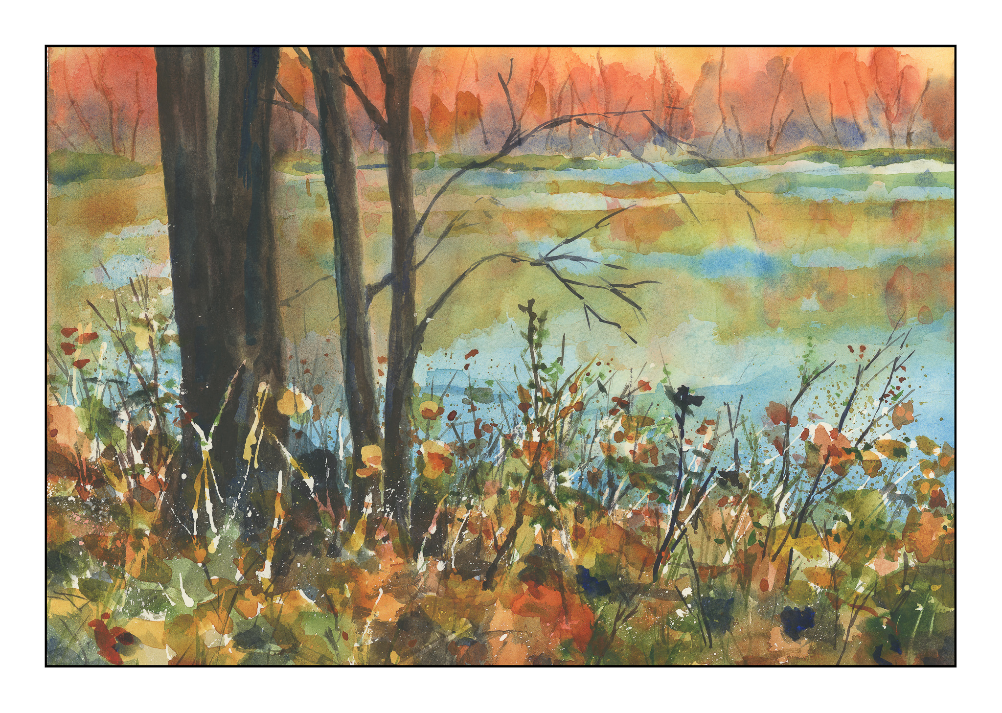
Besides trying to understand how an artist created a painting, I also searched YouTube for artists working wet-in-wet. I came across Edo Hannema’s channel and was so impressed! He is a master of wet-in-wet, as well as working with white space. I learned a lot from observing and copying his examples; this painting may be from one of his videos or an interpretation of one I saw online – don’t recall. I think seeing his work, and copying his exercises, has started my being able to move forward. I plan to follow his lessons more in the near future. His paintings have a lovely simplicity as well as demonstrate a finely honed skill in wet-in-wet. He is from Holland, so many of his paintings show very flat land, which for me is fascinating as I live in an area with a lot of hills and mountains and valleys.

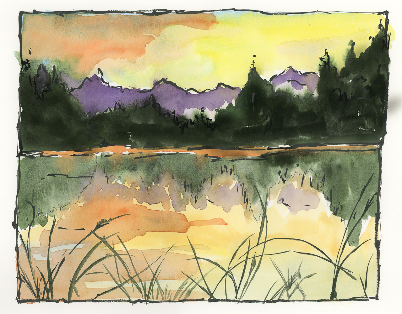
Finally, I did this one today. I was up at oh-dark-thirty, having my coffee, and thinking about all the things I have been painting over the past few weeks. It was time to try to paint something that used a lot of wet-in-wet, had a modicum of white space, and finally wet-into-dry, meaning wet paint applied over dried paint. I am pleased with what I have learned, from copying other artists’ works to my own experiments. Everyday is an exciting new adventure, and out of all of my interests and hobbies, watercolor is the biggest pleasure of all.

Below is a gallery of all the above paintings, and a couple of others as well.  Enjoy!

Shorelines

This morning I saw a photo of a shoreline at dawn.  A lake.  A sunrise.  Twigs.  Grasses.  Mountains.

I have spent the last two weeks making Christmas presents, sewing mostly, but also baking fruit cakes (brandied and bourboned), and shopping for this or that.  Today I have more sewing scheduled, and a few “must do” things.

The fact is, while I love sewing, I love other things as well.  I have done little if any drawing or painting.

Why do we get caught up in the “must do” so easily, so easily that the simple pleasure of an hour spent with paper, pen, and ink becomes something of a crime, one so self-indulgent that our Puritan ancestors shake their fingers at us?  Pleasure?  Nay!

But, I gave in!  I’m happier for it!

Rick & Me

About a year ago I found the YouTube channel of Rick Surowicz, and artist of considerable talent, and a formidably talented teacher.  In the space of just over a year, he has garnered 25K followers, and I am one of them.  Check him out if you don’t know who he is!

Anyway, I did two of his videos, both of which make use of frisket.  In general, I like to “travel light” – meaning, I like the idea of spontaneity for success, not thoughtful pre-planning.  The result for me is usually disaster and disappointment.  Rick’s videos are clear.  He explains what he does and why.  The results speak for themselves.  I decided to get off my don’t-panic-I’m-organic high horse and follow along.  These next two paintings are from his lessons, which I followed.  I can honestly say I enjoyed doing them, even in the moments of terror – that frisket!  those colors!  

Each one of these paintings required the usage of liquid frisket. I applied it, let it dry, and got to work. The beauty of the liquid frisket is that it allows the application of broad washes across the paper without the loss of white paper, or having to do in painting or negative painting. This actually gives a bit more ability to be spontaneous and splashy than not using it! (Surprise lesson here.) I did each of these paintings over a two or three hour period, watching the steps in each video a number of times.

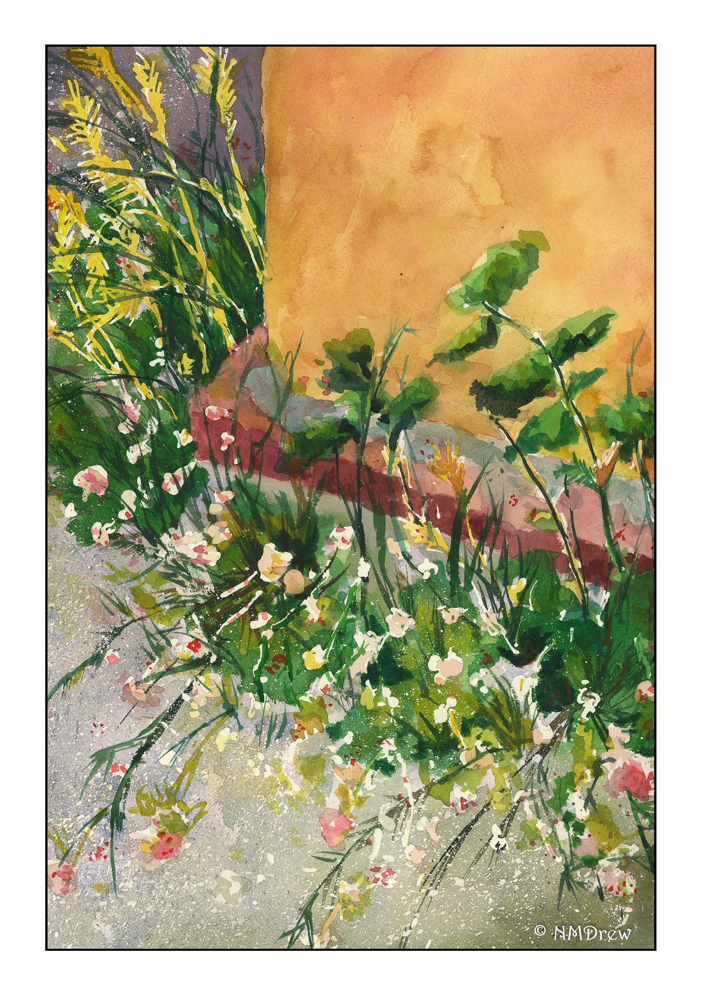
At some point, we all have to try our wings. I took a photo of a weed patch behind La Purisima Mission in Lompoc, California, last summer during a visit. There were white flowers – perfect for frisket – and yellowish grasses – also good for painted-over frisket after it was removed. This painting held a lot of terror, let me tell you! However, I am fairly pleased with the end result – simplification coupled with detail.

This morning, I did this painting, derived from a public-domain photo of an aspen grove. In the photo, light was shining from the right, and in looking at the picture carefully, the trunks of the aspens, which are a brilliant white, much as birch trunks are, were actually darker than the brilliant yellow-green foliage in the distance. I used frisket for the white areas on the right of the trees, and then, as I laid down layers of color, added more frisket here and there to protect areas of color. I did this for three or four layers until I finally removed it all, and then painted in areas needing more detail or contrast.

By following Rick Surowicz’s tutorials, I finally learned something. Frisket is not scary and can be an aid to a spontaneous or splashy wash as it helps preserve white paper. In the process of copying Rick’s process, I learned a bit about color, reworking areas, contrast, and whatever. I was also able to paint a representative of a bush or leaves rather than hankering to paint the details and losing the overall effect. I am thinking about redoing the last two paintings without frisket, just to work at white space without an aid. That will be more of a challenge I think than not using frisket!

Keep It Simple!

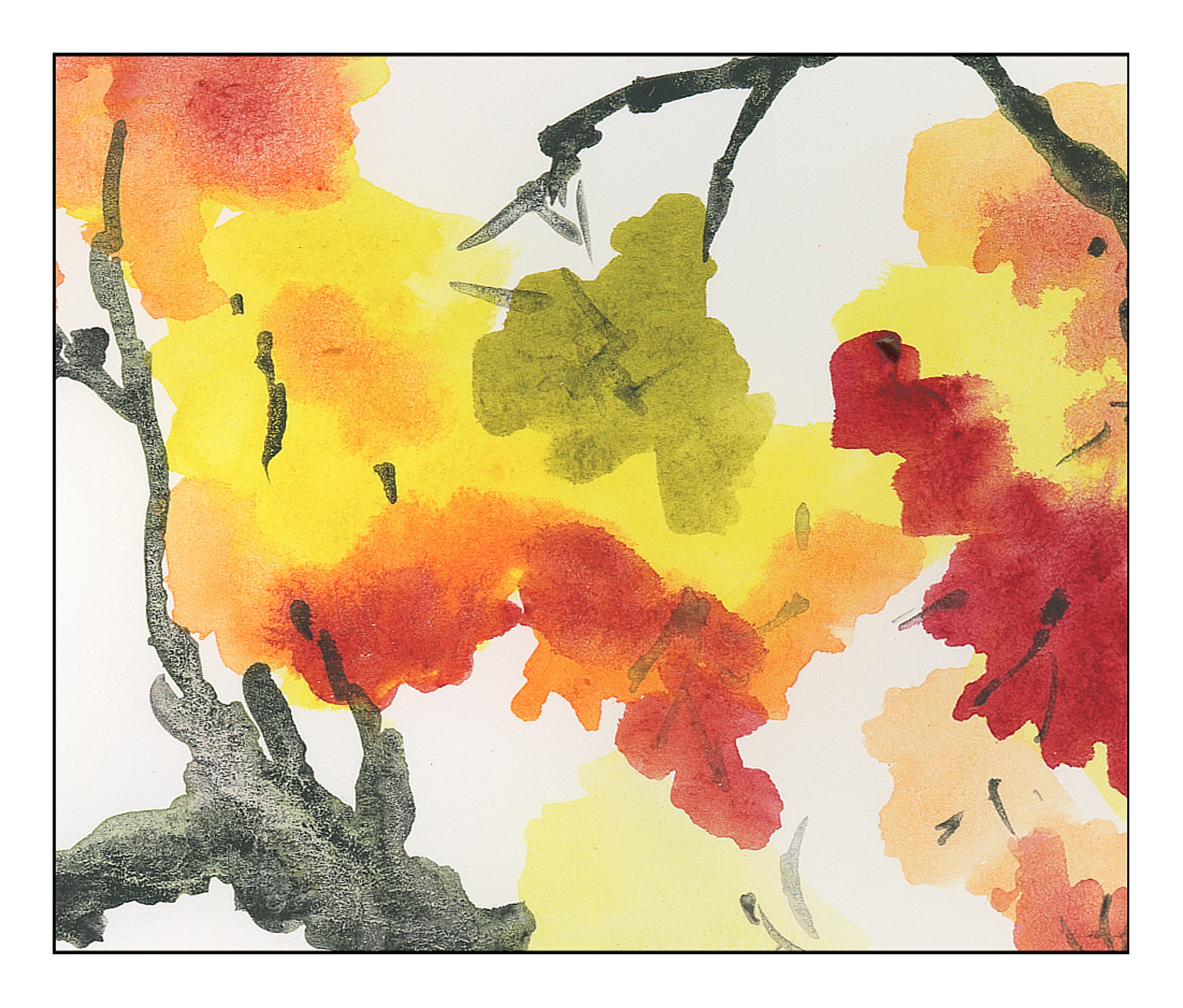
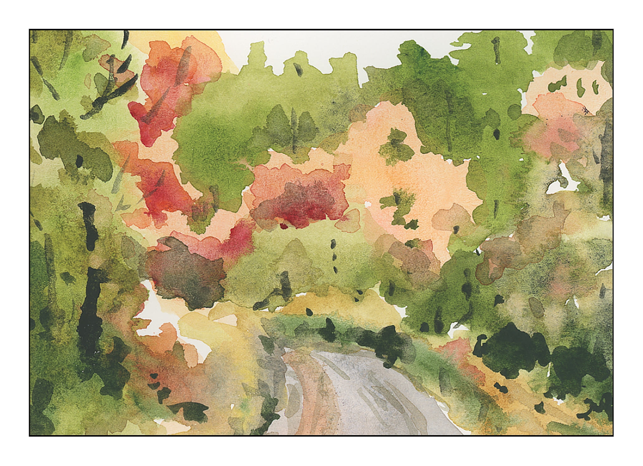
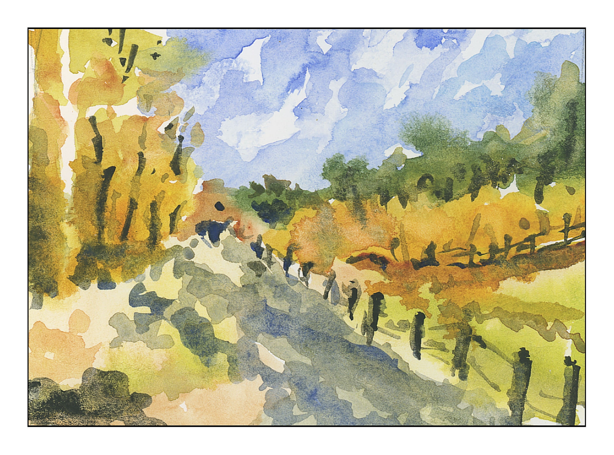
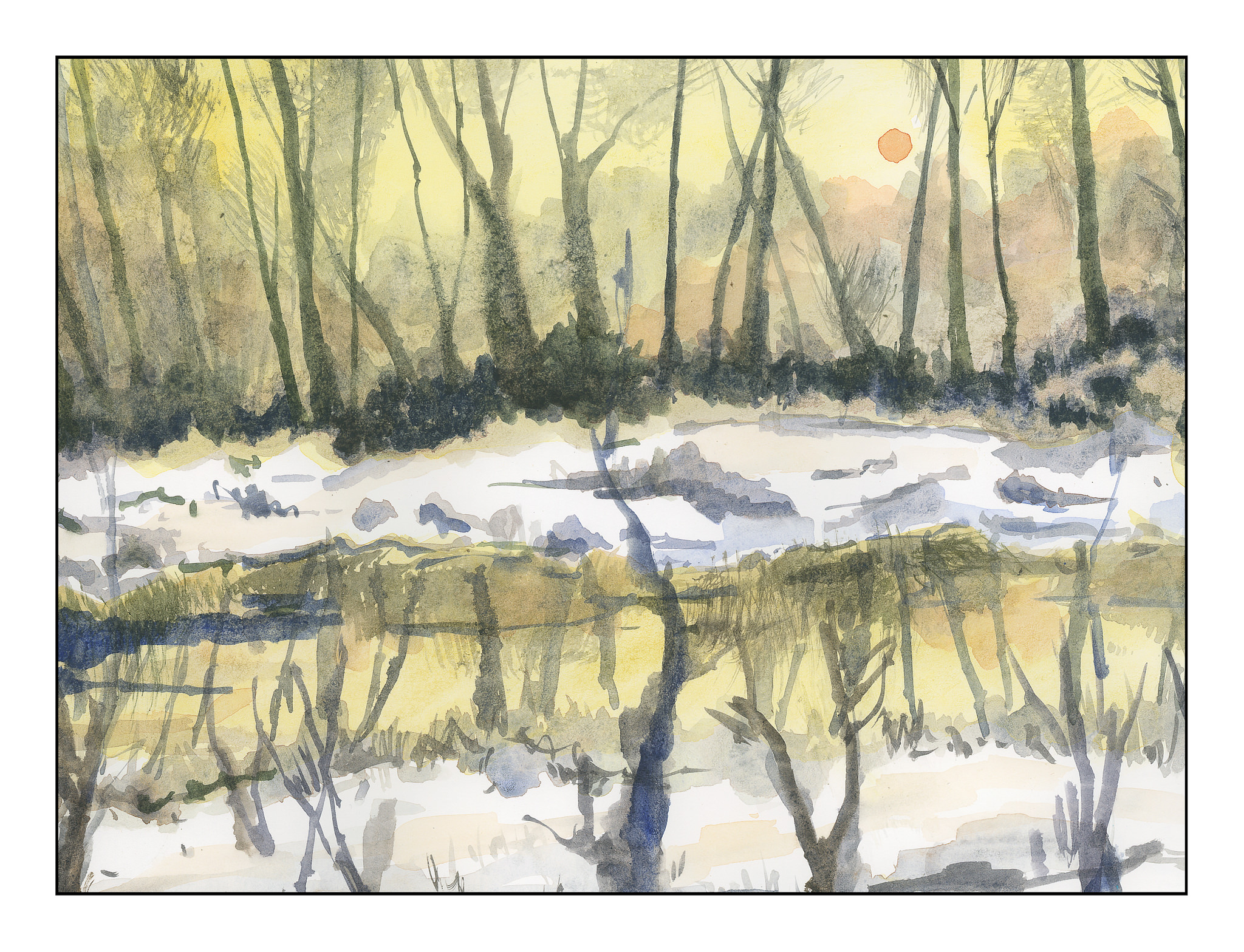
I have been so focused on buttonholes that I am getting a bit nutso.  Painting is a totally different experience, and was a welcome break yesterday and this morning from the analytics of buttonholes!  If I do anything with sewing today, it will be later on.  In a bit, we are headed out to collect our supplies for Thanksgiving dinner, and that will certainly be another pleasant break.  I don’t know about you, but too much of any one thing becomes almost an obsession with me – analyzing and studying whatever.  Painting does require a bit of analysis, but it also has an element of sheer doing that makes it very different.  It’s very relaxing, and because it just has a life of its own, watercolor is a challenge and a tease as well as a very creative experience.

Anyone who does watercolor or painting or drawing is well aware of the need to simplify details, especially in masses of color.  Every leaf does not need to be painted.  When we look, we see these details, and the effort to simplify them into areas of light and dark and midtones can be – and often is – very challenging.  Good artists make it look so easy!

The other day I was napping on the patio (I live in a warm part of the world).  When I woke up, I looked at the podocarpus trees along the back wall, and suddenly got the idea.  I saw the details of the leaves – each leaf – but I also saw the light and the dark areas.  That is when I realized I could do it – but it had never been in the front of my mind before.

I went to work.  No outlines by pencil, just some reference photos labeled “foliage” in a search.  Varied pictures showed up, and here are my studies of simplified details.

These first three are thumbnails, about 3×4 inches in the order I painted them.

I did the above paintings yesterday.  This morning, applying the same tactic of no lines drawn, I used a 9×12 inch sheet of paper and painted out to the edges.  Again, the focus is on simplification of details into masses of color.

Success?  I don’t think any of the paintings are particularly good, but I do think I am getting that element of simplification I find so elusive in my own painting.

The Rest of Inktober 2018

I’ve been really running around like a nut of late, going hither and thither, but I haven’t really had time to sit down and do much other than a quick post here or there.  It’s hard to believe we are nearly through with November!  And, Inktober ended 2 weeks ago.  I did a lot of the sketches for Inktober, and it was really fun.  It also helped me focus – given subjects – and improve on some of my old skills.  So, here are the rest of the sketches I did for Inktober 2018, not in any particular order.

Muddy – Inktober #23
Slice – Inktober #31
Thunder – Inktober #27
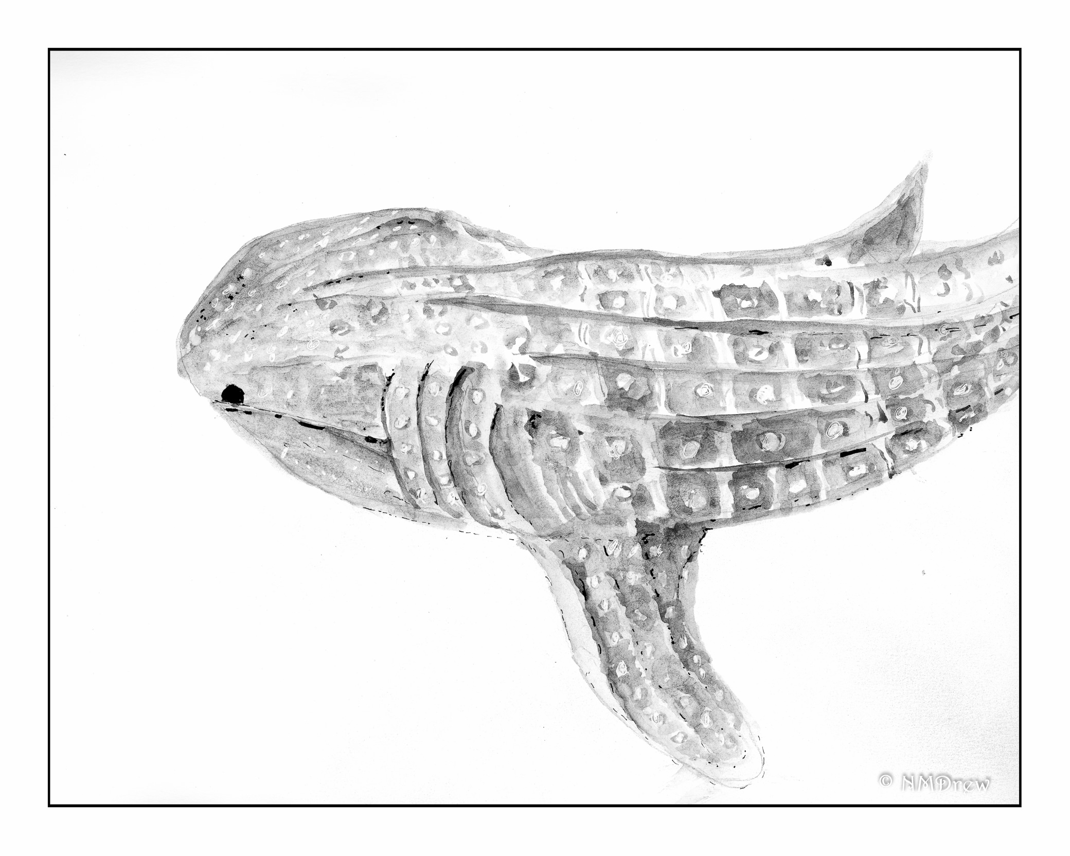
Whale (Shark) – Inktober #12
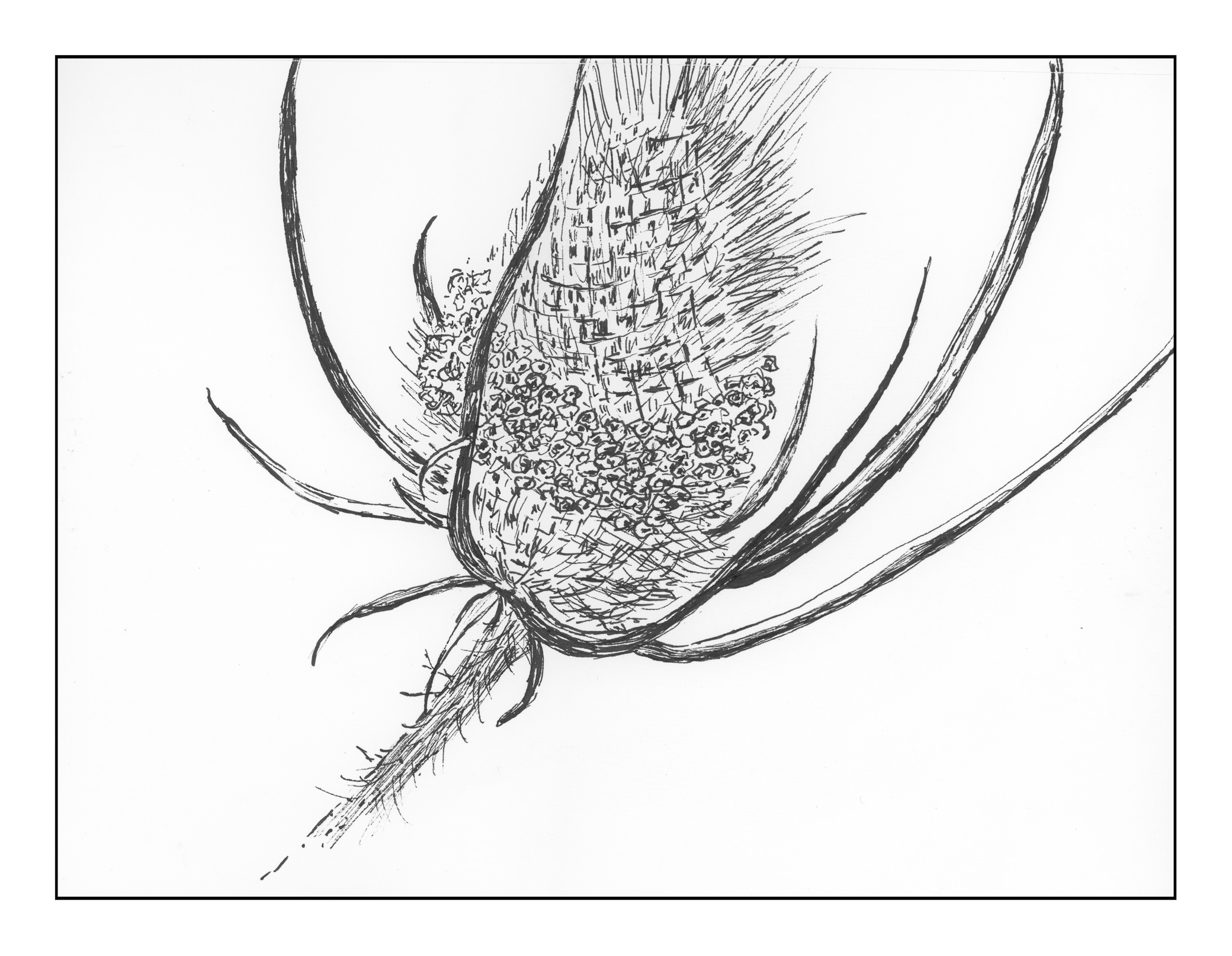
Prickly – Inktober #25
Weak – Inktober #15
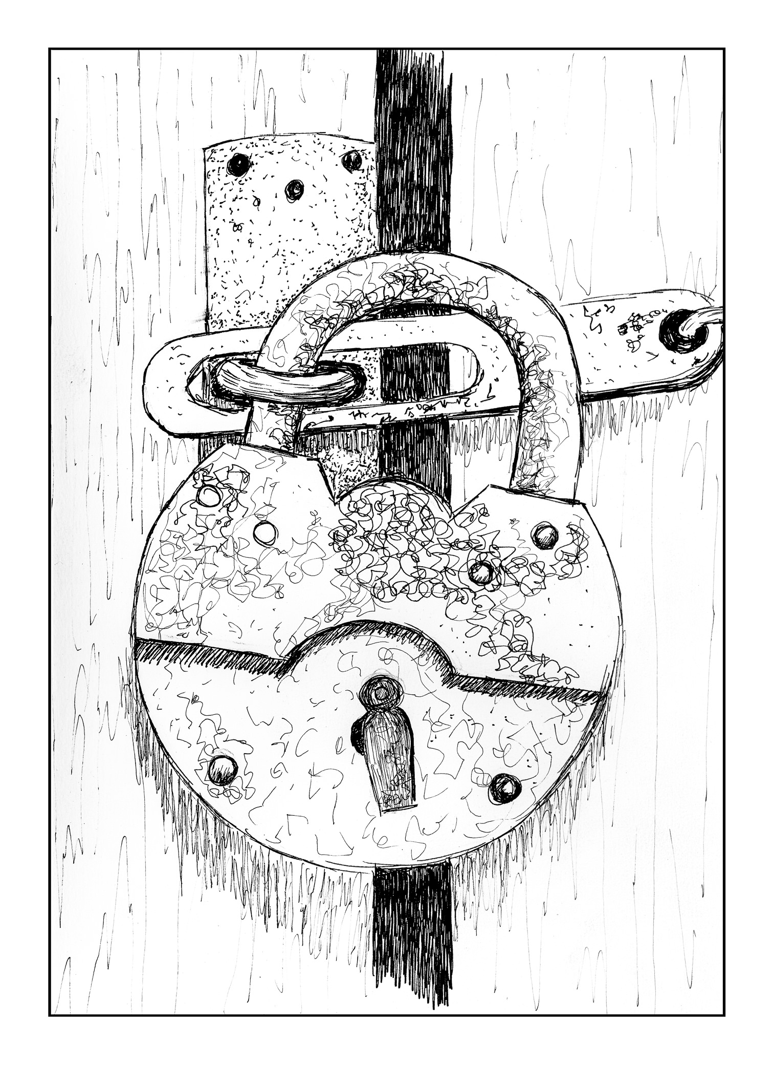
Guarded – Inktober #13
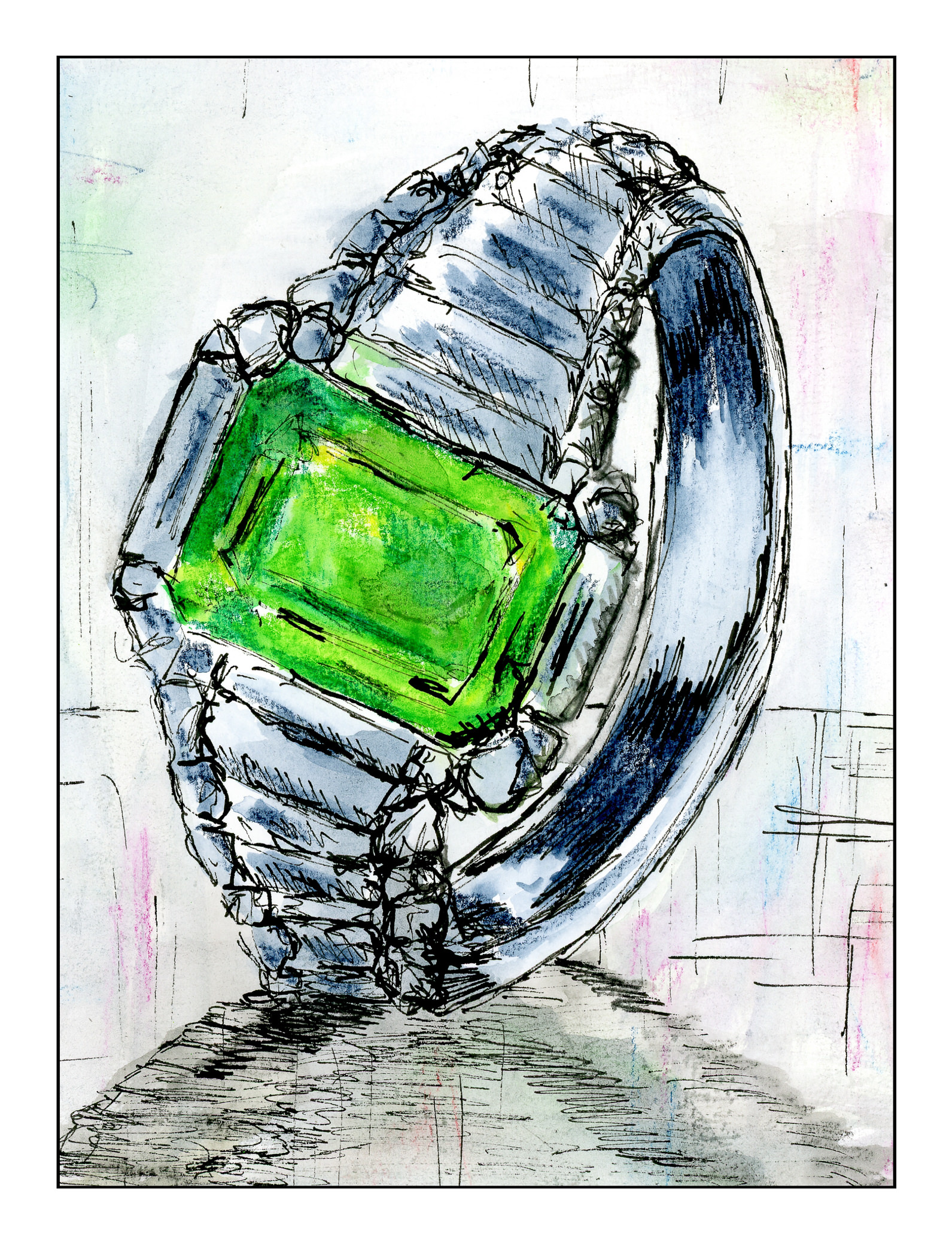
Expensive – Inktober #22
Clock – Inktober #14