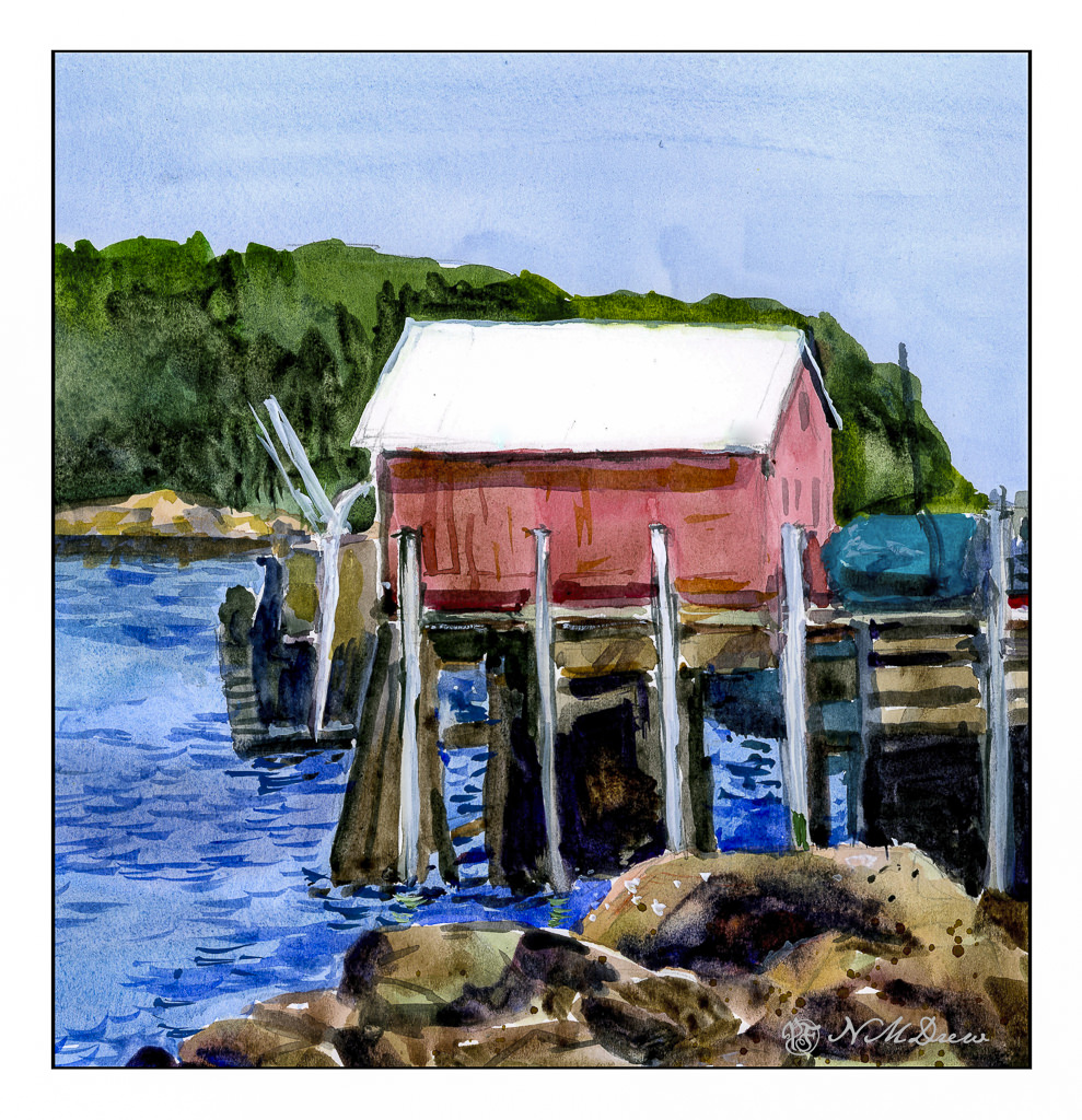
After playing around with the Strathmore Vision watercolor paper, I used it for today’s painting. Knowing its strength lies in painting directly on it with little to no lifting or scrubbing, I had to reset my thinking for this painting.
First, I did a pencil sketch on the paper, working to get proportions and placement of the bits and pieces in fairly good proportion to each other. From there, I worked as directly as possible to get values and colors the way I wanted them. I moved around the paper, too, laying in big washes and areas of color before adding detail.
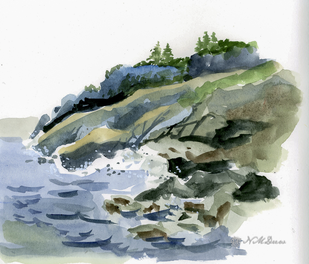
First, the foreground rocks. The wash was laid down to get the ranges of tonality and vary the colors within them. Once dried I added the darker areas to create shadows. If you look, you will know the sun is coming from the upper right, and thus shadows will be toward the left.
Next, the sky. It is a very flat sky so I did a wash of a blue mix once I had dampened the paper, carefully working around various shapes. From there, the red of the building on the pier, working around the light uprights. Then, the green of the trees in the distance, being careful about the roof. Finally, the water.
Once all this was dried, the little things began, such as sorting out the supports and boards on the pier, some rock details, and the ripples of darker blue on the water.
This painting took me quite awhile as I tend to splish-splash and be quite impatient. This time around I worked hard to consider the colors and the paint before placing them on the paper. My mind is fried! Still, even though it is not by any means a great watercolor, I do like the way it looks – there is a bit more freshness to it than some of my other ones. I ordered some Sakura Gelly pens in white for better details for more delicate areas – I couldn’t find mine at all.
More watercolors to come, but I am going to use my 100% cotton Arches and try this same approach – more direct and thoughtful. I am curious as to how I will feel about Arches absorbency vs. the Vision. The Vision paper works rather well in this area – a good balance of absorbency without drying out. Surprisingly, even with a fair amount of water, Vision does not buckle as much as Canson XL does, and it seems quite capable of handling water when applied over the entire sheet without a problem.
Both Canson and Vision have problems with lifting color or scrubbing, and in many ways I think continuing the usage of Vision will force me to retrain my painting techniques a bit by requiring patience and forethought.