California Coastal Cypress

Stuck at home for the most part because of my ankle, I need to find things to do. It turns out that my ankle, while a mess of historical injuries, has no tears in the soft tissues. That is good. However, my heel bone has “microfractures” from the hard landing dodging the car last month. This is a bone bruise, and it is painful! I finally got into see the orthopedist, got a walking boot, and return in a month. The boot makes a big difference though it does take some getting used to wearing and using. I have to be careful not to pitch forward or backward. And you can hear me coming a mile away – squish, squeak, squish, squeak.

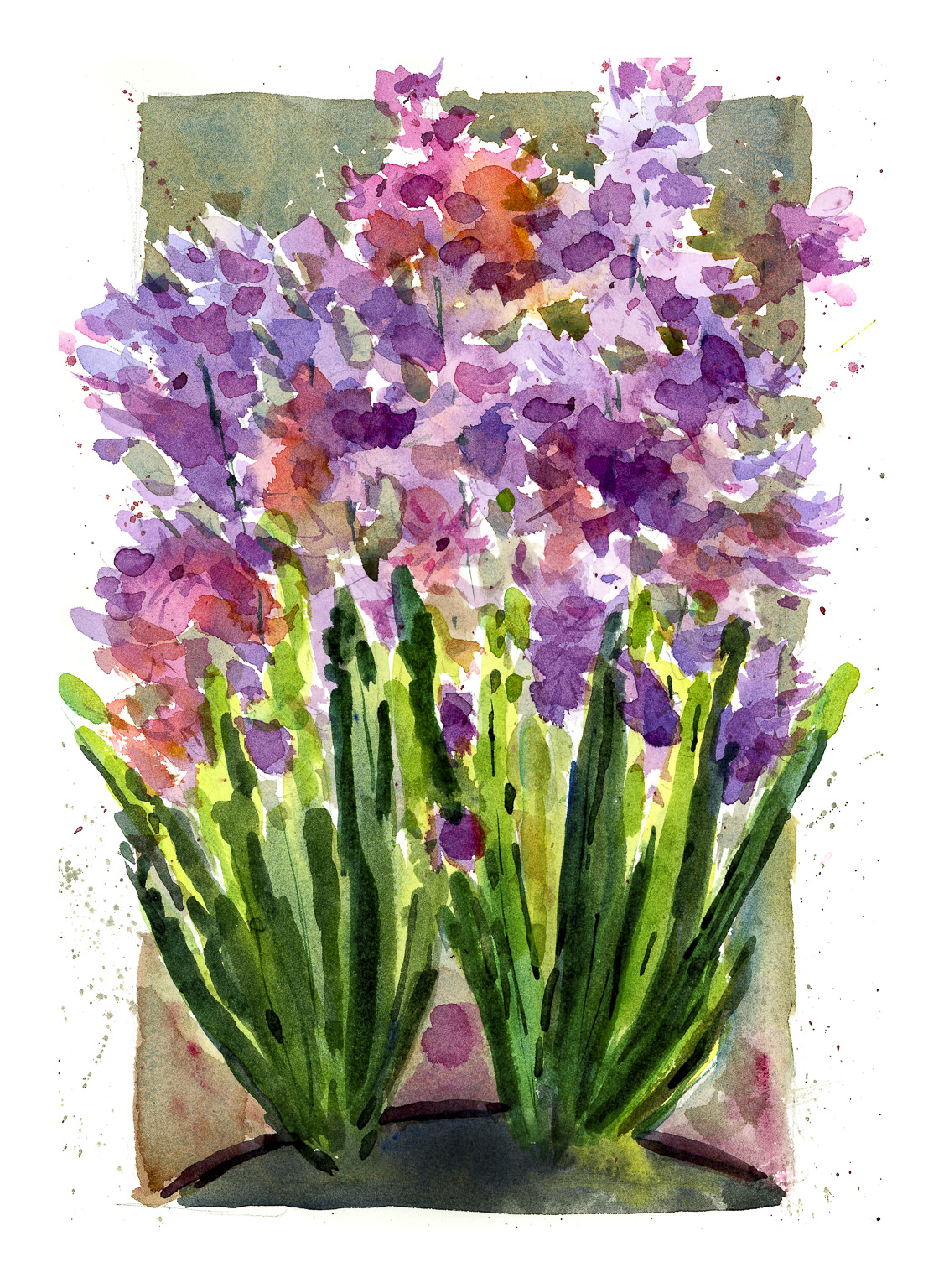
Of course, painting is the first choice! I am still tired intermittently from Covid, but I don’t have brain fog (at least I don’t think so), and look for things to enjoy but not be a source of frustration. Thus, ink and watercolor.

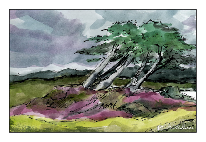
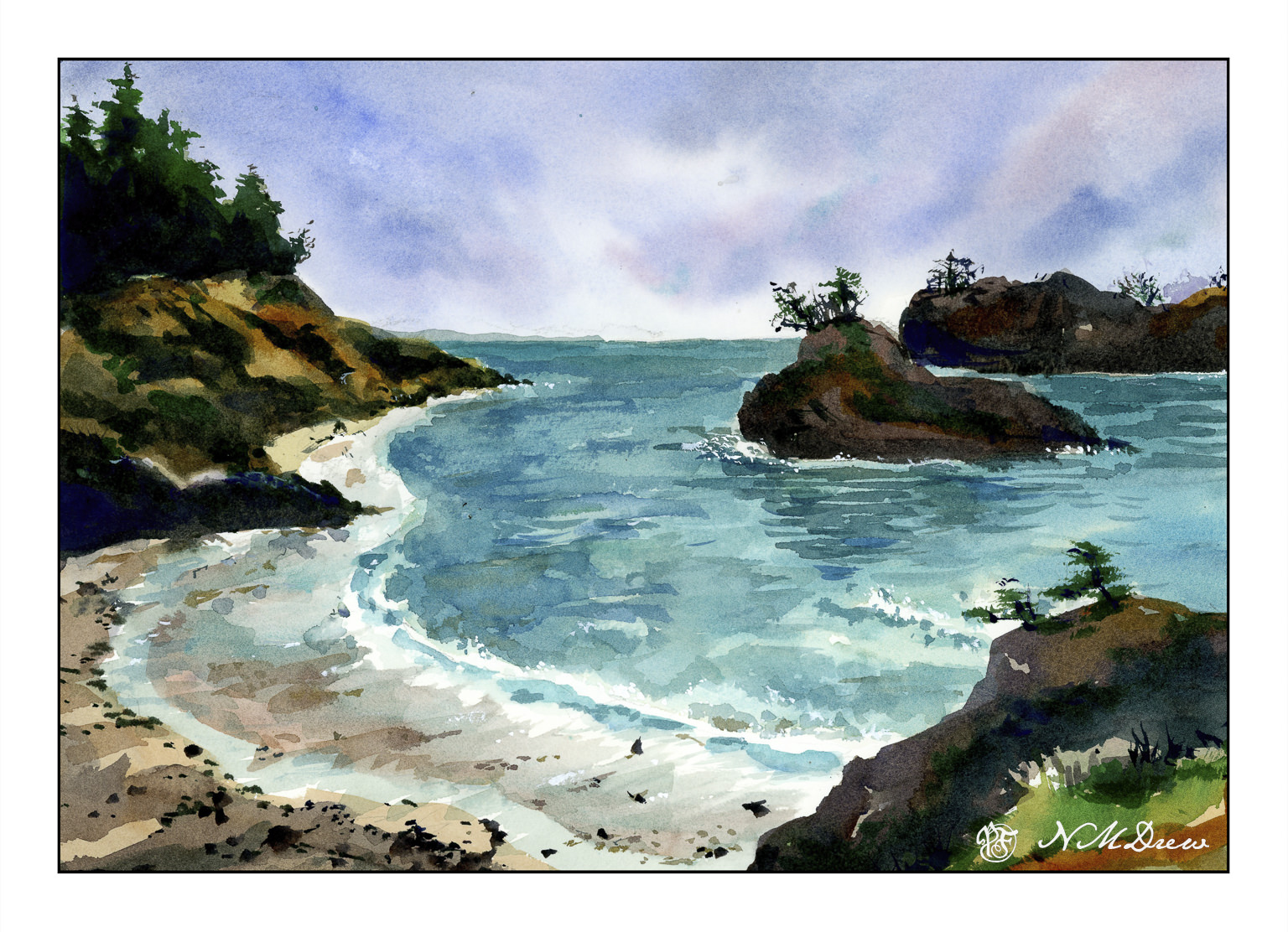
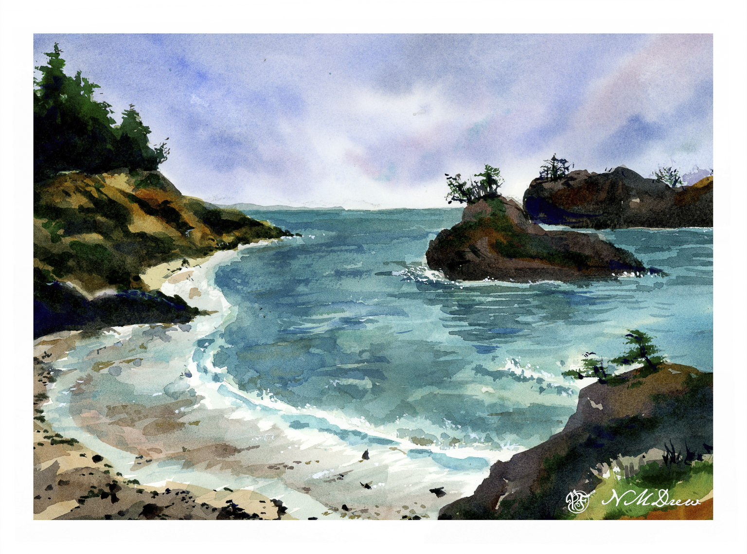
The Monterey Cypress is a tree that is common along the northern central coast of California. It is shaped by the environment as it moves with the wind and seems to grow away from the prevailing winds. To me, this quality is what makes it so beautiful and eye-catching. The coast is also subject to foggy days, damp and dreary, even in the height of summer.

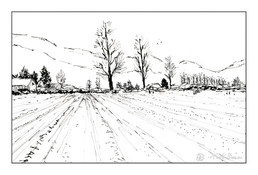
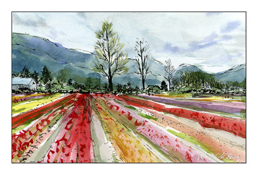
Carbon ink, watercolor, Koi pan paints, about 8×10.

Flower Farm

Since my return from Oregon, a lot has happened, much of which just threw life into chaos. I still have a messed up ankle which limits my ability to walk a lot – couch surfing became a major part of my life because Josh and I got covid. I don’t recall being so sick but luckily I got Paxlovid and that seemed to make a major turnaround in how I was feeling. Josh didn’t, but he recovered although he is still coughing. With covid and a bad ankle, TV was my friend, as was endless sleep. Before we got covid, though, we had to put our lovely dog Smudge to sleep – but that is a story for another time perhaps. We just miss her.

My energy levels have been really inconsistent, some days I sleep a lot, others I feel like my old self. The biggest issue has been getting back into our lives – doing what we like to do and completing them. Josh has been insulating the garage, and I have been thinking about things to do. Finally I had the energy to clean up the house a bit, and the studio, and finally to just get it together enough to fill a pen with ink and find some paper and paint.

I did a pencil sketch first, and then inked in the above using Carbon Ink by Platinum. Very nice stuff! You can put it into a pen and draw without too much worry about clogging up your pen. I think it is a pigmented ink, but I may be wrong. It is different from writing ink because of its intensity and being waterproof, which most inks are not. After inking in the drawing and letting the ink dry, I erased my pencil sketch and scanned the image.

From here, just find the right pan paint set. This is one by Koi, and as it got a good review, I thought I would try it. It is inexpensive, but the colors are really nice and have a clarity and beauty that many cheap watercolor sets lack. Very pleased with the results – good transparency combined with richness of color.

It always feels good to get back to what you like, doesn’t it? Slow steps. I am so bored with not feeling good and hobbling around! Hopefully the visit to the orthopedist – delayed because of covid – will not indicate surgery for messed up tendons and sloppy joints. Ah, well.

Carbon ink, 100% cotton paper, Koi watercolor pan paints; about 8×10.

Oregon Coastline – Your Thoughts?

The Pacific Northwest – Oregon, Washington – has some of the most dramatic and beautiful coastlines. I could easily spend a summer just exploring them. The rock formations, deep beaches, wildness all hold such an appeal. Any rugged coastline fascinates me, and perhaps someday I will get to spend weeks in Maine, Nova Scotia, and other places of such beauty.

Today, I decided to revisit Oregon from a trip awhile ago. Sea stacks run out into the Pacific, some merely rocks, other crowned with pine trees. Take a look at the two paintings below – the same, but with a bit of variation.

This is the painting as it now stands – but what do you think of the one below?

They don’t vary a great deal – and I am not going to tell you what I did – but if you have some thoughts as to which you like, and why, let me know.

Meanwhile, painting this, I worked really hard to create a sense of depth. The photo I used was an overcast and rather murky day. The distant sea stacks were not much different in value than the nearer ones; the coast itself was a bit brighter. Overall, the light was flat here and twas a bit hard to conceptualize it altogether. I am fairly pleased with it, but as with any painting, I see areas for improvement, some I like, some I think are great, etc. Anyone who paints knows this!

Watercolor, CP 140# paper, about 10×12.

Another Day in Late Spring

As I mentioned yesterday, I finished up Shari Blaukopf’s short course on painting spring flowers in watercolor. From crocus, we moved onto hyacinths, and today we have a field – or certainly a large patch – of tulips.

Shari’s tulips are more rounded at the tops, as are your standard tulip. Me, in my messiness and lack of attention to shapes, created ones which have more ragged tops, more open in bloom, and any other excuse you can think of for not adhering to recognizably-shaped tulips!

With that out of the way, this painting was a conclusion to all three studies. Out of all of them, for me the crocus was the biggest challenge simply as I am not familiar with them in reality – only pictures. The hyacinth was difficult because the flowers are small, 6-pointed, and blur into one another. Working with them as color masses, light to dark, with an occasional recognizable flower made for success in painting a complex subject. These tulips, while not especially tulippy, were my favorite to paint.

If you enjoy watercolor, I recommend Shari’s short courses – as I have before. They are reasonably priced, some are better than others, but in each one there is a clear subject and a clear goal. She has put together some “series” of online classes, too, which cover related topics. Many classes have a section for the student to upload their studies, and Shari is very good about getting back, even if it may be a few weeks later because she is away teaching in-person workshops.

Watercolor, 10×12, CP paper.

Yes, It Is Still Spring . . . .

The solstice is not yet here, so it is still technically Spring! I thought this was an important fact since I am showing off the hyacinth study from Shari Blaukopf’s online course of flowers in the spring. I already did the crocus – the flower I have never seen – and today I present you with the second study, hyacinths.

Whether or not these really look like hyacinths may be up to you. Shari is not a botanical watercolorist, and neither am I. I really like the intensity of her colors and the way she handles paint and subject matter. Add to that, she is a really good teacher and I have enjoyed all her online courses.

Overall, I am pleased with this study, but I will say the bottom, in the pot and the dirt, I need to fix that, but will later. Time to have a snack and kick back after this. I was focused and now I need to unfocus.

Watercolor, about 9×12.