A Bit of Snow

It is this time of year, the end of October, when I dream of autumn fading away and the first snows of winter arriving. I was born in mid-October, and my mother says she went into labor with me on a warm, sunny autumnal day and came home in a blizzard. I always remember this story, and as a kid loved seeing bright autumn leaves and berries still on the trees and bushes breaking through a fresh layer of snow. Weather like this was always a birthday present from Mother Nature!

Covered bridges spanning creeks are still in existence in various bits of the east coast. I imagine they were welcome resting spots for those on horseback or in open carts or wagons, out of the wind and snow or rain. For me, they are part of my own nostalgia for “the good old days” – and really lovely bits of historical architecture.

It has been a long time since I have witnessed the autumns and winters of hardwood woodlands. They always linger as some of the most beautiful memories. The mid-west and eastern states of New York north are where I want to be this time of year. But, where I live, in sunny SoCal, this is not the case, even though the Sierras have much to offer this time of year. And, admittedly, I am glad I don’t have to deal with chains and mukluks and woolies and long johns. I will admire the change of seasons from afar, more so in my dotage.

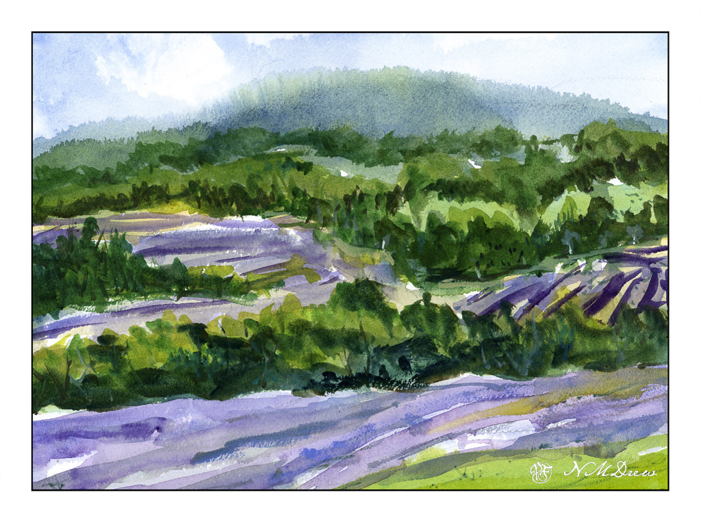
Watercolor, unknown watercolor paper with poor sizing, 11×14.

Summer Fields

Tomorrow is a family gathering, quite possibly the first since last year. This morning I cleaned up clutter and sorted out things, did all the first-of-the-month stuff, and so on. Meanwhile, the esposo is working from home and making both beef and chicken barbacoa in between saving database lives. I have already run around town collecting goodies, as have other family members, so we call enjoy a bit of a feast and each others’ company tomorrow with good food and good company.

Of course, a girl can only do so much and then the painting gods and goddesses beckon. Once more, lavender fields call, so here some are for your enjoyment.

Technique was primarily wet, beginning with they sky and distant mountain and trees, letting things bleed into each other. I like the misty effect and sense of distance it creates, as well as the suggestion of tree-covered hills. From there, greens and lavenders, lines and directional shapes. Final details were some dry brush lines in the foreground and in the tree shapes to create texture and vertical movement. I used a large mop brush (#6, Princeton Neptune) for the entire painting until the end. At that point, I took a small stiff brush to add some of the finer lines and dots.

Part of me thinks I could have done a bit more of a light lavender color, but overall, I am pleased with this painting.

Watercolor, Arches 140# CP paper, 9×12.

In Acadia

Acadia National Park is one of the most incredible parks – wild, rugged, beautiful.

Another painting with watercolor on Vision paper; again more direct approach. Not sure how good this looks online as the scan was not especially good.

This was a challenge altogether. Goal was simply to simplify. The rocks were not so easy to do as they are complicated in a lot of ways, at least here. They are very rectangular and sharp. I used broad strokes – and then some more – and then some more, each getting smaller. The trees, foreground, lighting were difficult as it was sunset or sunrise and catching the colors felt elusive. It feels overworked to me, but this is practice with both the paper and subject.

Vision watercolor paper, 140# CP, watercolor, 9 x 12.

Volleyball Court in the Library Park

Every now and again a small group of us meets at the park behind the library in town. Usually it is on a Monday, and I have been able to make it to the last two after missing so many it has been months. It’s a very nice group of people, from pencil artists to painters, and we are led by our wonderful teacher, Steve. We are usually there for a couple of hours in the morning.

The park itself is a bit small, but there are picnic tables, party areas, benches, playgrounds, and volleyball courts. Add a pond and ducks and a lot of trees, and it adds up to a very pleasant place to be. Today, in keeping with my more direct approach to painting, I brought along the Vision paper so I would be forced to work without a lot of messing around. The point of this study was to preserve the white – or add white as needed – to the volleyball net. The rest was whatever! Of course, more direct painting was the other, secondary goal.

Watercolor, 9 x 12 Vision watercolor paper, 140# CP.

Scarborough Bluffs

More work on painting more directly in watercolor. It is becoming easier but it still presents a mental challenge. By nature – though experience shows otherwise – I think of watercolor as splashy and fast. Well, it is not! Patience is paying off as I am rather enjoying my latest forays into watercolors.

To enlarge, click on the image.

Once more, a panorama in my current sketchbook. This one is simpler, I think, than my previous one, so it did not take as long – about 90 minutes, including using the hair dryer to dry things off.

First, sketch in with pencil the entire drawing. From there, wet the sky, leaving edges for the cliffs and trees, though I really didn’t worry about the trees too much. I knew the trees would be using dark, thick paint. The bluffs, though, needed to be fairly free of color and water, though if you look at the far left, you can see a bit of sky color ended up in the bluffs.

Colors for the sky were essentially ultramarine and cobalt mixed together. I mixed a large area of wash and applied the color after wetting the paper. To create the clouds I blotted out a lot of color. This is always a fun and scary part of any painting!!

While waiting for the sky to dry a bit, I worked on the water, the shore, and the land mass on the right. The lowest tree mass, too, was done with a mixture of colors. I am not really satisfied with it, but it is okay and not too messy or overdone. Once these areas – sea and shore and shrubbery – dried I moved onto the bluffs themselves.

The bluffs will vary in color, depending on sky and time of day. I decided these should be bright as is the sky. Mixing up a light grey is a challenge, so I did a bit of cobalt, yellow ochre, and bit of what I think may be quinacridone rose. (Alizarin crimson would work, too.). I mixed together very small amounts of each and diluted it heavily. I used this to lay int he lighter areas of the bluffs, leaving some areas plain white paper. From there, darker shades, yellower shades, lines and fissures.

The final stages were details. Trees on the bluffs, some green along the right side shore, varying color in the water, shadowed areas in the bluffs, and splattered color on the lower right. Finally, a couple of figures to give scale – these bluffs are really tall!

Watercolor in sketchbook on 140# CP paper, about 8 x 18 inches.