Scarborough Bluffs

More work on painting more directly in watercolor. It is becoming easier but it still presents a mental challenge. By nature – though experience shows otherwise – I think of watercolor as splashy and fast. Well, it is not! Patience is paying off as I am rather enjoying my latest forays into watercolors.

To enlarge, click on the image.

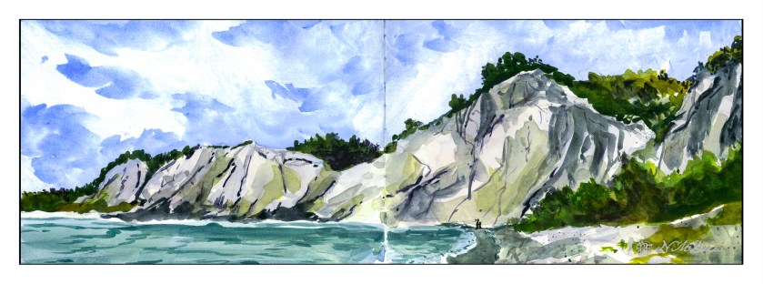
Once more, a panorama in my current sketchbook. This one is simpler, I think, than my previous one, so it did not take as long – about 90 minutes, including using the hair dryer to dry things off.

First, sketch in with pencil the entire drawing. From there, wet the sky, leaving edges for the cliffs and trees, though I really didn’t worry about the trees too much. I knew the trees would be using dark, thick paint. The bluffs, though, needed to be fairly free of color and water, though if you look at the far left, you can see a bit of sky color ended up in the bluffs.

Colors for the sky were essentially ultramarine and cobalt mixed together. I mixed a large area of wash and applied the color after wetting the paper. To create the clouds I blotted out a lot of color. This is always a fun and scary part of any painting!!

While waiting for the sky to dry a bit, I worked on the water, the shore, and the land mass on the right. The lowest tree mass, too, was done with a mixture of colors. I am not really satisfied with it, but it is okay and not too messy or overdone. Once these areas – sea and shore and shrubbery – dried I moved onto the bluffs themselves.

The bluffs will vary in color, depending on sky and time of day. I decided these should be bright as is the sky. Mixing up a light grey is a challenge, so I did a bit of cobalt, yellow ochre, and bit of what I think may be quinacridone rose. (Alizarin crimson would work, too.). I mixed together very small amounts of each and diluted it heavily. I used this to lay int he lighter areas of the bluffs, leaving some areas plain white paper. From there, darker shades, yellower shades, lines and fissures.

The final stages were details. Trees on the bluffs, some green along the right side shore, varying color in the water, shadowed areas in the bluffs, and splattered color on the lower right. Finally, a couple of figures to give scale – these bluffs are really tall!

Watercolor in sketchbook on 140# CP paper, about 8 x 18 inches.

At the End of the World

Today and yesterday were really rather discombobulating. Does getting older mean you are more set in your ways and less able to adapt to changes in the daily routine? Either that or my allergies just make me a bit crazy – this morning I had one of my sneezing fits where I sneeze about 30 times in a row. That is exhausting to the point I need a nap.

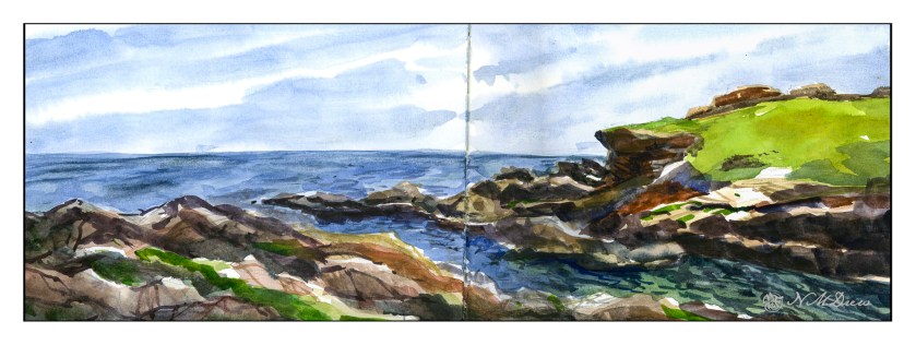
And nap I did. But then I decided to do something creative, and back to watercolor (my real first love in painting) and work on something idyllic, wet and watery, full of rocks, and put it in my sketchbook so I won’t take myself too seriously.

Click on the image to enlarge!

The Strathmore Vision paper works really well with little re-working of any part of the painting. I decided to see how the sketchbook would do with the same approach, as well as the more personal challenge of being more direct in color application.

With watercolor, many artists work with very wet paper, and while I like that, I prefer to have wet paper – as for the sky and the sea – but I also like to have layers. If you paint into wet color, your next incursion must be more pigment and less water than you are moving into, otherwise you get what are called blooms or cauliflowers. You can also paint onto dry paint and these won’t occur, and you can use thinner or thicker paint – less or more pigment combined with water. My sketchbook has good paper – far better than the Vision paper – so I could do all these things, and did.

First, wet the sky area, then drop in stripes of blues. Next, wet in the water, from horizon to the inlet area, all in about the same shades of blue, but darker than the sky. Let that dry. While that is going on, I painted in the greens on the right, blending colors into each other for gradations of green. The rocks, too, were painted with varying colors, working to leave bits of unpainted paper for a bit of pop and to indicate areas with more sun that shadow. Slowly I put in details, such as the waves or ripples in the lower right of the inlet, cracks in the rock, and so on. Large colors and masses first, finalized with contrast and detail.

I am pleased with this painting. I accomplished my task of direct painting with some modification – not a lot – later as I moved into detail. I drew in the general shapes with a pencil. The foreground rocks on the left and bottom were a challenge, but I think I have enough detail to make them interesting but not distracting. The same with the land mass on the right. Overall it took about 2 hours to do complete this watercolor.

Watercolor sketchbook, watercolor, about 7 x 18.

Morning at My Desk

Today there is a bit of running around to do, so this morning I was in a blithery mood. Things to do – like the usual morning stuff – but I also know I won’t feel too focused on any one thing, so sketching with ink and watercolor seemed to be the best of all choices. (After all, life is not all about dishes and making the bed!)

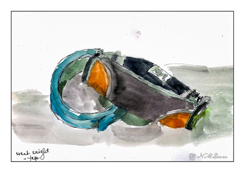
On my desk is a small hand weight and roll of painter’s tape. Warm-up. And now immortalized.

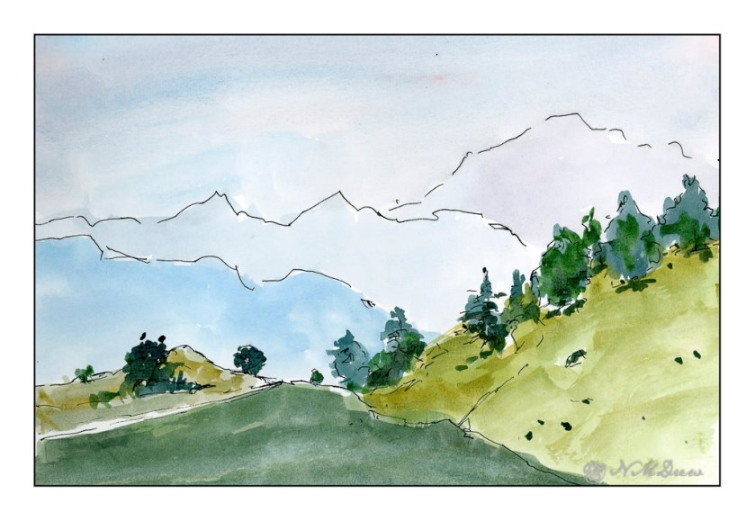
Next, the great outdoors. Mountains and trees. I would love to be walking around here, but sadly my ankle is keeping far more stationary that I want to be. I am getting better, but I have to just keep all to a minimum. I can go to the store and walk a bit, but I need my heel to get better more than anything.

So, the painting. Goal is to get a sense of distance with the gradations of the mountains as they recede into the distance. Accomplished!

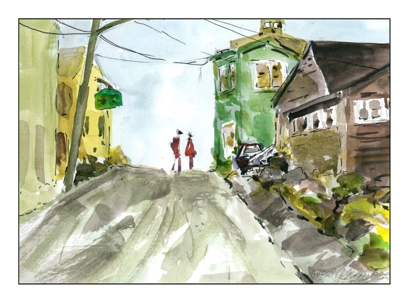
Finally, a scene with some complexity. I figured my warm up and splashing of paint were ready to meet my next challenge which is to paint buildings, people, perspective. Landscapes are comfy but I really want to push myself a bit more, as I did the other day, with direct painting and more patience and planning.

The first two sketches were done in very short order, but here I pulled out my pencil, limned in lines and worked on perspective and size. I think my people are a bit too tall, and I put them in before I did the painting of the buildings and the road. The buildings, too, are a bit wonky, but they work fairly well. I painted everything and then, once okay with the picture itself, I decided some black lines here and there would be good to help pull the painting together. Not perfect, but pleased with the results as I did meet my challenge.

Pentalic Aqua Journal, about 7×10, watercolor, Uniball micro pen.

California Coastal Cypress

Stuck at home for the most part because of my ankle, I need to find things to do. It turns out that my ankle, while a mess of historical injuries, has no tears in the soft tissues. That is good. However, my heel bone has “microfractures” from the hard landing dodging the car last month. This is a bone bruise, and it is painful! I finally got into see the orthopedist, got a walking boot, and return in a month. The boot makes a big difference though it does take some getting used to wearing and using. I have to be careful not to pitch forward or backward. And you can hear me coming a mile away – squish, squeak, squish, squeak.

Of course, painting is the first choice! I am still tired intermittently from Covid, but I don’t have brain fog (at least I don’t think so), and look for things to enjoy but not be a source of frustration. Thus, ink and watercolor.

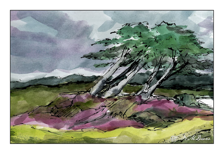
The Monterey Cypress is a tree that is common along the northern central coast of California. It is shaped by the environment as it moves with the wind and seems to grow away from the prevailing winds. To me, this quality is what makes it so beautiful and eye-catching. The coast is also subject to foggy days, damp and dreary, even in the height of summer.

Carbon ink, watercolor, Koi pan paints, about 8×10.

Flower Farm

Since my return from Oregon, a lot has happened, much of which just threw life into chaos. I still have a messed up ankle which limits my ability to walk a lot – couch surfing became a major part of my life because Josh and I got covid. I don’t recall being so sick but luckily I got Paxlovid and that seemed to make a major turnaround in how I was feeling. Josh didn’t, but he recovered although he is still coughing. With covid and a bad ankle, TV was my friend, as was endless sleep. Before we got covid, though, we had to put our lovely dog Smudge to sleep – but that is a story for another time perhaps. We just miss her.

My energy levels have been really inconsistent, some days I sleep a lot, others I feel like my old self. The biggest issue has been getting back into our lives – doing what we like to do and completing them. Josh has been insulating the garage, and I have been thinking about things to do. Finally I had the energy to clean up the house a bit, and the studio, and finally to just get it together enough to fill a pen with ink and find some paper and paint.

I did a pencil sketch first, and then inked in the above using Carbon Ink by Platinum. Very nice stuff! You can put it into a pen and draw without too much worry about clogging up your pen. I think it is a pigmented ink, but I may be wrong. It is different from writing ink because of its intensity and being waterproof, which most inks are not. After inking in the drawing and letting the ink dry, I erased my pencil sketch and scanned the image.

From here, just find the right pan paint set. This is one by Koi, and as it got a good review, I thought I would try it. It is inexpensive, but the colors are really nice and have a clarity and beauty that many cheap watercolor sets lack. Very pleased with the results – good transparency combined with richness of color.

It always feels good to get back to what you like, doesn’t it? Slow steps. I am so bored with not feeling good and hobbling around! Hopefully the visit to the orthopedist – delayed because of covid – will not indicate surgery for messed up tendons and sloppy joints. Ah, well.

Carbon ink, 100% cotton paper, Koi watercolor pan paints; about 8×10.