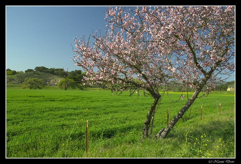
The Amargosa River is located in Nevada and California, moving into Death Valley National Park of the Mojave Desert. As a river, it flows freely both above and below ground, providing much needed water in an otherwise dry climate. Because of it, there are many rare and unusual plants and animals, some found nowhere else in the world. It is managed by the Bureau of Land Management (BLM) to conserve it . . .
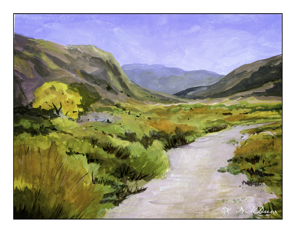
This is another gouache painting. I wanted to capture the contrast of the river basin to the mountains it runs through, as well as illustrate the wonderful colors you can see in a desert or riparian area. Dry, rocky mountains, flat areas from flash floods and trails, the occasional tree, low-growing plants adapted to a dry environment. Plant colors are generally pale – sage green being a dominant one as well as bright yellow flowers. Dry air lets you see for miles into the distance and at times you wonder if you will ever see a cloud in the endless blue sky.
Gouache, Strathmore Vision 9×10 140# CP paper.