Creating My Own Watercolor Palette

Books abound about colors to use and to choose and why and wherefore.  The fact is that to understand them you have to use them.  Years ago, my palette was filled with the traditional cadmiums and earth tones and blues and such, and I am very comfortable with them.  I still love those colors as they are old friends with history and familiarity.

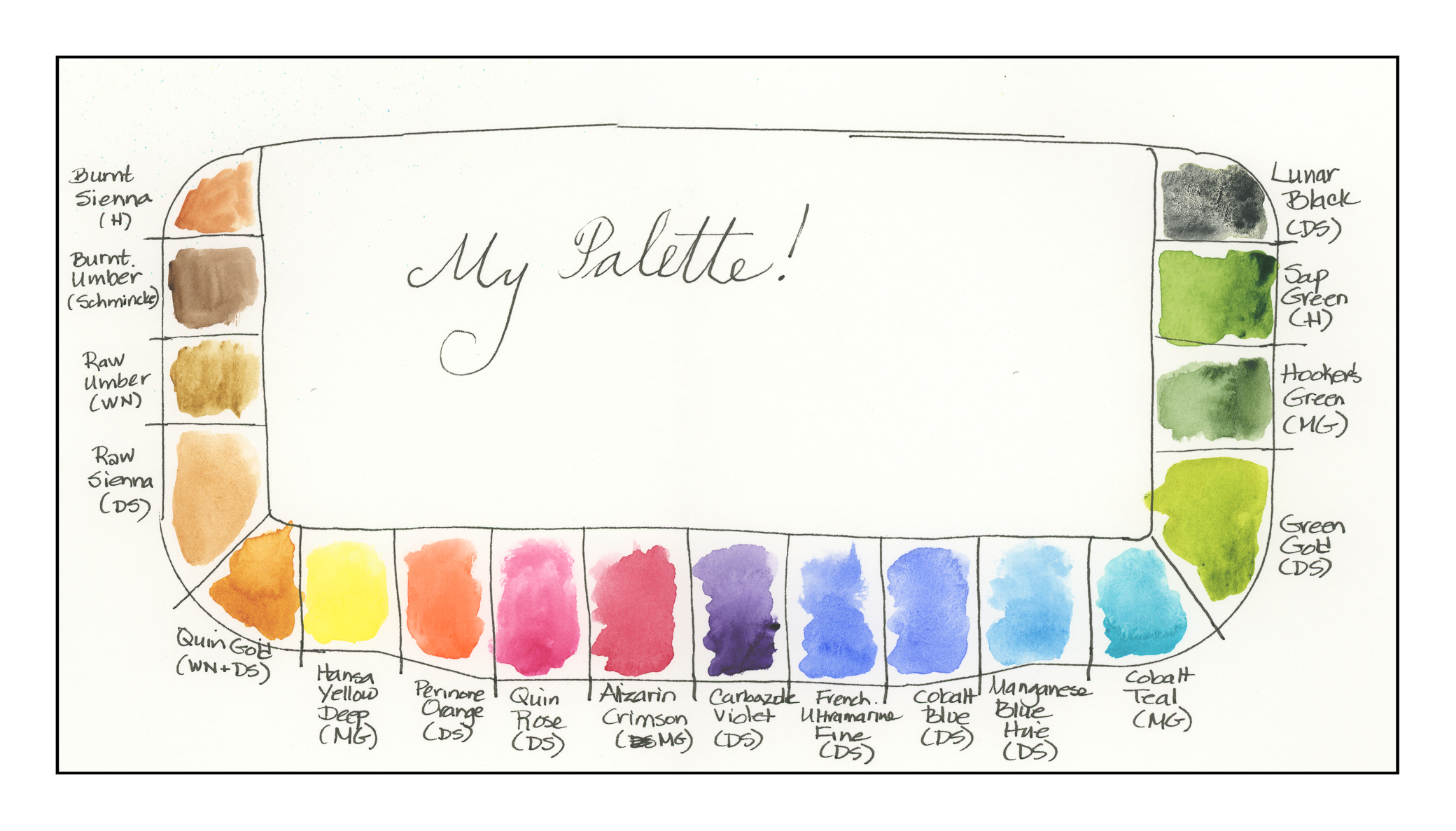
Today I decided to choose 18 colors.  Some are new-to-me (like quinacridones) in the past year, and some are old buddies, like the earth tones.  Here they are, as arranged on the palette:

  1. Burnt Sienna (Holbein)
  2. Burnt Umber (Schmincke)
  3. Raw Umber (Winsor & Newton)
  4. Raw Sienna (Daniel Smith)
  5. Quinacridone Gold (Winsor & Newton – last bit, along with Daniel Smith)
  6. Hansa Yellow Deep (M. Graham)
  7. Perinone Orange (Daniel Smith)
  8. Quinacridone Rose (Daniel Smith)
  9. Alizarin Crimson (M. Graham)
  10. Carbazole Violet (Daniel Smith)
  11. French Ultramarine Blue Fine (Daniel Smith)
  12. Cobalt Blue (Daniel Smith)
  13. Manganese Blue Hue (Daniel Smith)
  14. Colbalt Teal (M. Graham)
  15. Green Gold (Daniel Smith)
  16. Hooker’s Green (M. Graham)
  17. Sap Green (Holbein)
  18. Lunar Black (Daniel Smith)

Some of these paints are old and little is left in the tubes.  I took a chance and mixed two different brands of Quin Gold together – it might be interesting to see their differences when I use them on paper.

All of these colors sit really nicely in the wells except the Cobalt Teal, which is very runny and puddles.  I want to use it up and try a different brand – I have a tube of DS sitting in the wings – but it produces an extraordinarily beautiful green when mixed with Quin Gold.  Having used neither color in the past, that was a fun surprise.

Other new colors include Green Gold, Perinone Orange, and Carbazole Violet.  I’ve never had a violet on my palette until this past year!

When you think about it, modern chemistry and color chemistry affect us everywhere we are, from the colors of our clothes, to neon signs (replaced now with LEDs), to food, to who knows what!  Thus, it makes sense to use modern colors in a more modern watercolor palette.  Additionally, many of the colors made today are much more lightfast, which means less if any fading, compared to the more traditional colors.  A watercolor of 100 years ago was probably far more vibrant then than it is today.

Old friends include Burnt Sienna, Burnt Umber, Raw Umber, Raw Sienna, Alizarin Crimson, French Ultramarine Blue, Cobalt Blue, Manganese Blue (now a hue)), Hooker’s Green, Sap Green, and Lunar Black.

It was really difficult to choose these colors – like a lot of painters, I read about or see a color and go off to buy a tube.  There are some that are incredibly beautiful – but for a travel palette, even 18 colors may be a bit much.  For myself, I prefer to have a stable of greens rather than mixing them a lot.  I haven’t really taken the time to do it as the Sap and Hooker’s have been in the color stable for a long time.  Green Gold is totally new to me this year, so I thought I would include it.  This forced me to narrow down my blues and reds to a degree, as well as the addition of the Perinone Orange and Carbazole Violet.

Over the next several days I plan to use these colors, perhaps make some swatches and grids to see how they react to each other.  A “good” artist is inclined to do that . . . me, I get antsy unless I make it a goal!
Saturday Morning Sides

I’ve been on a Mediterranean food kick of late.

This morning I was in the mood to put together some foods to have on hand over the next few days.  Since I am off work, it makes sense to do something – particularly when I want to do something!  So, I put together a couple of sides, one which we like to have on hand, and another we had in a restaurant the other night.

First side was to make some tzatziki.  This is so easy it’s ridiculous, and really worth the bit of time to make it from scratch, because scratch is always better.

Tzatziki

2 c. Greek yogurt (I used homemade!)
1 large English cucumber
5-7 cloves garlic
1 T. fresh dill
juice of 2 lemons
salt
pepper
olive oil

Grate the cucumber. Place in strainer, mix with about a tsp. of salt. Place where the liquid from the cucumber can drain while you do the rest of the prep. Let the cucumbers sit for about 30 minutes.

Finely mince the garlic – we use a microplane. Juice the lemons. Chop the dill. Stir in the yogurt.

Rinse the cucumbers. Squeeze out as much liquid as you can. If you like, put the cucumbers onto a towel, or paper toweling, and squeeze and press out as much liquid as you can. Turn into yogurt-lemon-garlic-dill mixture. Pour in a tablespoon or two of olive oil. Mix well. Taste. Add salt as you wish, and pepper.

Refrigerate in container. Stir before using.

The next thing I did was throw together a sort of tapenade, mixed up from what I had on hand.

Sun-Dried Tomato, Anchovy, and Olive Tapenade

8 oz. / 1 c. sun-dried tomatoes in oil – use all of it
1 small can of anchovy fillets
2-3 T. capers
20 kalamata olives, pitted (if already pitted, slice them where the seeds might be – you don’t want them messing up your food processor!)
2-3 cloves garlic
1-2 finely chopped cayenne peppers (optional)
2 T. balsamic vinegar
salt and pepper to taste; olive oil to thin to your liking

In a mini-blender, put in tomatoes, anchovies, capers, garlic, olives, peppers, and vinegar. Whir together into a chunky paste. Taste. Add seasoning as you wish, and to thin, you may add some of the oil from the anchovies or a bit of olive oil on the side. Refrigerate for a few hours to meld flavors. Store in closed container for up to a week. Good on crackers or bread or straight out of the jar.

And there you have it – Saturday morning sides when you have nothing better to do!

The Days of Inktober 2018

October is “Inktober” to many artists – a time when, around the world, artists focus on ink drawing, from a suggested list of words, or just because you can.  Drawing in ink can be done spontaneously, over a preliminary drawing, with pen or brush, with black or colored inks.  Ink is ink.  And the experience is great.

I’ve been focusing on the list, which you can see below.

When you think about it, it can be really hard to be inspired by the topics.  How do you depict “precious”?  “Chicken” can be pretty obvious – until you pursue the more obscure meanings of “chicken” – as in cowardly or yellow.

Below are my Inktober drawings through the 11th day.   For the last one, the mushrooms just have to have that glorious red – so watercolors were added.  And, to be honest, I needed something beyond the black and grey and whites of ink.

I hope you enjoy them!

Boxy Tote, Part II – Completed!

Last month I started the “Boxy Tote” at a local quilt shop.  This is a very complex project, encompassing fusible foam, fusible batting, stays (the things that give the top of the tote its “snap” when opened and shut), pockets, quilting, and sew on (to excuse the bad joke).  It took close to 30 hours to complete!  You can read about it here.

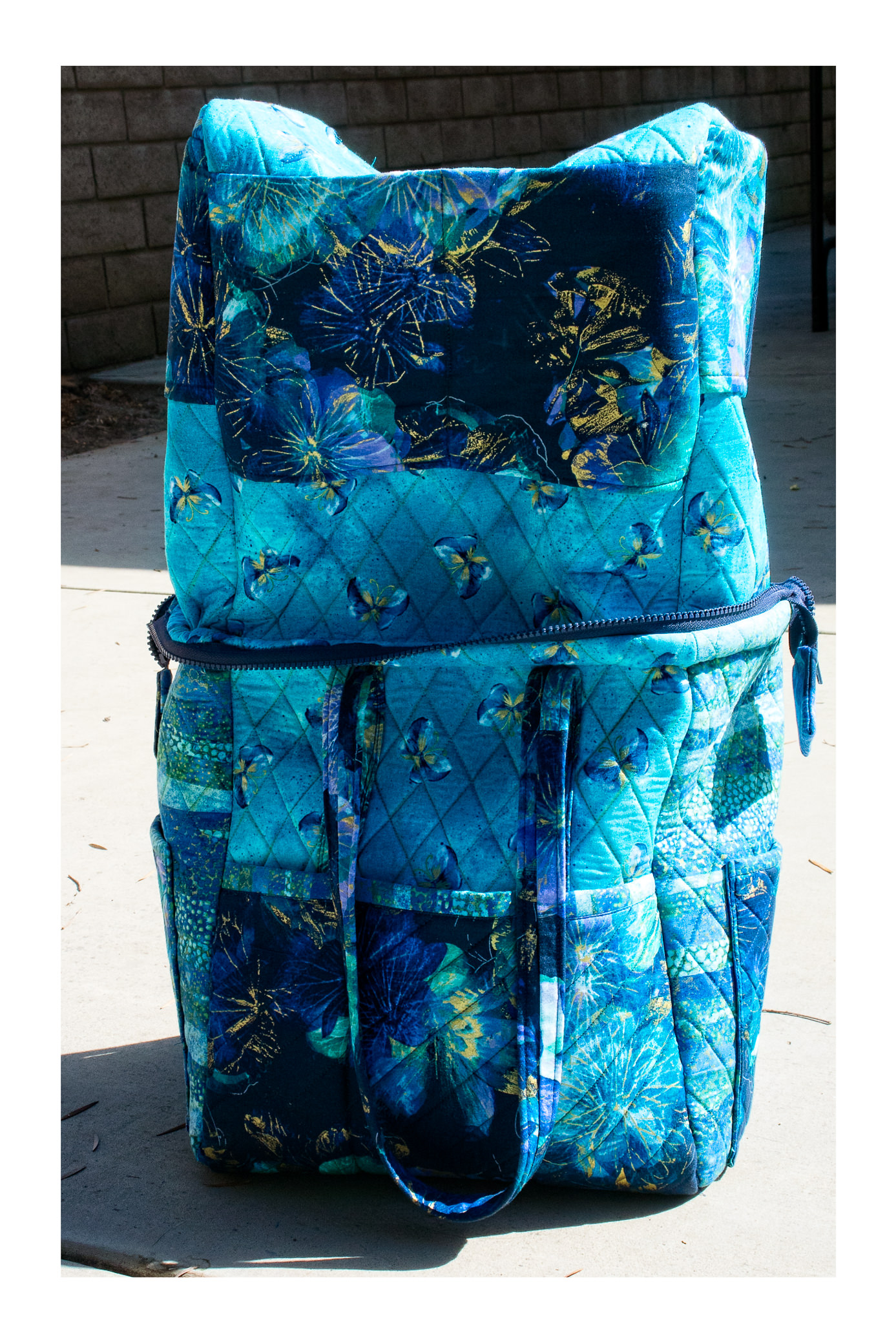
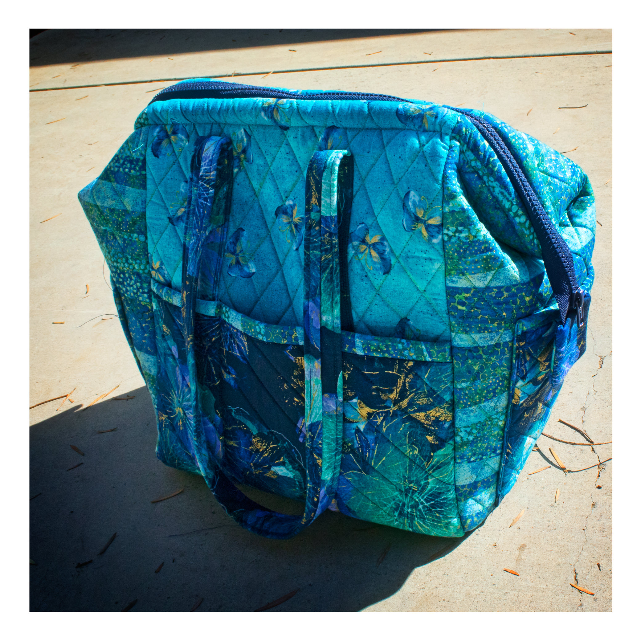
Below is a picture of the bag, inside and outside.  The top side is the lining, which is quilted and has pockets in it.

And finally, here is the tote.  Look at the shape of the top of the bag – flat with tapering sides.  This is where the stays come in.  They are actually quite handy.  The zipper also is there, a plastic jacket zipper to which, on either end, tabs have been added.  Without the tabs, the bag would be really raw.

As I have said, I probably would have thrown the whole project out if I had not taken a class.  Others in the class have said the same thing.  While the bag is great, the instructions left a lot to be desired.  I rather doubt I will make this again, but the experience was so worthwhile.  I learned about fusible foam and batting, neither of which I have ever used before.  Inserting the zipper and stays were also valuable experiences.  Having a room full of fun women (we had a lot of childbirth jokes going on, but I won’t repeat them here!) and an excellent instructor was worth it all.  I’ll be doing more classes, I know, from bags to maybe some quilting, just to refine some sewing techniques if nothing else, as I do not see myself as ever being interested in making quilts – quilted clothing, yes, but not quilts.  But, ya never know!

The Boxy Tote, Part I

I have spent the last two Saturdays sewing up a monstrously complex – and decidedly fun but crazy-making – project.  If it weren’t for Betsy, the able and skilled teacher, I probably would have stopped midway through it.  Besides spending 2 six-hour Saturdays in a classroom at Quilty Pleasures, I also spent about 15 hours quilting the pieces.  Oy oy vay!

This is my first sewing class since I left middle school a century ago.  Then, it was called Home Economics and we learned to sew by making aprons and A-line skirts.  Very simple and basic.  Since then, I have sewn oodles of stuff, but nothing like this.

The “Boxy Tote” is designed by Penny Sturges from Quilts Illustrated.  It’s rather sophisticated and well-designed, but the directions for many people were confusing.  This is where having an instructor who had it figured out was great.  The fun thing is, for me, there are a lot of new sewing gizmos and whatevers that I haven’t used, like fusible foam and fusible batting.  A zipper closes the bag, and arms or something, which you can see in the picture below, are used to pop it open.  There is also a firm flooring or bottom for the base, to keep the shape of the bag, as well as handles which, instead of batting, our instructor used webbing for the insides.

I am going back on this Thursday to finish it up.  Betsy is being kind enough to help us stragglers along, on her own time.  I’ll lug my machine and supplies over there and have a good time altogether.  I’ll probably buy fabric, too, as there is another bag class I’ll (hopefully) be attending in November.  Time to make Christmas presents, you know!

So, here are photos of the bag in different degrees of construction.   Maybe by Friday I’ll have it all together and ready for Part II.