Wet Work

I read too many spy novels!

So, if this isn’t about the darker sides of life, what is this about?  It is about watercolor painting.  As you may recall, I have been trying to work on my drawing and painting, between other life activities.  While I try to do one or the other daily, it doesn’t happen.  The thing that is happening is a beginning of focusing on various elements of watercolor.  Rather than just paint, I began to focus on retaining white space.  White space in watercolor is the paper itself – that is the only way to get a “true” white when painting, unless you put in white paint, such as a white gouache.  Many people frown on this.  So, retaining white means you paint around white areas, which have to be considered as you lay down color, or using a rubber-based frisket.  The frisket is great as you can paint right across it once it dries.  Both methods have their advantages and disadvantages.

In addition to retaining white space, I have added another focus in my painting.  Watercolor paper is painted on when wet or dry.  Painting wet-on-dry means applying paint to a dry paper.  Wet-in-wet means prewetting the paper, or painting onto paper where a wash is still wet.  Wet-in-dry allows for hard edges.  Wet-in-wet allows the paint to blur and blend, and how much it does this is dependent on the wetness of the paper and the slope of the easel.

The above picture was from a photo I took at the Monterrey Bay Aquarium of jellyfish floating around in their water.  The aquarium is backlit, and the light shines through the diaphanous membranes of the fish.  This was simply ink, followed through with a bit of color.  Drawing the jellyfish was fun – and in the lines of the tentacles, it almost became a dance with the jellyfish.

The jellyfish were drawn with a very fine point pen.  The Joshua Tree was done with a thick, permanent ink pen, about 0.5 in diameter (I think).  Here, the ink was used to create texture, with watercolor being secondary.

This is the point at which watercolor, ink, and white space became a focal point. I think these are a variant of snowbells, and they are found in the shade beneath trees. In such dim light, the white flowers are strikingly in contrast to the mulchy undergrowth, and in photos often are rather flat in appearance. This drawing demonstrates that flatness, but with the whiteness of the flowers preserved.

From the flatness of the line and watercolor drawing, I now worked on creating white in a dark painting. The flowers themselves look very flat because the paint I used to create – try to create – a 3D effect just pooled. The white is now filled with flat paint, which creates a flat picture. Here, the paint was applied wet onto dry paper, and the result is a bunch of hard edges. It is this realization that made me move into working a lot with wet-in-wet.

The pictures above are more attempts at preserving white, and working wet into wet. Probably the most successful one is the painting of the winter sky with the silhouetted tree.  Click on one of the paintings to cycle through the images in a slide show.

From the deliberate paintings I moved to wetting the paper thoroughly with water for the first of the two paintings above – soaking the paper with my brush, painting into the wet paper, and then painting again into the wet paint. The fir trees were more deliberate.  Here I tried to work with white space and with snow, trying to capture ways in which white can be interpreted with paint.  Again, click on one of the paintings to see the slide show.

While doing all these paintings, I started thinking about watercolorists whose work I admire, and who, I know, did wet-in-wet particularly well. Winslow Homer is one of the best watercolorists of the 1800s, and his skies have always appealed to me. The painting above is my rendition of his painting The Palm Tree, Nassau. I changed a few colors and compositional elements, but I used this as an exercise to study how Homer may have painted. He used wet-in-wet on the sky; white space for the waves and tower, and varying techniques for the palm trees and foreground.

Besides trying to understand how an artist created a painting, I also searched YouTube for artists working wet-in-wet. I came across Edo Hannema’s channel and was so impressed! He is a master of wet-in-wet, as well as working with white space. I learned a lot from observing and copying his examples; this painting may be from one of his videos or an interpretation of one I saw online – don’t recall. I think seeing his work, and copying his exercises, has started my being able to move forward. I plan to follow his lessons more in the near future. His paintings have a lovely simplicity as well as demonstrate a finely honed skill in wet-in-wet. He is from Holland, so many of his paintings show very flat land, which for me is fascinating as I live in an area with a lot of hills and mountains and valleys.

Finally, I did this one today. I was up at oh-dark-thirty, having my coffee, and thinking about all the things I have been painting over the past few weeks. It was time to try to paint something that used a lot of wet-in-wet, had a modicum of white space, and finally wet-into-dry, meaning wet paint applied over dried paint. I am pleased with what I have learned, from copying other artists’ works to my own experiments. Everyday is an exciting new adventure, and out of all of my interests and hobbies, watercolor is the biggest pleasure of all.

Below is a gallery of all the above paintings, and a couple of others as well.  Enjoy!

Fish Hat: Dead or Alive (Revisited)

Years ago I made a fish hat for my husband.  It’s in the shape of a real fish, complete with eyes, fins, and a tail.  That was some 10 years ago, and over time, I have probably made another half dozen.  The fish hat is clever and a fun way to use up your stash of left over yarn.  The pattern was published in the online knitting magazine, Knitty, and you can find it here Fish Hat:  Dead or Alive? Because the dead fish hat was so popular, the designer even opened up a special website for more information about her ingenious pattern. The beauty of this last link is that you can find the fish hat in crochet, for charity, using a knitting machine, in different languages. If you don’t want to knit, find the crochet version at that site.

Fish Hats from the Knitty pattern site.

I even created knitted, rather than felt cloth, eyes for the dead fish.  The pattern is below:

Fish Hat [Dead or Alive?] Eyes

Cast on 4 stitches. Knit front and back of each stitch – 8 stitches. Transfer to double point needles, place marker at round beginning.

Rnd 1: Knit

Rnd 2: Knit front and back each stitch – 16 stitches.

Rnd 3: Knit

Rnd 4: *Knit front and back, knit 1,* repeat to end – 24 stitches

Rnd 5: Knit

Rnd 6: *Knit front and back, knit 2,* repeat to end – 32 stitches

Rnd 7: Knit

Rnd 8: *Knit front and back, knit 3,* repeat to end – 40 stitches

Rnd 9 and 10: Knit

Bind off.

Here is the first fish hat I made.  I made it around 2008 for my husband.  It has the knitted eyes, which look pretty good, I think.

The most recent fish hat is all stripes and has crocheted eyes.  The eyes were all done with single crochet.  For these eyes, follow the same ideas as the knitted eyes, but crochet.  It works.

I like the knitted eyes better.

With limited amounts of yarn for the most recent fish hat, I had to be pretty careful about what I used.  For instance, the tail is in two colors, not one.  The pectoral fins are smaller, too, because I was running out of black yarn.

I spent the last week knitting up this most recent fish hat – good way to listen to an audio book or watch some TV and do something productive and satisfying while riding out a head cold.

If you need something to do with your stash and have worsted-weight yarn, make a fish hat!  I’ve made a Nemo (clown fish) and others, and everyone has liked them.  The yarn is worsted weight, and my preferred yarn is acrylic, specifically Vanna’s Choice, which I find to be a very nice yarn altogether.  The original fish hat is about 10 years old, and has been washed multiple times.

This one is for my SIL who, at Christmas, said, “I’d like a fish hat, too!”  So, here it is, ready for her birthday next month.

Below, a rogue’s gallery of the fish hat in action!


Chaos Contained

Christmas and New Year are busy times of of the year, particularly if you tend to make things for the holidays.  That’s me.  After all the sewing and knitting and baking and such, I sort of collapsed and just didn’t do much of anything except blob along.  As a result, nothing was really like I wanted it to be – this here, that there.  What was getting me – and is still, to a point – are sewing supplies, material, machines.  Today I made a dent in the mess and put all my patterns into under-the-bed shoe storage containers that I got here on Amazon These storage containers got good reviews, but best of all, you can move the dividers around as you need, to fit your stuff, whether shoes or patterns!  I am actually really pleased with these and recommend them – for shoes or patterns or…?

Well, one part of my sewing life is a bit neater.  I also worked on the closet where the machines reside.  I rearranged the machines, put a plastic tray system in the closet to hold things such as manuals, and other trivia.  Tomorrow, since I freed up a whole drawer in the sewing bureau, I am going to go through it to rearrange fabric and interfacing, along with other little things.  If I get really organized, I’ll even sort out the material by yardage and future usage.   The studio shelves have projects in containers to work on.  On a digital level, I want to make sure I have a back-up of my pdf patterns.  Once this little bit of reorganization is done, my head space will be clear for upcoming projects!

A Boy, His Dog, and a Bath Robe

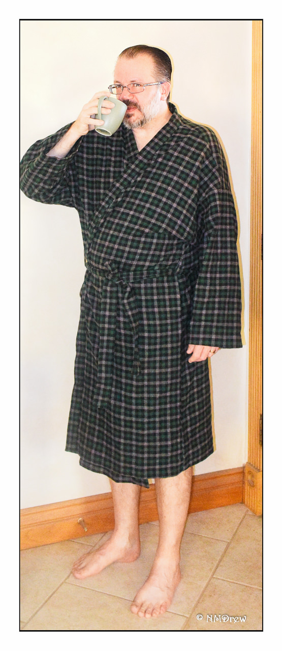
Here are a few pictures of the other half in his bath robe.  It was a 2-hour Simplicity pattern, which is lying around here somewhere in the post-New Year debris!

We began the morning cup of coffee, and a wicked grin.  Trouble is brewing – more than just the coffee in the coffee cup!  Photobombing is most likely going through his mind . . . .

Do you notice the overall greenish theme – robe and coffee cup?  Pretty clever of me to think ahead for the photo shoot I knew was coming.

The robe was a success!  I wasn’t really sure if it would be.  I felt the roll collar was a bit too stiff, didn’t know if the side pockets would be acceptable (side rather than patch), and the length of sleeves and robe were left undone at the time of the wrapping.  I loved the material, which is a fluffy flannel, rather loosely woven, and rather ravelicious when sewing.  Overcasting, felling, all sorts of endeavors to keep the threads from escaping the warp and woof.

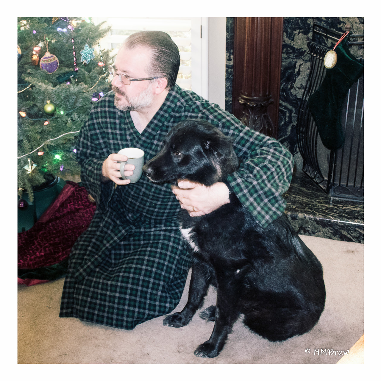
And speaking of “woof” – here is the Master of the House with Smudge, a Mistress of the Canine Guard.  Please admire the modesty of the pose, the fine fire guard, Italian marble and mahogany fire place, and decorative tree, along with my fine photography skills.

Happy New Year, Everyone!!


Christmas Sewing – A Bag for Marguerita

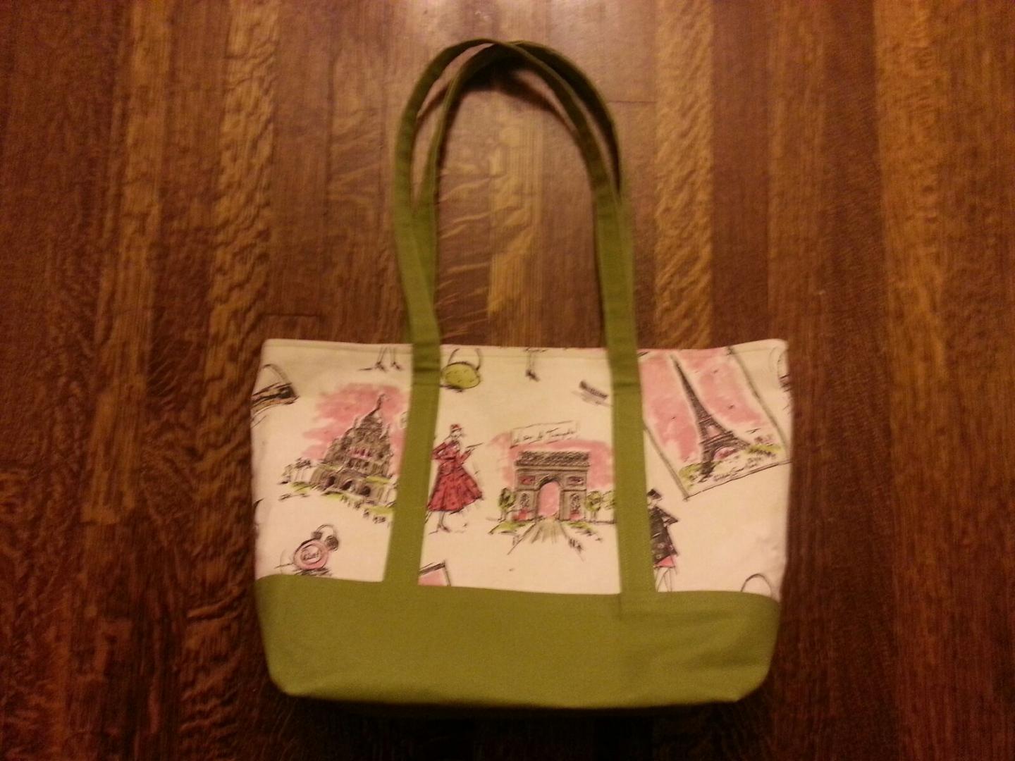
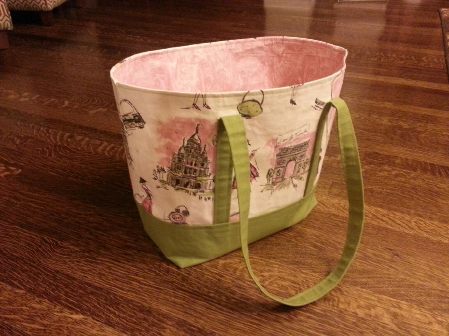
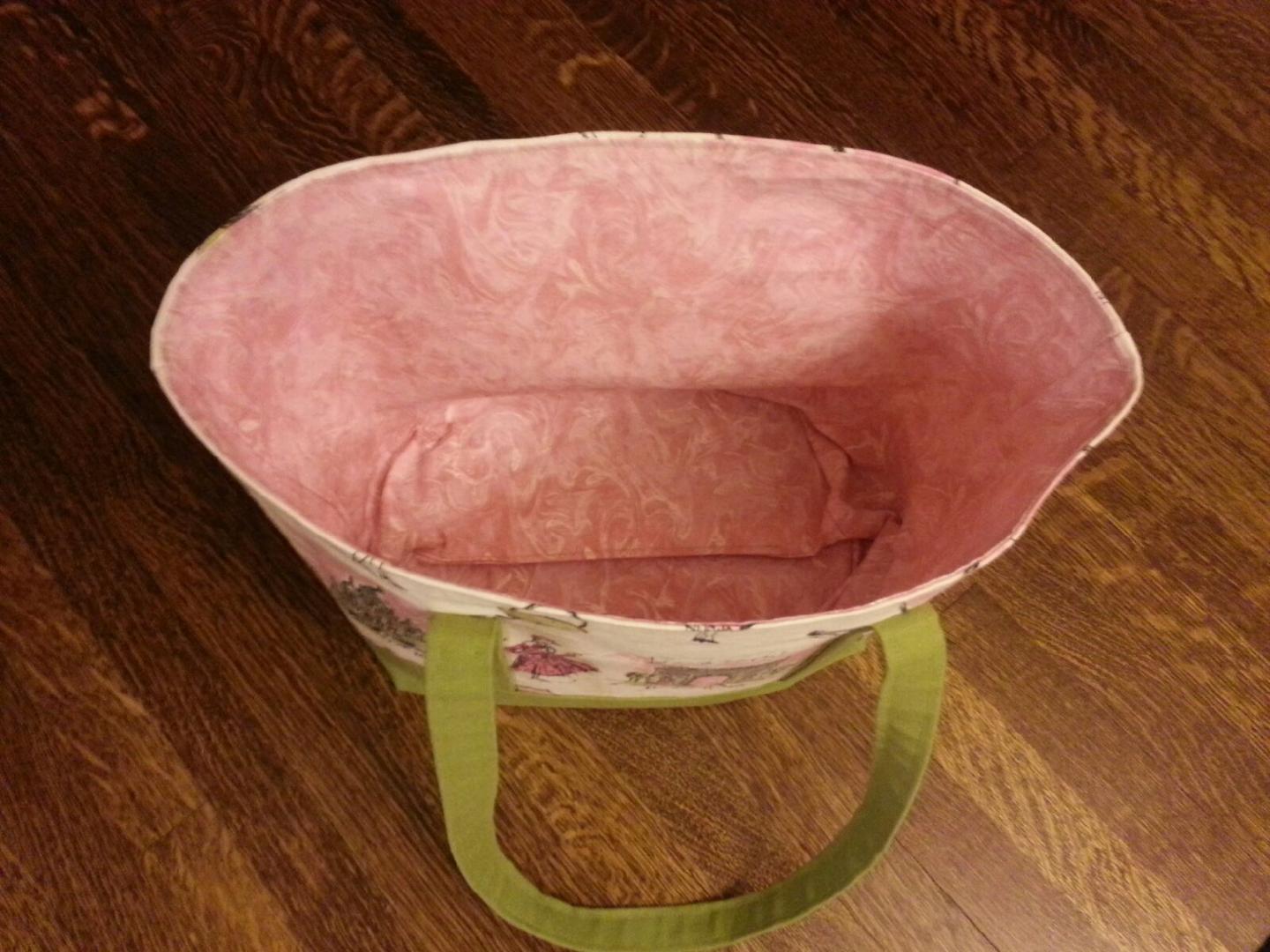
This year I made a lot of Christmas presents – hats, bags, and a robe.  Here is the bag I made for my sister-in-law, Marguerita, who kindly sent me some photos of her bag as I forgot to take some.

After the complexity of the other bags I made, as well as the hand sewing they required, this was a pleasure as it was super easy to make!  I was really burnt out by Christmas Eve, but also felt really good to have accomplished making so many presents for those I love!  This season I knitted 3 beanies and made 4 bags, and one robe.  You won’t get to see the beanies and all the bags (bean bags?), but you will get to see the robe soon enough.

The materials were, for the most part, 100% cotton. The green is duck, rather coarsely woven as is the nature of duck. It’s stiffness was both a blessing and a curse. I also ran out of thread and had to go out to buy more – the result was nothing matched what I had used originally, so I had to remake the straps. No biggy.

The bag lining was pure serendipity for the matching of the pink to the printed fabric. I felt really lucky to find it – so many shades of pink!

The Parisian scenes are some upholstery fabric, and it was the focal point of the bag. The pink and green matched perfectly!

I had enough material left over to make a sewing machine cover for the Baby Lock Presto II – it came with a lightweight vinyl cover, and I thought something more classy would be fun to design and sew.

I used my Janome 6500P to make M’s bag. I have not used this machine in a while, and since I plan to use it when I go to the class to finish up my quilt top, I thought it would be a good thing to dig it out, reread the manual, and relearn all its parts. As an aside, it is a more sophisticated machine than the Presto, but less portable simply because it is a lot heavier. The Tutto makes it easy to tote, so I am looking forward to testing it out in a classroom situation.

So ends 2018!  I plan to continue sewing and learning to be a better sewist in 2019 by exploring new and different ways to sew, or things, such as using knits.  Photography, painting, drawing, knitting, and designing are all in the plans.  It is so nice to have time to do things – to not feel a horrific pressure to get things done!  Savoring time to think, to design, to plan, to learn – those have been so absent for the last 5 years.  Those 10-12 hour work days suck!  And now I get to enjoy the leisurely activities of a housewife – some of which I like (cooking) and some I just tolerate (cleaning) . . .

Happy New Year to everyone!  May 2019 bring you joy, health, and happiness!