Somewhere in Ventura County

I have been taking classes from a local teacher and artist, Harvey Cusworth, through a seminar and adult ed classes in oil painting. He is an experienced teacher and one who pays attention to each student, gives good suggestions and advice. Additionally, he is an experienced teacher which, in my opinion, adds a lot of value to a class as he is very aware of how a classroom of unruly kids or adults can act!

In the seminar we started landscapes, but because of getting sick, I missed two of the classes along with a number of adult ed classes. I decided to continue into the adult ed class the landscape I had started in the seminar just because I thought it challenging but also something I wanted to paint – a landscape from the back country here in Ventura County.

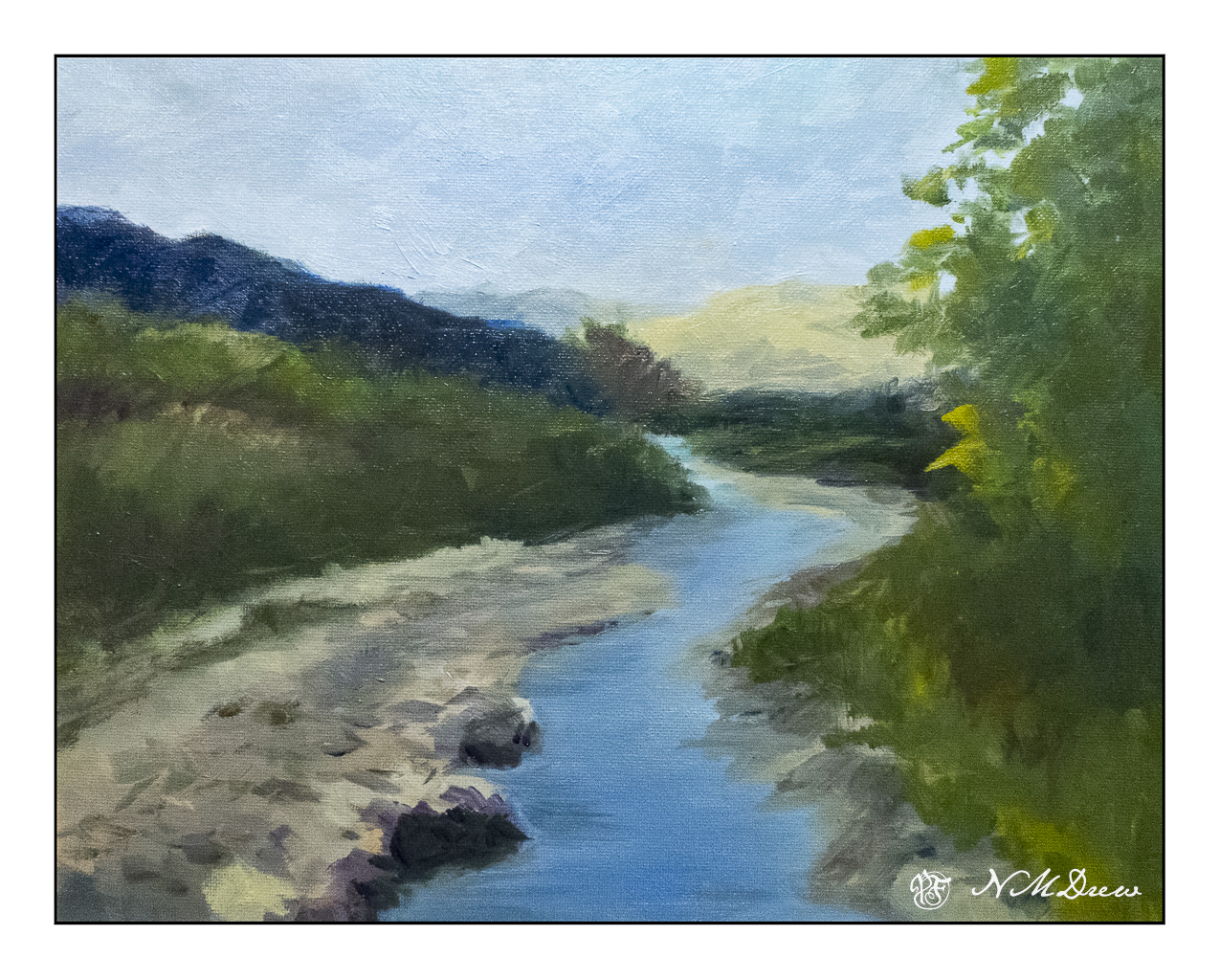
First: my final (as of this writing) version of the painting.

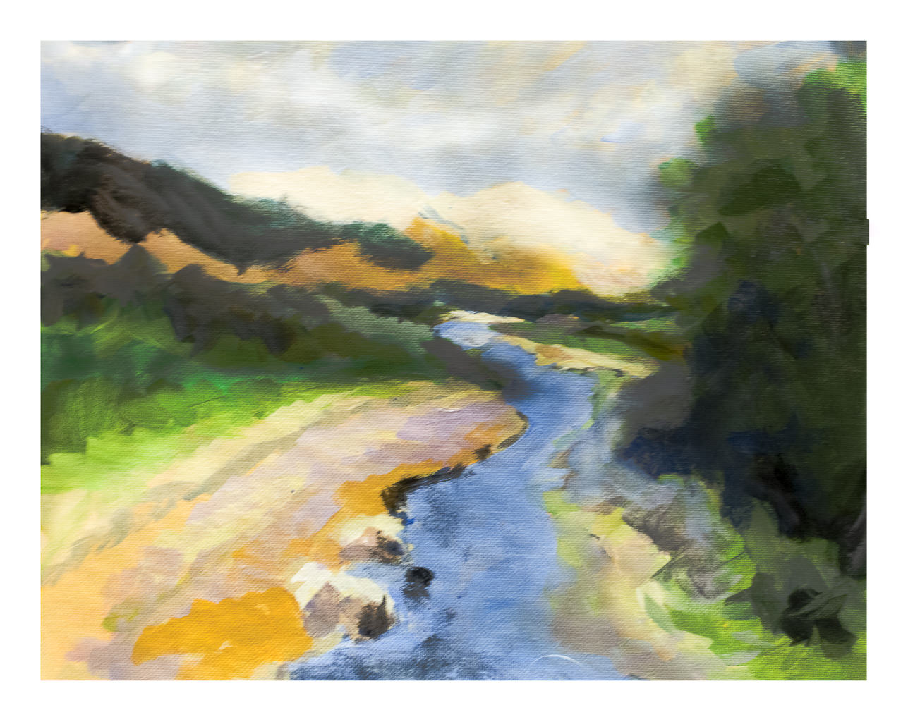
And now, it’s evolution. First, Harvey’s photo which was the subject matter – in color and then reduced to black and white to get a sense of values.

Photograph by Harvey Cusworth

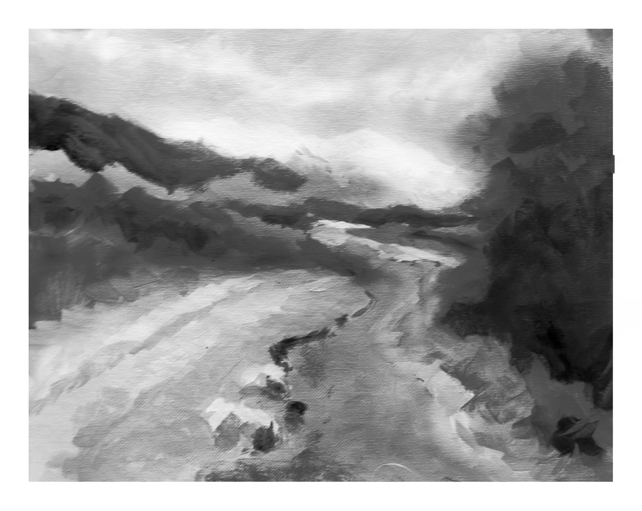
Next, my own rather goofy value study, painted in color and then reduced into black and white.

Underpainting

This painting is done in oils, and has taken me several hours over several days to complete it. Even now, I have to let it sit and dry and regard it a bit more carefully to see what I think of it. As it is still wet I took a photo of it, and in places there is some glare, seen more clearly when enlarged. 11×14 on a cotton canvas panel.

As above, I like to see what my work looks like when turned to black and white – for values. Also, it is just fun to do! I just use the sliders in LR to reduce vibrancy and saturation reduced to -100. Doing this is really a good way fro me to evaluate contrast and such.

Final painting in color and black and white

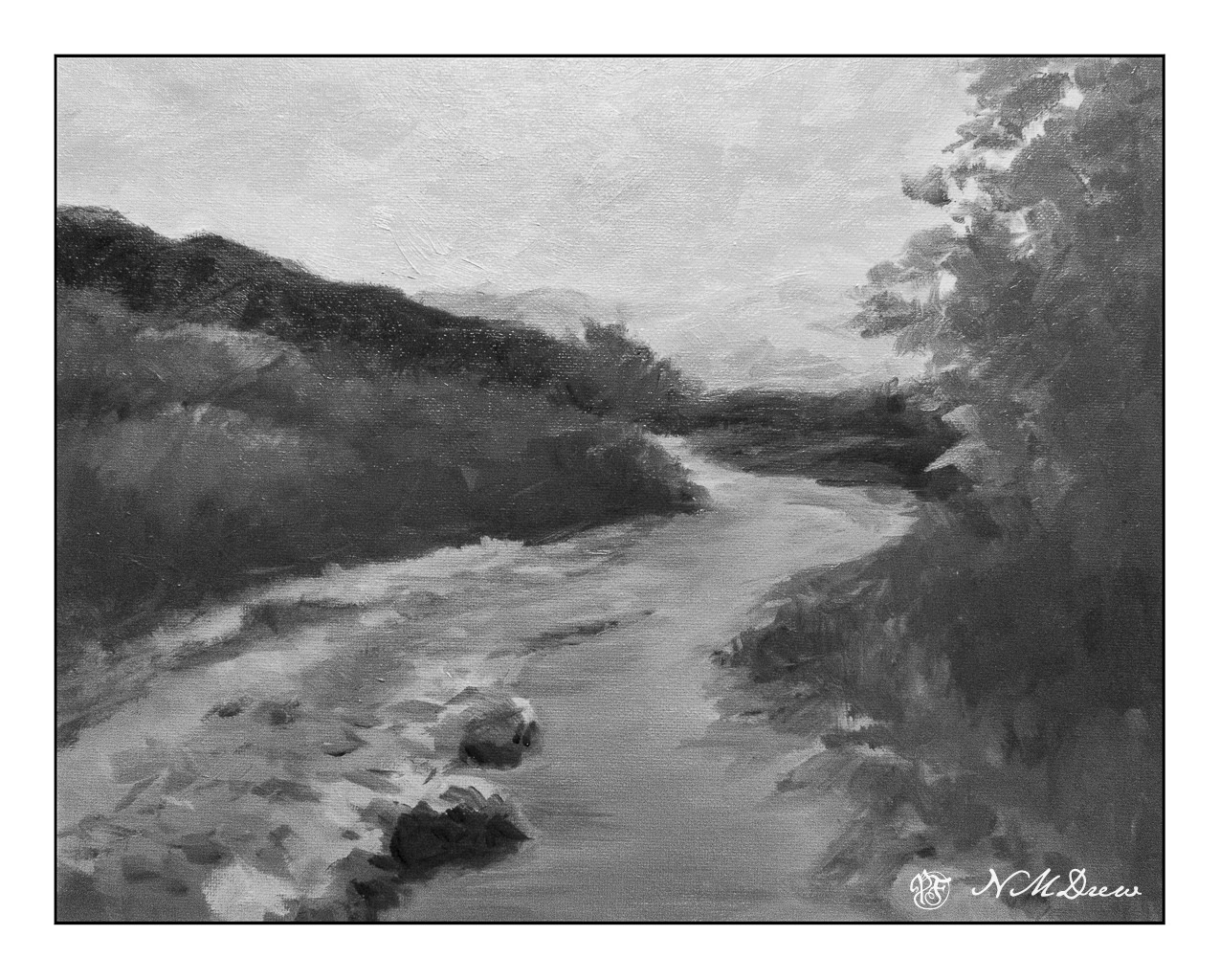
So, there we are. In general, I am pretty pleased with this painting. The goal is to lead the eye along the creek to the small stand of tree at the top of the creek. I wanted to show the brightness of the barren mountains in the distance, but did not want them to become overwhelming. The BW image of the final painting shows that the mountains are very similar in value as the sky. Is this an issue? Not sure. Things like this are to be considered in a few days when it is no longer in front of me.

Now, on to other things, like cleaning my brushes . . .

Lone Cherry Trees Along Figueroa Mountain Road

These two trees have long since vanished. I photographed them in 2012 in Santa Barbara County along Figueroa Mountain Road in the early spring. I thought they were a beautiful spot of color against the greens of the California hills, which in themselves, during a superbloom, can be covered in shades of lavender, orange, and gold.

I mixed together gouache paints – whites (zinc and titanium) and some ivory black with my watercolors. This allows for layers to be built and bits painted over, as in gouache, but allows for a bit of transparent and opaque. I’ve done this before and always find it is a lot of fun. Gouache, when thickish, is best with small paintings, but mixing whites with watercolor gets an effect like gouache but at a much lower price point.

The photo – linked from Flickr – is not an especially good photo, but I do feel it catches the beauty of these two trees. When I went back looking for them a few years ago I could not find them, so I am glad I have captured them!

Lone Cherry 3

Watercolor paint mixed with white and / or black artist’s gouache. 11×14 on Canson watercolor paper.

Daisies, Daffodils, and Basil

With a break in the cold and rain, a relapse of my cold, and sheer need to get out into the afternoon sunshine (74F! – 23.3 C!), I sat down and listened to Lord Peter Wimsey on Audible, pulled out a pan of paints, and looked around me. There are a lot of daffodils in various pots, a bunch of daisies, and a basil plant I just bought. The rains have kept me from replacing and modifying my drip system, but as today we probably had the last of the seasonal rain, it is time to reset them as as well as clean up various beds.

This potted basil was the first bit of painting. I wanted to focus on the lights and darks, the shadows and bright spots. It is quite a complicated bit of greenery to paint – enough detail to get depth and separation of leaves, as well as a sense of the direction of light. Pencil first, and then a try at a bit more than a lick and a promise. Not great, but I did accomplish a bit of what I wanted.

Once the basil was done, the paper was flipped over. I have a huge pot where some spring daisies are just jumping up with an enthusiasm that always frustrates my own when I try to paint them! I tried to paint them as masses – but the white daisies are very clear in shape, white with bright yellow centers – and all this in a field of varying green. The sun was in and out behind the clouds, so the two patches look a bit different. Again, complexity being simplified. The one on the right is my favorite as it feels somehow “cleaner” if that makes any sense.

And then, the daffodils. The one on the left is better than the one on the right; the spiky leaves are okay. What I focused on here were colors and their shapes, not a daffodil. The same with daisies on the right. This meant I did not use pencil, but painted directly.

Altogether, a few hours in the afternoon spent playing and relaxing. Some success, some failure.

Watercolor, 9×12 Arches CP 140# paper.

A Sunday Painter

These past two weeks have been rather a waste – bumps in the normal routines create havoc and everything just seems to fall apart. When that happens, it really does require a focused effort to get back up and into whatever interests me. I am just coming out of a cold – thankfully, not a sinus infection – that has made me not really tired, but just lethargic and lazy between bits of fever and congestion. Lounging around and doing very little and sleeping a lot has been my agenda, filled in with little fun things like dishes . . . .

Actually, yesterday was possibly the real turning point. I was feeling better, so I did some sewing in the morning. I am hand-sewing a top without a machine (including finishing the seams with a whip stitch), just to do it. Then blob time. Miss Marple entertained me for an hour or two between naps. And then it hit me – I was just unhappy because I wasn’t doing what I like to do best – paint or draw! I didn’t want challenges or messes (ie oils) to clean up, but …. what?

Gouache!

I haven’t used gouache for some time. I keep it in the fridge between uses. So, while it was coming to room temperature and soaking up the water I put on it, I taped up a piece of 9×12 CP 140# Arches into two somewhat equal sections. Hot press paper is my preferred paper for gouache as it is smoother and lets the paint move over the paper more easily than cold press.

If you have been following my blog, you know that of late I am rather focused on lavender fields. This first painting was no exception. I wanted to see what I could produce, sort of from a photo, sort of off the top of my head. I wanted a gloomy-looking sky to match the grey, rainy sky of my own world this Sunday, and so moved along. Landscapes are very forgiving (I think) and are a good way to warm up when re-acquainting myself with a medium. So, a lavender field, somewhere in the world.

Then, more of a challenge: Buildings, water, plants, and a boat on a river.

Somewhere in a mythical village along the Nile in Egypt. The traditional sailboats – the felucca – are just so beautiful to see because of their simplicity in shape and line. I sourced a number of photos to create this one. I drew in some basic lines, but that was it. I started with the buildings and then the sky, painting the palms and plants before beginning the river its banks. I left the entire area of the felucca as blank paper, waiting until the end to fill it in. The sail was fairly easy, but the shape of the boat and the suggestion of a person was the most challenging. In the end, I was really pleased with how I met this challenge I presented myself!

Paintings are about 4.5 x 10 each – maybe more or less, I am not going to measure! – using gouache on Arches CP 140# watercolor paper.

Abandoned

Yesterday’s splish-splash was fun, and it seems that I need to take time to paint in watercolor and acrylic as I work toward mastery of oils (on some level!).

I love watercolors, and some days I find I have no patience and just do not want to be too serious. This is when play and messing around are best. Because of yesterday’s madcap painting, today I felt calm and inclined to taking time to pay attention to detail and think. Watercolor really does require thinking as you cannot correct a lot of mistakes.

When I draw with ink and then add color, I never use a pencil to create the rough outlines. Ink and I just get along really well, and usually proportions and details are sufficient to get me started. After painting, I go back and add more ink in areas I think need it, but as today was a minimal ink day I used the watercolors to create more details and information. It is also interesting to note the amount of time a painting takes – sometimes hours, sometimes minutes. I spent about 90 or so minutes here, and am pleased with the results over all.

9×12, Hahnemuhle CP 140#, watercolor.