Turkeys in the Field

Turkeys in the Field

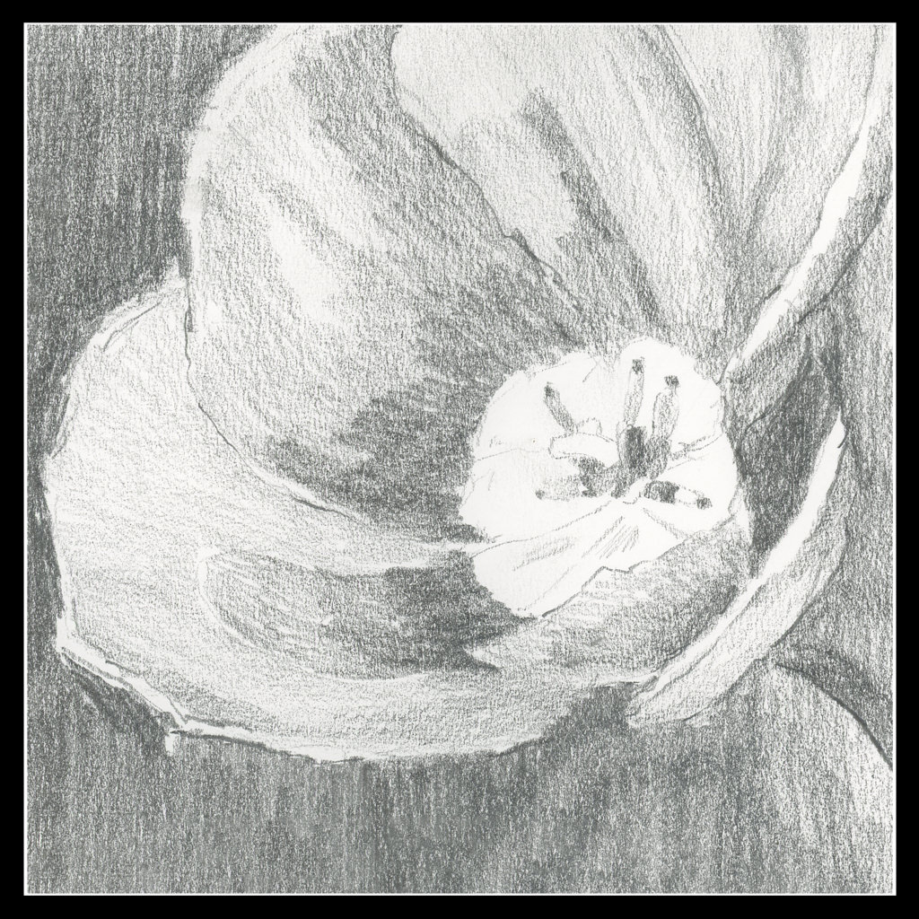
I feel like a school kid – classes are taking up so much of my life! It is keeping me off the streets, so I am sure a few people are glad to know that! The classes are a series with Ian Roberts (online), Andy Evansen (online), handsewing 18th stays with Burnley & Trowbridge (far behind!), and a local class in oils / acrylics with a good teacher. Housework is falling by the wayside!

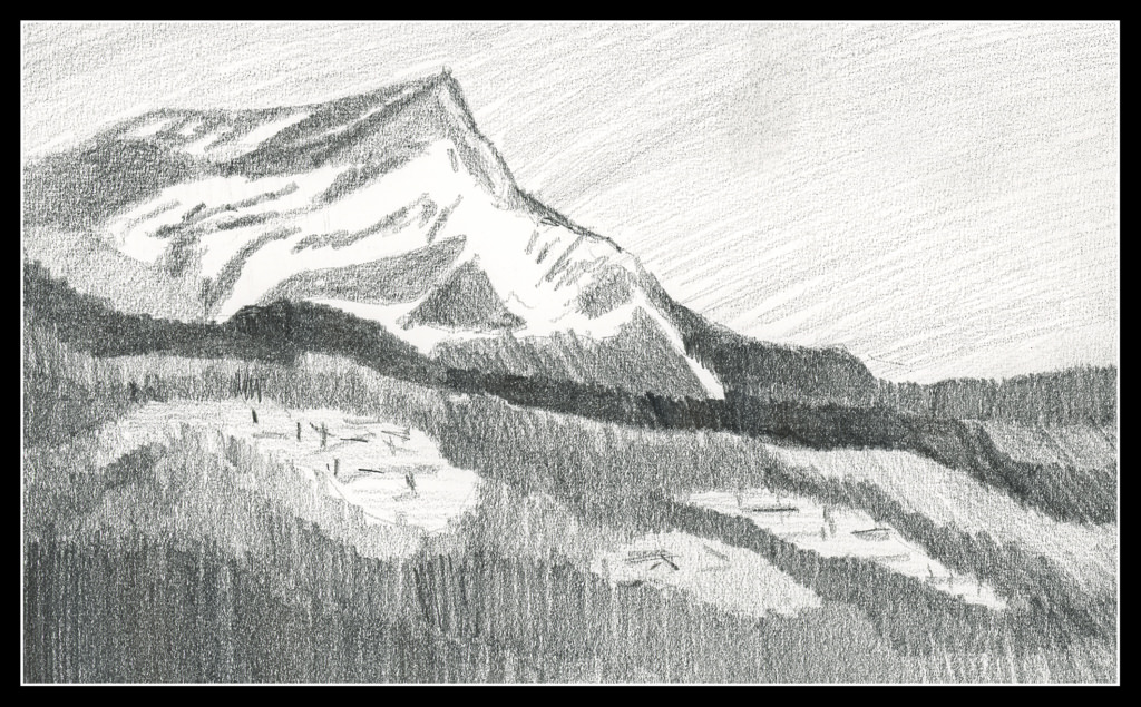
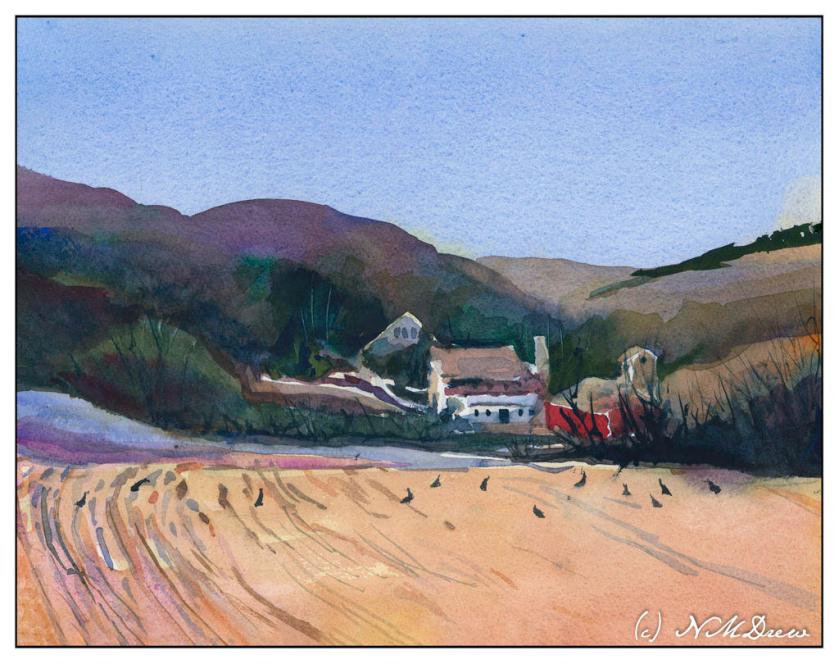
The above is a watercolor exercise from Evansen’s class. It’s a year-long course in watercolor, and the content needs me, the student, to work hard at the lessons. We began with skies – I am pretty comfortable with those. This module works with values, and I think I did a pretty good job with it.

What I found especially interesting was the beginning of the value study. Unlike Roberts who puts in all values in a pencil sketch, Evansen puts the middle value only as the first step. The white areas are bright spots and the sky, but the middle values are all created as one big shape. That was quite interesting, and not the usual route one takes with value studies.

Pencil drawing with middle value only added as a shape.

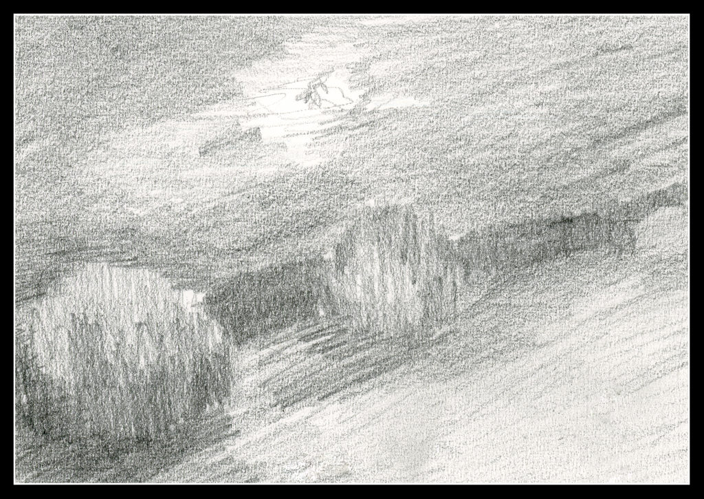
I messed up a bit, but it did lay out a map that was more clear to me than also including the darks. Once I got the idea in my head, the next step was to lay in soft colors on paper that was wetted on both front and back with a natural sponge. I used 9×12 140# CP Kilimanjaro paper here.

After doing the middle value shape, both as a prelim and then on the final painting, you are supposed to go back and add the dark areas to the prelim. I didn’t get there – I was too involved in the final product!

Light areas filled in on dampened paper. Includes the sky, white areas for buildings, and field and trees.

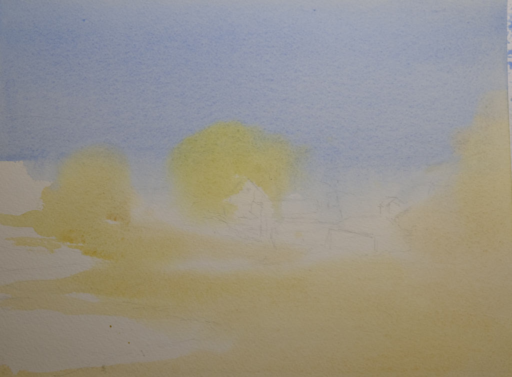
Doing the light areas on dampened paper allows the colors to bleed a bit, and create soft edges.

Thicker paint added once the light areas have been worked.

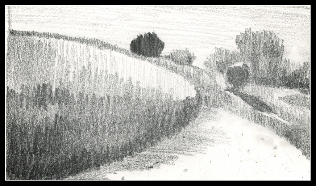
The next step was to work left to right so that the shape created for middle values in the preliminary study could be made on the painting. The idea is to work in one movement – left to right since I am right handed, but right to left if you are left handed. The idea is to create a bead of color that varies as you paint in a continuous design.

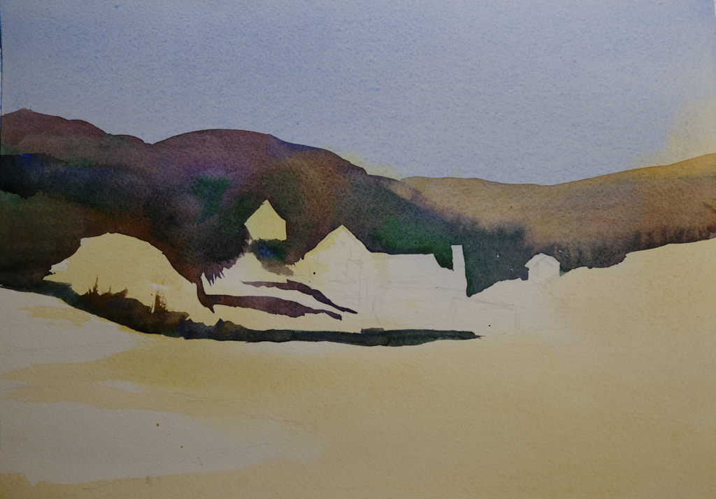
To me, this was really a dark based on the reference photo, but that is life! As I did this, I worked around the buildings and structures, as well as roads. The thicker paint and dryer paper allowed this to happen to create hard edges. I was happy with how easy it was to do!

Almost done!

This was perhaps the 3rd stage in my painting. I added furrows to the field and details to the structures. I scraped in tree branches and such with my finger nail only to realize I keep them trimmed too short to be of any use there!

After all the layers were dried, I did the heavier dry brush as well as glazes over the field and hills to create areas of warmth or coolness. I also did it on some of the structures to keep them from dominating .

Some thoughts . . .

It is really a lot of work to do these classes. My whole purpose is to stop my old ways of approaching painting and create some kind of shift so that I can become a better painter in my opinion. Also, I need to stay busy. I have felt like I have been floundering a bit, so an area of focus was important, especially in an arena I wanted to learn. I am still adjusting to all this, but in the big picture, I am happy I made the commitments.

17-20 / 30

Somewhere, a corner turned. It is becoming easier to simplify a picture, throw out unnecessary things and perhaps adding something else to make it more interesting or work more than a photo can.

Day 17

I’ve been wanting to draw a cloudburst and finally did. After looking at lot of pictures, I realized that the drama comes from the soft rain blurring what is behind it. However, there is also contrast – light and dark. To achieve this, I drew everything in with graphite and then used a grey rubber eraser to create the streaks, lifting the graphite. From there, I smudged it in. Values remain but the messy nature of graphite sometimes defeats itself for value studies!

Day 18

I am pretty pleased with this study. There are nice, subtle areas in a photo that was basically very high contrast in the tree and vegetation in the foreground. The ocean is in the middle right and extending into a misty sky.

Day 19

I took a picture of a tulip years ago – pale pink and backlit. The blurry quality of my drawing is just a value study, not a drawing to show what a tulip looks like. This idea is really challenging at times because I have done portraits in pencil and details abound then! It is important to remember this is to be a simple reference, not a finished work of art.

Day 20

As I progress in this 30 day challenge, I find I am running out of subject matter! So, it is time to work with other things. The flower was one. This one is perspective.

I actually got out a ruler and for the sketch created a grid, and then worked hard to put things in both perspective and in proportion to each other. As well, I wanted to create a nocturne.

Commentary

So, the days are rolling by, little shifts are occurring, and as my confidence in value studies grows, so is, it seems, my patience for doing preliminary work before trying to execute a painting. Not easy for me at all!d

14-16 / 30

Day 14

I am beginning to lose track of the days since I began this project since some days I do nothing, and other days I do a few.

Above is Day 14. Continuing to simplify shapes and masses into values, the above should represent a mountain in the distance. From there, mid-ground is a dark ridge before the mountain, and another to the right of the mountain, behind the mountain itself. The white blobs in the foreground area with sticks is supposed to represent structures. To me, they look like felled timber. Ideally, I think the mountain itself should be lighter to represent atmospheric perspective.

Day 15

This is an attempt at a nocturne – a night time value study to see if I could catch the light of the full moon. The bush-like thing in the middle needs some lightening at the top. Overall, I like this as a start to something even though it is so vague – but that is how night is!

Day 16

This is a view upward to the hill at the center of the local botanical garden. The white swath in the right foreground is the sand trail which winds around downward (behind the viewer) into the riparian woodland below.

I am not quite sure if I like the values as I have them set up here – nor am I really sure about the focal point of the drawing. It seems the dark tree at the top is too dark, but it could be a leading line down the hill to the tree with the cast shadow. The trail leads the eye. In a painting, this could work out with warm and cool tones in addition to values. Maybe I’ll give it a shot!

Commentary

With Day 13 I tried to make my masses more simple and graphic. I am continuing this, and will for the rest of the 30 day challenge.

Some studies lend themselves to it more readily than others. Despite that, I tried to simplify in all three. Doing this makes Roberts’ admonition to “draw shapes, not things” easier to do. Distilling the more important – most important – into value masses seems to be happening (at long last!).

Again, it will be interesting to see where it works with painting.

13 / 30

Day 13

A couple of takeaways from last Saturday’s Zoom meeting for this class. First, a suggestion to make marks simpler – horizontal and vertical. Done. It creates less noisy masses.

Obviously this is some kind of wetland. I sort of made it up. It’s missing a focal point. I should have done that, but this is sort of dashed off as we are soon to leave for a birthday party and I would like to put on my frippery!

12 / 30

Day 12

Again, behind on the 30-Day Challenge. I do see the results. For instance, this drawing is very simple, done on grey-toned paper. It’s not an especially exciting picture, but I am beginning to think differently! That is the whole point.

What are the changes?

  • Focal point of the picture. Here, the lone figure.
  • The lines of the estuary into the distance.
  • Contrast – white (light) sand, crashing waves on shore.
  • Line direction to show changes in terrain, vertical, horizontal.

This paper – the grey – is very toothy, and the result is the lines are not very smooth. Midtones are a bit difficult to achieve – that is supposed to be represented by the plain paper – but that just doesn’t really seem to fit into my brain. This makes it difficult, challenging, and rather a bit of a visual tweak.

Overall, the point in these studies is to look at values, and to simplify. It is not easy as I am used to doing detailed work in pencil. Making simple marks on the paper which interplay well is difficult. “Noisy” marks distract from the point of the value study. In other words, lines which are scribbled and curly distract from the values. Value, value, value!

Onward!