Snowfall

Christmas Day! Nothing like a snowfall and the cold and the quiet of the woods for remembering the magic of the season. New and old traditions overlap, memories and hopes for the future all seem to be rolled into the end of the year and depth of winter. The stillness of the winter woods gives pause to our crazy lives. Holidays of any sort at this time of the year make us look backward as well as forward.

Here I worked from very light to dark. The colors I used for the greenish-blue sky were cobalt teal, a bit of ultramarine, and a touch of Hooker’s green, neutralized by a bit of alizarin. The leaves and autumnal foliage were various siennas and orange with a touch of Indian yellow. Trunks, from light to dark, were essentially ultramarine with burnt sienna and raw umber with a bit of Payne’s grey. Snow shadows were ultramarine and Payne’s grey. Finally, I watered down some titanium white gouache and tapped my brush across my forefinger to look like falling snow after applying a few lines and dots in white here and there.

This is another watercolor which pleases me. Perhaps I should stick to Arches Rough paper instead of my usual cold press . . . ?

Have a wonderful Christmas Day – or whatever it is you celebrate!

Watercolor, Arches Rough 140# paper, 10×14.

Morning Walk

I don’t know if I have published this image before . . . . I have a feeling I did, but cannot find it. Of course, with all the stuff I have here on IY&B, it makes sense.

I painted this a few years ago. I worked really hard to get soft tones and paints. I had been working mostly in acrylics when I picked up the oils and was used to the hardness I seem to produce with acrylics. So, with the blendability of oils, that was my focus of the exercise.

The results here have been sitting around for ages with the thought the painting could use a bit of work. Looking at it now, it seems finished enough. I am pleased with the moodiness and sense of a damp woodland as well as how you can tell it is a misty day by the colors of the sky through the trees.

Oils, 10×14 canvas panel.

Old Trees in Winter

If you have been reading this blog awhile, you know I live where there is fire and not snow. Still, winter does come to my warm (ish) part of the world, and with it memories of tromping through the snow under spreading trees along a lake shore.

I use two software programs these days to scan my paintings – and I rather like the way they end up, similar but different. Above is the one using VueScan. Below is the one using Epson V600 and its software.

Epson software is more inclined to push colors, but in this case it does a decent job and pulls out more of the colors I put into the tree. Both scans are pretty much straight out of the scanner. Your choice as to preference!

Watercolor, Arches Rough 140#. Colors primarily burnt umber, ultramarine blue, Hooker’s green. 10×14.

Autumn Trees, with Apologies to Wolf Kahn

Color always fascinates me, and two modern painters, Richard Mayhew and Wolf Kahn, are masters of it. They pay tribute to the natural world with their colors and whether or not the landscape is based on reality doesn’t matter. The subject matter and the colors are the point, just as the squares and rectangles of color are of such importance in the work of Mark Rothko.

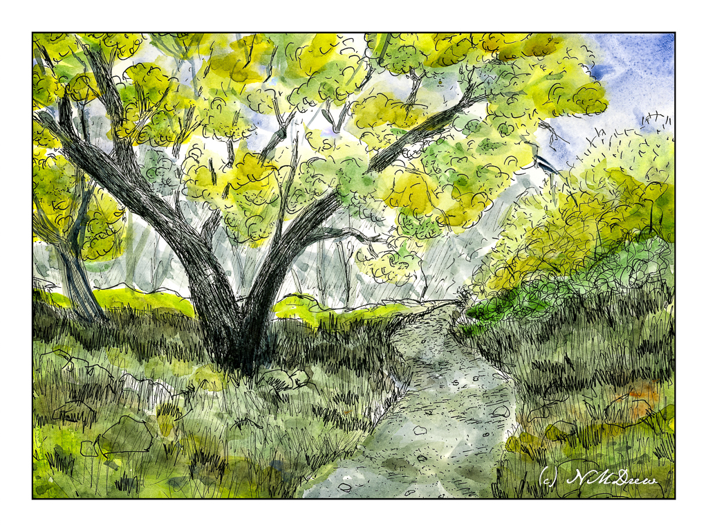
For this study, I looked at several of Kahn’s pastels of trees and woodlands. His color choices range from contrasting and bright to subdued. Sometimes the trees are distinct from the background, other times almost camouflaged into the surrounding foliage. I decided to continue using linseed oil here and soft colors to see what I could do with blending and creating lines for tree trunks within the the woodland while keeping the visuals of Kahn’s woodlands in mind.

This was painted in one sitting, and as the paint was damp and pliable, it was fun to move it around, wipe some off, add more, and then use the brush to create lines and dots to suggest trees and leaves and open field before entering the woodland. As I painted, I realized that I could place lighter colors in vertical strokes between darker areas to create tree trunks. I used short horizontal strokes to suggest foliage.

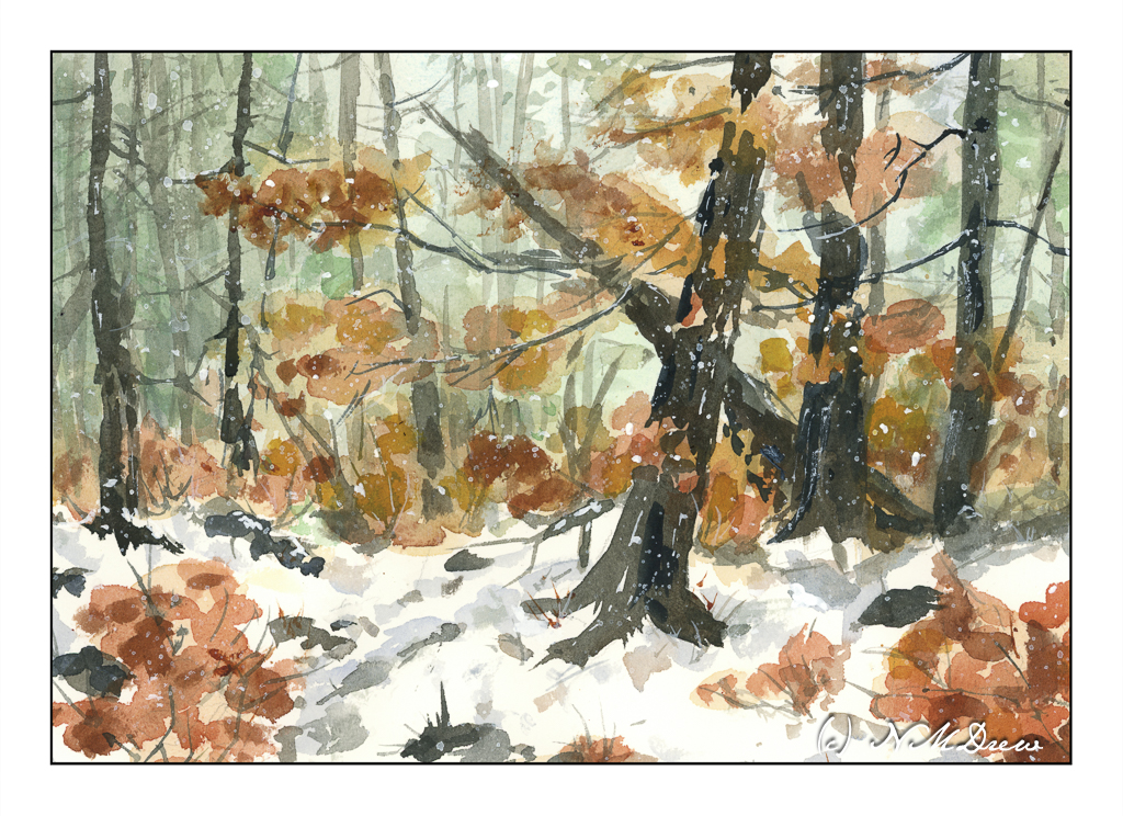
Again, I painted on the linen-textured Canson XL Oil-Acrylic paper. Linseed oil allowed for easy movement of the paint. And, again, this painting has been taking forever to dry out in my chilly garage, but I scanned it anyway, and cleaned up the glass afterward.

I really like Kahn’s work, especially in his later years. I also want to explore color as Mayhew and Rothko have used it. Besides exploring colors, exploring the subtleties of one color and its variants within a given area will be fun. Mayhew and Rothko will be fun to emulate, as has Kahn, because the experience of copying is a form of exploration that adds to knowledge by doing, and that, to me, is the best part of all.