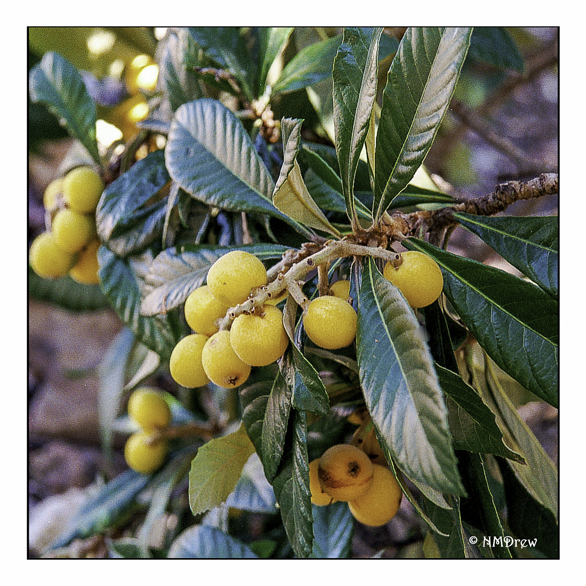
I love loquats! They are an odd fruit to most Americans, but they have a mild taste, beautiful seeds, and are borne on bushes or trees with glossy leaves. Over time, I have taken many photos of them and painted or drawn them.
I don’t remember where or when I took this photo, but it really shows the loquat in its full beauty. The fruits are pale yellow to a more deeper orangish color.
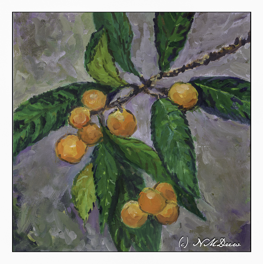
This is my most recent rendition of loquats, done in oil on a 12×12 canvas panel.
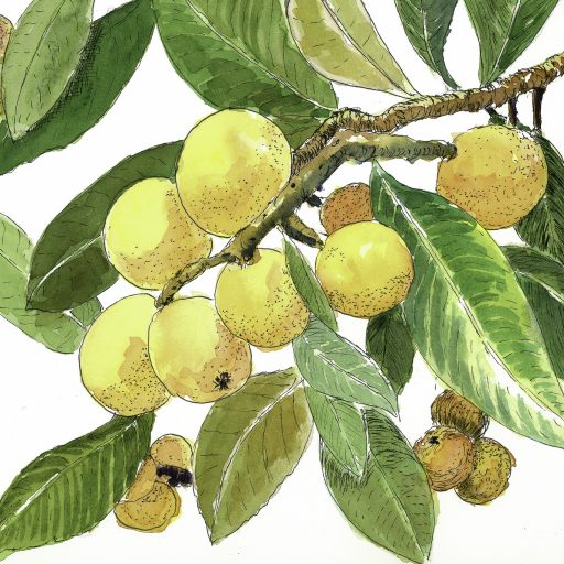
Above is one done in pen, ink, and watercolors.
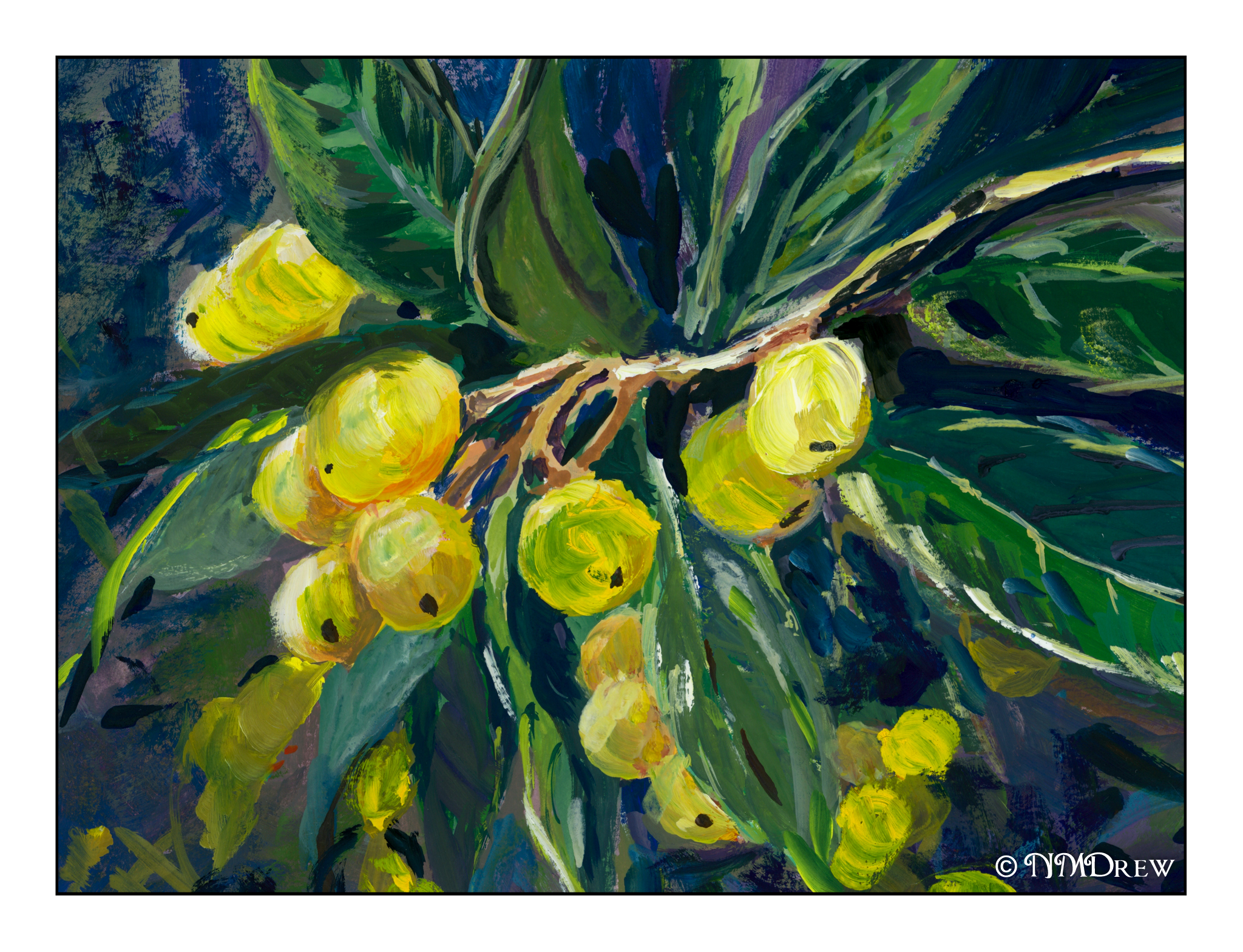
And the above is done in gouache.
The round shapes against pointy, glossy leaves is always a pleasure for the eye.
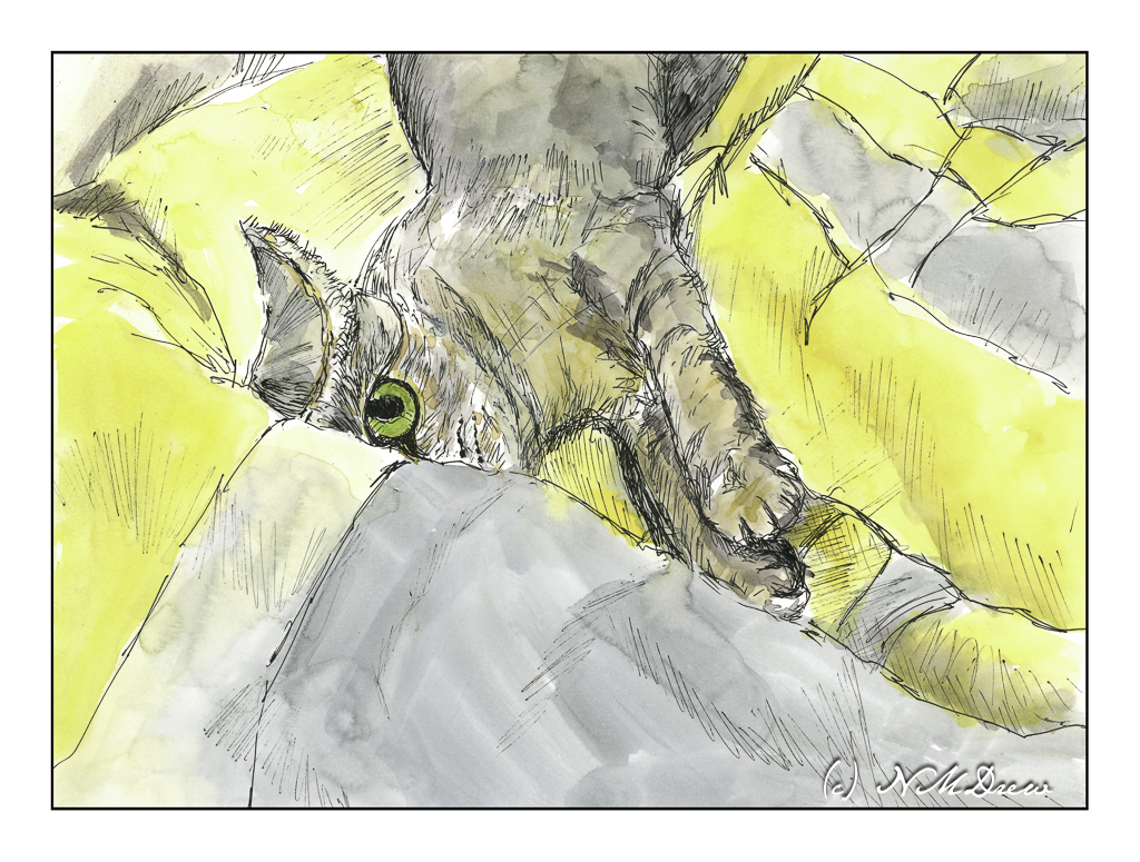
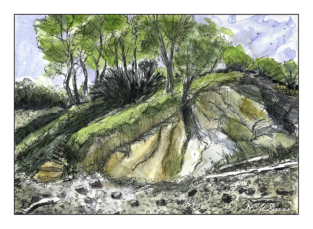
Gouache, oils, watercolor, pen and ink on various surfaces.
Rocky coastlines are always fascinating because the first time I ever saw the ocean was along a wide, sandy beach with gentle waves. Not so here! You can see the debris – fallen trees stripped to bare logs, rocks, erosion. You can only imagine what it is like during a storm.
Years ago, we drove up the California coast, heading into Oregon and points north. It seems once you hit the central coast, about 100 miles from where we are, the coastline begins to change. Highway 1 leads into Big Sur, that fabled and beautiful land, and it is here you see rugged cliffs. Then, north of San Francisco, you move into the wide beach sands of Stinson Beach and move further along to the rugged Mendocino coast and then beyond. This picture is based on a photo I took there years ago – no idea where we were, but it was stunning.
Copying the work of a master painter, as I have been doing with Edward Seago (and others) of late in watercolor, is a time-honored tradition in learning how to do things. There is a lot to be learned while doing a master copy, and doing a master copy imprints itself on the copy-ist in many ways. Search “why make a master copy” on the internet, and you will find a million bazillion results.
These are all great reasons, and some you may not even expect, such as muscle memory! For me, these are salient reasons, and even more importantly, open my mind up to a way of doing things and seeing things that I probably never have otherwise considered. By nature, I am not analytical but reactive – patience is not one of my virtues and frustration is not something I like reacting to. As a kid, well, let’s just say my inability to handle frustration made me the “bad” child!
Watercolor master copies are easy enough to do, as is with any water-based medium which dries quickly. I say “easy” because once done, I can scan them and look at them, and critique them more objectively. I see things I miss when looking at a non-digitized painting. (Need to work on that!) Oil painting, though, is a different story. Oils you can paint over, you can use quick-drying mediums, you can take forever to decide something is finally “done”. I have been working on three oil paintings, master copies of three different artists: Erin Hanson, Michael Chamberlain, and Maggie Siner.
Today let’s learn a bit about Erin Hanson.
I first came across the work of Erin Hanson about 3 years ago. Cruising through who knows what, I found her site and learned that she created a painting style called “Open Impressionism” which, as her website states, “continues the work of impressionists and post-impressionists.” It does insofar of the radical use of color to capture light and movement. There is a freshness here that I rather like, and the bright colors appeal to me. Her ability to create good composition is evident, too, and these make for attractive paintings. Below is a lengthy YouTube video which will acquaint you with her work:
YouTube has a number of videos by and about Hanson. Explore at your will. As well, check out her portfolio of paintings on her website – you can see her evolution over time as well as decide for yourself if you like her style. As with any artist, some paintings will appeal to you more than others.
Yesterday was Easter, a quiet time for us. The day was gorgeous and the weather so pleasant – perfect Spring. I love the way the light catches as the seasons turn, and the clear, dry air of the southwest pushes colors to a harshness which at high noon can be glaring, but early or late in the day, when the shadows are long, the light is clear and bright but doesn’t hurt your eyes.
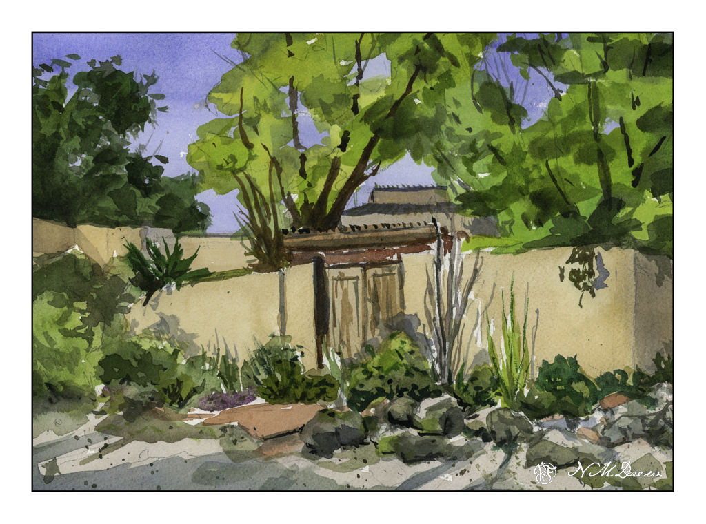
For the past several days I have been working in watercolors on smooth paper to practice pale colors which would work well with ink. I think I am getting it. Easter Sunday, though, I was getting a bit bored with the colors I was using as well as the lack of papery tooth to hold colors. As a challenge, I decided to paint a building. I realized why I am intimidated by buildings – they have straight lines and a jerk of the brush can ruin a good, hard edge.
A few straight line glitches, but I will say I am pleased with what I did here. I took my time and tried to create a simplification of a complex structure that works well with shape, shadow, contrast. I know where I messed up my straight lines, but you can find them and tell me if you like!