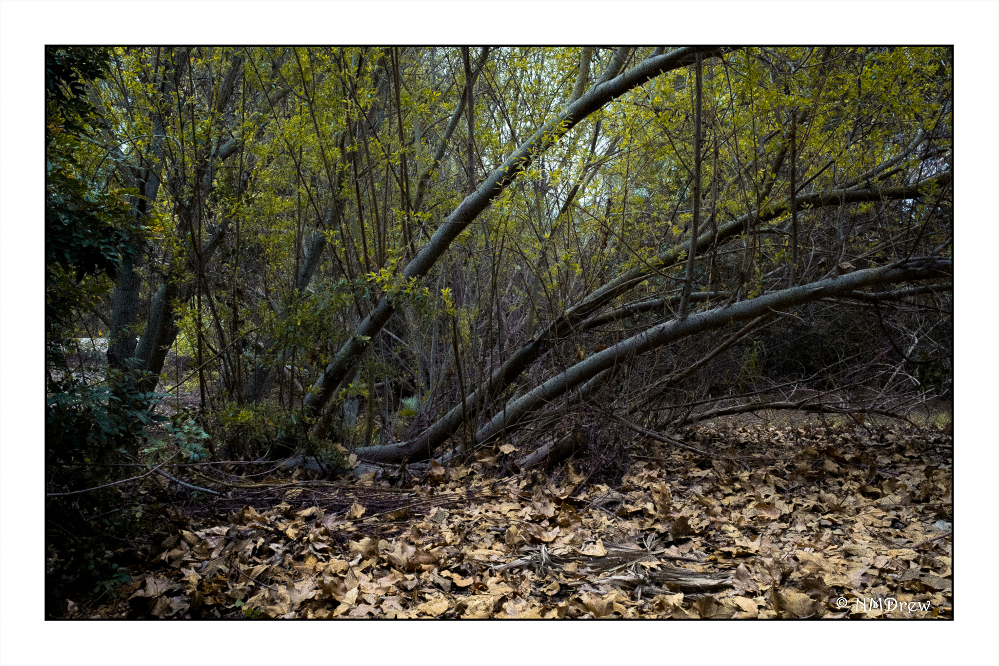
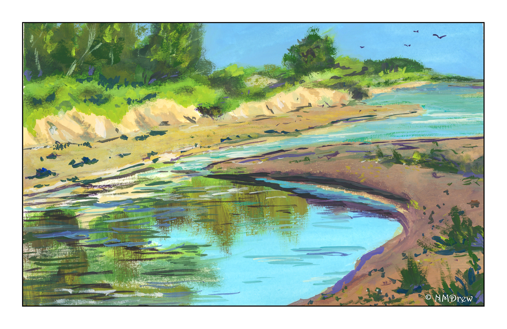
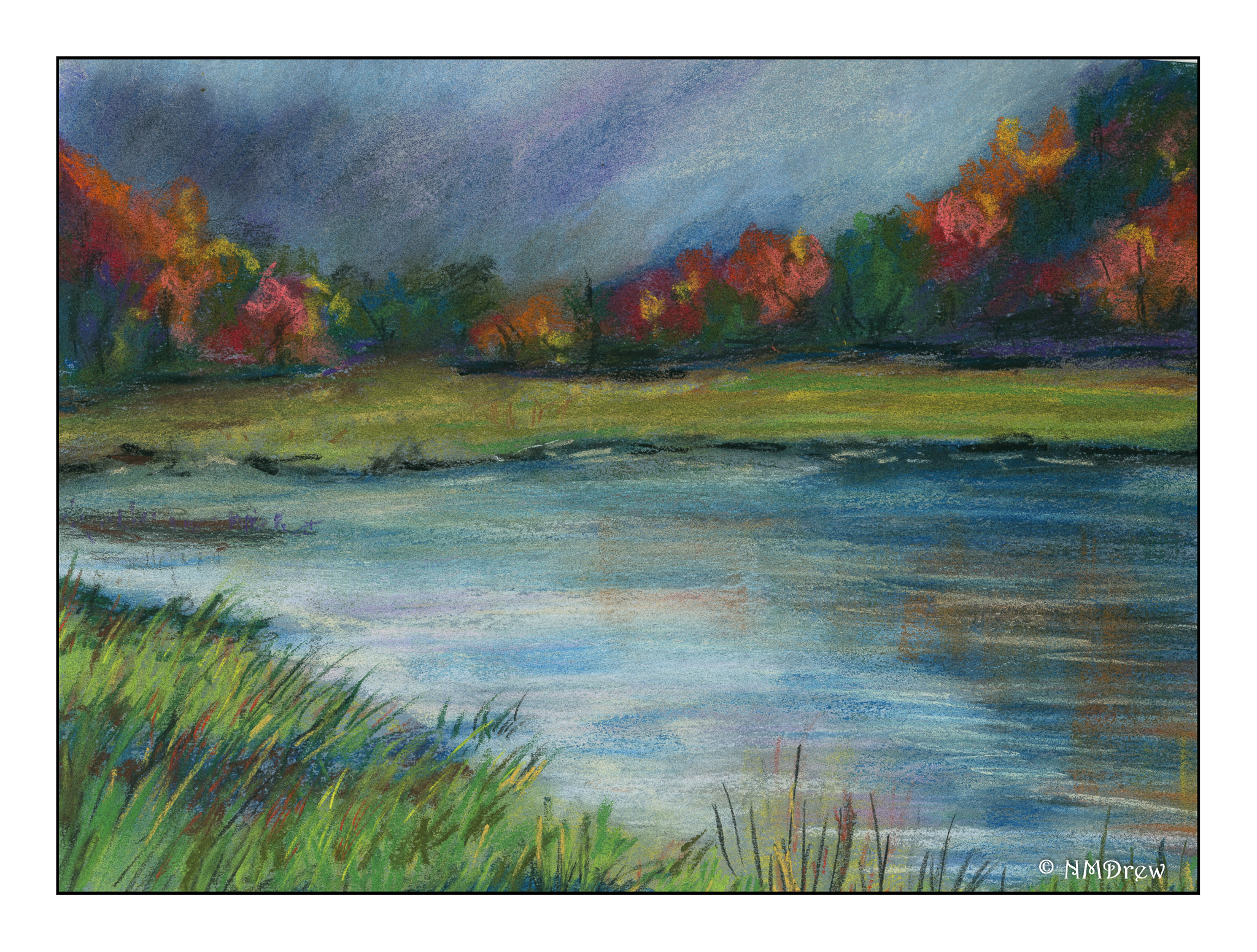
Over the last week I have been painting the same image three times, each time in a different media. I began with gouache, moved to pastels, and did the final painting in watercolor. Doing such an exercise was really educational as well as pleasurable.

As you can see in the gouache, the perspective is totally off! I didn’t do much of an underdrawing, just a few quick lines, but I didn’t really check this point against that, as well as compare it to the photo. The result was an uphill beach, and a total lack of realistic perspective. I suppose it would look like htat if my head were on its side, lying in the sand or something! Anyway, it was a good lesson as I realized most of my perspective issues are simply the result of poor drawing techniques.

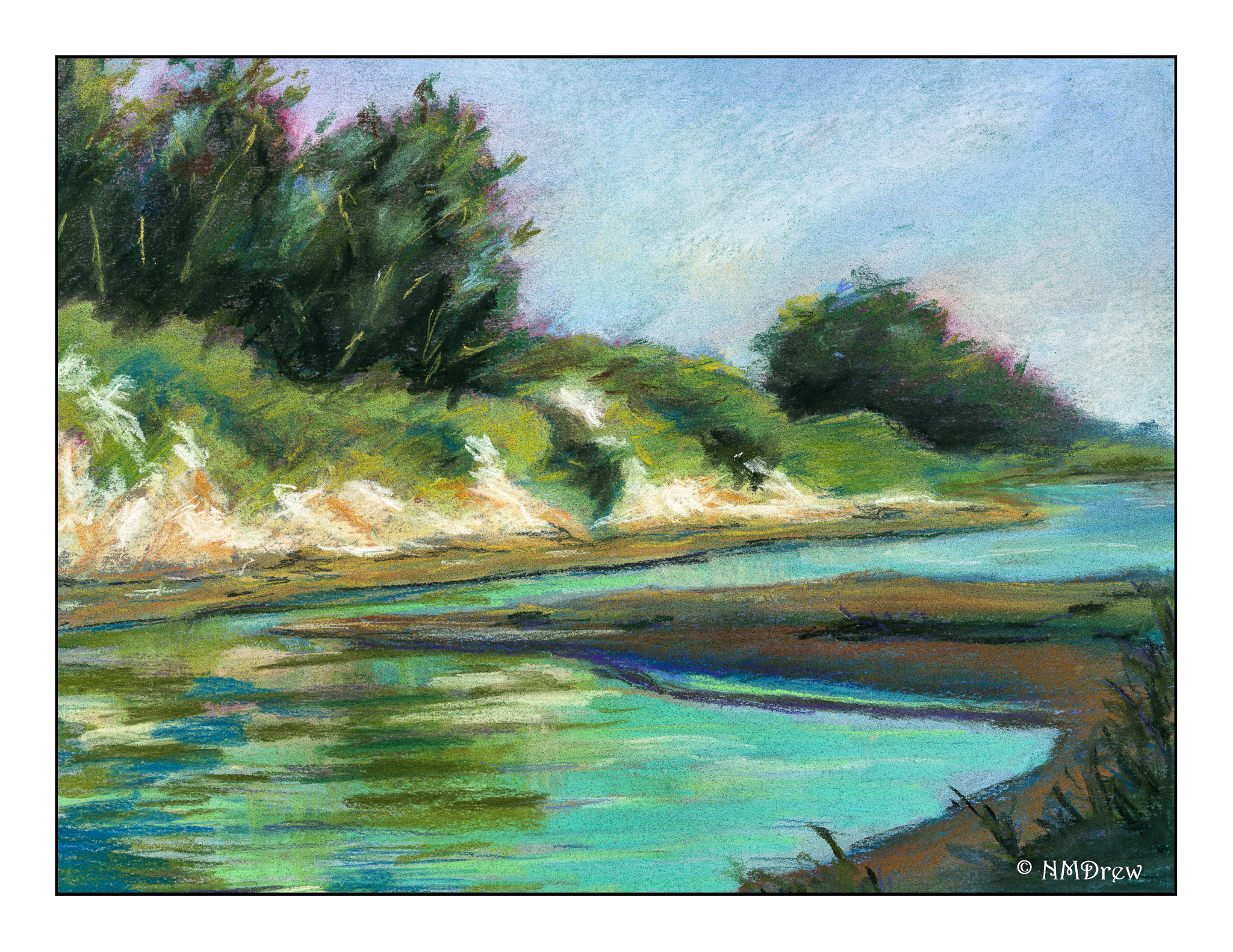
This next one is my favorite. Maybe it’s because I am just learning pastels and totally in love with them. Here, the perspective problem is solved. The cliffs look quite sandy in the picture, and in reality, they are. Along the coast where I live in California, cliffs tend to be friable, made of highly compacted but still fragile sand. They easily collapse, and it is really foolish to sit under them on the beach or to walk along there edges. After rains it can be especially dangerous, and one year a major landslide occurred and several people died. It was not good. So, I think these cliffs are pretty accurate representations of what our cliffs look like here.

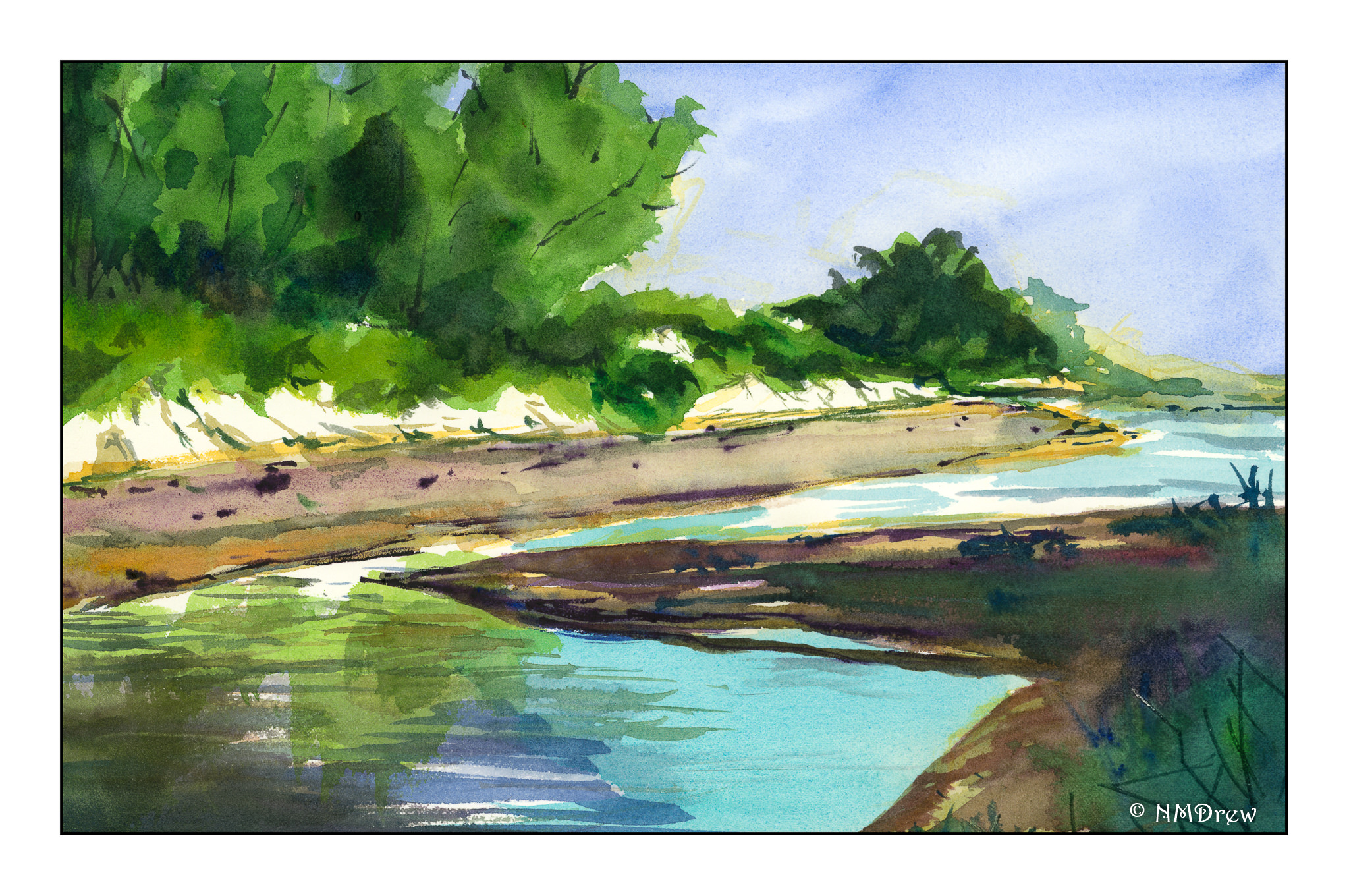
Finally, watercolor. Perspective issues remain resolved, but a sense of distance prevails along the strand of beach on the opposite shore. Rather than overwork it, I left it as it was, still pondering how I could make a sense of distance as the beach veered off to the left and background. More blue? Less detail? I’m still befuddled on that one.
Altogether, using three different mediums to paint the same image was rewarding. Problems occurred in all paintings, many of which could be applied to others. Perspective is always an issue for me, so I really need to focus on it probably more than anything in landscapes. I know the rules, but need to find methods to implement them. Gouache and pastels are more forgiving as you can paint over what is underneath to a reasonable degree; watercolors are pretty much a one-shot deal. I think I will continue the 3 painting studies in the future as I learned far more than if I had only done one study in a single medium.