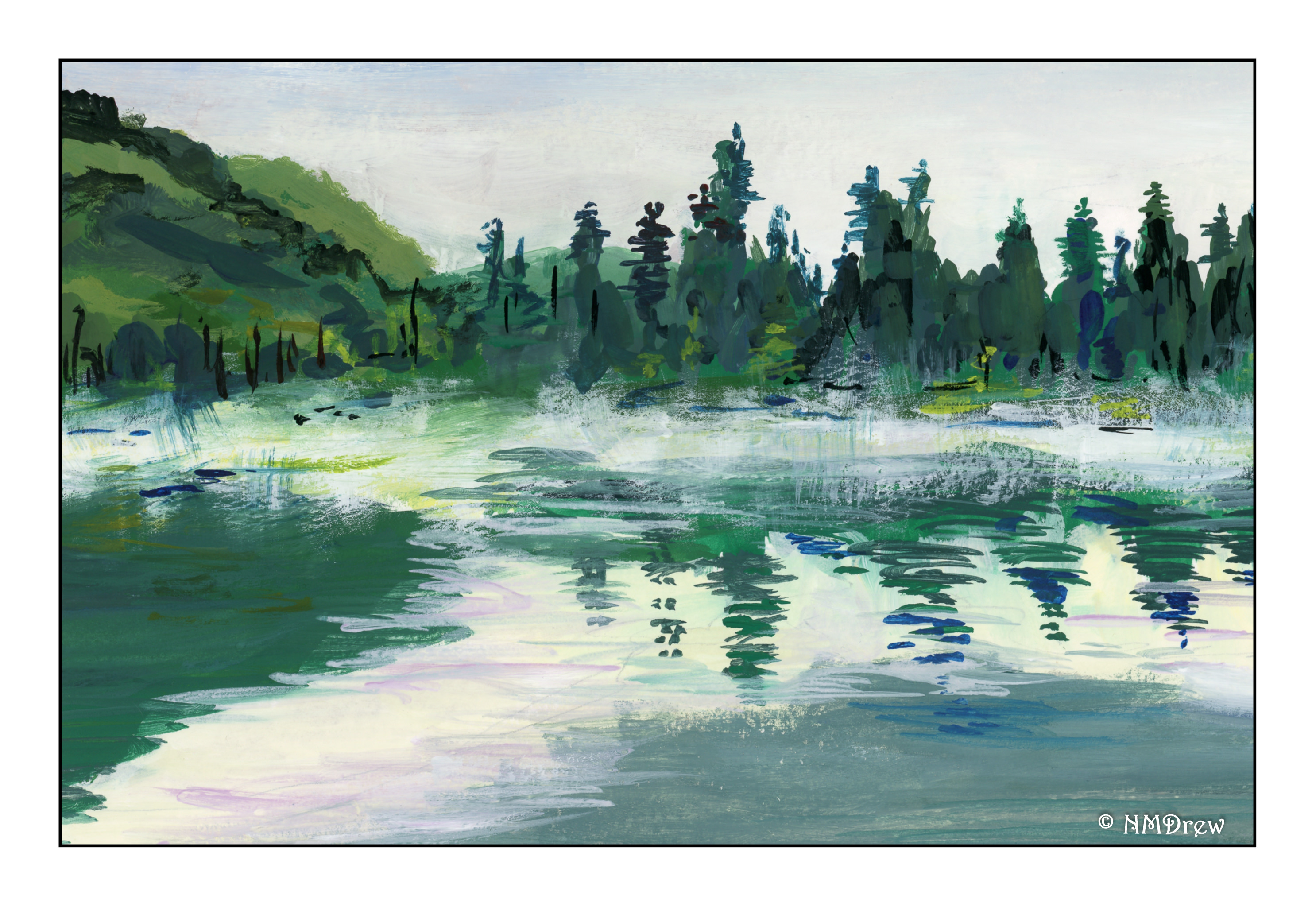
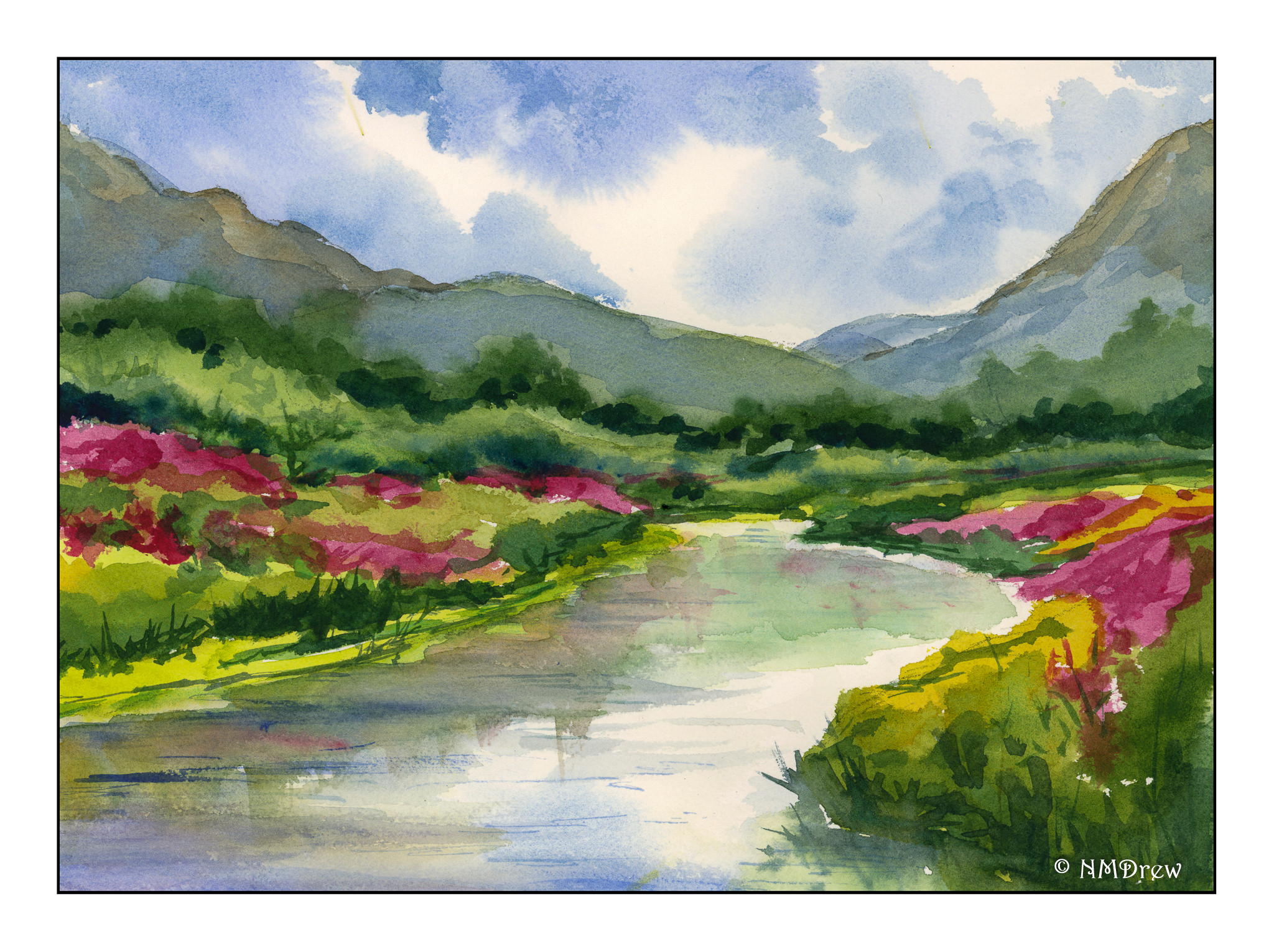
Summer is not yet officially here, but the warmth, sun, birds, and wind all make me long for a quiet spot to sit and relax. No nothing except the sounds of the natural world. Here, all the things I love.
Tag: trees
A Study from Vernon Nye
I decided to use a study by the watercolorist Vernon Nye. He caught the back country of California perfectly – the hills and trees in particular. It was a fun study and I liked it because it pointed out to me how deceptively simple the hills can seem, but they really are not. The road, too, was another eye-catcher. I have driven along a number of back-road highways throughout the state, and you feel like you are the only person in the world. The perspective was a great challenge, too. Altogether, a good study of something in my own back yard, and I can take what I learned into future paintings.
Nowhere Barn
Addendum!
This is the second scan from the final one below. I changed a bit of the elements after doing a preview scan – don’t know why the one on the bottom of this post is so, er, intense!
Now, let us continue . . .
More perspective studies! Today I did a single point study.
This time I created a single vanishing point. This one is below the building, and above the road. The idea for this is that the road ends up going over a hill or slope before the horizon, at eye level, is met. I did a pencil sketch and erased it a billion times. Finally, when I liked what I did, I erased most of the lines after inking it in.
Sort of a value study combined with a color study to see what I might like for color mixes in watercolor. This paper is mixed media paper, so it is not the heavy Arches 140# cold press I like for most work. I think the perspective works pretty well.
Well! Aren’t these colors intense! The scan for some reason just came out like this – the original is a bit more subtle – but I rather like it as I think it expresses the intensity of color that sometimes comes with lowering clouds and a storm. Makes me think of my time as a kid on the plains of the midwest.
So, the final study does have decent architectural perspective, and perhaps even some atmospheric (lots of atmosphere, but more like pressure type!) insofar as I tried to simplify things.
I will continue my focus on perspective, and using it in different media. Watching videos, referring to books, and just doing it is helping.

Tanglewood (Watercolor)
Here is the third painting in the series of three different media, this in watercolor.
For this painting, I used a piece of 16×20 Arches cold-pressed paper. I laid down some frisket to keep the paper white for sunspots of leaves and the edges of the trees. From there, multiple initial light washes to establish areas of color (ie sky, leaves, leaf mould, trunks) and from there just sort of let it happen until I was ready to remove the fisket. Once that was done, greens and darks, and finally the rigger brush for tree branches.
Each painting has it good points and bad points. Watercolor is the least forgiving of the three, but here I think I did a pretty good job as I do get a sense of the flickering light through the new leaves, and that really was the main point. This painting and the gouache are my favorites of the three.
It will be interesting to perhaps try the pastel again as I ordered a set of 25 greens and just took possession of a Terry Ludwig Darks 2 set the other day. The greens are Mount Vision and will arrive Friday. The pastel was the first in the series, and now that I am comfortable with the values of the painting(s) more, a 4th try and a 2nd pastel may prove to be a good exercise!
Tanglewood (Gouache)
The second painting in my series of three, in three different media. Today this is in gouache. My previous post showed the photo from which these paintings are derived, as well as the pastel which I did the other day.
To date, I think this is one of the better paintings in gouache I have done. Two differences here: 1) I used hot pressed Arches paper rather than cold pressed. 2) I made sure I kept my paints moist by spritzing them, and covering them with saran wrap between painting sessions – keeping the paints moist made the job of painting much easier.
Smoother paper (hot pressed) allowed the paint to move more easily on the paper. Keeping the paint moist added to that experience. I really put effort into keeping the paint about the consistency of cream and spritzed the paints when they stopped looking glossy. The only area I rather wonder about is the right middle ground – I may want to redo that a bit.