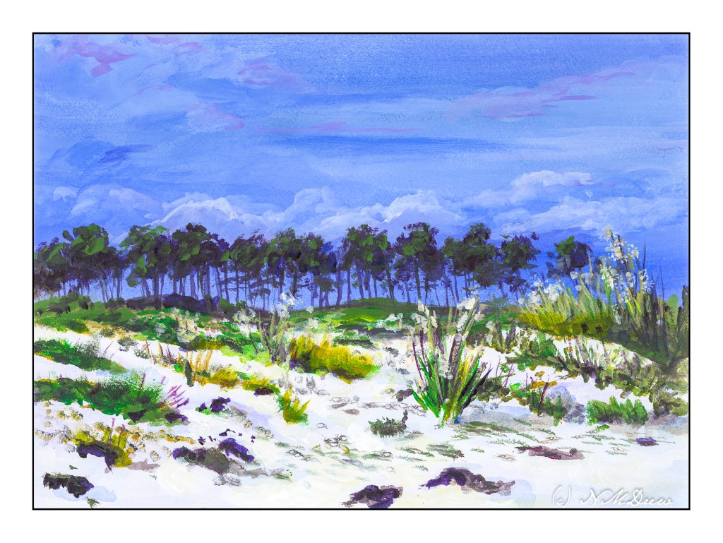
I enjoy gouache a lot because you can rework places and easily blur edges to soften them. That is a lot harder in acrylics. I decided to give it a shot. It worked rather well for the sky, but like gouache, the whites in the clouds darkened more than I thought they would. On the other hand, I did work on the sand a bit, using very thin water glazes for the shadows. That worked out pretty well.
I realize the key to “getting” acrylic painting is to just keep doing it, experimenting, trying. Each painting, successful or not, is a lesson.
Another wet-into-wet painting, but this time with more challenges and a longer painting period. As before, 140# Arches CP paper.
The goal of this painting was to get away from trees and aim for seeing how using a very wet piece of paper could be worked for skies and water along with plant life, from rushes and grasses to distant trees. The style itself lends itself more to softness in general, but with judicious brushwork and glazes, more defined areas were achieved. I also used white gouache to represent a tasseled top to the tall reeds (or whatever) in the middle right of the painting; I realized I might have achieved an airier effect by splattering some frisket in the areas I wanted white.
I painted the majority of the picture last night, working glazes over areas more defined to blend them in more harmoniously. Dry brush was used for the the foreground and in areas where a rough edge was needed to show plants.
I don’t think this painting is as good as the one I did previously. The contrast is not good enough to convey distance – too strong of colors were used to paint the reeds and trees in the horizon. I do like the colors and softness, though. Another point of focus was to create a point of focus! I tried to use birds, warm colors in the center of the painting, a bit of a vignette around the edges, and other visual tricks to lead the eye somewhere. Again, I don’t think I had much success. As well, the sky and land do not seem to match.
I did accomplish a few things I set out to do – wet-into-wet with some control for sky and plants and water. Doing it is a lesson in itself, and each painting teaches something. I worked on the painting last night and then refined it this morning. I had more patience than I usually demonstrate when painting in watercolor. Why is that? Is it because watercolor is wet and watery and seems to demand a bit of speed?
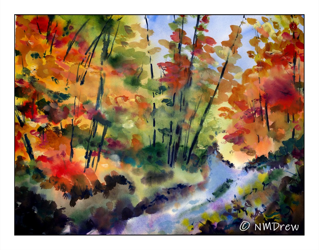
Here, I wet the paper, and then began putting in areas of color, beginning with the sky in the central part of the painting, and then blobbing down the foliage in the foreground and the distance. The line of the slope was separated from the horizon beyond. As things dried, I blobbed on more colors, and continued to work wet-into-wet as the paper dried. In the end, I was able to draw the trunks of the distant trees without their blurring using diluted colors of the darker tree trunks.
It’s really hard to describe how to do a painting like this. In doing these kinds of paintings I am finding it is necessary to have a sense of the composition itself – lights, darks, soft shapes, hard edges. It is also necessary to think about negative and positive space while painting, as well as the overall effect desired. I worked light to dark, and strove to keep the earliest colors as separate as possible from others. In the end, I used glazes to unify areas with color as well as worked with thick paint and a very dry brush for some detail.
140# CP Arches, 16×20. It took about 3 hours to work on, using time in between to dry the paper with a blow dryer or let the water get absorbed into the paper so softer edges could be achieved.
Of the 3 “splish splash” paintings I have done, this one is my favorite. This technique works very well for areas with a lot of foliage, but what about ocean scenes, skies, and so on? That is next on my agenda for this method.
More of the splish-splash effect this morning, and I will say it is fun. This time around I added some zinc and titanium white gouache to some of the colors – something I have never done with watercolors at all. It feels rather sacrireligious.
Fraggy, this painting title is dedicated to you! I loved your comment yesterday, and it really says it all about some days in autumn. 😉
About six weeks ago I started this painting and then all the chaos of insurance and plan choices and lost mail brought most of my creative life to a screeching halt. It was emotionally exhausting in a lot of ways, but those details really are not important today. Instead, this painting is finished at last!
Details first: acrylic on gessoed 16×20 CP Arches 140# paper. Borders of paper taped down all the way. I probably spent about 10-12 hours on this painting.
There have been multiple iterations of this painting. In the original, a tree was in the right middle front foreground. That disappeared last night. Then the road, which disappeared dead center, was reworked and made visible through the trees this morning. The suggestions of vineyards in the background disappeared, too. Too many stripes – I was looking for a zebra.
To finish the painting, I decided to work in middle of the night last night, and from 10:30 pm to 2:30 a.m. I painted out nearly everything except the blobby middle that I knew was not what I wanted. My husband, who is no art aficionado, always has good advice on painting problems. He and I agreed on the issues. So, this afternoon, I spent a few hours working and reworking it until you see the finished result above.
I have not done a lot of painting in acrylics, but each painting I do brings new experiences. I still tend to be a dabber, but am working to think about how I move the brush more, such as long horizontal or vertical strokes, or suggestions of something with just a blob (not a dab!) of color. I need to work in acrylics more to build more confidence in my brushwork.
So, here you are, on a gravel road in the backcountry, enjoy vineyards and olive groves, somewhere in a Mediterranean country on a hot day in summer.