
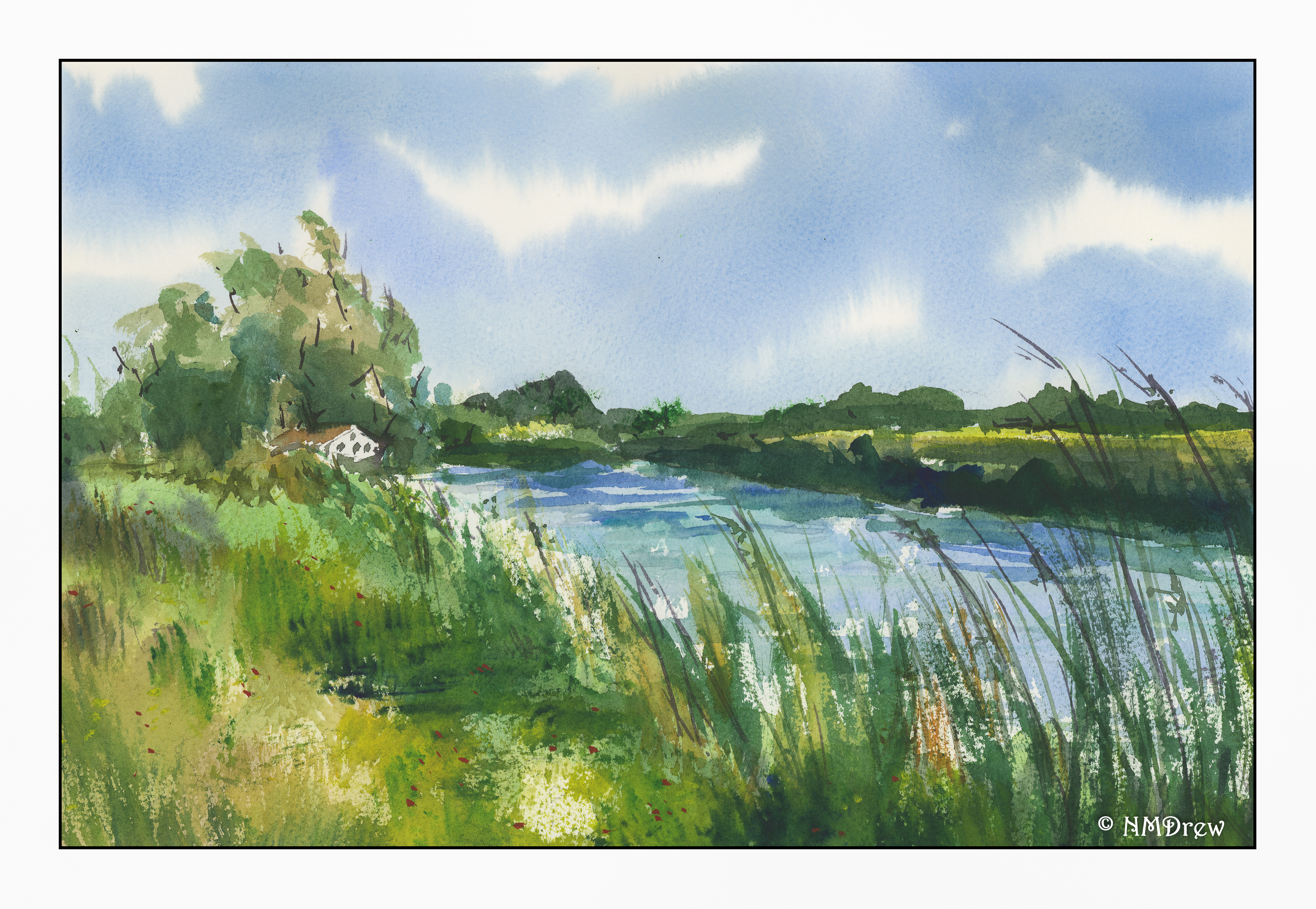
North Country

Hard to believe it’s been two weeks or so since I was last online.

Life has been busy, but in reality, the weather has been awful! We have had a heat wave that knackers you – 100+ F, and even worse further inland. Temps have ranged from 95-111 in the vicinity where I live (35-43C). Ugh. As a result, blobdom has reigned as the primary mode of existence and, sadly, some binge watching on the TV in the air-conditioned house. I guess we all have to do it.

Despite that, I have met with a pencil portrait group in a local park and have enjoyed those mornings. I have also done some sewing. And mice chasing, but no catching. Today I cleaned up the mess I call a studio.

And finally, I have sat down to paint. I wanted scudding clouds and changing light – movement from bright to dark across the hills and the sky. Wind, too. Anything to cool off.

Why a Ham?

Why not a ham?

This video shows you the reasons a tailor’s ham, aka a “pressing ham”, is a useful addition to your sewing (and ironing) wardrobe. I never used one until several years ago when I was on a super sewing binge. That’s when I really tried to improve my slap dash approach to something more sophisticated. While those attempts turned into annoyance, I have found my sewing and pressing aids really add to the pleasure of my sloppy sewing. Things are easier because of the shape of the ham.

And, I still sew, making shirts mostly, but now that I have more time than stress, I do want to make some more sophisticated clothes. Lately I have been wanting to sew a 1920s style dress, and am thinking of either hand stitching the whole thing. I think it would be perfect for summer. The ham will be perfect for anchoring my fabric so I can stitch on my project and put some tension on the fabric.    I may also find my ham useful if I decide to master handsewn buttonholes.

But that is for another time, like when I get started on it. And I really should get started on that dress, come to think of it. The solstice is less than 3 weeks away!

A Summer’s Bouquet


I decided to attempt a more high key painting today – one with a lot of white!  I always look for contrast, but here I tried to lessen the usual contrast.  Maybe it’s because I rather like contrasty photos as opposed to subtle one with a long scale of color or black and white.  Even here, I kept adding contrast!  It’s a fixation . . . but contrast is how we differentiate shapes and depth, so it’s necessary, but I am trying to minimalize it.  Not sure if it worked or not!