
Dragon Stone

We are still moving things around since my brother moved out last year.  Needless to say, we are slow!  In that process of making room for him, a lot of stuff was shifted, stored, and forgotten.  Now that the studio is being revamped, I am refinding things, namely, two ink stones, one Chinese, one Japanese. Today I will write a bit about the dragon stone.  Clicking on the image below will take you to a larger image which will allow you to see the in greater detail.
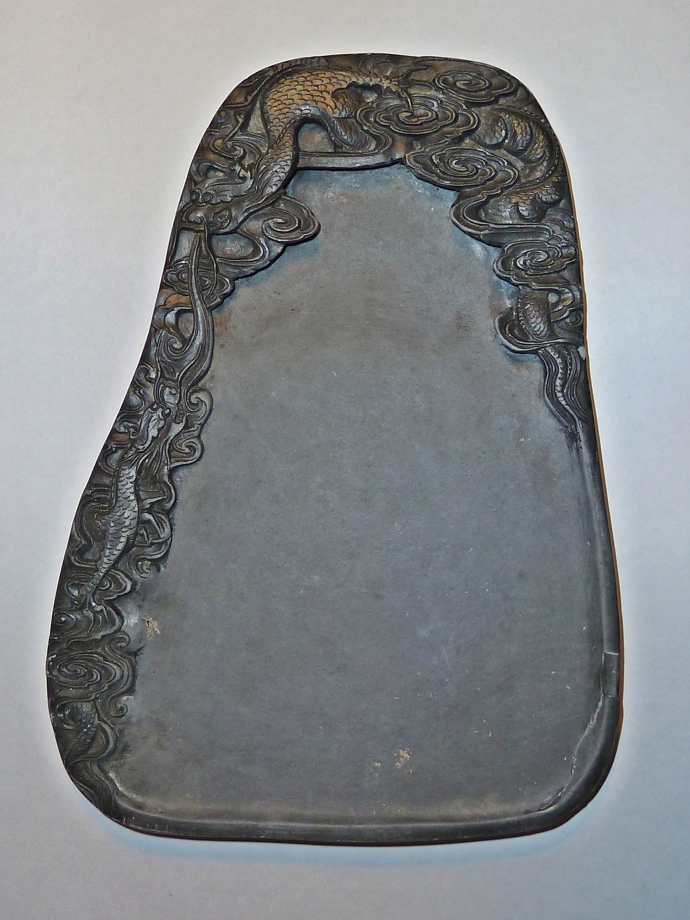
Dragon Stone - Dragon on Upper Left, Clouds and Tail on Upper Right - Smaller Dragon Along Left Edge

The above stone is Chinese and measures about 8.5 x 6 inches (22 x 15 cm). What kind of stone it is – most likely a slate – I cannot tell you for sure, but I will say the design is more Chinese, from what I know, than Japanese. The stone has a rather bell-like sound to it when tapped. Breathing on the stone shows little retention of surface moisture, as do some other stones, but a thin layer of water holds to the surface, then vanishes. I have not ground any ink on the stone as of this writing. Also, I have no idea where or when I purchased this stone! I expect I bought the stone because I like the carvings of the dragon in the clouds more than anything else – I’m a water dragon myself.

Repairing Chips on Lower Right Side of Dragon Stone

Unfortunately, when I unpacked the stone, a number of chips were in the box. I managed to salvage a few, and, not knowing what type of glue to use, decided to just try white glue. As the stone is porous, and white glue works well on porcelain, I decided to give it a shot. Admittedly, it doesn’t look great, especially in large pictures, but the mending is not too noticeable in the large picture of the stone itself.  The stone seems rather soft, which may account for the issue of low moisture retention on its surface, so it may be rather porous as well.  However, until I use it to make ink, I really cannot assess its grinding qualities.

Top of Stone - Dragon

I love the energy of the carving!  You can just imagine wild, stormy weather, and a fearsome dragon flying through the clouds.

Dragon Tail - Upper Right

The carving on this stone is quite fine, with thin lines being well expressed in the undulating lines of the dragon’s body as he flies through the clouds. Scales are small and subtle; the whorling clouds undulate gracefully over the carved surfaces.

Left Side Carving - Smaller Dragon and Clouds

There are also small, light inclusions in the stone, which probably to the knowledgeable will give a lot more information about the type of stone this is, and its origins.

This stone is enjoyable for its carving and size. I’ll ink it up in the next few days and tell you what I think. And, hey, maybe I’ll even do some painting (at last!).

Calligrapher’s Suzuri

Deep Well for Ink

This is a beautiful little suzuri, ideal for calligraphers.  It measures 4.75 x 2.75 inches (12 x 7 cm), originates from Japan, and is made of natural stone.  The size makes it perfect for taking with you.  Western calligraphers who like to use sumi with dip pens find the deep well at the end a perfect reservoir for ink.  Brush calligraphers also find it useful as the brush tip can be dipped straight in.  Because of its small size, obviously this is not going to work for someone who needs a lot of ink, but for someone who is writing with a pen or fine brush, this is a superb little stone.

For the sumi artist, a deep well is equally useful.  The flat surface can be laid with water, the tip dipped in the well for dark ink followed by a small amount of water, held tip up, and the two will combine in a lovely gradation of ink.

Combined with a professional grade sumi stick, this little stone produces rich, dense ink with little effort.

Calligrapher's Suzuri - 4.75 x 2.75 inches (12 x 7 cm)

Color

I love color.  Lots of color.  The fact is, it is extremely difficult for me to buy things that, to me, do not have color.  That means beige, white, and black.  A Japanese kimono full of vibrant colors is far more interesting than the serenity of monochrome; Hawaiian shirts hold endless attraction.  Prints intrigue me far more than a brilliant, single color.

Child's Kimono

Because color is so attractive, the absence of color in a painting – such as in sumi-e – and in photography – become endlessly fascinating in the variations of black-grey-white.  Color reduction, meaning decolorization, can be done in various photo editing software programs.  This pushes the photograph to near monochrome, but with an essence of color.  The same may be done in an ink painting.  Both become intriguing as the color draws the eye, but because of the lack of color elsewhere, it also becomes a messenger, speaking to the viewer on a symbolic level.  Or, it can simply become an attractive element essential to a composition.

Electric Snowflakes

In sumi-e, there is a challenge in gradation and contrast.  This is managed by both how the brush is loaded as well as forethought and knowledge as to how dark something will dry – or, more challenging – how light.  Understanding the paper being used, the qualities of the ink stick, the subtleties of the brush become an art in themselves, all of which lead to the success or failure of the final painting.

Wheat in Sumi

In photography I am finding much the same challenge.  In playing with software, such as Corel Paintshop Photo Pro X3 and Photoscape, I can take a colored photograph and either decolor it, separate it into multiple pre-press layers, or simply change it to a grey-scale image.  Red flowers which look awful in color can become quite fascinating when rendered into black and white.

Red Rhododendrons - BW Rhododendrons

Composition also plays into photography, as much as it does in painting.  Because one is physically doing a painting, I think that the elements of composition have time to unfold, and the unconscious works toward the final result long before the concept is visible to the artist.  It is a slower process altogether.

The very nature of photography lends itself – especially with digital – to taking picture after picture after picture.  Only now am I considering more carefully my compositions.  Knowing I can crop and edit in software, as well as the fact I don’t have to pay for printing, lets me shoot all over, all and everything.  This lets me play.  Play is creative, fun, and educational.  Happenstance leads to analysis in looking at photographs, which leads to thought about all the elements which come together, as they do in painting, to create the final image:  light, subject, color, direction, contrast.  As a result, I am developing the skills which permit me to think ahead a bit; these are the same skills, conscious or not, which I apply to a painting.

Fallen

I am finding that my preferences in photography echo those I have for paintings.  Simplicity and contrast.  Less is more.  Whether or not I succeed is up for question.

Persimmons, ii

With this entire week off for Thanksgiving, I have free time.  No rush like at Christmas.  Other family members will be serving up dinner, which means I don’t have anything to do, other than show up and be charming!  Josh is making tiramisu for dessert – off the hook there.  So easy.

Not really.  I’ve brought work home to do, such as contracts and letters of recommendation, but in that mix I certainly plan to do some fun things.  The latest Harry Potter movie is slated for the next couple of days, as is time to knit and paint and work out and walk and take some photos and read and learn some software.  Maybe a day trip to Santa Monica, too.

And paint I have – with disastrous results.  Persimmons are far harder to do than I was thinking – and I can see what not painting has done as well:  I’ve lost the knack.  Sure, I know I will get it back, but it is not a lot of fun to be frustrated!  More importantly, though, is realizing that, although I enjoy photography, I also love having things in my hands to manipulate – a brush, a knitting needle, a trowel, a mixing spoon.  Photography is a bit more intellectual even though I like the gut approach, too, of thinking of something, and trying it out.  It also can be cumbersome, and I really like to travel light.  Lugging around a dog and a camera is not fun, especially if the dog sees a squirrel!

Here are my persimmon paintings.  Yuck.

I certainly plan on working on the subject matter a lot.  The part where the fruit attaches to the tree is rather interesting – the area is square and continues that square shape into the leaves at a 45 degree angle, creating a rather interesting pattern of diamonds within diamonds.  The shape of the hachiya persimmon is longer and pointed, sort of like an acorn, while the fuyu persimmons are squat.  Luckily, both are available in the market right now.  Mine are getting moldy.

Persimmons, i

I love the color of persimmons – bright orange fruits silhouetted against the sharp blue of the autumn sky.  These are the hachiya variety, and when you buy them in the store, they are hard.  As they ripen, they become blacker and squishy.

Honestly, I bought these with photographs as my primary thought, but in the back of my mind, ah!  persimmon bread!  And now, having photographed them, my current thought – before turning them into bread – is to paint them.  And so I shall, later on.  Right now, though, on to photographing them.

Set-up for the Persimmon Photo Shoot!

The photo shoot took place on the south side of the house, with the sun rising from the east.  No clouds, just a bit of wind.  Above is the set up – you can see the directional cast of the shadow.  Light was quite contrasty.  The camera shoot involved about 100 or so images (ah, the glories of digital photography!), at all f/ stops and exposures, with a polarizing filter and without.  Add to that, some with flash and some without; some with filtered flash, some without.

The final images here were done with a filtered flash, using f/32 and 1/60 second for exposure.  Post processing was done to clean up spots in the background in the paper, as well as to clean up a few flaws on the fruit.  Color was adjusted to some degree, with the final photo given a slightly warm setting to give an impression of reflected light from the fruits, or from a bit of a glowing evening light.

Cropped Image, Print Size 9x12 Inches
Some Clean Up
More Clean Up with Warming Tint

I pulled on compositional elements in painting – three items, three directions. I also cropped the photo at one point to create a different image, using the two persimmons on the right.  However, the last picture, supposed to suggest an evening glow bombs now that I think about it!  The reason is because the tint of the background is too consistent – certainly not something one would paint!  So, in the final analysis, the ones with the white background are more pleasing to me, and so is the black and white one below.

Final Image in Black & White with Contrast Enhancements

I expect I will do something in sumi-e with these persimmons in the next few days, with and without color. I need to pick up that paint brush!