Body Parts, I

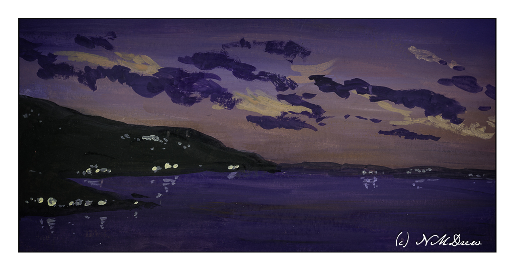
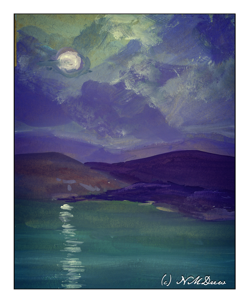
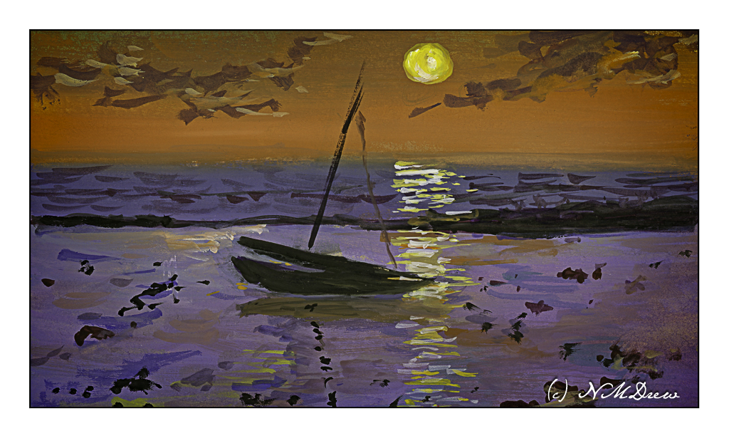
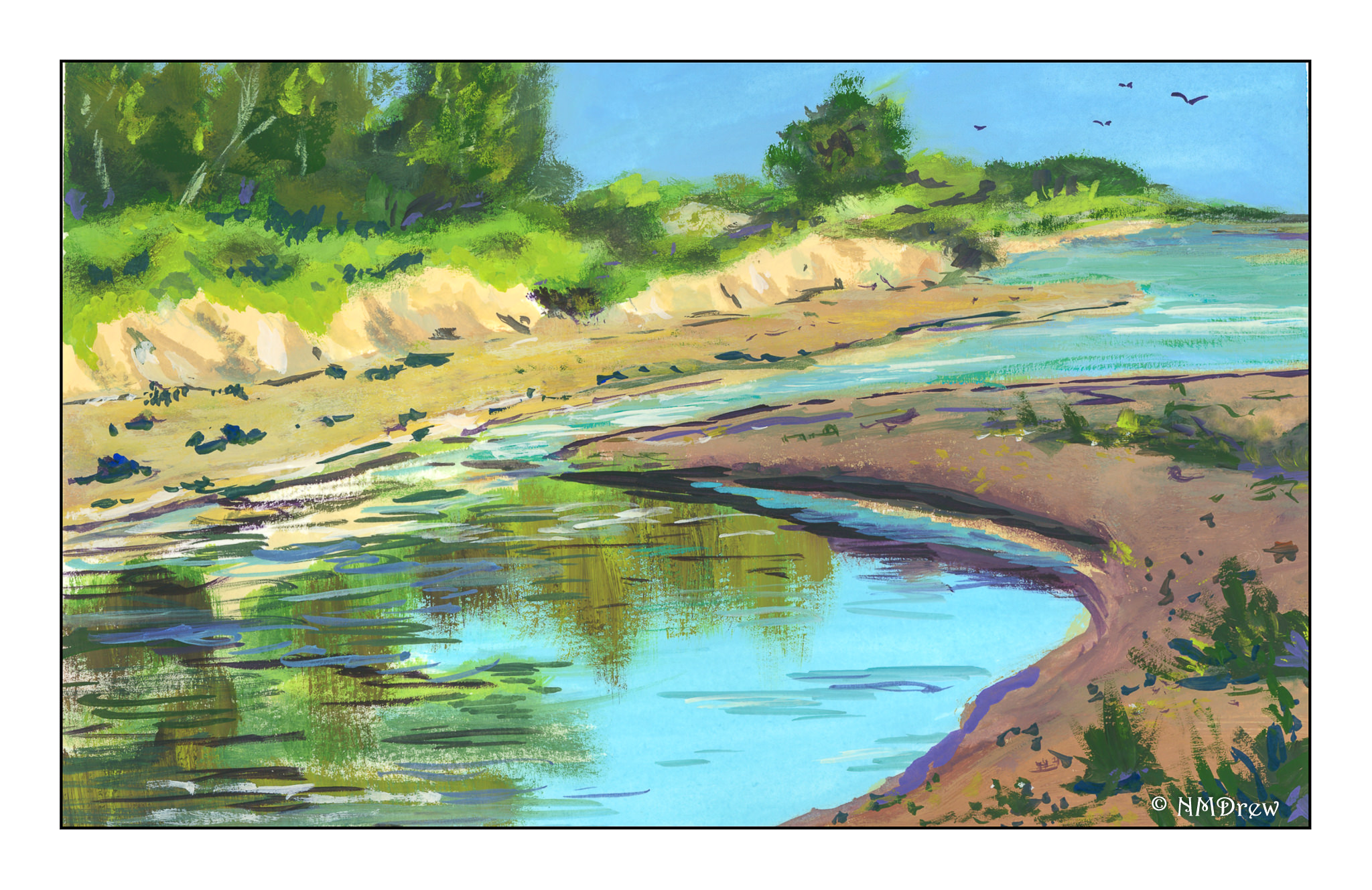
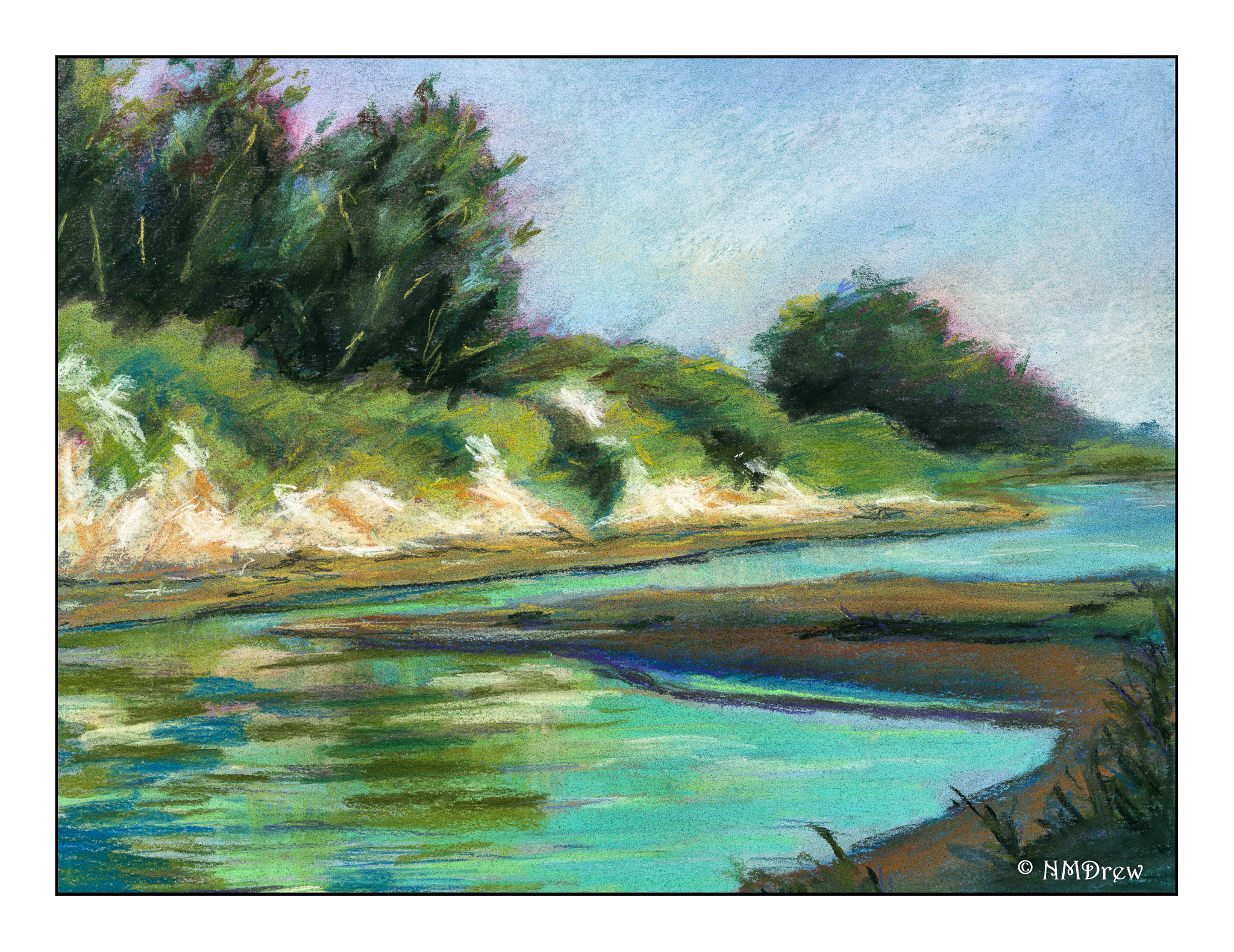
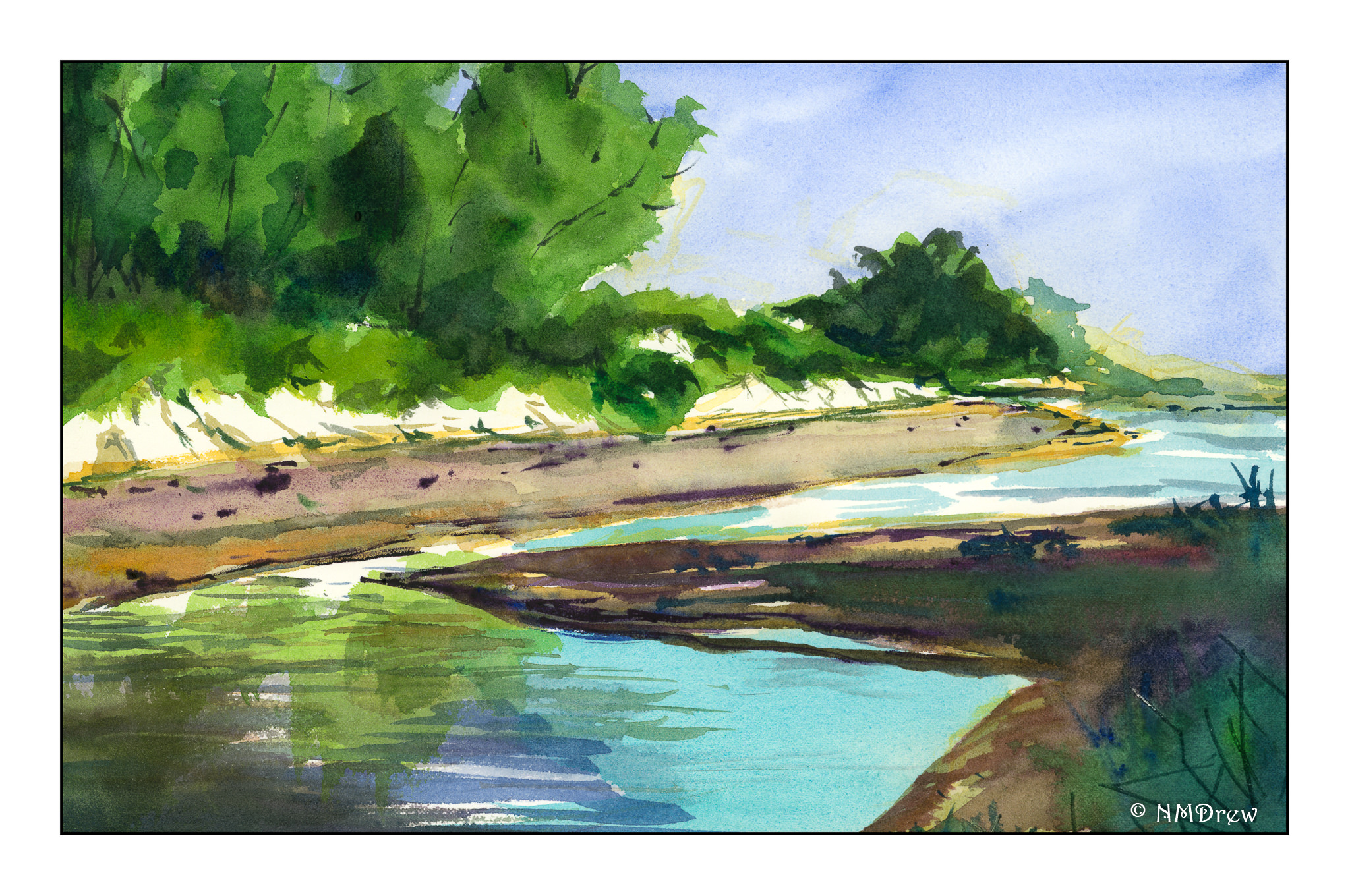
These past few weeks have just flown by! I spent a number of days up in Monterey. I’ve been learning Mah Jongg (American style), playing cards, running around, taking my painting classes, and just enjoying life. I also ignore the news as much as possible.

I decided to get more serious about portraits, have done a few which I am still working on, as well as decided to go into the body parts business. It’s one thing to get all the bits and pieces to work together well in the face, but I have decided to do some studies of the eyes, nose, and mouths of different people – from photos – just to have a focus on the details of each body part.

Or, I guess, face part.

I also decided to use a new-to-me product, Arches “Huile” paper – 140# cotton rag paper treated to take direct painting of oil paints without the need to gesso its surface. The texture of the paper is not like canvas, but it is tactile in its own way, and I rather enjoyed it.

To begin . . . I decided to save the hardest part for last and begin with what I thought would be fairly straightforward. First, lips and a few teeth, then the nose, and finally the eyes.

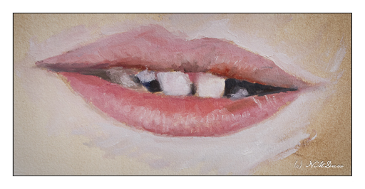
This study is from a photo of a kid just getting his adult teeth. Snaggle-toothed and chapped lips, so it was a pretty realistic photo. As this was my first painting on the Arches “Huile” I dipped my toe – well, my brush – in a bit gingerly, getting a sense of paint on paper. My brush was really small, a flat synthetic.

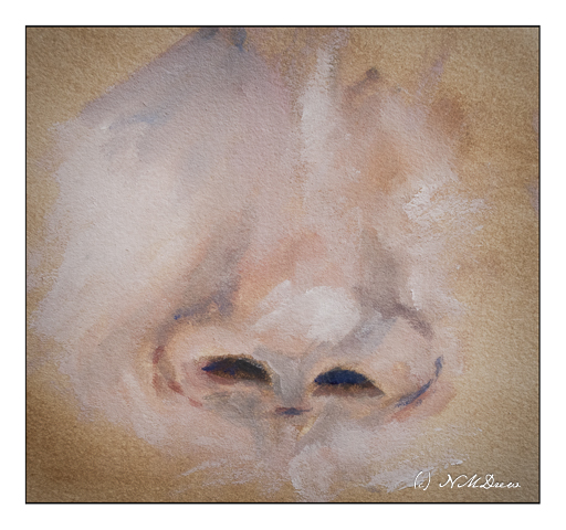
This is the nose of the same child, done separately on a different part of the paper. My brushwork became a bit more loose and I played a bit more with mixing colors not just on the palette, but on the paper as well for blending.

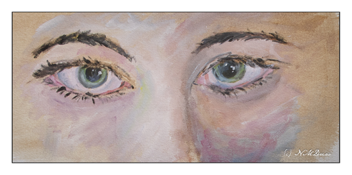
Finally, the eyes of an adult woman. I wanted something with a bit of drama, such as catch lights and strong eyebrows and lashes against a pale skin. Doing the eyes was a a bit of a slog, but in the end it seems to have worked out. Eyes have a lot of details whereas the lips and the nose had were more about color and shadow rather than itsy bitsy parts.

When I began the painting, I toned the paper for all studies with a thin layer of burnt umber, washed onto the paper with soy solvent. Once that was dried, I began each part separately by sketching it in with a small, flat brush and darker burnt umber. Once that was in place, I worked at pre-mixing the colors I anticipated I might use to match both value and color of the part I was painting. This is not my usual routine, so it was also a challenge.

After I did the mouth, I did the nose, followed by the eyes. Each time I used the same steps of outlining each part with the darker burnt umber. As many of my colors were already mixed on the palette, I added some new ones and modified the existing ones. This was rather fun and I did a bit of guessing about modifying colors, but it worked out pretty well.

My palette was restricted to titanium white, cadmium lemon, yellow ochre, cadmium red light, alizarin crimson, magenta, cerulean blue, ultramarine blue, burnt umber, and ivory black. The Arches “Huile” paper is rather nice, a bit pricey, but has a nice tooth. Other oil / acrylic papers I have used have smoother textures. Both are pleasant under the brush.

My goal is to learn to finally paint portraits with oils. It means practice and observation. I plan on continuing with this current palette and have set aside the above colors in a designated, dedicated “portrait baggy” to keep all the colors easily accessible.

Nocturne Studies in Gouache

For some reason, gouache seems to be especially good for depicting strong colors and contrasts. In part I think it is simply because the colors can be so very saturated compared to watercolor. Their opacity also lends to this. Artist gouache is also water soluble, and you can re-wet what you have painted to modify it. You can hide mistakes, but you can also scumble and scratch and get some rather nice effects.

I divided up a sheet of tan paper which measures 11×14 inches. I used a lightly sticky artist’s tape to make up the different areas to paint. The first I painted is the large rectangular area on the right, and then on the left I did the next largest rectangle, and finally the one in the lower left corner. This image is directly from the scanner, so if you look carefully, you can see my mistakes which I corrected using Photoshop. The one in the lower left has 2 masts in the reflections – that is because I misplaced my mast and had to fix it for the final image.

Cheating? Well, if I were printing these critters, I would fix them, so for purposes here, I don’t think so. Also, these are all studies and the point is not accuracy so much as atmosphere – night, whether after sunset, before sunset, and on a full moon night.

In the above painting I wanted here was a sense of dusk, when the sun is down and darkness is coming on. I worked with the sky, making it brighter than the water because with the earth’s curvature, the sky will still be bright. Lights coming on, too, add to the atmosphere, some warmer than others. And reflections, too, on the rather calm water.

This one I played with in post because all of a sudden, in one foray of this or that setting, the light of the moon suddenly seemed to light up the surrounding clouds! I really liked it. Now, as far as the moon’s reflection on the sea – should it be more narrow closer to shore, and wider toward the bottom of the page, suggesting that is where the viewer is? The same applies to the painting below.

Once more, dusk. The sun is still out, but it is becoming increasingly dark. The sun’s reflection on the sea may need to be more narrow toward the horizon – again, something I need to check. What I wanted to do here was to get a sense of a boat resting on shallow water because the tide has gone out. The water is acting as a mirror and a bit of glass for the light above and the sand below.

Altogether, I had so much fun doing these studies! I want to carry them into watercolor, which I think could be extremely challenging, as well as into acrylic and oils. I also think that, much as I like the tan paper, it is very absorbent and perhaps I need to use a layer of acrylic paint or casein as a bottom layer for the paints. That is something to try later on.

As I post this, I have been awake about an hour. Rather funny to post a bunch of nocturnes as I watch the sunrise.

Now, back to my coffee!

A Tale of Three Paintings

Over the last week I have been painting the same image three times, each time in a different media.   I began with gouache, moved to pastels, and did the final painting in watercolor. Doing such an exercise was really educational as well as pleasurable.

As you can see in the gouache, the perspective is totally off! I didn’t do much of an underdrawing, just a few quick lines, but I didn’t really check this point against that, as well as compare it to the photo. The result was an uphill beach, and a total lack of realistic perspective. I suppose it would look like htat if my head were on its side, lying in the sand or something! Anyway, it was a good lesson as I realized most of my perspective issues are simply the result of poor drawing techniques.

This next one is my favorite. Maybe it’s because I am just learning pastels and totally in love with them. Here, the perspective problem is solved. The cliffs look quite sandy in the picture, and in reality, they are. Along the coast where I live in California, cliffs tend to be friable, made of highly compacted but still fragile sand. They easily collapse, and it is really foolish to sit under them on the beach or to walk along there edges. After rains it can be especially dangerous, and one year a major landslide occurred and several people died. It was not good. So, I think these cliffs are pretty accurate representations of what our cliffs look like here.

Finally, watercolor. Perspective issues remain resolved, but a sense of distance prevails along the strand of beach on the opposite shore. Rather than overwork it, I left it as it was, still pondering how I could make a sense of distance as the beach veered off to the left and background. More blue? Less detail? I’m still befuddled on that one.

Altogether, using three different mediums to paint the same image was rewarding. Problems occurred in all paintings, many of which could be applied to others. Perspective is always an issue for me, so I really need to focus on it probably more than anything in landscapes. I know the rules, but need to find methods to implement them. Gouache and pastels are more forgiving as you can paint over what is underneath to a reasonable degree; watercolors are pretty much a one-shot deal. I think I will continue the 3 painting studies in the future as I learned far more than if I had only done one study in a single medium.

Pen, Ink, and Watercolor with Claudia Nice

I have always liked pen and ink combined with watercolor.  The contrast between the two can be art in itself, or the two can work together, each enhancing the other.  I came across this book by Claudia Nice, Creating Textures in Pen & Ink with Watercolor, quite some time ago.  It’s detailed and it has some exercises with suggestions as to what to do and notes as to what she did to create the effects.  Some are just ink and colors, others involve traditional “helpers” such as alcohol or salt to achieve results.

Yesterday afternoon I was in an antsy mood, but didn’t want to paint in my usual splashy style, but wanted some “containment” if that makes sense.  I wanted something requiring a degree of precision.  Ink is always the answer there.  Realism, too, is not where I wander naturally, so Nice’s work and exercises always have a magic to them.

The first I chose was her “Old Broadleaf Maple” – detailed, subtle.  And a tree.  I love trees!  This is my rendering of her example.


The second one I chose was a fly agaric mushroom.  I have seen only one like it in my entire life – and even then I am not sure it was the same mushroom.  I was hiking up in the Rockies in Colorado, up high, and came across some huge, red mushrooms, the kind you see in fairy tales.  Wanting more colors than the tree, the red hues of the mushroom were perfect.

The beauty of Nice’s work is that while it appears easy, if you are doing the study, you focus on the small things as well as the overarching picture.  By nature, I am not detailed oriented, and for me, it is a different way of seeing and doing something.  I am always pleased with the results when I take my time.  The biggest challenge is to take these studies to my own world, outside the pages of the book, and look for the details on a plant or whatever, decide what to keep, what to discard, and so on.  It is hard work worth every minute!

Trying, Keeping, Discarding

I’ve returned to watercolor in the past year, trying a lot of things, and realizing that some things are just not “me” and others are “me.”  This means there are styles of painting I just don’t care for – and ones I do – and what to do?

First, I think it is important to try something.  This way you gain a working knowledge.  This means repeat the situation a few times to learn the subtleties.  The brain works on an unconscious level and incorporates that knowledge.  Whether or not you continue down that path, you learn something and it is stored away somewhere in the mystery of the brain.

The painting above is a study I did out of Ted Kautzky’s classical work, Ways with Watercolor, which I bought when I was 16 with babysitting money.  Three colors only, and the variety of colors is amazing.  Restraint, self-control, forethought, execution, results, experience and knowledge.

And then, think about the experience.  Worthwhile?  Did you like it?  Were you a klutz?  Did you hate it?  Did you like it?  Do you want to move on?  My philosophy about work comes into play here:  learn what you hate about your job and what you love – then decide if you want to continue.  That applies to painting and art in general.  I like certain things and find other things not to my liking.

What I don’t like is a sense of constraint.  I like painting to be an experience – but to get good at something, you have to work.  So, I like free-flowing painterly watercolors.  To get there requires practice and experience.

When I was doing a lot of sumi-e, I hated the brushes and the paper – they had their own qualities which, one mistake, could ruin an attempt.  Eventually, though, I found some mastery over paper and ink and brush.  Part of that came from knowing my materials – which paper I liked, which brushes I liked, which ink and ink stone I liked.  Then I could begin mastery.  Poor quality brushes shed hairs; too-porous paper spread the ink to quickly.

The same is to be said for watercolor, which I have been drawn to since whenever.  However, I have scurried away from it, always annoyed with my style, with my lack of ability, with my lack of control.  I still deal with it today, but now that I am on the slippery slope of old age, such things seem like foolish wastes of my time.  Just do it!  Do it as often as possible!  To hell with the results – the experience itself leads to wherever it will lead.

Yes, I do know what I want to be able to produce.  I don’t want to rely on lines to contain a bad composition or execution of color.  If I do ink and watercolor, there will be a purpose for it – a reach for a particular style.  With watercolor, I may need to do (and will do) value studies and use a limited palette of colors to train my eye.  This is a form of restraint, but not an onerous one.