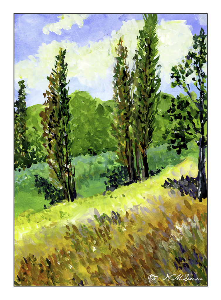
Not too long ago a painting done by Gustave Loiseau called Les Peupliers (The Poplars), ca 1898, caught my eye. I really liked the composition, colors, and overall atmosphere – a bright, sunny, breezy day in the countryside. I will leave it to find it based on my rendition of Loiseau’s lovely painting.
As with yesterday’s painting, this is done in gouache on Strathmore Vision paper. I painted in the underlying colors with an angle brush and then used a finely pointed round to do the remainder of the work.
Gouache is, to me, a rather strange paint, but one which I really enjoy using. The colors always strike me as a bit unreal, but not necessarily in a bad way. They always seem to end up rather cheery, even when I use them to create a rather monochrome or dull scene. It can be used really thin, as a wash, as well as thicker – it all depends on the amount of water you add to it. It is designed to be opaque, but its opacity depends on how much water you add. I think I am on a bit of a gouache streak as I have at least another painting to show you . . . .
No, I don’t mean life. I mean trees and piles of leaves and undergrowth – all the stuff that makes up a good fall scene! Some trees have dropped a bazillion tons of leaves and others are hanging on to them. Years of detritus build up on the ground, creating a fertile place for new growth, plant, fungal, insect, which in turn supports other life in the wilder world outside the super market.
Anyone who has taken a walk in the woods or tried to photograph or paint this jumble knows exactly what I mean – it is really a busy-ness of color and texture and shape.
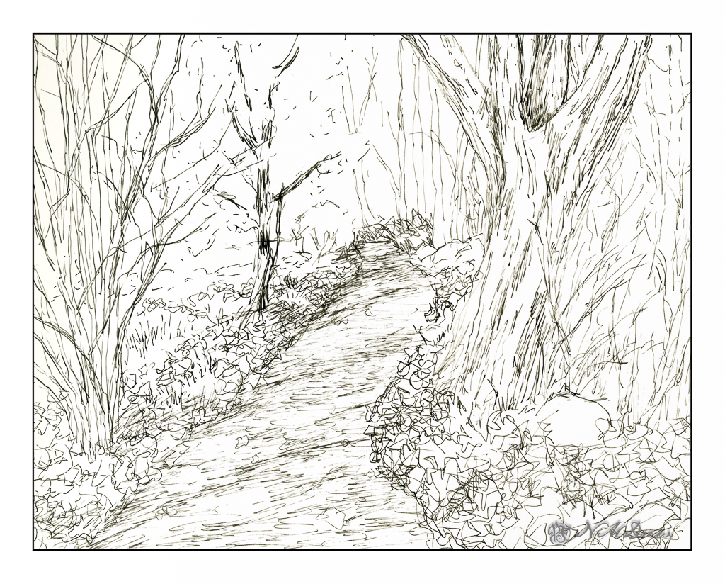
This is my sketch, done with a fountain pen and some Carbon Ink by Platinum. The paper is a bit rough so it could be what caused some difficulties with the pen nib – or the pen itself is not the best – or both. I tried to convey light and dark and texture with different pen marks. Straight lines to show trees and texture and the shadows of the trees across the pathway. Contrast is suggested rather than emphasized as I wanted to use paint to give the sense of shadows and so on. With that in mind, I pulled a palette of my out-of-the-tube paints rather than pan paints, cleaned them up and went to work.
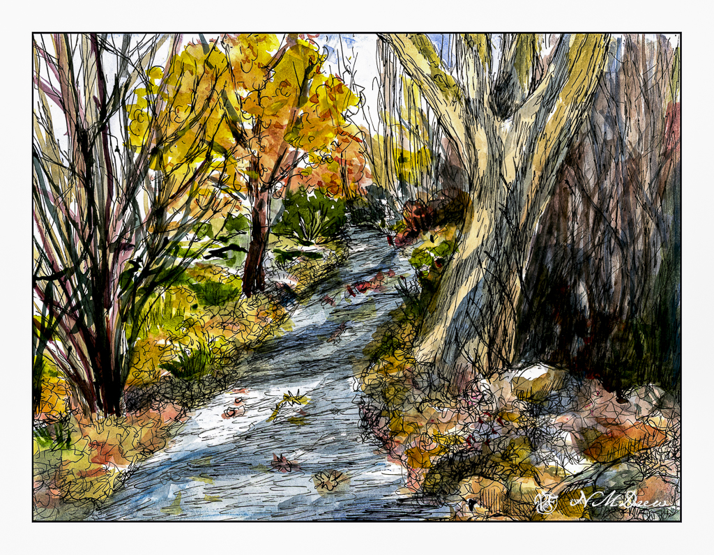
As you can see, light and dark are more emphasized with the use of color, as are the colors of the leaves and the complex shapes of trees on the left and undergrowth on the right. The leaves that have fallen have some variegation, depending on when they fell and how long they have been there. Green grasses and weeds peek through. There are a few rocks, too, and leaves on the pathway. Tree shadows fall across the trail and up onto the tree on the right. There is a brightness to the day despite the murk of the undergrowth.
After adding color, I waited for the picture to dry. I made some color adjustments. And then, back to the waterproof ink pens. This time I used Micron pens and my Uniball waterproof pens. Micron pens come in different nib widths (here 0.1, 0.2 and 0.5) and the Uniball is labelled as “fine” but in reality makes a darker, thicker mark than the Micron pens.
Overall, I am more pleased with today’s ink and wash sketch than the one I did yesterday of the plumeria. As usual, I did not do a preliminary pencil drawing but just worked from the end of the path and then moved back and forth to establish areas. I really like my tangled tree in the lower left and the shadows on the big tree on the right. The brightness of an autumn day is expressed. Now all I have to do is get to scuffling through those leaves and it will make my day.
Pen, ink, watercolor wash, on Strathmore Vision 140# CP paper, 9 x 12.
A package I am eagerly awaiting is supposed to be delivered today. I want to be home for it even though it is not required – I just don’t like leaving things on my doorstep even though I live in a good neighborhood where porch pirates don’t happen as far as I know. I mean, people leave their garage doors open all hours! Me, I batten my hatches and lock my doors because I prefer to, even though a part of me so wishes I could be that trusting.
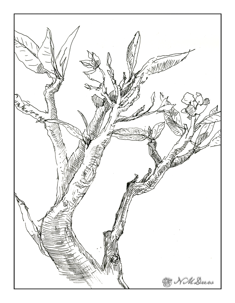
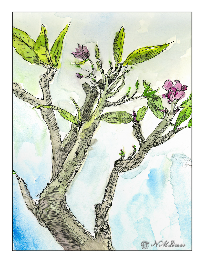
And so, what to do whilst I wait? One thing is always to go outdoors and sketch. My plumeria plant has been beckoning me for some time, as a sketch and as a painting. Today, ink and watercolor wash on some Vision watercolor paper.
First, the scanned pen sketch. Waterproof ink always works when using a wash over ink. The pen itself is not especially fine, but with a lighter or heavier touch, line variations can happen. I did this without a preliminary sketch with pencil.
Then, nap and coffee and now, ready for the watercolors, I chose just a few colors – a magenta, green, yellow, blue. Mixing magenta and green produced the greys of the stems, greens and yellows the greens, and the blue and greens the background wash. The idea was to keep the colors minimalist as well as create a consistency throughout the washes.
The scan is not a good one but it does give the idea of what it looks like on paper. I am inclined to think that the background wash is not ideal and the next time I do a sketch like this I will just leave the paper white. Too many times I have been disappointed by such scans, and even with the original paintings.
Time to go knit in the sun with a good audiobook!
Watercolor, pen and ink, Strathmore Vision paper, 9 x 12 inches.