Morning at My Desk

Today there is a bit of running around to do, so this morning I was in a blithery mood. Things to do – like the usual morning stuff – but I also know I won’t feel too focused on any one thing, so sketching with ink and watercolor seemed to be the best of all choices. (After all, life is not all about dishes and making the bed!)

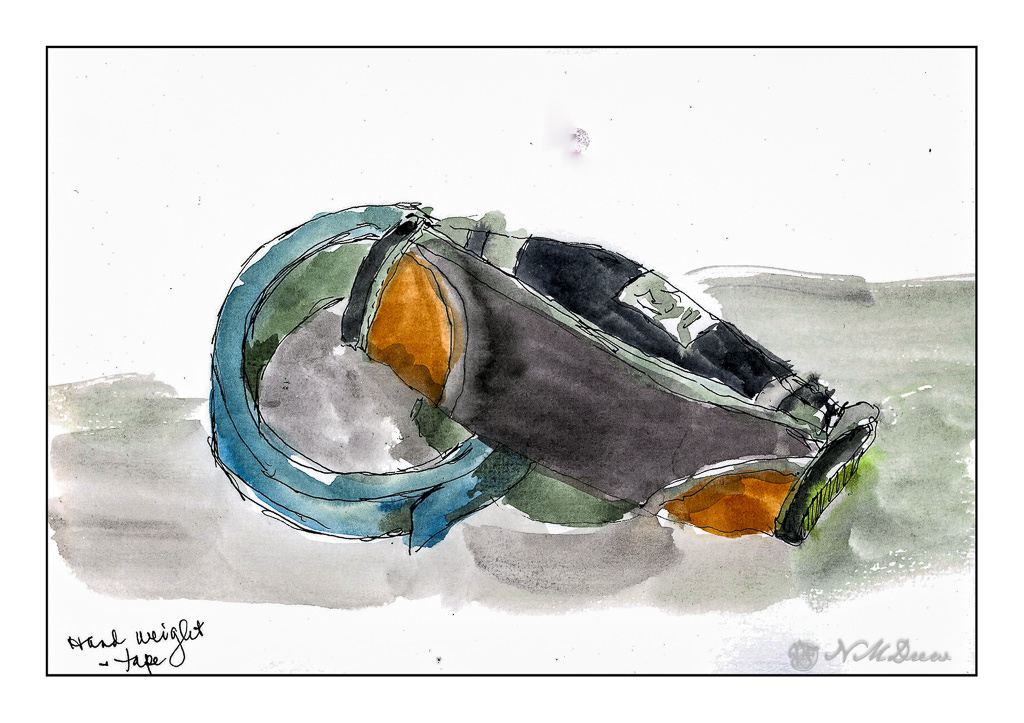
On my desk is a small hand weight and roll of painter’s tape. Warm-up. And now immortalized.

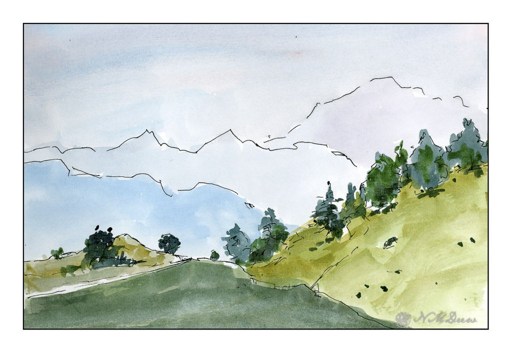
Next, the great outdoors. Mountains and trees. I would love to be walking around here, but sadly my ankle is keeping far more stationary that I want to be. I am getting better, but I have to just keep all to a minimum. I can go to the store and walk a bit, but I need my heel to get better more than anything.

So, the painting. Goal is to get a sense of distance with the gradations of the mountains as they recede into the distance. Accomplished!

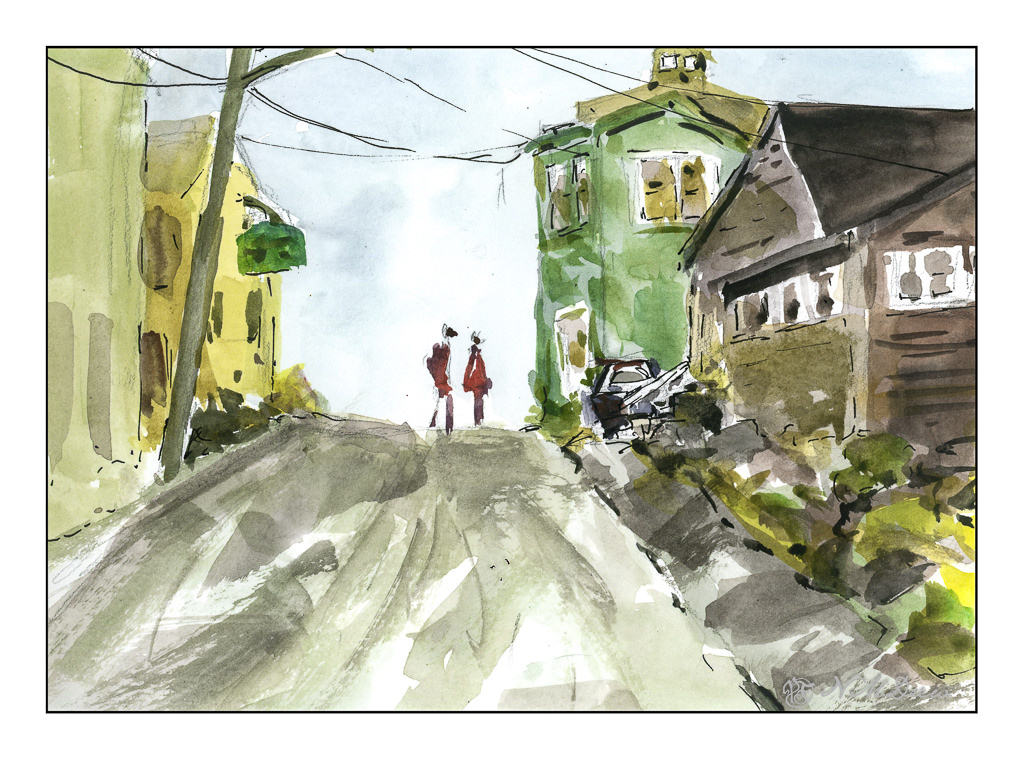
Finally, a scene with some complexity. I figured my warm up and splashing of paint were ready to meet my next challenge which is to paint buildings, people, perspective. Landscapes are comfy but I really want to push myself a bit more, as I did the other day, with direct painting and more patience and planning.

The first two sketches were done in very short order, but here I pulled out my pencil, limned in lines and worked on perspective and size. I think my people are a bit too tall, and I put them in before I did the painting of the buildings and the road. The buildings, too, are a bit wonky, but they work fairly well. I painted everything and then, once okay with the picture itself, I decided some black lines here and there would be good to help pull the painting together. Not perfect, but pleased with the results as I did meet my challenge.

Pentalic Aqua Journal, about 7×10, watercolor, Uniball micro pen.

Practice

Over the next several weeks I am enrolled in a couple of oil painting classes. Acrylic paints really do frustrate me in a lot of ways, and please me in others, but it is time to work with oil paints on a more serious level. Let’s see where it goes.

To get ready for these classes, I pulled out some of my supplies. Of course, the oil paints come out – I have a smaller selection of colors than any other medium! I also have canvases in panel and mounted format. However, I did need to stock up on linseed oil, solvent, and other such stuff. And then paint.

Canvas mounted on panels is actually, I think, the easiest way to go. Canvas pads flop around and easily bend. Mounted canvas on stretcher bars takes up a lot of space but can provide a gratifying surface to paint on if properly and tightly mounted and prepared. For now I am using canvas panels which, while not super high quality, are relatively inexpensive and easy enough to prepare, if at all, prior to painting. 

I love pears! Painting them is far less tasty than eating them, but they are by far one of my favorite winter fruits. Here, some d’Anjous, all cuddled together. My focus here was brushwork and getting a sense of the unctuous quality of oil paints. Some people use the paints straight out of the tube, but I like mine to slide around a bit. It really makes for fun blending. The colors, too, were rather limited here for the purpose of seeing how they can interact. 

Here, more lavender fields. Why so many? It is because lavender and purple are honestly rather nasty colors to create from the standard mixes. I find that I like to have “convenience colors” on hand – namely, a good violet such as carbazole or dioxazine. Mixed with other colors and / or white, I get lavenders and such that appeal to me. I initially tried to just use variants of red, blue, and white for the lavenders, but gave up with frustration. Not worth the sweat! Maybe later I will master a good orchid lavender, but for now . . .

As with the pears, playing with the things you can add to the oil paints to thin them out. I used Gamsol and Soy-Thin, both low odor solvents. I didn’t use any linseed oil in either painting – that will come later – as will other things, such as drying agents like alkyds. 

The pears and the lavender field were painting on pre-gessoed 10×10 cotton canvas panels measuring 10×10 inches square.

Carrots

I watched a few videos by Jane Slivka, an acrylic painter out of Florida. She tones her canvas with a reddish orange color, paints in the major shapes in Hooker’s green, adds white for highlights, then proceeds to build her painting. Her paints are heavy body while I have been using fluid acrylics. I thought her process was quite interesting as it is seemingly spontaneous, but not without structure. Her steps give it structure, but she is not a slave to her subject – she sort of moves along with a game plan and no game plan, if that makes sense. 

What really fascinated me was how she actually creates values by working in the lights and darks before adding colors. Additionally, the red tone beneath the brushwork pops through, and adds a bit of sparkle to her paintings. Negative and positive space and shapes are worked back and forth. 

I tried to follow this approach, and found it really quite interesting. In many ways it simplified what I wanted – lights, darks, values, contrast. Carrots are not especially exciting things to paint, but they are quite cheery with their bright colors of orange and green.

Painting the carrots and their tops was really fun. I didn’t take this painting seriously, and sort of slapped around colors, working to see what might be successful, might not be. Never before have I toned a painting surface with cadmium red, but I think it could become a favorite thing to do. Yellow ochre is a wonderful color, but it is not especially dramatic. The little bits of red poking through the greenery is quite pleasing to my eye. I expect I will try more paintings like this.

Golden Fluid Acrylics, Strathmore 300 watercolor paper, 10×14.

Poinsettias in a Blue Vase

I wanted to paint today, but I didn’t want to deal with acrylics and the bit of a mess they create. Gouache has been on my mind as I haven’t done it for a long time!

Starting this painting was a bit tough, just because I am out of practice. Still, I found all the painting I have been doing made it a bit more easy than I anticipated, but, once more I find myself stuck with problems of light and shadow. But here, it is play; the concept is there, and the plan, while not working out, did kind of get there. Certainly you can see where the light is coming from – but not sure how much it worked out.

Fun time, and that is what an easy afternoon is all about! I used bristol paper for this, and was rather pleased with the way the gouache went on. About 10×14 inches.