Trees in the Back Yard

For the past few weeks it is as if I fell down the rabbit hole – nothing made too much sense! The main thing was getting the walking boot off and getting used to being a bipedal organism after weeks of sitting around, walking here and there in the house or at the market, only taking minimal steps. It may sound weird, but for me, actually walking became an almost surreal experience. I am doing fine, too, but my mind and body had to coordinate it all once again. Jumping away from a moving car to save my skin was great, but spending 2 months recovering, and then some, from a badly bruised and messed up ankle is something else.

Doing nothing much sort of leads to a torpor and little desire to do much. I admit, I watched a ton of TV and movies, and played bits and pieces of music, but the motivation to do much of anything was very much missing. But now autumn is in the air, cooler days and cooler nights, light shifts and just that wonderful sense of change that comes with seasons – and being able to gad about – have me emerging.

Classes also help! A couple of painting classes, a ukulele class, and digging out my pen and watercolors have got me moving. Today, my ukulele class is at 5, so I decided to just sit out in the back of the house with pen and ink and pan paints and a waterbrush and sketchbook. As the season changes, leaves change color and drop.

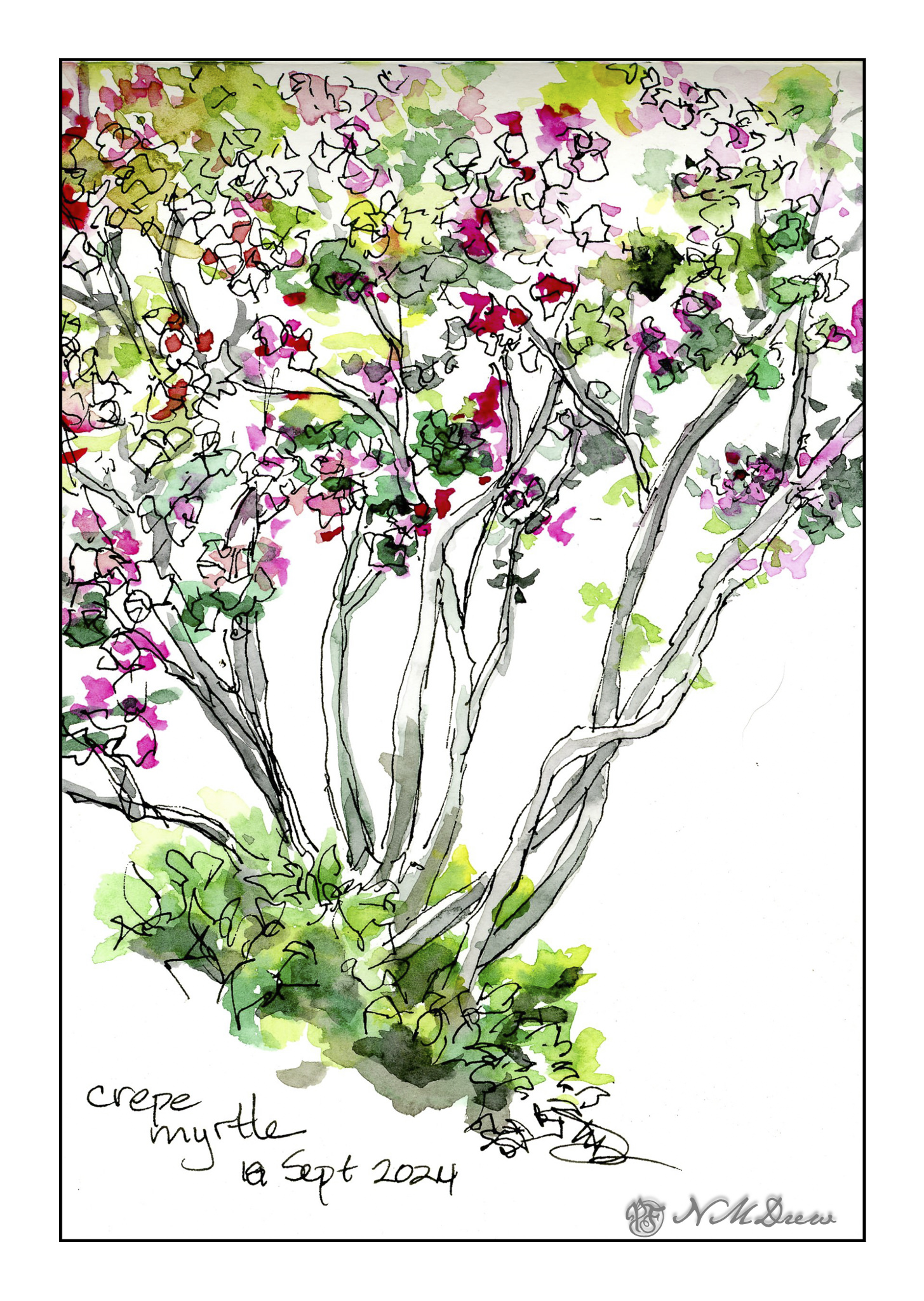
This is my first sketch. We have a beautiful crepe myrtle tree with a rather vase-like base. Large branches spread out from the trunk like a V. It’s the prettiest of the local crepe myrtles, I think, because of this shape. Its flowers, too, are not the usual bright pink but a deep red violet. I decided to sketch with its flowers even though they are mostly gone. The leaves turn an orangish green with the end of summer. I made them greener. At the base of the tree is a small bush that has pink flowers in the spring.

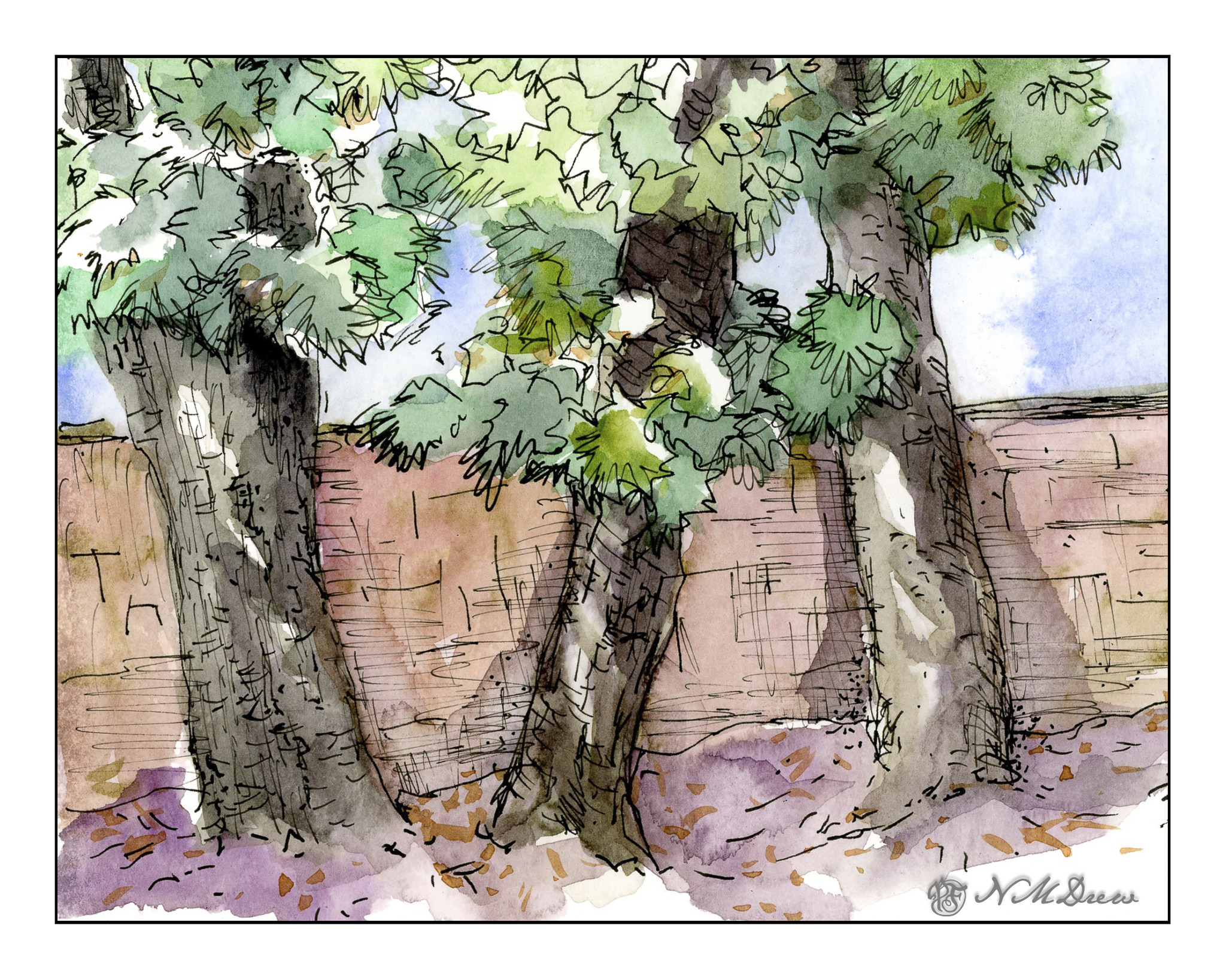
These are podocarpus trees which line the back fence. They are ridiculously fat and poorly spaced – I am innocent! I didn’t do this! – and way too tall. I need to get them removed. They are really rather messy trees, and drop leaves year round as they are not deciduous. Despite these drawbacks, I really rather like drawing them as their trunks have an abundance of texture and the leaves seem to appear in clumps so that colors vary in shades of green depending on the light.

And there we are! I think I am beginning to feel like my life is returning to normal, and for the past year it really has been odd. Breaking and injuring my bones seems to be this year’s theme, so let’s hope it is not going to become a tradition. I would rather spend my time rambling around outdoors, enjoying what there is!

Later . . .

Scarborough Bluffs

More work on painting more directly in watercolor. It is becoming easier but it still presents a mental challenge. By nature – though experience shows otherwise – I think of watercolor as splashy and fast. Well, it is not! Patience is paying off as I am rather enjoying my latest forays into watercolors.

To enlarge, click on the image.

Once more, a panorama in my current sketchbook. This one is simpler, I think, than my previous one, so it did not take as long – about 90 minutes, including using the hair dryer to dry things off.

First, sketch in with pencil the entire drawing. From there, wet the sky, leaving edges for the cliffs and trees, though I really didn’t worry about the trees too much. I knew the trees would be using dark, thick paint. The bluffs, though, needed to be fairly free of color and water, though if you look at the far left, you can see a bit of sky color ended up in the bluffs.

Colors for the sky were essentially ultramarine and cobalt mixed together. I mixed a large area of wash and applied the color after wetting the paper. To create the clouds I blotted out a lot of color. This is always a fun and scary part of any painting!!

While waiting for the sky to dry a bit, I worked on the water, the shore, and the land mass on the right. The lowest tree mass, too, was done with a mixture of colors. I am not really satisfied with it, but it is okay and not too messy or overdone. Once these areas – sea and shore and shrubbery – dried I moved onto the bluffs themselves.

The bluffs will vary in color, depending on sky and time of day. I decided these should be bright as is the sky. Mixing up a light grey is a challenge, so I did a bit of cobalt, yellow ochre, and bit of what I think may be quinacridone rose. (Alizarin crimson would work, too.). I mixed together very small amounts of each and diluted it heavily. I used this to lay int he lighter areas of the bluffs, leaving some areas plain white paper. From there, darker shades, yellower shades, lines and fissures.

The final stages were details. Trees on the bluffs, some green along the right side shore, varying color in the water, shadowed areas in the bluffs, and splattered color on the lower right. Finally, a couple of figures to give scale – these bluffs are really tall!

Watercolor in sketchbook on 140# CP paper, about 8 x 18 inches.

At the End of the World

Today and yesterday were really rather discombobulating. Does getting older mean you are more set in your ways and less able to adapt to changes in the daily routine? Either that or my allergies just make me a bit crazy – this morning I had one of my sneezing fits where I sneeze about 30 times in a row. That is exhausting to the point I need a nap.

And nap I did. But then I decided to do something creative, and back to watercolor (my real first love in painting) and work on something idyllic, wet and watery, full of rocks, and put it in my sketchbook so I won’t take myself too seriously.

Click on the image to enlarge!

The Strathmore Vision paper works really well with little re-working of any part of the painting. I decided to see how the sketchbook would do with the same approach, as well as the more personal challenge of being more direct in color application.

With watercolor, many artists work with very wet paper, and while I like that, I prefer to have wet paper – as for the sky and the sea – but I also like to have layers. If you paint into wet color, your next incursion must be more pigment and less water than you are moving into, otherwise you get what are called blooms or cauliflowers. You can also paint onto dry paint and these won’t occur, and you can use thinner or thicker paint – less or more pigment combined with water. My sketchbook has good paper – far better than the Vision paper – so I could do all these things, and did.

First, wet the sky area, then drop in stripes of blues. Next, wet in the water, from horizon to the inlet area, all in about the same shades of blue, but darker than the sky. Let that dry. While that is going on, I painted in the greens on the right, blending colors into each other for gradations of green. The rocks, too, were painted with varying colors, working to leave bits of unpainted paper for a bit of pop and to indicate areas with more sun that shadow. Slowly I put in details, such as the waves or ripples in the lower right of the inlet, cracks in the rock, and so on. Large colors and masses first, finalized with contrast and detail.

I am pleased with this painting. I accomplished my task of direct painting with some modification – not a lot – later as I moved into detail. I drew in the general shapes with a pencil. The foreground rocks on the left and bottom were a challenge, but I think I have enough detail to make them interesting but not distracting. The same with the land mass on the right. Overall it took about 2 hours to do complete this watercolor.

Watercolor sketchbook, watercolor, about 7 x 18.

Morning at My Desk

Today there is a bit of running around to do, so this morning I was in a blithery mood. Things to do – like the usual morning stuff – but I also know I won’t feel too focused on any one thing, so sketching with ink and watercolor seemed to be the best of all choices. (After all, life is not all about dishes and making the bed!)

On my desk is a small hand weight and roll of painter’s tape. Warm-up. And now immortalized.

Next, the great outdoors. Mountains and trees. I would love to be walking around here, but sadly my ankle is keeping far more stationary that I want to be. I am getting better, but I have to just keep all to a minimum. I can go to the store and walk a bit, but I need my heel to get better more than anything.

So, the painting. Goal is to get a sense of distance with the gradations of the mountains as they recede into the distance. Accomplished!

Finally, a scene with some complexity. I figured my warm up and splashing of paint were ready to meet my next challenge which is to paint buildings, people, perspective. Landscapes are comfy but I really want to push myself a bit more, as I did the other day, with direct painting and more patience and planning.

The first two sketches were done in very short order, but here I pulled out my pencil, limned in lines and worked on perspective and size. I think my people are a bit too tall, and I put them in before I did the painting of the buildings and the road. The buildings, too, are a bit wonky, but they work fairly well. I painted everything and then, once okay with the picture itself, I decided some black lines here and there would be good to help pull the painting together. Not perfect, but pleased with the results as I did meet my challenge.

Pentalic Aqua Journal, about 7×10, watercolor, Uniball micro pen.

Lands End, SF

I think every country has some form of a “land’s end” – at least if it borders on water, like an ocean. Lands End in San Francisco, CA, is a park overlooking the Pacific Ocean and part of the Golden Gate National Recreational Area. It’s a beautiful, wild, windy place – and it has a ridge of Monterey Cypress as well.

Note: Click on the image to enlarge.

I did a quick sketch in pencil, just to get the general shapes of the trees and the land. I put in the tree trunks first as I wanted to be sure I knew their placement along the land. I used a mixture of blacks and greys, pale to dark, but initially light to indicate placement. From there, the foliage and the land. Once established, detail began, with dry brush strokes for vegetation and later for the leaves on the cypress. More than anything, I wanted a loose, windswept look with a sense of direction and sky.

Planning a loose painting takes a bit of forethought. I put in the tree trunks first, then some foliage and land. The sky was done after all these with a large, soft flat watercolor brush. Final touches came after all was dry. I made this into a panorama, spanning 2 pages of my sketchbook, to give a sense of expanse. In the end, I was rather pleased with this.

Koi pan watercolors, watercolor, about 8×18.