
A wonderful bird is the pelican,
His bill will hold more than his belican.
He can take in his beak
Food enough for a week,
But I’m damned if I see how the helican.
–D.L. Merritt

A wonderful bird is the pelican,
His bill will hold more than his belican.
He can take in his beak
Food enough for a week,
But I’m damned if I see how the helican.
–D.L. Merritt
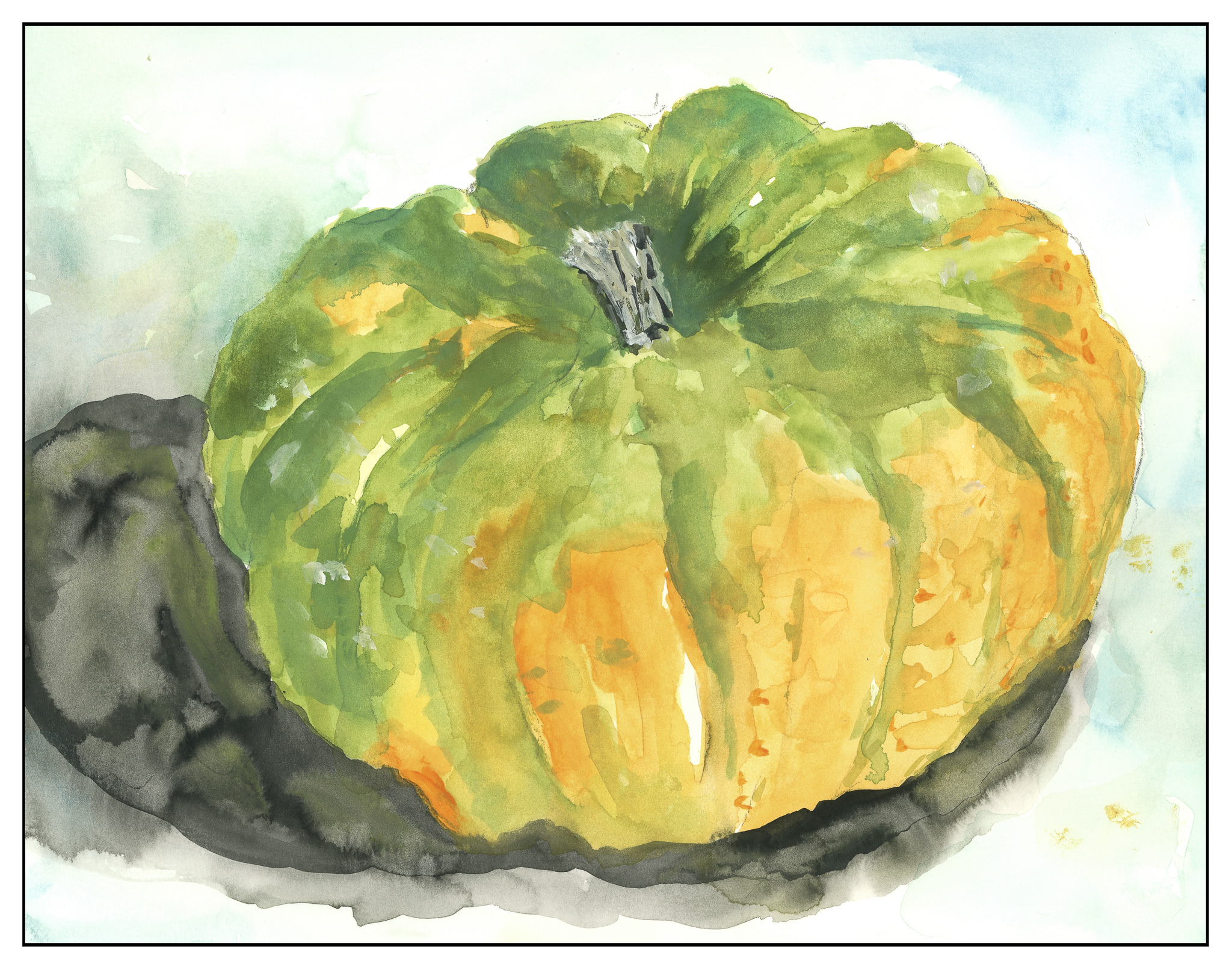
Today I dug out my old Pelikan opaque watercolor paints – they are so much fun! What is it about something that looks like it is for kids that lets you kick back and just play? In reality, this is a very well-designed set of paints – a balance of warm and cold variations of colors, along with a tube of Chinese white.
A Bit of Frustration
The other day I pulled out watercolors and paper – you saw the results in my last post. Yesterday I spent most of the day painting. Suffice it to say that the watercolors were a total disaster – my impatience, as always, got in the way. Or, from another perspective, when it comes to watercolors, the paper is not absorbent like xuan, and as a result, I cannot be as spontaneous and as controlled with the brush at the same time. For me, I think my best results in watercolor come when I am far less impetuous, and thinking more graphically. Happy splattering never occurs for me with sized paper! So, after feeling frustrated (but still in a painting mood) I pulled out my large table of rice paper (12 x 18 inches) and a bottle of Japaneses sumi ink.
Moving from watercolor – wait, patience, think – I messed up a few sheets of the rice paper. My ink was not loaded into the brush, just solid black. My brush choice was poor. My attitude was pretty crappy after a disastrous watercolor experience, and it showed. Still, that energy also started to mellow out – I love the feel of ink and paint on absorbent paper! Finally, a few kinks worked out, I set about to using just the ink itself, and sometimes coupled it with the washes I’d made using my Pelikan pan paints.
Three Out of Four Gentlemen Show Up
To warm up, I used a large, soft brush and a finer, coarse hard brush. I did the plum. The large brush was loaded with a lot of light grey wash, and then the tips were slightly covered in dark black ink.

The next painting was the orchid. For this one I took out a large hard brush and loaded it with ink. This was for the leaves. I then used a medium choryu brush (soft on the outside with hard hair in the center) for the orchid flowers. I used the small hard brush for the orchid centers.

For the bamboo, I took the large, soft brush, again loaded with ink. I used it filled in different ways to get the four stalks. On one of the bamboo, I went in with just a solid wash, and came back later with a darker wash, doing thin strips down the left side. The joints in the bamboo stalks was done with the small, hard brush; I used this same brush for the bamboo leaves.

Palm Trees in Sumi-e
When I looked back over the logs for this blog, I realized with a bit of horror how much time has passed since I received a request for palm trees painted with sumi. I apologize for that, but unfortunately my life got too busy for such endeavors. So, here, at least are some palm trees.
I am not an expert in palm trees, so any mistakes here are my own as far as determining what kind of palm is what. Given that, let’s proceed.
The first thing I always notice about a palm tree is the trunk. Some are smooth, some rough. Coconut palm trees seem to be tall and smooth, with leafier, more graceful fronds. Date palms have thicker trunks with an obvious roughness where palm fronds have fallen off. The fronds tend to be stiffer and less flexible than those of the coconut palm. What they do have in common, though, is the way in which the serrated areas of the frond meet at the center. This gives a clear line in the middle which seems to have a space between it and the serrated areas. If you look at pictures of palm trees, you will see what I mean. To paint them means leaving that gap there, or using a very fine line to connect to it, and then using a steady sweep of the brush, much like you would do with an orchid leave. Pushing down on the brush – smooshing it – creates the wrong impression of the frond. However, you can turn the brush and create bent areas – palm fronds are pretty messy. A hard, dry brush is really good for expressing the ragged edges of some of the serrated “leaves” in the frond.
This is a palm frond, done first to consider how to do the structure of the frond itself. I used some of the colors from my pan paints as well, mixing it with different dilutions of ink.

This next one is from a picture of a coconut palm. The trunk was done with my choryu brush, loaded with a light and medium ink, and tipped in black. I laid the brush sideways, and did a quick stroke for the entire trunk. I then came in with the small, hard brush for the texture found at the base of the trunk and into the trunk itself. I used the choryu brush for the center lines of the fronds and for some of the paler frond leaves. I used my large, hard brush for the darker dry brush fronds. Before dipping it into the ink, I spread out the bristles, and then dipped only the ends into the ink, keeping the brush perpendicular to the ink. I painted the frond leaves the same way, using a quick flick while doing the best to avoid any pause on the paper. As the brush lost its load of ink, this became easier.

The next palm is a date palm. Its trunk is considerably coarser than that of the coconut palm, and its fronds are stiffer and messier. They were all over the ground around the palm tree in the photo I used as a reference. To paint the trunk I used dabs of medium ink, and then began using various loading combinations of light / medium / dark. I ended with the hard brush and undiluted dark ink. For the fronds, I used much the same approach as I did with the coconut palm, but worked to make sure I caught the more upright and clustered qualities of the fronds, as well as the shorter leaves along the frond itself.

Maple Trees with Chinese Paints
With all my washes from the watercolor painting excursion exhausted, but still in a mood to paint, I found a picture of some maple trees in Vermont, brilliant in their autumn foliage. I used the bottled sumi ink for the trunks, and then used yellow, orange, and red from my box of Marie’s Chinese colors. You can see how opaque they are in comparison to the Pelikan paints. I diluted the colors in some areas, mixed them together, smooshed them around. Other areas will show you the individual colors as dabs. Different layers from red-to-yellow can be found, as well as orange or yellow or red on top of everything else.

Altogether, I had a fun day painting. The best paintings are those done in sumi-e. I really like the palm trees and the frond, more so than the orchid, bamboo, or plum. The texture of the plum trunk was enjoyable to do, but the blossoms are too blotchy – you can see where the paint plopped down and spread. I must admit, too, that I find pictures I have done with Marie’s paints never satisfy me – the colors are too garish. I do know, though, that Teacher does lovely stuff with them, and when I work hard at it, I can produce paintings which appeal to me.
My own approach to sumi-e and Chinese painting is certainly influenced by being trained in Western art. I find my best connection is with sumi ink, brush, and paper, and feel it is closest to my own personality. Still, the mastery of watercolor is one of those lifetime goals, and for me, my best results are when I employ patience and thought, which is very different than immediate results of sumi painting.

The Book and the Paints
I’ve been doing sumi-e for awhile, and now with my return to my Chinese painting class, the urge to paint is getting stronger, and the need for color is making itself known. However, it never hurts to refresh one’s skills; given this, I dug out a book I’ve had for some time: Watercolour by Patricia Monahan. This is a good book for standard watercolor techniques. So, I’m going through it, front to back, in my spare time. It’s a good refresher. As well, these techniques are important to remember as I know many will be used in any subject done in the Chinese style.
In watercolor, I’ve encountered different approaches to how to work – light to dark (Monahan’s approach) and dark-to-light. Personally, I find that I work more logically light-to-dark, but the truth is that working dark-to-light just confuses me. Maybe it is something I should deliberately try. For now, though, I will hold that thought and practice a few simple techniques.
Monahan’s book is broken down into sections. Currently I am on Washes (having read the introduction and chapter on equipment), which include techniques and then subject matter, such as rain clouds and the beach. I’ve done a solid wash, into which I’ve done
I’m using pan paints, made by Pelikan, and I think they are technically opaque, but I find that they work fine and have a nice degree of transparency when diluted. They are convenient and easy to use on my crowded desk. For paper, I have a 7 x 10 inch block of hot press, 140 pound, Arches. I’m using both sides of the sheet for the exercises.

Washes: Solid, Wet-into-Wet, Dry-onto-Wet
The very first exercises in the book are reviews, or introductions, of the wash. The solid wash is explained, and demonstrated. From there, the author moves into wet-into-wet. Below, you will see it in the upper left corner of the picture. Wet-onto-dry is also done, with a wash laid down, allowed to dry, and then another color applied over it. This is illustrated by the weird circles in the lower left corner. Finally, layering of color is done, which you will find on the right. I kept the same strength of color for the layers, and applied about eight. The results are quite nice.

Diluting a Dark Wash
This next exercise was actually one I’ve never encountered before. This consisted of creating a fairly dark wash, and continuing to dilute the wash with the same amount of water. Each stripe in the picture below shows what occurs as the intensity of pigment is weakened. I was not scientific because I did not measure out specific amounts of water, but I did add two brushes full of water to the pan as I moved along. It seems to have worked out well.

Gradated Wash Using Flat Brush and Round Brush
Next was the ever-popular gradated wash. Onto dry paper, color is placed at the top and diluted as the color is worked down. I did this twice, using a flat brush on the left, and a large round on the right. Both have their merits.

Two Gradated Wash Methods
This next exercise consisted of placing a gradated wash onto dry paper and moving it into damp. This is on the left side of the picture below. I used a small sponge to dampen the lower half of the paper, and then at the top began my wash on dry paper. As I moved down the dry section, I added a bit of water, and then continued on down into the damp section, moving left to right and back. When I got to the damp section, I did not add any more water, nor pigment, but just let it become weaker. This was a brand new technique for me. On the right I did the dampened paper with a gradated wash. The paper was dampened with a sponge, allowed to dry a bit, and then a standard gradated wash done.

First Exercise: Monochrome Rain Clouds
Finally, the first exercise: monochrome rain clouds. Using black, I laid down a gradated wash onto dry paper. Before I let it dry, I used the sponge to lift up some of the color. I squeezed the sponge out into my waste water jar and continued. After I let this area dry, I laid down some medium and darker washes, doing some wet-into-wet, some lifting, and so on.

I was pretty nervous doing this as I was sure it would all be a disaster, but decided to trudge on rather than freak out! I always over do my watercolors – or nearly. I get sooooo frustrated! However, I am rather pleased with the results, and will do a few more monochromes before moving onto the next exercise which is the same thing – rain clouds – but with a limited palette.
