Pair and a Half

Pear season is here! I think that says it all. So many to choose from, but my favorites are Bosc and d’Anjou.

This is the original orientation of Pair and a Half, but rotating it showed me this one looked pretty nice, too.

I sort of like the second one the best. What about you?

Oil on cotton canvas panel, 10×10. Or maybe 12×12?

Composition & Direction

I have my acrylic pear painting sitting on my easel. It is tilted to the right. I rather like it!

This is how the painting was painted and presented here the other day. Now let’s look at different directions and see how a 90 degree shift impacts the painting for better or worse.

Rotating the painting and adding a signature in the lower right of each image lets you know where the bottom of the image is supposed to be.

The image on the top of these four is the way it is tilted on my easel and what started this idea. I think of the 4, it may be my favorite. The original is conventional, the 2nd is my next; the bottom two are a bit odd for my eye.

This is my preferred variant.

Art for thought! Or, artsy food for thought?

Abstraction & Simplification

Different media create different relationships. Some are pure love – how they handle, results – and others can be total dislike to a love-hate. Things can change, of course, but that comes with time and experience.

Acrylic paint and I have a long love-hate relationship. I love its quick drying time. I hate its plastic feel and difficulty in getting smooth blends, as with oils. I also hate having to fight with thick paint to dilute it and then having to work quickly so that I don’t waste it. Add various mediums to affect its transparency and viscosity and drying time, and, for me, it becomes a war zone of frustration and annoyance. Why bother?

Enter fluid acrylics. These are still plasticky, dry quickly, but they have the consistency of cream. As a result, they are easily used straight up or diluted or blended. The good qualities of acrylic are here – quick drying and easy clean up. I like these a lot but still find they are not suited for the blending and softness of edges I like in oils. Thus, what can I do with them?

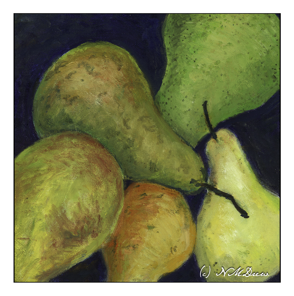
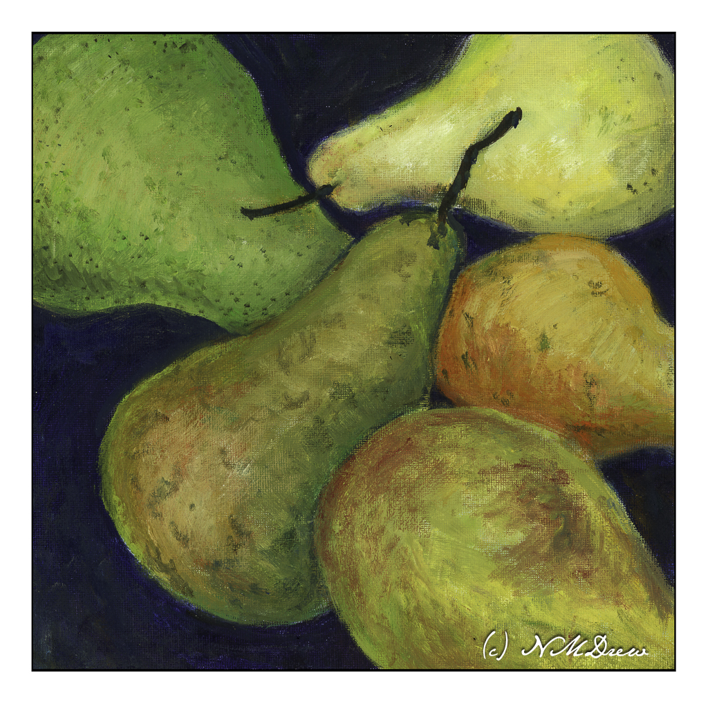
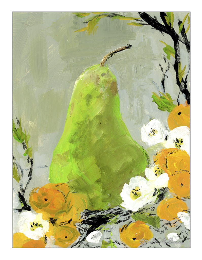
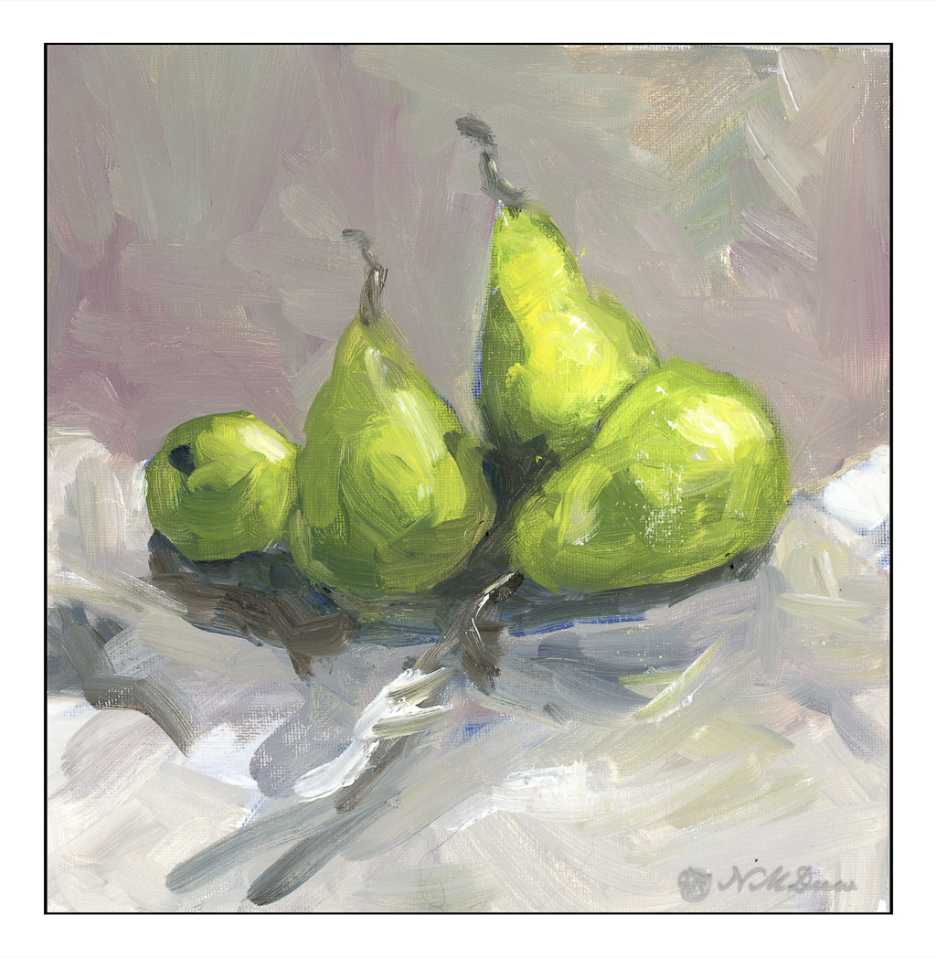
Autumn and pears – so, a D’Anjou as a subject, to see how blending can work with a flat brush. Then, just because, I added abstractions of flowers and mandarins. This was to just play with the paint and my own thoughts of simplification and abstraction of a real object. Blending isn’t smooth on the pear, but that was not my intention. Instead, it was to get a feel for the brush and the paint, using the strokes to create shape and depth, but not a photographic copy. I did this about a week ago.

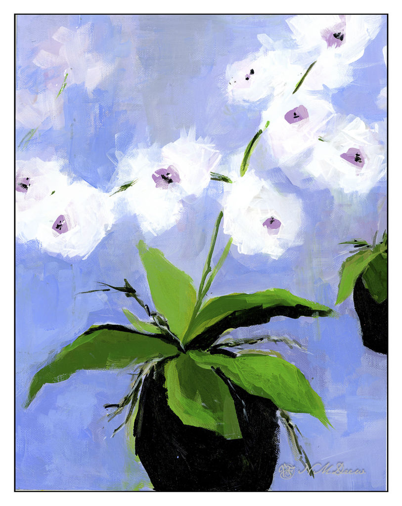
A few days later I decided to do a phalaenopis, or moth orchid, to focus on leaf shapes, flower shapes, and more abstraction and simplification. Additionally, I wanted to play with the background colors to see what and how they can affect the painting. At this point I am not sure where I am at with this painting, but am looking at it to make the decision. If you paint, you know staring at a painting for a bit can determine if it is done or needs more work – and what that work might be.

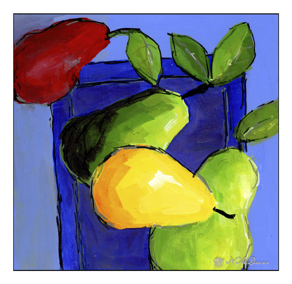
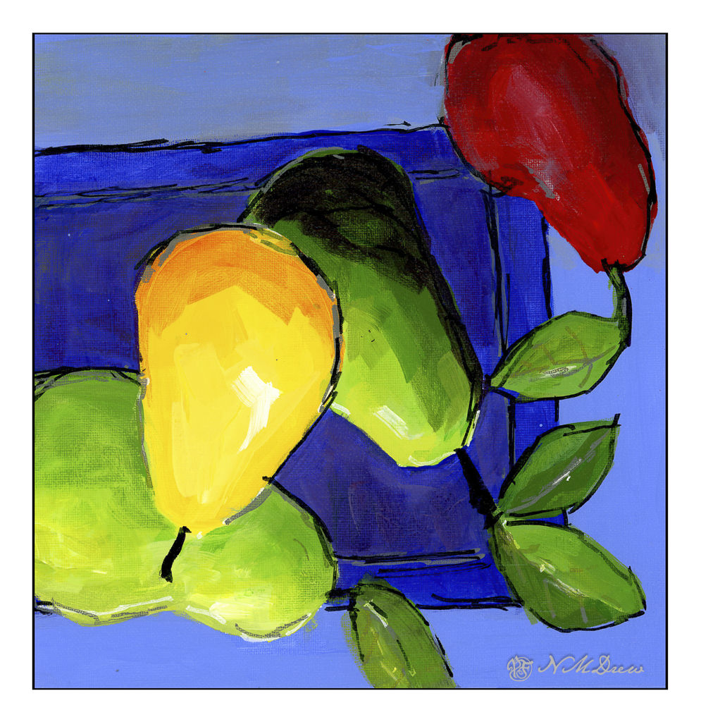
Finally, this one, a product of yesterday afternoon. With the preceding two paintings, I worked on just becoming familiar with the paint and specific brush as well as some ideas blubbing around in the back of my mind. This, though, was more deliberate in what I chose to do.

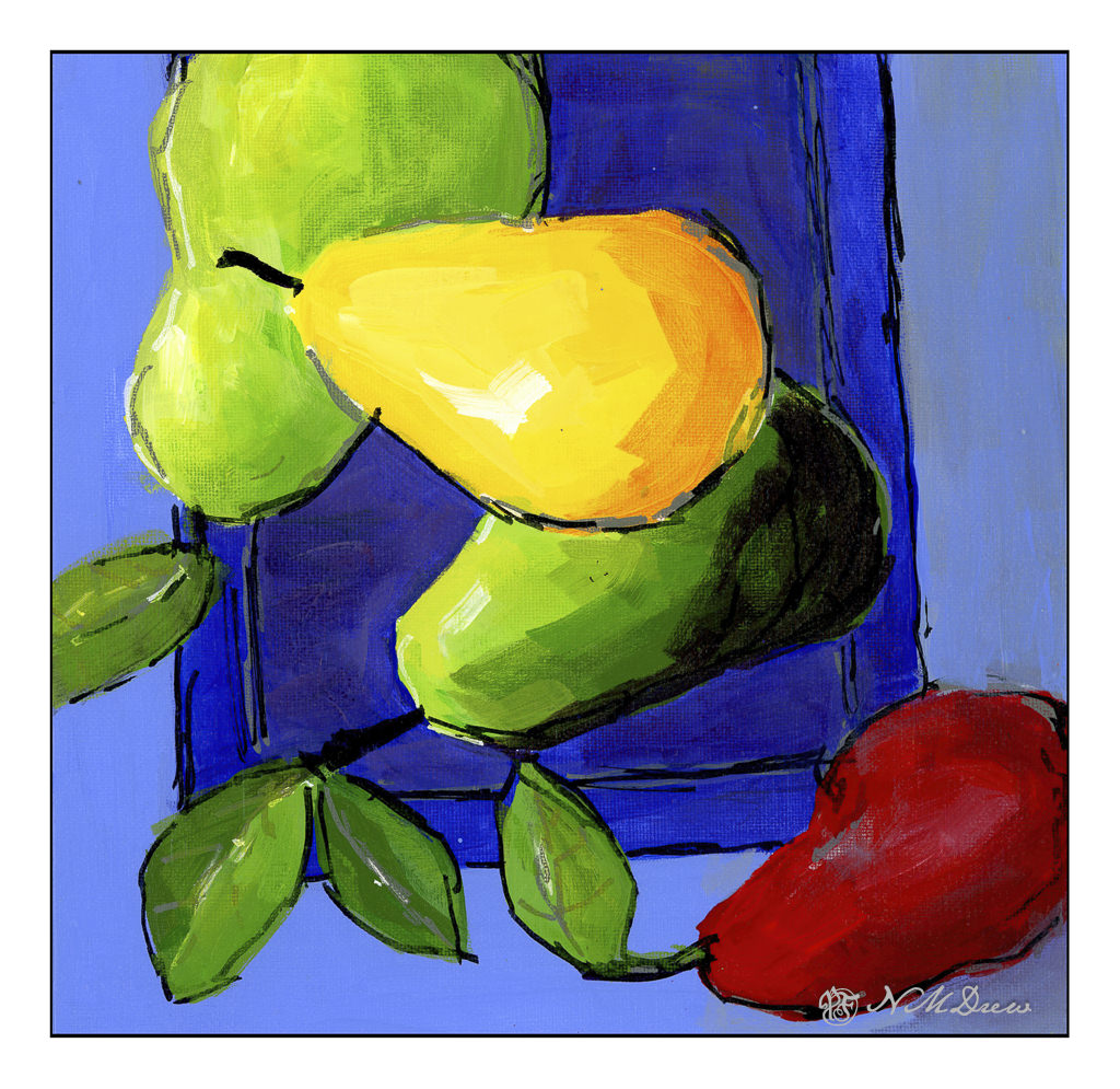
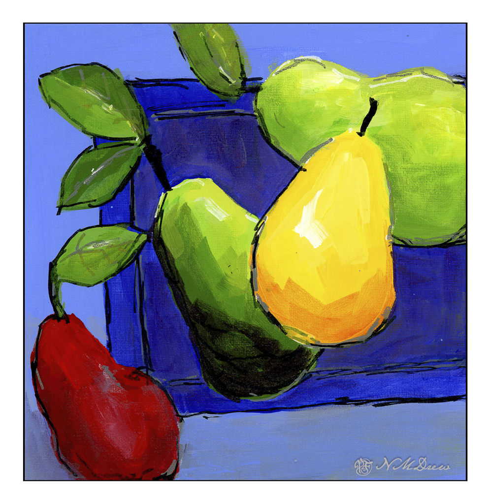
The first thing was to create shapes and colors. Pears, of course – they are so versatile and fun! Planes of color and blending of color variants within the planes. For instance, each pear is a given color, and then there are shifts. The top pear has more blended colors, but the remainder are a combination of brushwork for suggestion of dimension, shadow, and highlights. The red pear was hardest as it is less easy to create a believable red pear (IMHO) than with green or yellow ones. I used green and purple blended into cadmium red for the shadow, and a bit of grey to make the highlight in it. As with the pears, the leaves, plate, and background have the same elements of exploration.

Once I had the shapes and painting as I liked, I added lines. I have some acrylic markers in black, grey, and white, and used those to create the lines as well as touch up stems and highlights. This mark making was fun, and helped define areas with a strong line. What I found, though, is that the lines themselves could be a bit much. Thinning paint into a glaze or transparent wash helped tone down some of the intensity of all the marker marks. Glazes also helped to pull together some of the colors more easily.

The leaves were especially a challenge. I like the veins in the leaves but didn’t want to delineate them too much – just suggest them. The same with the leaf shapes and how they fold and catch the light. In the end, simplification, suggestion of light, and then using the markers to create the veins. These were dulled down by washes.

Overall, I am having a lot of fun with this. The pears on the blue plate are my favorite as far as a sense of achieving what I want, but all of them bring something to the table. The acrylic markers give a strong line, and while good, can also be disastrous. Each painting taught something as well as give a sense of satisfaction while opening the doors to further exploration.

Art is always evolutionary!

Fluid acrylic, acrylic markers, paper and canvas on board.

Practice

Over the next several weeks I am enrolled in a couple of oil painting classes. Acrylic paints really do frustrate me in a lot of ways, and please me in others, but it is time to work with oil paints on a more serious level. Let’s see where it goes.

To get ready for these classes, I pulled out some of my supplies. Of course, the oil paints come out – I have a smaller selection of colors than any other medium! I also have canvases in panel and mounted format. However, I did need to stock up on linseed oil, solvent, and other such stuff. And then paint.

Canvas mounted on panels is actually, I think, the easiest way to go. Canvas pads flop around and easily bend. Mounted canvas on stretcher bars takes up a lot of space but can provide a gratifying surface to paint on if properly and tightly mounted and prepared. For now I am using canvas panels which, while not super high quality, are relatively inexpensive and easy enough to prepare, if at all, prior to painting. 

I love pears! Painting them is far less tasty than eating them, but they are by far one of my favorite winter fruits. Here, some d’Anjous, all cuddled together. My focus here was brushwork and getting a sense of the unctuous quality of oil paints. Some people use the paints straight out of the tube, but I like mine to slide around a bit. It really makes for fun blending. The colors, too, were rather limited here for the purpose of seeing how they can interact. 

Here, more lavender fields. Why so many? It is because lavender and purple are honestly rather nasty colors to create from the standard mixes. I find that I like to have “convenience colors” on hand – namely, a good violet such as carbazole or dioxazine. Mixed with other colors and / or white, I get lavenders and such that appeal to me. I initially tried to just use variants of red, blue, and white for the lavenders, but gave up with frustration. Not worth the sweat! Maybe later I will master a good orchid lavender, but for now . . .

As with the pears, playing with the things you can add to the oil paints to thin them out. I used Gamsol and Soy-Thin, both low odor solvents. I didn’t use any linseed oil in either painting – that will come later – as will other things, such as drying agents like alkyds. 

The pears and the lavender field were painting on pre-gessoed 10×10 cotton canvas panels measuring 10×10 inches square.

3 Pears: A Study in Simplification

Pretty fancy title for an attempt to 1) take a color photo of pears, 2) reduce the colors in the photo to 16 so that fields of color appear, thus allowing an easier visualization of values, and 3) painting observed fields.

First, let’s put this out there: I really do not like painting outside at this point. I used my gouache paints for this study and had to take the following out to the table on the patio in multiple trips – paints, brushes, water, paper towels, image on a tablet, palette. Of course I forgot this and then forgot that, and it really just riles me up! If I ever want to have a plein air experience, everything needs to be consolidated in one thing to take all the little things out at the same time. Inefficient usage of my art supplies really makes me crazy. It is soooooo much easier to have everything in one place on a shelf rather than having to traipse hither, thither, and yon.

Okay, gripe session over. Using gouache on hot press paper, I used green in different values to depict light and shadow, somewhat successfully. I referred to my simplified image (which kept turning itself off on the tablet – another reason why painting from a reference photo indoors is so much nicer), and worked from there. Some areas of the pears were more yellow, as pears can be, and other areas were a colder green. This did end up showing in the simplified photo, and you can see it in the above painting.

I like to desaturate color photos or paintings to see how they read in black and white. This way I can get a sense of values in the colors I used. In the above painting, you can see that, overall, it worked in the pears. The shadows beneath the pears were nothing special and honestly not something I paid much attention to. Using desaturation, I see faults and areas for improvement. For example, the neck of the middle pear would benefit from more dark shades – middle values – to create a sense of the cylindrical nature of that part of the pear.

This was actually fun once I got into it, despite my frustrations with the outdoor set up. I have to think more about how I go about painting outdoors. The fact is the day was beautiful and nearly 70F for a bit of the afternoon. No wind to fight with. Later this week the rains will return (hooray!), so getting outside was probably the main point! Painting was just something to do . . .