I don’t know if I have published this image before . . . . I have a feeling I did, but cannot find it. Of course, with all the stuff I have here on IY&B, it makes sense.
I painted this a few years ago. I worked really hard to get soft tones and paints. I had been working mostly in acrylics when I picked up the oils and was used to the hardness I seem to produce with acrylics. So, with the blendability of oils, that was my focus of the exercise.
The results here have been sitting around for ages with the thought the painting could use a bit of work. Looking at it now, it seems finished enough. I am pleased with the moodiness and sense of a damp woodland as well as how you can tell it is a misty day by the colors of the sky through the trees.
No, I don’t mean life. I mean trees and piles of leaves and undergrowth – all the stuff that makes up a good fall scene! Some trees have dropped a bazillion tons of leaves and others are hanging on to them. Years of detritus build up on the ground, creating a fertile place for new growth, plant, fungal, insect, which in turn supports other life in the wilder world outside the super market.
Anyone who has taken a walk in the woods or tried to photograph or paint this jumble knows exactly what I mean – it is really a busy-ness of color and texture and shape.
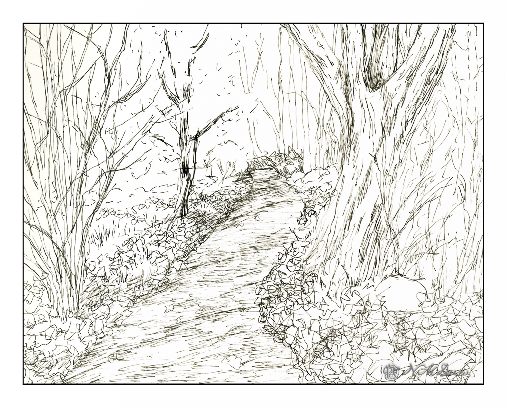
This is my sketch, done with a fountain pen and some Carbon Ink by Platinum. The paper is a bit rough so it could be what caused some difficulties with the pen nib – or the pen itself is not the best – or both. I tried to convey light and dark and texture with different pen marks. Straight lines to show trees and texture and the shadows of the trees across the pathway. Contrast is suggested rather than emphasized as I wanted to use paint to give the sense of shadows and so on. With that in mind, I pulled a palette of my out-of-the-tube paints rather than pan paints, cleaned them up and went to work.
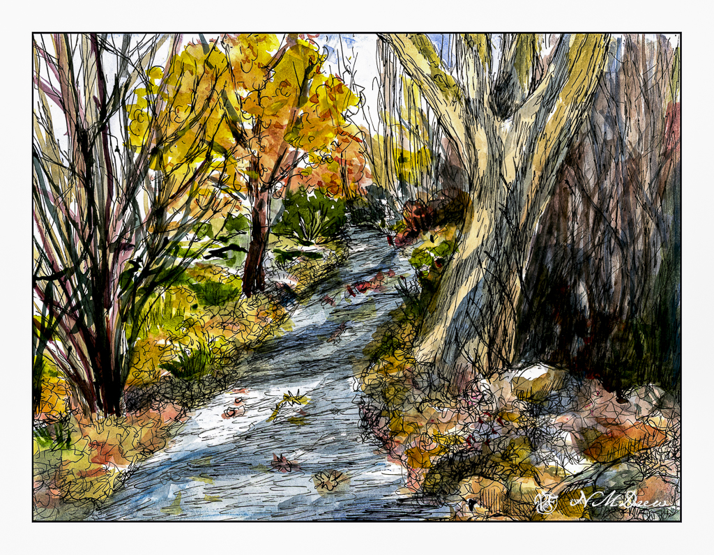
As you can see, light and dark are more emphasized with the use of color, as are the colors of the leaves and the complex shapes of trees on the left and undergrowth on the right. The leaves that have fallen have some variegation, depending on when they fell and how long they have been there. Green grasses and weeds peek through. There are a few rocks, too, and leaves on the pathway. Tree shadows fall across the trail and up onto the tree on the right. There is a brightness to the day despite the murk of the undergrowth.
After adding color, I waited for the picture to dry. I made some color adjustments. And then, back to the waterproof ink pens. This time I used Micron pens and my Uniball waterproof pens. Micron pens come in different nib widths (here 0.1, 0.2 and 0.5) and the Uniball is labelled as “fine” but in reality makes a darker, thicker mark than the Micron pens.
Overall, I am more pleased with today’s ink and wash sketch than the one I did yesterday of the plumeria. As usual, I did not do a preliminary pencil drawing but just worked from the end of the path and then moved back and forth to establish areas. I really like my tangled tree in the lower left and the shadows on the big tree on the right. The brightness of an autumn day is expressed. Now all I have to do is get to scuffling through those leaves and it will make my day.
Pen, ink, watercolor wash, on Strathmore Vision 140# CP paper, 9 x 12.
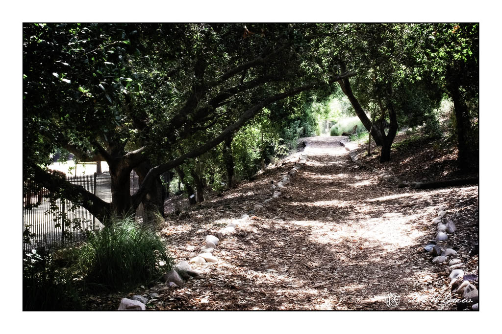
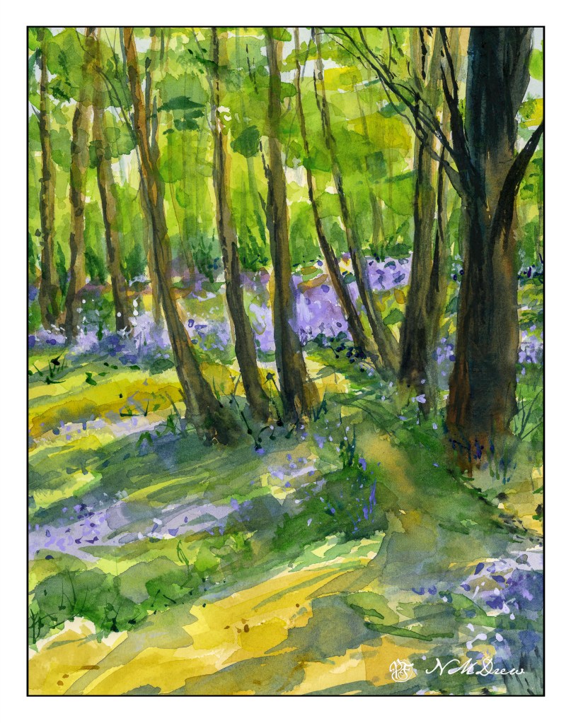
Yesterday I went to the local botanical garden, Smudge on leash, Fuji X100V in hand. Smudge is really good about stopping and sitting and waiting for me as we take a sniffy walk around for her and a looky-lou walk for me. It is a stop and start proposition.
As any photographer know, dappled light is hell to try to catch, especially if there are flowers under the foliage, a bit of wind, and so on. The cameras just cannot do it justice and our eyes see more than the camera in many instances, digital or film. But, I was determined to find something to both photograph and then paint.
I doctored it a bit in post as I wanted fairly strong contrast and warm / cool balance. This one pleased me. It is right at the gateway to the botanical garden and the path zooms off uphill, which we see ahead and to the right, and downhill, which is behind me. I always enjoy this section as I can choose my adventure.
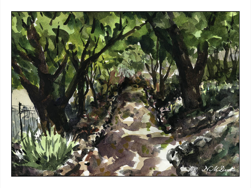
I tried to keep this painting fairly close to both the values and perspective of the photo, but as always what I see and want is not necessarily what I paint. My sense of depth is not good and I often find it happens when I paint. I know a few tricks, but that is not always something I “get” – oh, well. Nonetheless, I rather like the dappled light I did get even if the end of the path ahead is rather wonky.
This took me a bit of time to do, and I did it in my sketchbook. Sort of a “serious” study, but because it was a sketchbook and I did it at my desk I didn’t take it too seriously. Cramped and messy space to work in but it did work out fairly well. I wonder if this ability to work in limited areas, such as my desk rather than my drafting table, will also help when I decide to go plein aire . . . .
Up the Hill – Final Painting – Signed on Lower Left in Liquitex Acrylic Black Marker!
Finally! I am dee-oh-en-ee. I took the painting I thought was sorta done, talked with my teacher, and we decided to add a few more flowers. So, I did, and signed my name on the left. On the right I have my digital signature.
I really enjoyed doing this painting. It is on 12×16 Fredrix canvas pad, primed with gesso, and painted over about a 3-4 week period. It is a pleasant break from monochrome – but that is for another time. Today, let’s enjoy Spring as we go up the hill.