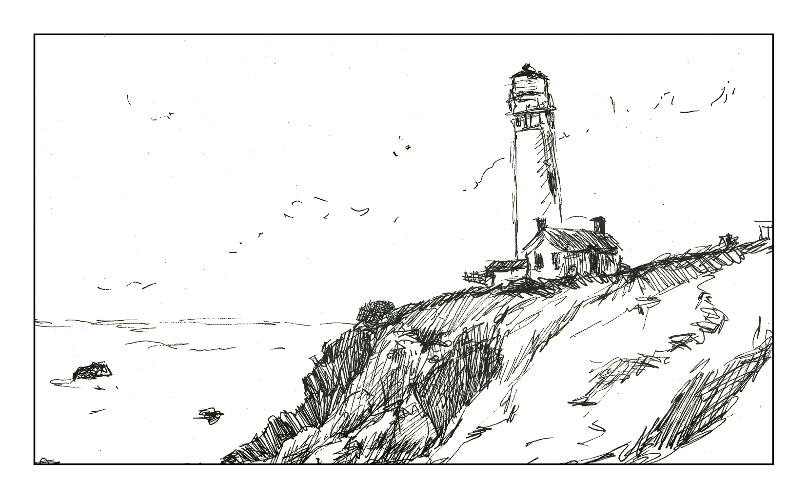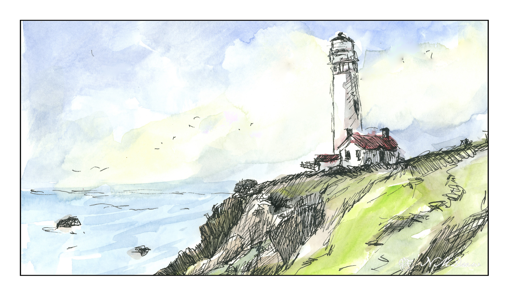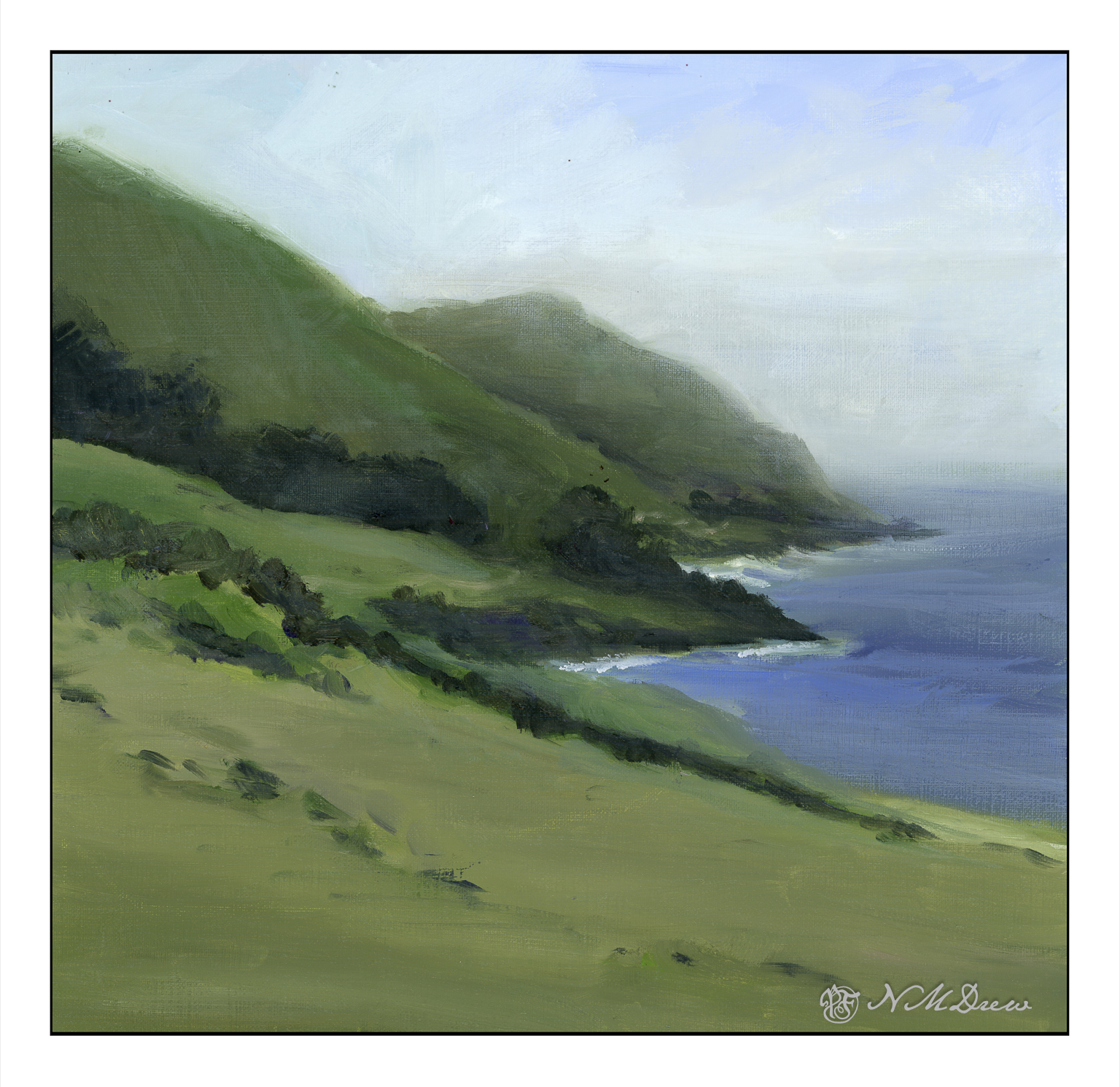
Big Sur along the California coast is an incredibly beautiful bit of the state – at once wildly beautiful, in many ways easily accessible along Hwy 1, but delicate, too, as it is easily destroyed by heavy rains creating mudslides. Parts of it are rugged with mountains rising up and coming down into the Pacific Ocean. Hwy 1 skirts along, and it is always best to be the passenger so you can enjoy the wonderful views.
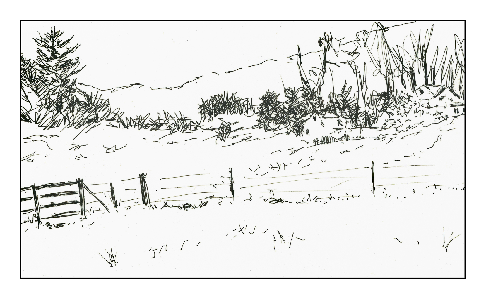
From where I live, you drive north, past Santa Barbara and then veer off on the 101 in an area marked on the map as Las Cruces. You could continue up the 101 up to San Luis Obispo, cutting west toward Morro Bay and then along the coast. Before you get deep into Big Sur, the mountains are toward the east, and there is a coastal plain. Slowly the landscape changes as the flatter areas disappear and the mountains move ever closer.
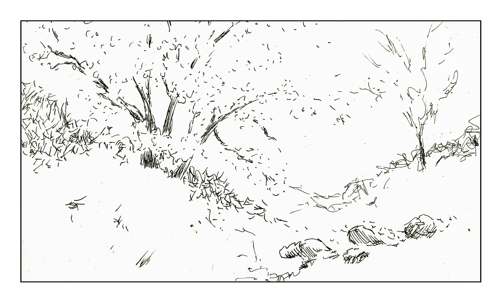
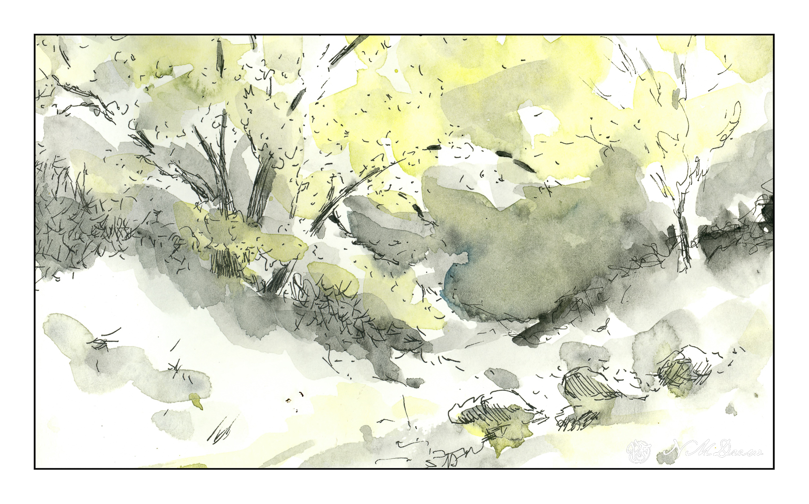
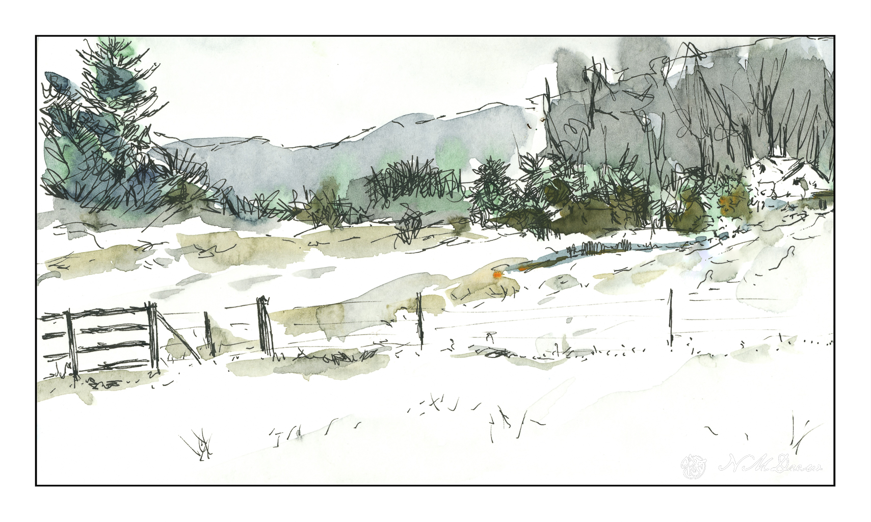
The entire drive is a delight. Coastal fog may drift in and out, and no matter where you look, the beauty is breathtaking. I have tried to catch this in the distance and along the horizon. The Canson XL paper is nice to paint on, and I used Gamblin Galkyd gel to speed up the drying time, but it sat in the garage this past week so I could ignore it and look at life away from the studio. Getting some time away from a painting is always a good thing as eyes are fresh upon the return. I was pleased with what I saw, and so scanned it, and present it to you for your viewing.
Painted on 11×14 Canson XL Acrylic / Oil Paper, about 10×10.