Tomorrow is a family gathering, quite possibly the first since last year. This morning I cleaned up clutter and sorted out things, did all the first-of-the-month stuff, and so on. Meanwhile, the esposo is working from home and making both beef and chicken barbacoa in between saving database lives. I have already run around town collecting goodies, as have other family members, so we call enjoy a bit of a feast and each others’ company tomorrow with good food and good company.
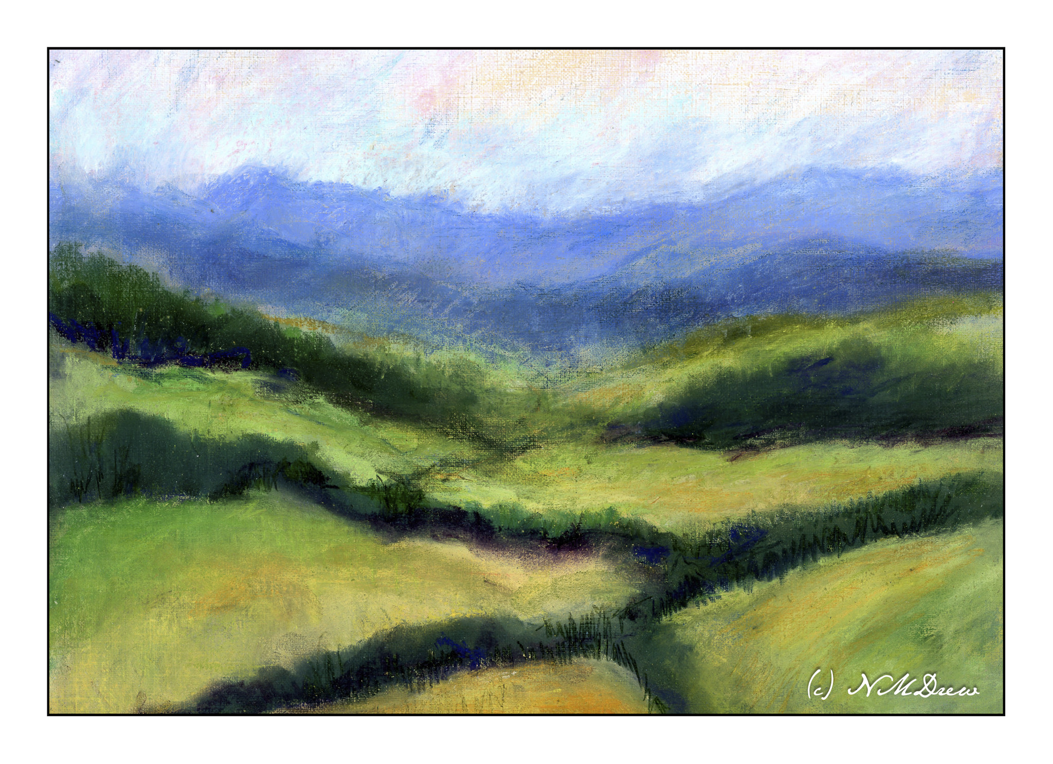
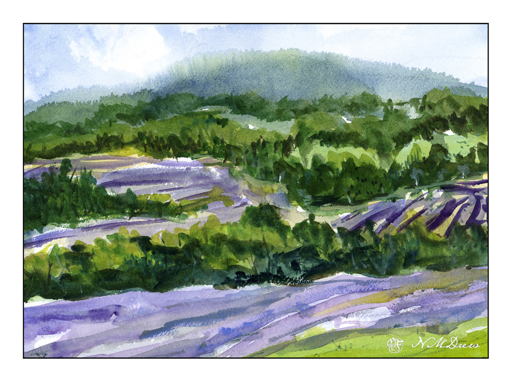
Of course, a girl can only do so much and then the painting gods and goddesses beckon. Once more, lavender fields call, so here some are for your enjoyment.
Technique was primarily wet, beginning with they sky and distant mountain and trees, letting things bleed into each other. I like the misty effect and sense of distance it creates, as well as the suggestion of tree-covered hills. From there, greens and lavenders, lines and directional shapes. Final details were some dry brush lines in the foreground and in the tree shapes to create texture and vertical movement. I used a large mop brush (#6, Princeton Neptune) for the entire painting until the end. At that point, I took a small stiff brush to add some of the finer lines and dots.
Part of me thinks I could have done a bit more of a light lavender color, but overall, I am pleased with this painting.
Watercolor, Arches 140# CP paper, 9×12.