Over the past year, I have gotten some requests about recommendations for sumi-e / ink painting books. In my own collection, I have a number which are still available on today’s market. Current books will be the focus for today’s posting; later I will move into other books in my library which may still be available as used, or in re-issued editions. Calligraphy books will be in their own postings.
These are technique books. Some are filled with little text and a lot of pictures, others have a lot of writing as well. There are times when I love to read, and there are times when I want a picture to copy and learn from it. My mood and subject interest will determine which book I choose.
By copying a picture, you have to analyze what is going on, and figure out how you will do it. This means looking at the brush strokes – even if there is a description in the text on how to load the brush, angle it, and move it. It never hurts to do these as practice because that is how we all master anything – through repetition, thought, doing.
Current Sumi-e / Ink Painting Books
 Copying the Master and Stealing His Secrets, by Brenda Jordan and Victoria Weston
I am placing this book a the top of the list because it is important to understand a bit of the history of an artist’s training in traditional Japan, not just in modern times, but hundreds of years ago.
Copying the Master explores the handing down of painting traditions in Japan from one generation to the next. Students may vary in ability, but the skills taught allow the student to gain technical skills needed for successful painting. Japanese tradition in teaching is through observation, not explanation, at least in the arts, as I understand it. This book has some amusing stories behind the students’ learning, as well as give the reader an appreciation of what it meant to be an art student in an artist’s atelier. Whether or not the old masters of the Renaissance taught their students in the same way is an interesting thought – natural skill, observation, or was it more didactic, as we may find in today’s art schools?
For myself, this book is of considerable importance because understanding the traditions behind Asian art training really helps lessen my sense of guilt about copying someone else’s work! After all, plagiarism is seriously frowned upon; the same may be said for copying another’s artwork. Besides that element, this book broadens the reader and artist’s appreciation of the cultural and historical context of the training of artists, as well as acknowledging the whims of fashion and social attitudes about the roles of men and women in the art world.
 The Mustard Seed Garden Manual of Painting, translated by Mai-Mai Sze
In and of itself, this is a really wonderful piece of work. The reason for this is because it has been in print for over three hundred years, in China and Japan – there is a traditional approach which may seem odd, but it does lay a foundation of appreciation for Chinese painting and its place in time. For the westerner, this book gives valuable understanding about the structure of plants and animals in brush stroke and in outlines (created using a brush). Because of the fact these images are derived from woodblocks, the nuances of the brushwork are lost, but if you copy the examples, you will create your own subtleties. In my own library, I have a ten-volume series of this book in Japanese from the early 1900s (I think).
 The Way of the Brush: Painting Techniques of China and Japan, by Fritz van Briessen
This book combines a history of Chinese and Japanese ink painting along with examples of specific brush strokes, their forms and shapes, and how to do them. While this is not a book for the beginning painter who wants to dive in and just do, this book is, in my opinion, a necessity to begin to understand the aesthetic of ink painting.
Many beginning ink painters – myself included – are lead to believe that all is spontaneous scribbling and splattering. “Anyone can do that!” is a common approach. When you get into this book, which may be a bit of a challenge, you learn far more than you ever thought was possible about ink painting. There is work involved, planning, and thought in a picture, and even though it is only ink on paper (something the Western sense of art tends to devalue), any sumi painter knows that one wrong brush stroke can destroy a painting. When the appreciation of the mastery of brushwork is gained, a greater appreciation for Asian artwork is gained as well.
For myself, gaining mastery of a brush is essential to my appreciation of Chinese and Japanese art. As someone with a bit of experience in art media of America and Europe, I have to work very hard to forego my cultural definitions of art. This is not something I have been able to achieve overnight, but something that has come about through my own painting. Understanding aesthetics foreign to our own allows a greater appreciation and a deeper valuation of an art, whether in ink painting, pottery, or literature, to name a few.
 Chinese Painting Techniques, by Alison Stilwell Cameron
This, like van Briessen’s book, is another book that is informative and practical. Cameron spent her childhood in China, and spoke Chinese as her first language. Her training in Chinese art began in her youth, following traditional subjects and training methods.
Cameron does not go into the historical details of Chinese painting, but she does go into the different styles of painting. She covers brush strokes and their structure; plants, animals, and people; spontaneous painting, and best of all, explores fine line painting. The scope of this book is broad and much of it is general, but the detail of writing takes the student / reader / artist into areas of ink painting which many books do not cover.
 Japanese Ink Painting: The Art of Sumi-e, by Naomi Okamoto
I’ll admit to some prejudice in favoring this book, partly for the author’s name (!), but also because of the fact Okamoto is from Japan, and has been trained in both Japanese and European art traditions. As a result, she demonstrates sumi-e in both ways – the gentle, simple, clean aesthetic of sumi-e, as well as the illustrative use of ink in more Western traditions.
The medium of the ink stick is not one in which most westerners have been trained. In school, it might come along as part of a cultural awareness, but it is not taught in most school classes as an ongoing point of study, such as pencil drawing or watercolor. Higgins opaque India ink is what most people will think of when it comes to “ink” for artwork. I think many westerners approach ink painting as an experience so different that the artist really does not learn to appreciate its value as a medium. Without color, the ink only gives us black and white and shades of grey. The characteristics of the ink, and the type of paper used, also are odd to us – unsized paper?! That is usually cheap newsprint. If you look at Okamoto’s landscape and figure paintings, a different appreciation of ink-on-paper can be developed.
Finally, Okamoto approaches subjects in a less messy and splattery way than a number of western sumi-e painters. I enjoy her structured approach, which is not tight, but more graceful. I have learned a lot from this book that I have not found in others; if I were to put it into words, I would say that I understood the simplicity and elegance of an ink stroke most fully in following her instruction – a very subtle experience.
 Japanese Ink Painting: A Beginner’s Guide to Sumi-e, by Susan Frame
Susan Frame combines watercolor techniques and sumi-e strokes in an uniquely personal way. There is spontaneity in her work which is expressed through a mastery of brushwork. Most sumi-e is black / white /grey, but Frame adds color intensively.
Brush strokes are demonstrated in this book, and while the author does not go into great detail, the information is clear and well presented. The student can learn from this book, as well as realize that ink painting does not need to be confined to one’s perception of ink and its role in artwork.
For me, this book is not just about brushwork, but also about having fun, not taking myself too seriously, and letting go. Frame’s work is splashy and expressive. My only criticism is that her work appears more Chinese in influence than Japanese, but that is simply my perspective.
 The Sumi-e Book, by Yolanda Mayhall
Yolanda Mayhall’s first book, The Sumi-e Book, covers many of the basic strokes of sumi-e and ink painting. Because she does not introduce color, the beginning student can truly appreciate the nuances of gradation and the impact they have on paper. From basic brush strokes, demonstrations show how pictures may be created. Overall, this book covers enough for the beginning student to gain mastery if he or she has the correct supplies.
The Sumi-e Dream Book, by Yolanda Mayhall
I have mixed feelings about this book as far as some of the illustrations – the “dream” pictures make me a bit edgy – but the illustrations of brushwork, flowers, and landscapes are quite enjoyable. The subtle colors of many of the illustrations bring out the beauty of the brush strokes, but I find that in the very colorful paintings the brushwork is easily lost.
Artists need to explore medium in different ways, not limited ones; the creativity of Mayhall comes through quite clearly. I also enjoy the fact I can see the evolution of her work and the influence different art traditions play out. The biggest value of this book is that it takes sumi-e and utilizes it in a melding of both East and West.
Conclusions
Any student of sumi-e / ink painting should know of the traditions behind it, its cultural and artistic significance in Asia. I think that an appreciation of a traditional art form in its own context takes it beyond just something to look at, and brings it into a realm of personal understanding – I can appreciate a brush stroke far more than before because not only have I read about the training, I have done it, I do it, I struggle to master it. I know its continuum.
At the same time, I am also a product of western culture and its values and aesthetics. Being able to take ink painting into my own sense of aesthetic is important for my own expression. Some people may not approve of the works of Frame or Mayhall, as they break with tradition, but they have a significance because they demonstrate how cultures meld and art develops. Western art has also made its impact on the visual arts of Asia – there are some very fine oil / acrylic / watercolor painters who have learned our traditional media and mastered it, blending it with their own traditions, and creating wonderful pieces of art.
If you are a serious student of ink painting, I recommend all of these books, each for a different reason.


 From circles and spirals, came a series of circles – some of which developed an incredible dynamic quality for me.


 Bone Lines


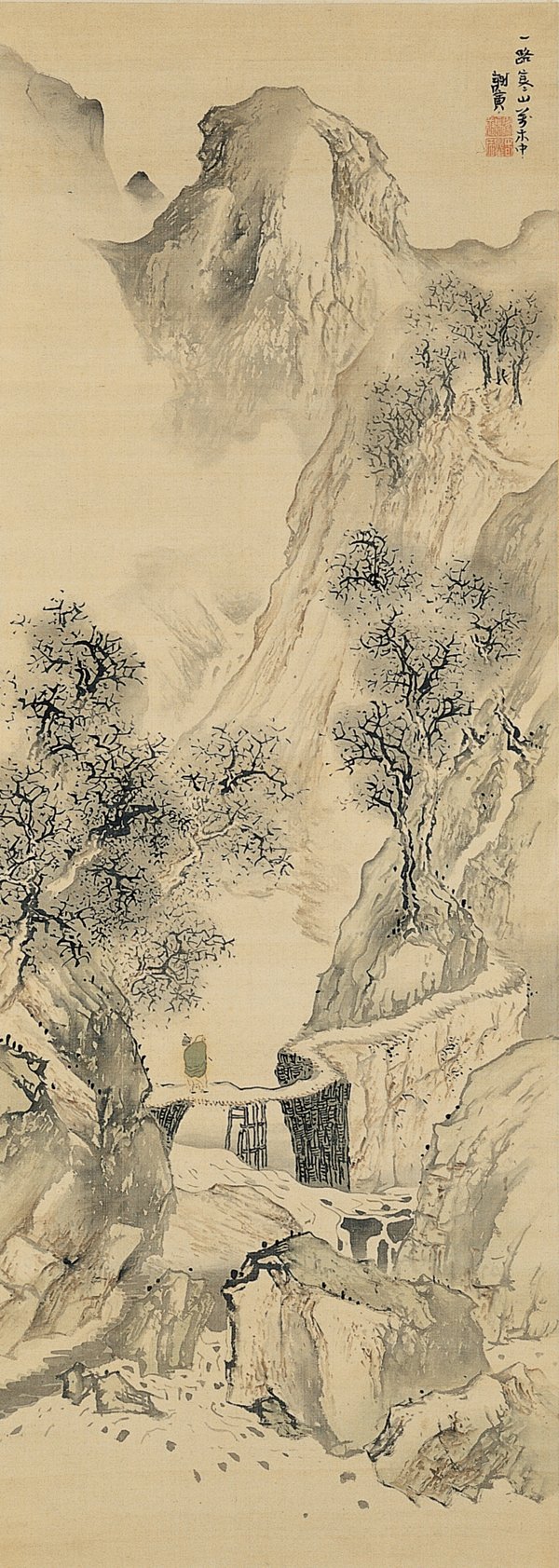
 Copying the Master

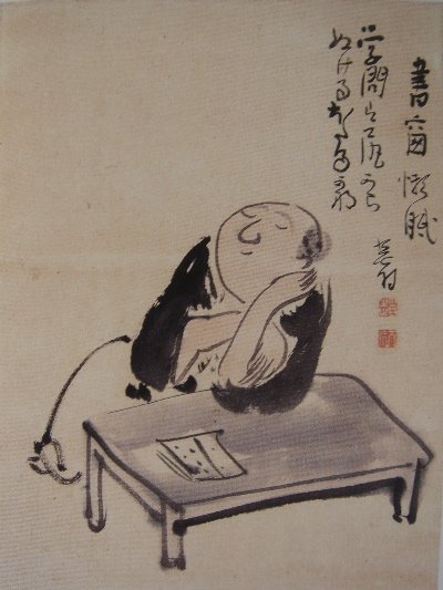
 And now?