Boring Waterproof Ink

I had hoped to have a nice dark ink on this paper, using a fountain pen filled with waterproof ink. The ink is waterproof, but it is so pale I fell asleep. If you are going to do a line drawing and then color it in, you need to have a dark ink. The ink was definitely waterproof, but so what if I don’t like the result?

I also used my cellulose paper sketchbook for this, and once more I am not happy. All these blobs of unabsorbed color and a few more than many times using the hair dryer.

Maybe I am not being realistic about the paper, but I am realistic about the point of this study – is the ink waterproof? And that answer is yes. Goal met.

Corner

I live in a typical American suburb built in the late 20th century.  It’s pleasant, and not on a gridded platte.  Here, in Monterey, is an older neighborhood, most likely dating from 1910-1930 when neighborhoods were built and the streets ran parallel and perpendicular to each other.  If care is taken, or upscaling occurs, these neighborhoods are charming and pleasant for walks.  The houses here are smallish and closer together than where I live, but a part of me is always drawn to these areas.  They are usually near downtown (older downtown) and very pleasant for walking.  Here, the road slopes steeply down to the left, while the one on the right and out of sight is straight.  Good place for exercise and sight-seeing.

Along the Italian Coast

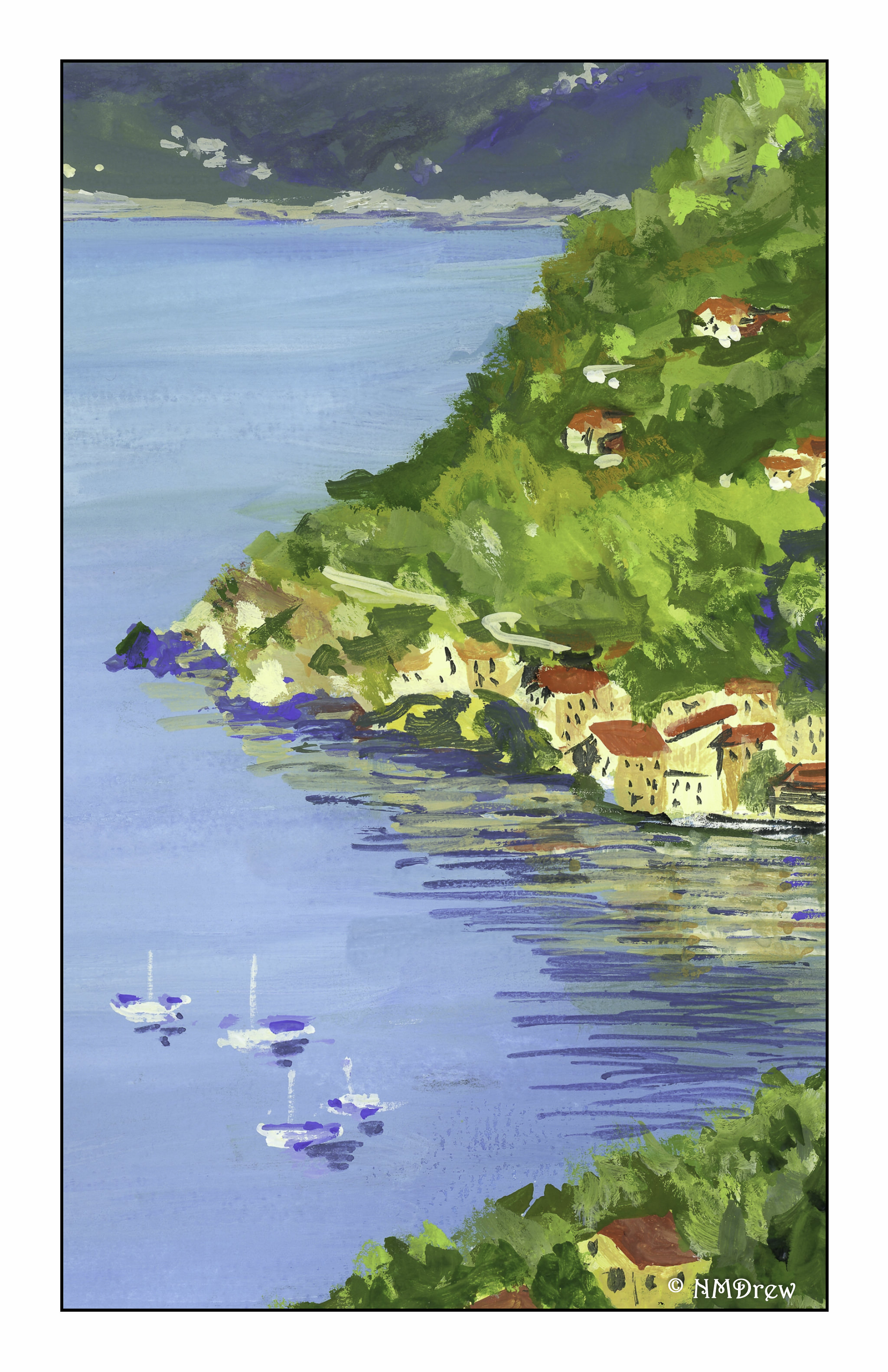
This was a rather fun painting to do just because it forced me to really rethink using white.

The ocean was the problem.  I thought I had put it in so it would be fairly light, particularly toward the distant shore.  Instead, when it dried, it was darker than I wanted.  The trees on the hill in the midground were essentially the same value as the water!  This was quite an eye-opener.  In the end, I put plain white (zinc) onto the paper, and kept blending it in until I got it where it was acceptable.

From there, it was back to the background.  It was also too bright.  I toned that down, and greyed it up a bit.  The background shore was too bright.  More work.  Then, back to the midground, foreground, buildings and boats.  I painted – with oodles of white! – the buildings, making them abstract shapes and then adding slightly darker shades to make the buildings seem 3-D.  More trees.  Finally, reflections, boats, and their reflections.

While I don’t consider this to be one of my better paintings, it is certainly one filled with lessons, in particular the usage of white (lots!), perhaps in the future check the colors on a separate piece of paper to see how light or dark they will dry, and finally deliberately trying to create abstract color blobs for buildings and trees that are discernible as such, but still indistinct in the distance.

I am ordering more white today!