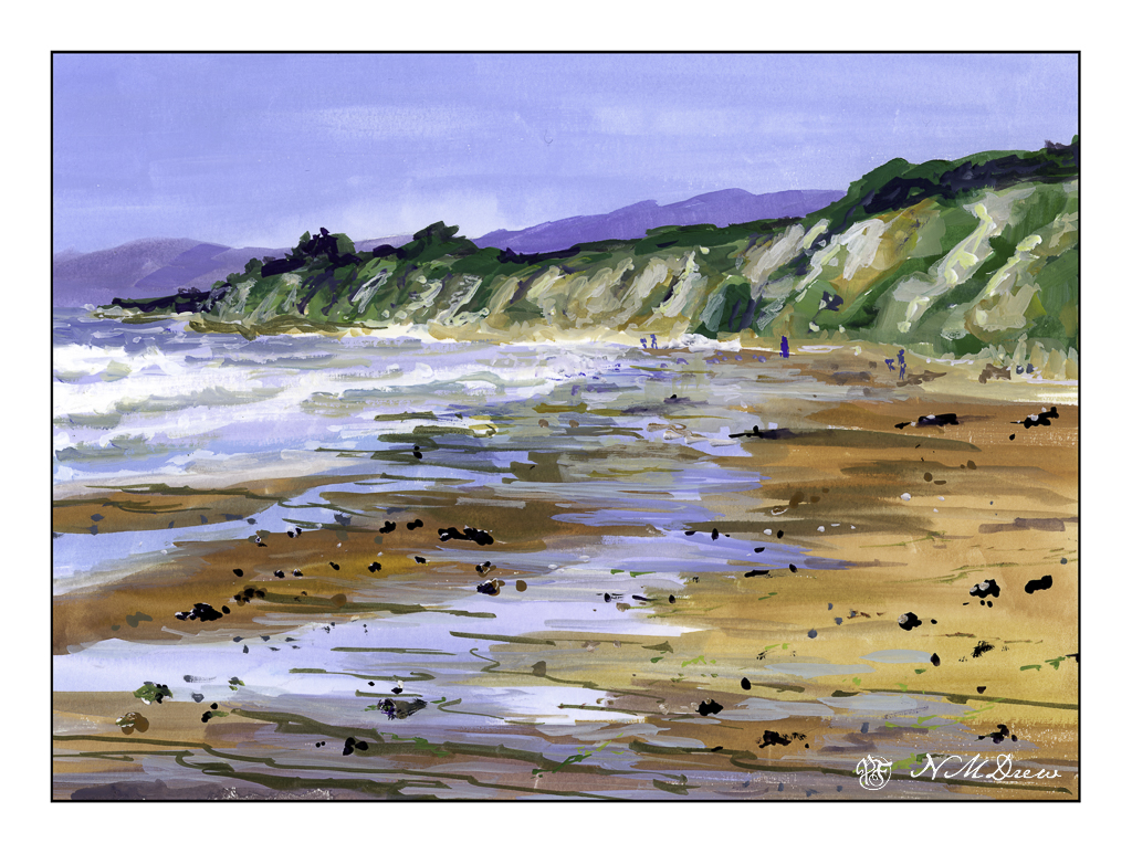
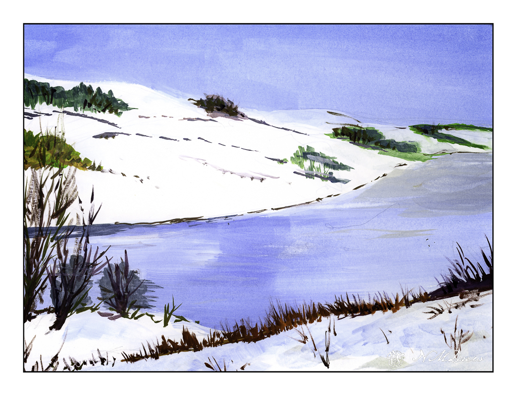
I’ve lived on both coasts of the US as well as been to a few other places. The color of water never ceases to interest me -blue, turquoise, grey, green, fluorescent!
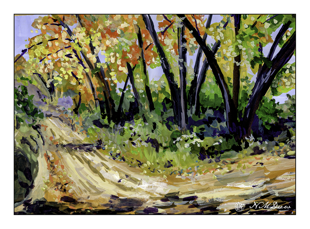
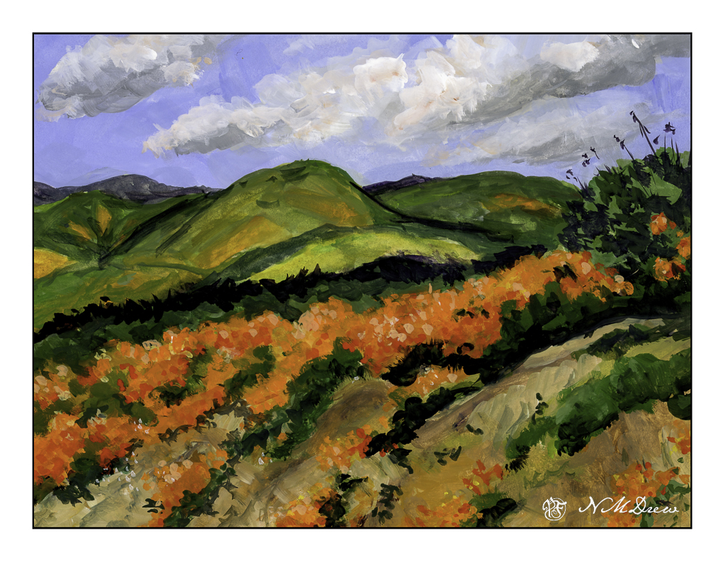
Along with the waters, the intensity of colors is also dependent on where you are and the weather. Here in California, as in other dry climes, when the sun is out and the moisture in the air is very low, the light has its own intensity. This light changes with the seasons and the tilt of the earth. Landscapes without water problems are more abundantly green and often may seem softer simply as the water in the air creates an invisible filter.
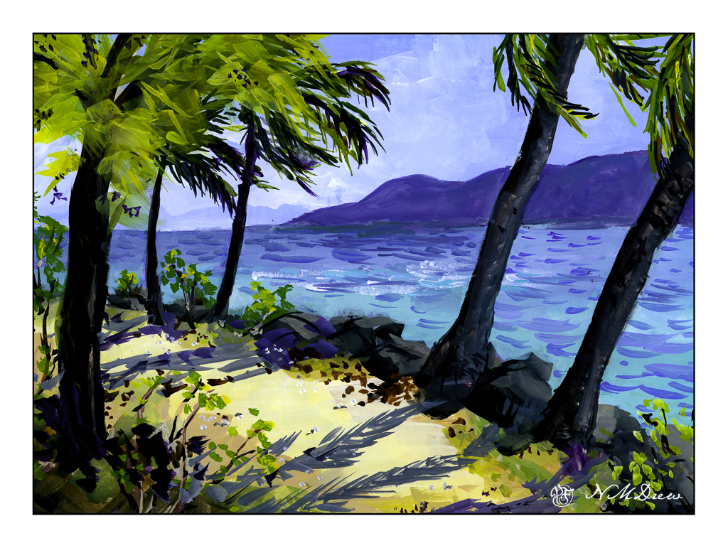
Like many people who have enjoyed harsh winters, tropical scenes with palm trees seem like paradise! And I will leave that thought – paradise – up to your imagination!
Gouache, 9×12 Strathmore Vision 140# CP paper.