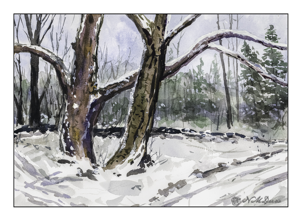
If you have been reading this blog awhile, you know I live where there is fire and not snow. Still, winter does come to my warm (ish) part of the world, and with it memories of tromping through the snow under spreading trees along a lake shore.
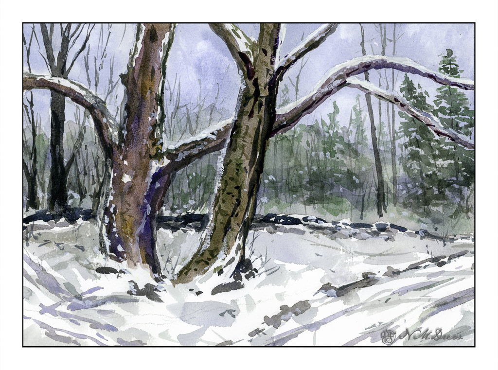
I use two software programs these days to scan my paintings – and I rather like the way they end up, similar but different. Above is the one using VueScan. Below is the one using Epson V600 and its software.
Epson software is more inclined to push colors, but in this case it does a decent job and pulls out more of the colors I put into the tree. Both scans are pretty much straight out of the scanner. Your choice as to preference!
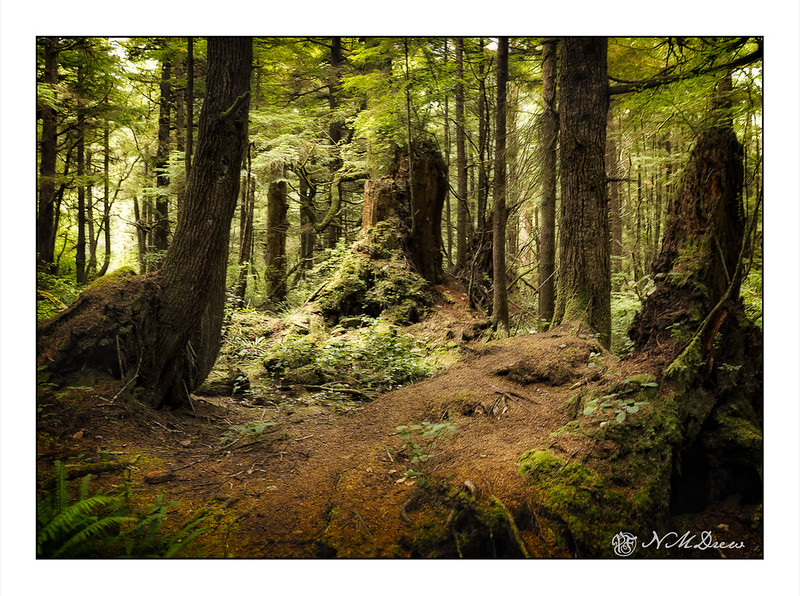
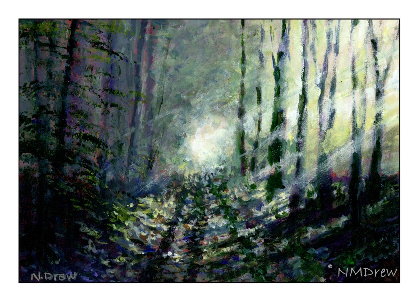
About 10 years ago we spent several weeks exploring the Olympic Peninsula in western Washington State. This corner of the country is home to rain forests and here, a virgin forest of ancient cedars covered with moss and dripping with foggy condensation. To get to Second Beach, we took a trail through this forest. At times I wondered if we were still on the trail, but there were others, too, bound for the beach.
This forest goes straight out to where the beach meets the forest. One moment you are in a dripping and scary forest, and the next minute, out on a wide flat beach with sea stacks, and behind you, an edge of a forest that all looks the same! Luckily, the exit to the forest and entrance to the beach is clearly marked, otherwise, I doubt few people would make it back to the parking lot.
I don’t think I have ever seen anything as magical as this forest. Nor, do I think, have I ever visited a rain forest. It was very quiet and eerie, but I recall birdsong, dripping water, and the fact it was so quiet even with others nearby. The trail was covered with fallen cedar needles and moss was thick everywhere. A hush pervaded and could be felt like a blanket, yet it was comforting and joyful at the same time. Seeing such beauty reminds us other, older times, and the magic in the natural world.
For the past several weeks I have been immersed in painting classes – 2 or 3 a week, and too many hours to count. I finally decided I was doing more than was good for the rest of my life, and decided to cap it to a few hours a day. That balanced things out as I was getting rather nutso.
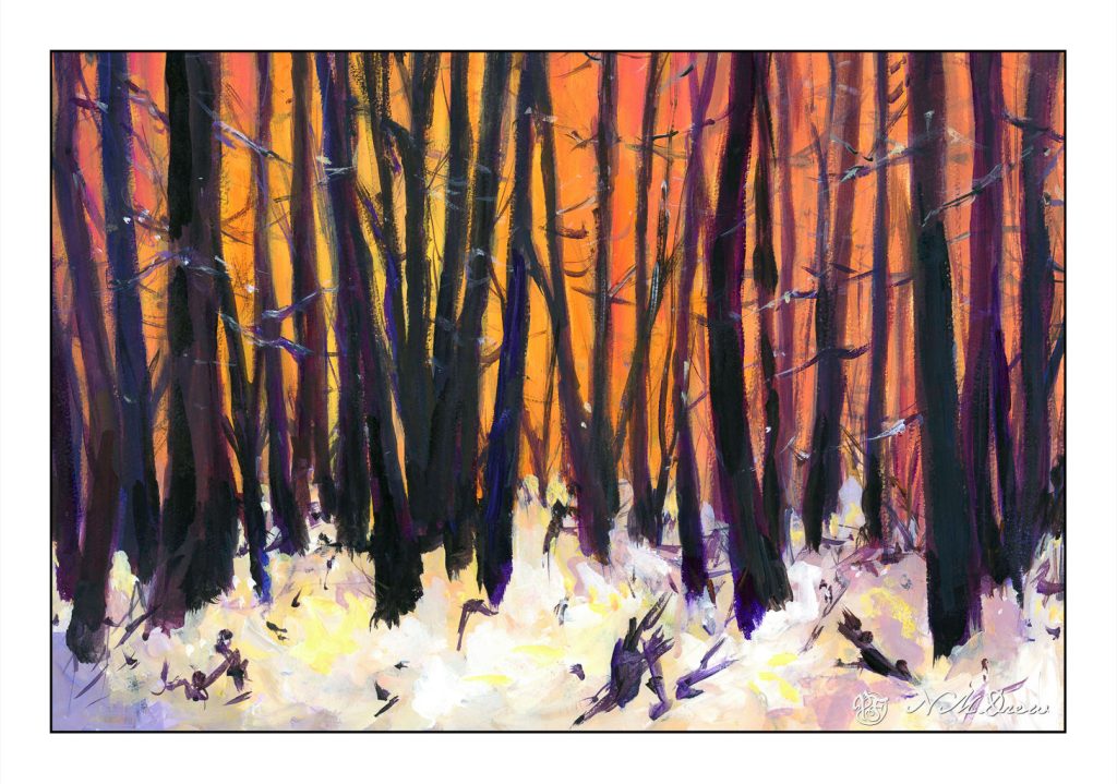
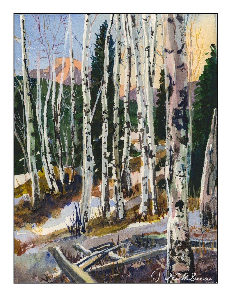
This is based off a Pixabay photo of trees and snow, at sunset or dawn. I am not sure if this one is “finished” yet, but think it is done enough to scan and put online. It is acrylic paint on a piece of 11×15 watercolor paper. I decided to use it as the paper is 100% cotton but the sizing is not good. As I bought the paper a long time ago, I cannot return it.
One thing about painting in acrylic, you can paint on a lot of different surfaces. I like the feel of paper beneath my brush more than a canvas panel that I have gessoed. Maybe it is because I am used to its surface texture, but there is more of a connection there with its surface – smoother than a cotton canvas panel, but with some tooth. I do plan to learn more about oils later this summer but need to play with it a lot more and figure out where to paint as oil solvents, while now often odorless, are still volatile and not exactly something to be breathing in a closed space.
As I work on learning how to paint I also explore different artists. Right now I have been looking at a lot of the Russian artists of the Impressionist variety along with ones from the 1930s, such as Nikolai Timkov and his fellow painters. Impressionists and more modern painters appeal to me because their sense of color and brushwork, as well as subject matter, are more to my liking than any other era. I like abstraction, too, so a bit of all of these appeal to me. Strong graphics, elegant composition, good colors get my eye. Art is really a personal thing anyway. What I want to hang on my walls may be nothing you would even consider . . .
All this painting is also making me think about brushwork. It expresses so much. Smoothly blended or broken? I think the next exploration will be broken brush strokes and trying to choose a color and put it down – paint it and leave it, as Ian Roberts is telling us!
Birch Trees – from a photo in Module 2 of Andy Evansen’s Class
If you have been following me for a bit, you know that I have enrolled in a lot of painting classes. This is a study from my watercolor class, online with Andy Evansen. His work covers a lot of subjects, but I like his ones of the natural world the best. So, lazy me, I stick with his photos of the wilds, but will, at some point, take the dive and do something with buildings and people, and maybe even cars.
I used frisket to create the hard edges of the birch trees and the snowy areas of the logs in the foreground. The other white areas, the snow, is plain paper, no frisket. After the frisket dried, I did the sky, sunlit mountain, and dark background. Then, a bit of the foreground. Finally, the frisket was removed.
When the frisket was gone, I worked left to right, creating the shadows of the birch trees. Upon those shapes I added heavier paint to create the blacks characteristic of birch trunks. Various other details got worked in. White gouache came in handy to clean up some of the birch tree trunks as well as to create the fine branches of the trees toward the top of the painting.
The only thing I have some issues with is the very large birch tree on the right, the one which stretches top to bottom. It is not quite right, but that is something for correcting later on. Despite that, I am pleased with what I am learning, and creating, with all these classes. Painting and drawing and artwork is in the forefront of my mind these days, and it is beginning to show in more “successful” paintings from my viewpoint.
9×12 CP 140# Arches paper; primarily watercolor with a touch or two of gouache. (Maybe 3 or 4 or more….)
Today is my fifth painting with acrylics. I felt confident enough to choose a more complex subject, using (of course) another YouTube video. I am learning a lot by following videos, especially ones that suggest brushes and colors, as well as explain techniques.
This painting is done on Fredrix canvas pad paper, 11×14. The canvas, though already gessoed, was gessoed by me. I like that step and feel it is a good way to begin a painting, much like grinding ink prior to doing sumi-e. There is a meditative element to it.
Murray Stewart, whose video I followed, painted his underlying canvas with burnt sienna. I used red ochre and found that the color is just yummy! I live where red soil is known, so it was like seeing an old friend. That said, from there I pretty much followed through the video. About half way, Stewart mentions that the basic work was done, and details were what were needed to finish the painting. I agreed, but watched through to the end.
I have been using titanium white for mixing colors, but decided to use zinc white, as I do with gouache. For gouache, and mixing colors, it is great, but the titanium is a much better choice for mixing colors in acrylics. I am not quite sure where I will use zinc white in acrylics, but I am sure I can do some research.
This video presented me with a lot of material I enjoyed learning: making sun beams, using a fan brush for foliage, dark against light and light and against light effects. More, too, simply by doing. While painting, I found that dipping my brush in water prior to picking up paint made for better painting. The brush wasn’t sopping, and the water in the brush gave enough moisture to allow pure pigment to be spread around. I also found that this helped with glazes.
So, here is Stewart’s video – he did a good job, and he is pretty darn funny, too!