
#2 – Suit
Guess what kind of suit I have drawn . . .

Guess what kind of suit I have drawn . . .
I keep finding new adventures in the art world. For the past 6 or 7 weeks I have been taking a beginning colored pencil class. What fun! Here you can see what I have done from earliest to most recent. I’ll say more at a later date because I am doing 2-fingered typing while my splinted finger heals.


Sometimes I have too much fun making up titles for my posts!
This is a colored pencil exercise I did, just because. I used the more highly textured side of a piece of Mi Teintes pastel paper, choosing a rather grey paper with threads of darker grey running through it. I drew the cherry blossoms on with a graphite pencil and then laid down a rather heavy layer of whites, greens and brown for the blossoms, leaves, and branch. From there, more colors, burnishing and blending. Finally, I scribbled in a turquoise background, followed by layers of blues and lighter colors as well.
Initially, I decided to use a tortillon to blend the background colors, attempting to emulate the bokeh one sees in photographs. Bokeh is a wonderful bit of photography at times, achieved either via the lens itself, or distance between the object in focus and the next object behind the primary one. To blur colored pencil requires a lot of pencil color and a bit of elbow grease. Not quite what you would get when blending pastels.
Never having done it, but interested in the effect, I took a small amount of odorless mineral spirits, a soft brush, and began to blend the colors in the background. Where there were heavier layers, the colors blurred and blended more readily. I waited for the mineral spirits to evaporate and then added more color. More blending, this time painting around the cherry blossoms and branch with the loosened pigment. More drying. Finally, a bit of blending – very little, with a very light touch – of the leaves and blossoms. To complete the drawing, sharp colored pencils were used to enhance the branches and yellow pollen in the center of the blossoms.
I decided to try bokeh in colored pencil as I think that is what my teacher said we will be doing in our class Thursday morning, as well as drawing on black paper. This was a fun exercise and like everything, doing equates learning and understanding. Let’s see what Thursday class will bring . . .
The last day of my Pencil Portrait class was last Wednesday morning, and it was a rather sad time for me. I have learned so much. The next session will be in the classroom, on a morning which is not good for me. Interestingly, by happenstance, by good luck, I came home and found out that a colored pencil drawing class begins this coming Thursday! Thursdays are always open in my schedule . . . . Email can be great – if you read it!
I am not sure what to expect from a colored pencil class, much less in a socially distanced and masked classroom. Hopefully it will work out well, and the teacher will be logical and good. It is not often that you see such an offering as more traditional media classes are apt to be offered.
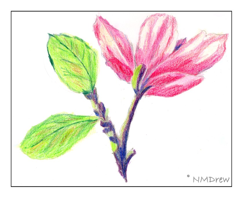
In my library I have a few books on colored pencils, so I dug them out. One that is really a rather interesting one is called “Creative Colored Pencil Workshop” by Carlynne Hershberger and Kelli Money Huff. It combines pencils with other media. The magnolia blossom is a quick take on one of their very first studies. I like to warm up so I will be doing a bit of colored pencil drawing over the next few weeks, but plan to really continue to work on painting in gouache and / or watercolor as well.
Last year I started a pencil portrait class, and since have continued with it when offered. It used to be through the local adult school, but with Pandemia, that was quickly shut down. Thus, the teacher offered it to us outdoors at a local park, and I jumped on it, as did others.
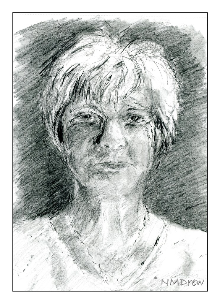
The above portrait is the first one I did this year. I was determined to do it within the two hours we have for the outdoor class, rather than the 10 hours I took for the little boy below last summer. The style is rough and quick, but important in the sense of working to get proportions and shadings correct.
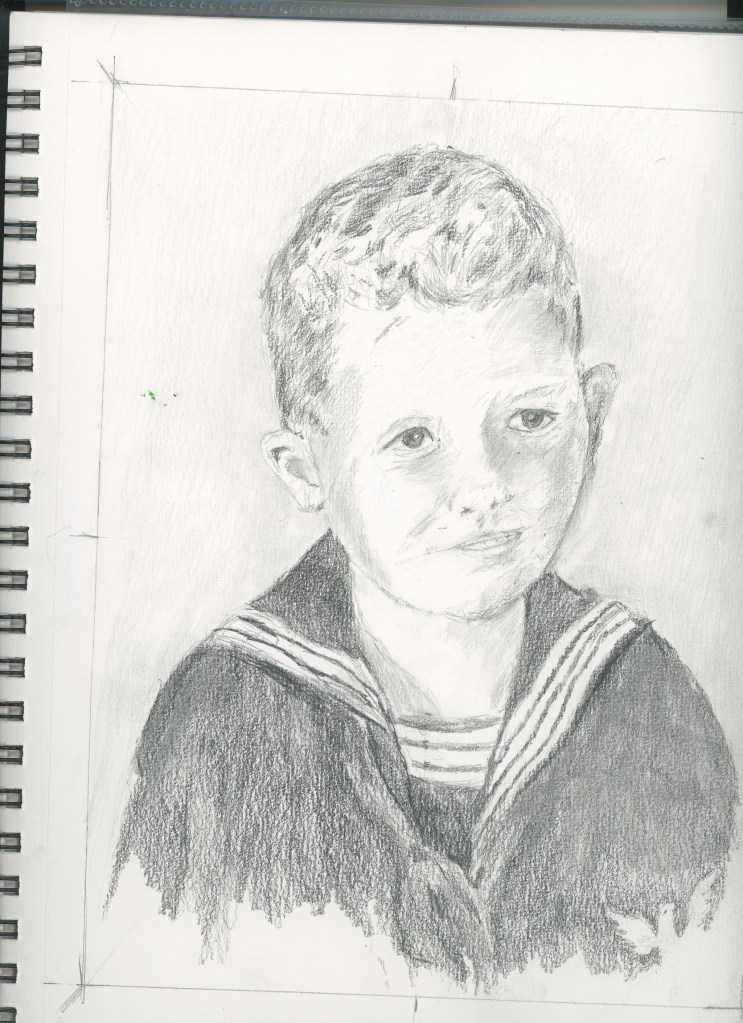
This little boy is from a photograph from the mid 1950s. He is really sweet and I think I managed to catch his character. He looks older in the drawing than he did in the photograph.

I think I may have posted this drawing here or on another blog, but this one I was determined to catch a different position of the head. Proportions change when the head position changes, and I was rather pleased with this one!
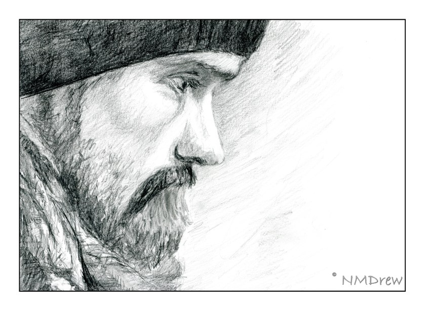
This profile I completed last week. The photo I used as reference came from Pixabay, a great resource for royalty-free photos. I decided to print out the photo on my laser, forcing black and white, and then using it taped upside down on my drawing board, as suggested by Betty Edwards in her book “Drawing on the Right Side of the Brain”. It worked! At the end, I turned it right side up to put in the eyelashes . . .

This is my current WIP. I started it last Wednesday. As with its predecessor, this one is also being done with the portrait upside down, and from a photo on Pixabay. It’s about 75% done I think. I need to work on the lights / darks and shadows a bit more, as well as make the hair more distinctive.
I got a few others in my class turning their reference photos upside down! The one thing they noticed, as did I, is that the shadows and shapes become dominant – you aren’t drawing a person any longer, but you are copying light and dark, shape and shadow. It’s amazing how well it works.
Well, time to wander off. The day has been spent reorganizing my life, meaning the garage, the closet, the studio, and the bedroom. Cocktail or whisky, anyone?
