Along the Riverbank

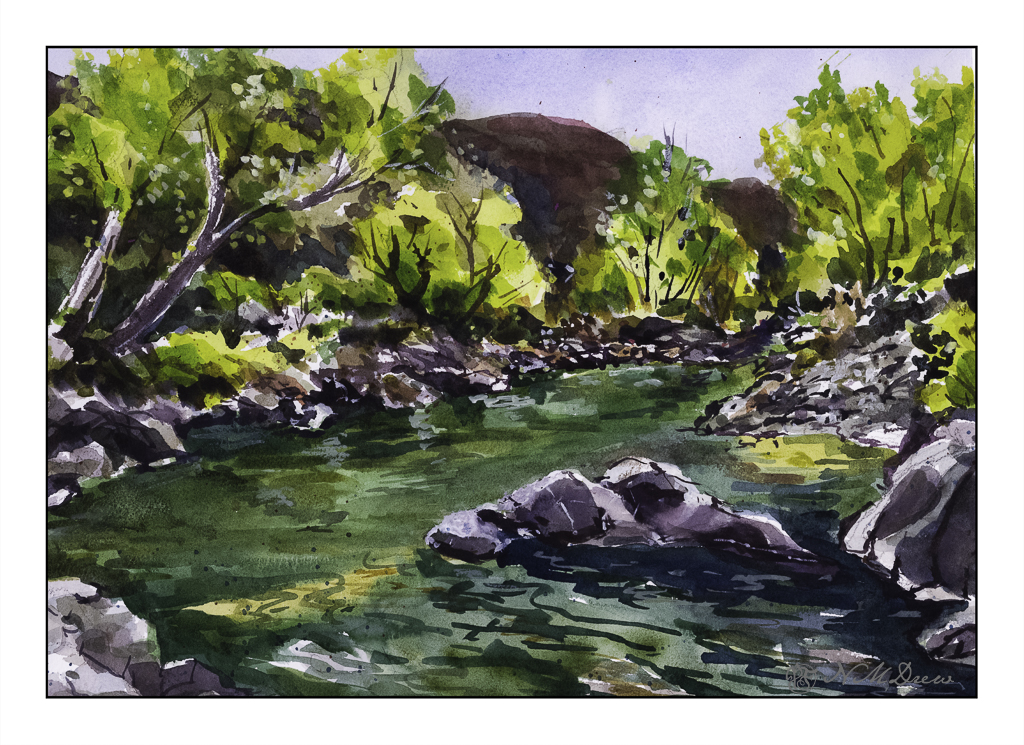
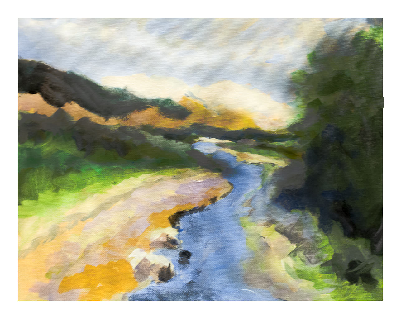
When we lived alongside the Rancocas Creek in New Jersey, the shores of the creek were slick and muddy and the underbrush along the edges of the creek were thick and tangled and nearly impossible to get through. Of course, kids worked their way in – as did I – and paths led to some wonderful places. We had a tree house in a huge willow tree and a rope swing over the creek. If you were brave enough, or foolish enough, you could jump into the creek from the rope. I never did that! Instead, I traipsed around in the mud, pushing my way through stink weed and elephant ears (our names), losing my shoes in the mud (and getting spanked for that!), and getting bitten by mosquitos.

Such memories are the inspiration for this watercolor. I wanted to show the crowded growth along the banks, the greenish water, et cetera, et cetera. I also wanted to make it a simpler painting, trying to do masses of color without all these details. I don’t know if that would have been possible but I think I will try this painting again, but I need to think about it and play a bit to get it. As well, the whitish bark of the trees, living and dead, were hard to paint – decisions to paint around, then tint, or tint and then paint around them drove me a bit to the frantic side of my personality, which already tends towards hysteria.

Anyway!

I also used a new-to-me watercolor paper, made by St. Cuthbert’s Mill in England. I am not sure as to its fiber content, but it is archival. The texture is nice, size is good at 11×15 inches, and worked really well with the paints and water. Color could be lifted, as in the reflections of the trees on the left in the creek. So far I am pleased with this paper and definitely plan more paintings using it.

Colors were, again, of a more limited and older tradition: Hookers, ultramarine and cobalt blues, yellow ochre, siennas. A bit of alizarin and both cad red and yellows were thrown in for mixing.

While this painting is busy, it works okay for me. I think the challenge to simplify it will be worth the time and energy I spend to do it.

Sparkly Day

The way the light shimmers through leaves on a bright day is something so difficult to capture in a photograph or a painting. The contrasts between light and dark shift and change to be almost blinding.

This is a creek running through the Coconino National Forest in Arizona. It is near Flagstaff and Sedona, and the terrain varies from alpine to the red rocks of Sedona and creeks and forests of Ponderosa pines. The above scan is a VueScan image with some corrections. Below is one using Epson Scan.

Neither scan really does justice to the colors, but the sparkle is caught. I think like a camera a scanner and software has difficulty with subtle variations from light to dark.

Sigh.

So, what did I try to do today? First, a bit of a limited palette. I didn’t do a triad, as with yesterday’s painting. I used (off the top of my head) mostly ultramarine blue, cadmium yellow, and burnt sienna, but into that mix I added Hooker’s green, cobalt teal, phthalo blue. The greys of the rocks came mostly from ultramarine and burnt sienna. Hooker’s provided a basis for some of the more obvious greens, but the cobalt teal mixed with yellow were used for the lighter, brighter greens you seen in springtime. Some titanium white gouache was applied here and there.

Additionally, besides limiting my colors, I tried some of the techniques for the water. Here, there were swaths of shallow water with an ochre coloring, reflections of rocks and trees in the water, and shadows beneath the rocks in the foreground and lower right. I didn’t use enough color and water to create a bead to allow blending – I have been told I would make a stingy bartender! – but still managed to get some of the colors to blend with one another. I also did glazes to show direction of water and movement. It turned out better than I thought it would – if nothing else, I need to be more generous and allow more paint and water than I think I will need. This something we all need to learn – how much is too little, how much is too much. Of course, the Goldilocks effect is best!

Watercolor, Arches 140# CP paper, 10×14.

Oh, hell – here’s another scan!!

Somewhere in Ventura County

I have been taking classes from a local teacher and artist, Harvey Cusworth, through a seminar and adult ed classes in oil painting. He is an experienced teacher and one who pays attention to each student, gives good suggestions and advice. Additionally, he is an experienced teacher which, in my opinion, adds a lot of value to a class as he is very aware of how a classroom of unruly kids or adults can act!

In the seminar we started landscapes, but because of getting sick, I missed two of the classes along with a number of adult ed classes. I decided to continue into the adult ed class the landscape I had started in the seminar just because I thought it challenging but also something I wanted to paint – a landscape from the back country here in Ventura County.

First: my final (as of this writing) version of the painting.

And now, it’s evolution. First, Harvey’s photo which was the subject matter – in color and then reduced to black and white to get a sense of values.

Photograph by Harvey Cusworth

Next, my own rather goofy value study, painted in color and then reduced into black and white.

Underpainting

This painting is done in oils, and has taken me several hours over several days to complete it. Even now, I have to let it sit and dry and regard it a bit more carefully to see what I think of it. As it is still wet I took a photo of it, and in places there is some glare, seen more clearly when enlarged. 11×14 on a cotton canvas panel.

As above, I like to see what my work looks like when turned to black and white – for values. Also, it is just fun to do! I just use the sliders in LR to reduce vibrancy and saturation reduced to -100. Doing this is really a good way fro me to evaluate contrast and such.

Final painting in color and black and white

So, there we are. In general, I am pretty pleased with this painting. The goal is to lead the eye along the creek to the small stand of tree at the top of the creek. I wanted to show the brightness of the barren mountains in the distance, but did not want them to become overwhelming. The BW image of the final painting shows that the mountains are very similar in value as the sky. Is this an issue? Not sure. Things like this are to be considered in a few days when it is no longer in front of me.

Now, on to other things, like cleaning my brushes . . .

Winter Creek

First, I am not at all sure where I found the photograph upon which this painting is based – public domain? If not, and it is yours, I am sorry I cannot give you credit. Let me know, ok?

Oil paints on Canson Oil/Acrylic paper.

Initially I started out with a brush and soon realized that whatever I tried to paint was just not working. The grasses were not clear and sharp and the clouds were blobby. In the end, and out of frustration, I took a palette knife and used it to smear color into the painting – and all of a sudden I found out what painting in oils with a palette knife is capable of doing.

I am prejudiced against heavy impasto just because I don’t find it interesting to look at. First in my mind is how much dust it could collect and what a pain heavy impasto paintings could be to clean. Much impasto is done with a knife – though brushes also do the job, as seen in the work of van Gogh. So, I have avoided it to date.

Smearing paint around with a knife gives some dimension (3D) on a flat surface, but the way the paint moves is so interesting! I also used the knife tip to scratch away in the colors for the grasses, and that was both doing what I wanted to do, as well as somehow felt deliciously rebellious against my conformist self.

The snow, though, and the river, are done with brush. Brushwork was laid down first pretty much throughout the painting, and my aggravation then brought out the knife. Learning experience. And, I don’t think I could have rendered either sky or grasses anywhere to my liking with a brush of any size.

Live and learn.

11×14, knife and brush, on paper.

Wood & Wetland

I have been spending the better part of the day watching the videos in a class in which I have enrolled before starting any of the projects. There are a lot of short videos in it pointing out this and that, but sitting still to watch the longer ones makes me restless. I need something to do with my hands rather than just sit on my butt! Knitting is out as I have a few projects at a point which need some focus, but oil pastels did the trick. I can draw / paint and watch at the same time. I may not get all of the video, but I do get a lot of it – just as I am now as I write this post.

I picked up a few brands of oil pastels and a 6-pack each of soft white and greys. These include Sennelier, Mungyo, and Caran d’Ache. The white and grey pack are labeled “Anders” I think. I also have been playing on various papers, but decided to check out the Sennelier oil pastel paper. It seems to do a pretty good job despite all the rubbing in of layers of pastels.

Oil pastels, at this point, are more like playing with crayons for me. I blur the colors using my fingers and tortillons. Harder oil pastels make up the underlayers with the softer, oilier ones going on top. This adheres to the adage of “fat over lean” in oil painting, so it makes sense that it would apply to the oil pastels as well.

Oil pastel on Sennelier paper; about 5×7 finished. Scanned on Epson V600.