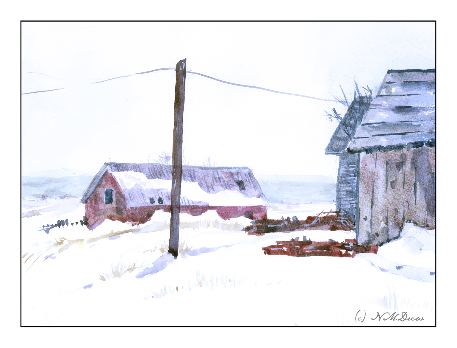
The Great Plains stretch from Canada south to the tip of Texas and into Mexico. It is essentially a high plateau of prairies and grasslands, a vast flat country swept by winds. The Rocky Mountains form the western border and the woodlands of the midwest form the eastern edge. Tornados are not uncommon, and unpredictable weather is the norm. Rain is sparse, increasing as the plains roll eastward.
When we moved to California from New York, we drove across the plains in the dead of winter. Often the weather was windy and the air was frosty and misty. Stubble fields were seen, with remnants of corn or wheat pushing through the snow. It can be very desolate and lonely, but indescribably beautiful in a rather terrifying way.
Here I have tried to catch that loneliness. I used a limited palette for the most part consisting of cerulean, lemon yellow, and alizarin. Payne’s grey and burnt sienna helped with the darker areas. Patience was needed here, from applying the very thin washes and letting them dry, to carefully considering how paint the wooden buildings. I painted on it throughout this morning and early afternoon, in between exciting stuff like dishes and laundry!
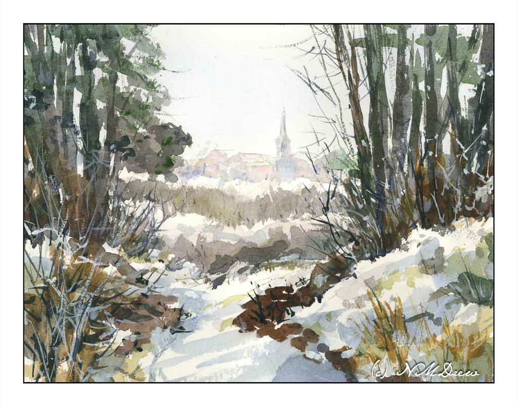
A few days before Christmas and, while I don’t live in it, I do enjoy a snowy holiday! I’ve always thought that a walk in the woods, in the snow, on a misty but sunny day is the best way to enjoy the cold. Colors are soft in the distance. The contrast of bright white against dark branches and trunks is fascinating, creating twisty patterns on the intertwined branches of bushes and young trees devoid of leaves. There are lines and blobs, shades of blue and grey snow, bright white and deep shadow.
I used a limited palette here – mostly umbers, sienna, some yellow, blues. A touch of alizarin, too, to make some warmth. One of the goals of this painting was to create a soft view of buildings in the distance, suggestive of a misty sunniness. The pale blue of the sky is barely there. I used a lot of water for this effect! Coming closer to the viewer, colors are a bit brighter and shapes more evident. In the woods, sharp trees, shadows, snow, plants.
To date, I think this is one of my better watercolors.
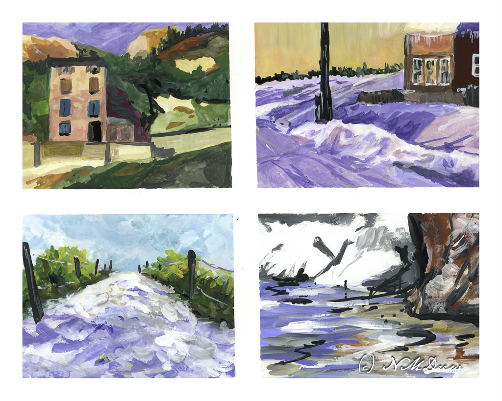
Today I set another painting goal: contrast. This means working toward bright whites and dark darks. Catching light is what art is all about, at least in photography and more realistic painting. I tend to struggle with contrast, more so when the colors are very similar. Today I decided to work on the light-dark contrast, but in the near future, monchromatic studies in black-grey-white and in variants of tone will be done.
Today I chose a white, multi-media paper with a very smooth surface. I blocked off 4 rectangles on a 10×14 sheet of paper, so each rectangle is about 4×6. This is the single sheet I used.
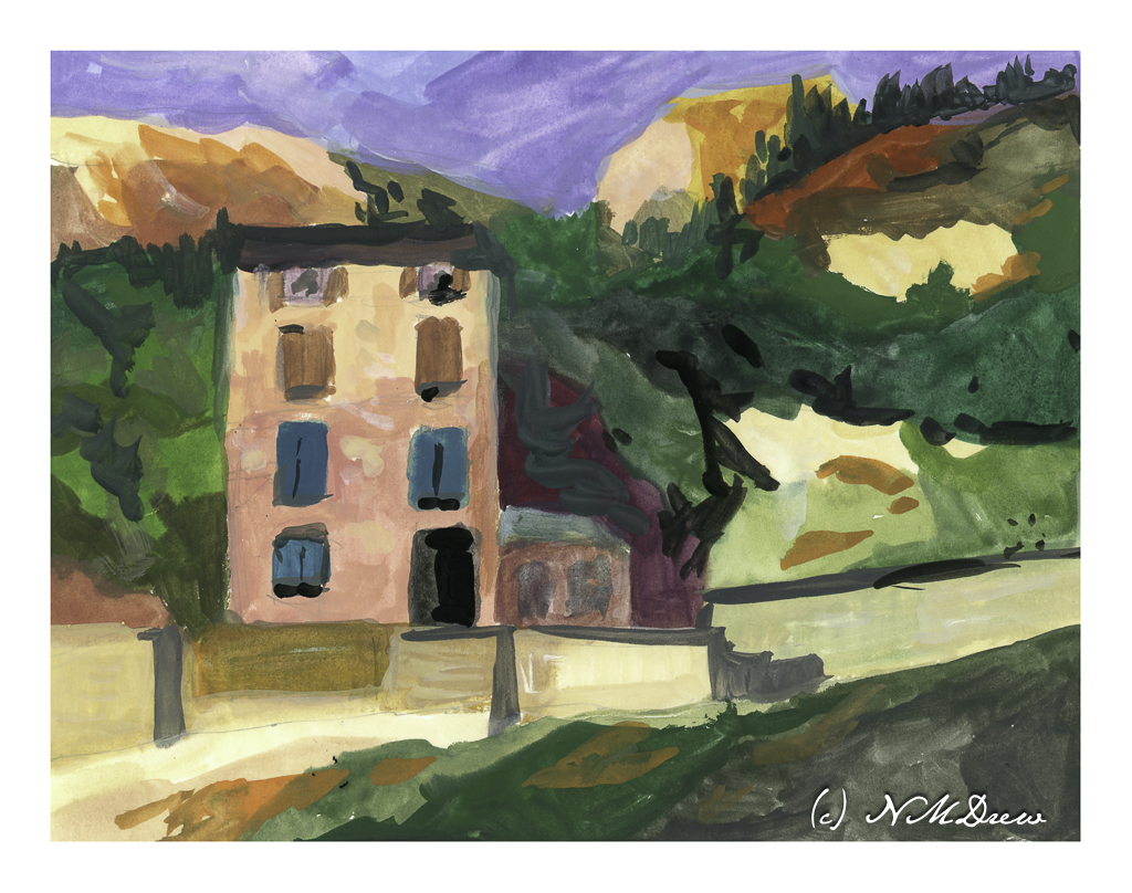
This is the first painting I did. I looked to have a shadow on the lower part of the building and the upper part in sunlight. The same for the various bits of light and dark rock and walls, or whatever they are, to give a sense of a strong light, perhaps from a late afternoon.
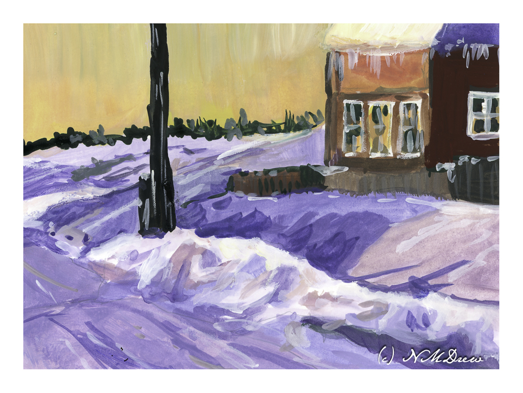
This painting was a bit easier to do than the first – I was warmed up. Here, I wanted to catch bright snow and shadows on snow and buildings. I used titanium white for the really bright bits of snow alongside the road. The contrast is much stronger than in the first painting, but the real challenge lay in capturing the snow – which is white – in shadows. I also put in some icicles on the building, which was rather fun!
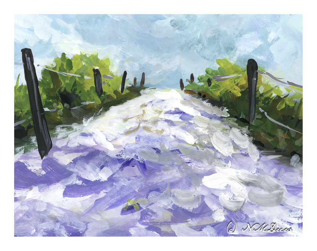
Moving from the dead of winter in the middle of nowhere, I now went for a bright day in the Caribbean. White sand, bright sky, brilliant light, strong shadows. I think this worked out fairly well and am rather pleased with my contrast.
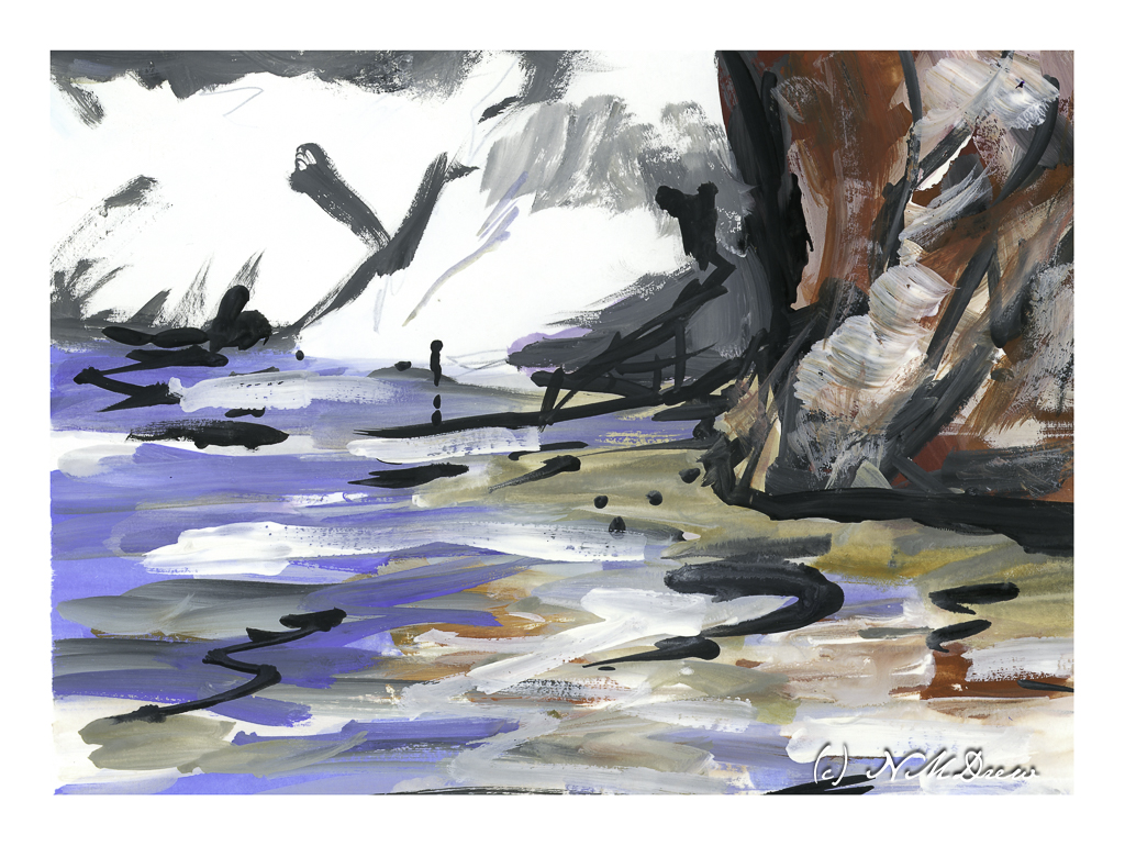
And this one? A crazy bit of abstraction of a beach, reflections in shallow water, and bright white cliffs in the background. I did this just to be “painterly” and use up the paints left over on my tray. Playtime with a bit of success.
Today’s activity accomplished what I wanted to do – strong contrast in different settings. There is a challenge in gouache insofar that colors are a bit odd in some ways. I played with colors as I mixed them trying to get a color you might call a “rosy glow” that could portray the golden light of a late afternoon or early evening. A strong white, too, with very little if any color added, was used for the cliffs and sand. More than anything, the experience of working on a lot of little paintings turned out to be a bit of fun because each painting had a slightly different area, or areas, of brightness and darkness.
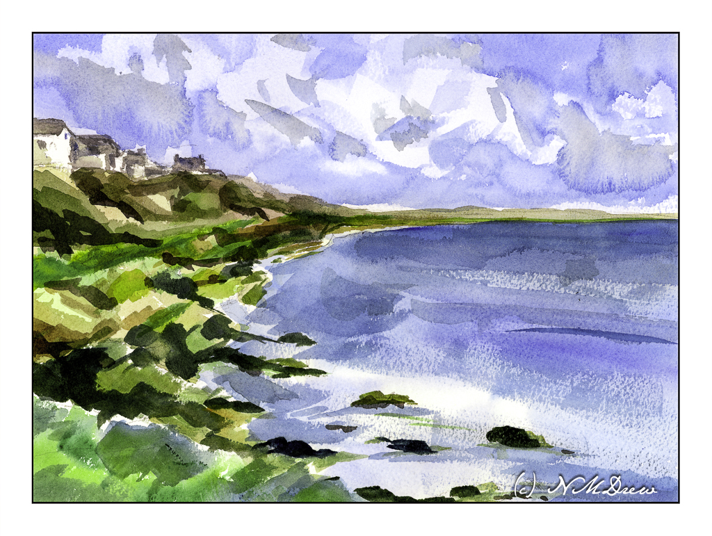
What can I say except this was one hell of a challenge! I wanted simplicity in the form of abstraction combined with atmospheric perspective. Well, the day is crisp and bright, a bit windy, and the light is harsh. Somewhere in there lays a bit of compromise.
The largest areas of the painting -sky, water – were laid in with very wet washes and allowed to dry.
The clouds were lifted out later and more blue, wet paint applied over the initial light wash. Shadows and shapes were created during this step.
The sea was a light wash with simple areas of white left behind in the foreground. Somehow the rest of it sort of happened using a large, flat brush. I find using flats really helps push the abstraction. The same can be said with the shoreline, using color to indicate plants, rocks, cliffs. The most “planned” part of the coastline were the houses and roofs. Dry brush with darker blues were applied with a wide 1″ brush to give the sea some dimension.
I had no idea how this painting would turn out. I like it for the simple fact I did achieve my desires for a simple, abstract painting which still has recognizable subject matter.
Wouldn’t it be great if we all liked everything we did? Maybe not – then we would probably never progress!
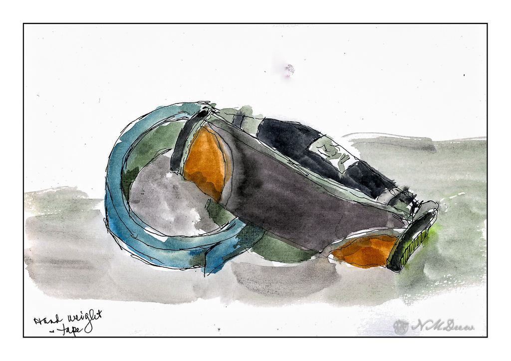
Today there is a bit of running around to do, so this morning I was in a blithery mood. Things to do – like the usual morning stuff – but I also know I won’t feel too focused on any one thing, so sketching with ink and watercolor seemed to be the best of all choices. (After all, life is not all about dishes and making the bed!)
On my desk is a small hand weight and roll of painter’s tape. Warm-up. And now immortalized.
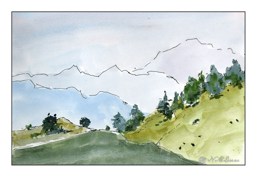
Next, the great outdoors. Mountains and trees. I would love to be walking around here, but sadly my ankle is keeping far more stationary that I want to be. I am getting better, but I have to just keep all to a minimum. I can go to the store and walk a bit, but I need my heel to get better more than anything.
So, the painting. Goal is to get a sense of distance with the gradations of the mountains as they recede into the distance. Accomplished!
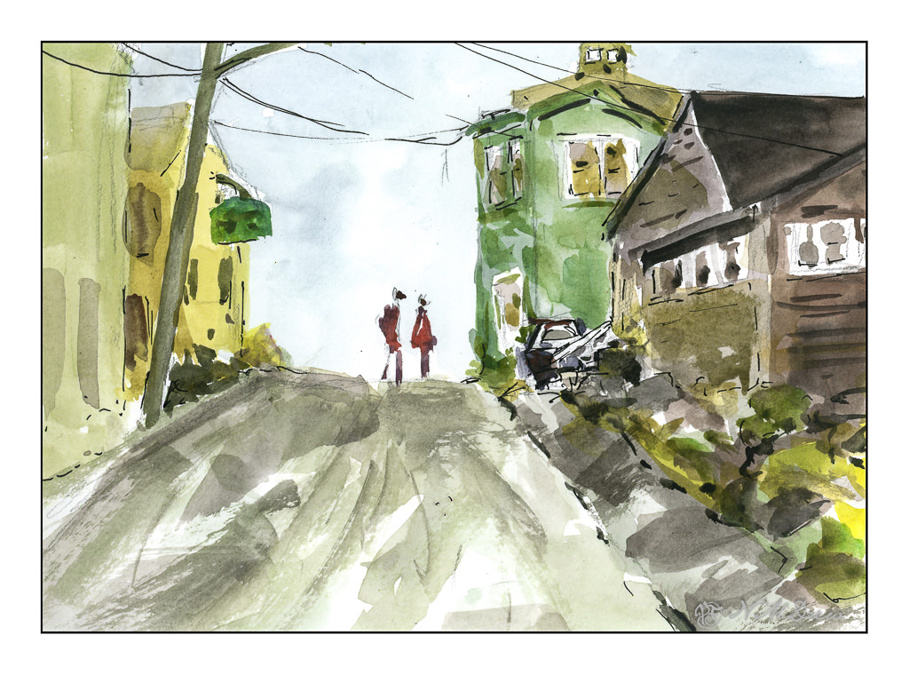
Finally, a scene with some complexity. I figured my warm up and splashing of paint were ready to meet my next challenge which is to paint buildings, people, perspective. Landscapes are comfy but I really want to push myself a bit more, as I did the other day, with direct painting and more patience and planning.
The first two sketches were done in very short order, but here I pulled out my pencil, limned in lines and worked on perspective and size. I think my people are a bit too tall, and I put them in before I did the painting of the buildings and the road. The buildings, too, are a bit wonky, but they work fairly well. I painted everything and then, once okay with the picture itself, I decided some black lines here and there would be good to help pull the painting together. Not perfect, but pleased with the results as I did meet my challenge.
Pentalic Aqua Journal, about 7×10, watercolor, Uniball micro pen.