Trees, Late Afternoon

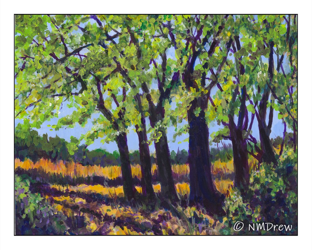
Third and last of a photo I took earlier this month in Independence, CA, before being driven back home because of Covid. I am not sure which of the three of these paintings I did of the same photo I like best (you can back track on this blog if you want to see them, or go to Instagram!), but this one, in acrylic, was by far the most time-consuming.

I used 16×20 Arches 140# CP paper and a variety of acrylic paints, but first I laid down a few layers of gesso to prep the surface of the paper. The first layer of gesso was thinned with water and brushed on quite firmly to work it into the paper itself. The paper warped as watercolor paper does, but I was really happy to see it flatten out with the second, thicker layer of gesso.

Most of my brushwork tends toward dabbing on dots, which is great for pointillism and impressionistic painting, so I worked at creating lines, as seen on the grasses in the background, along with using a flat brush and using its tip or sides to work paint in a more up / down, side-to-side manner. My next painting is going to include these types of brush strokes, just because. It never hurts to try things you don’t usually do.

Every type of media – watercolor, gouache, acrylics – has its own “language” – that is, the way you have to work with it. Acrylics are rather heavy on paper and I need to think ahead for what I want to do. I tried the slower drying acrylic paints, and just did not like them. As a result, the ones I use tend to dry rather quickly. Filling the palette with every color I think I might want to use is a waste of paint. Instead, I have to plan, not like a general, but certainly I need to anticipate what comes first, what comes next, and so on. I also have to think about brushes and brushwork. Painting can be spontaneous, but it also needs experience to allow for more success (however you want to define “success”) than failure.

One thing I considered for this painting, but did not do, was to lay down a glaze to unify it. Chicken! Maybe I will come back to it later. Now, two things are on my next painting agenda: buildings and no dabbing! And maybe a glaze . . .

The Bridge

Take a look at this!

NOT a landscape!

This is really unusual for me – buildings and people intimidate me. However, by painting nearly every day I am gaining confidence in my abilities.

Also, the use of extremes in light and dark are another oddity for me, as well as the limited palette, the colors of which were primarily cad yellow and violet of some variety. White, too, along with some sienna, ocher, and ultramarine.

Painting really means learning a lot of things: how to use color, composition, brushwork. It is here that using a wide, flat brush to paint the buildings rather than my usual preferred rounds that I was able to achieve 90% of the painting. I was rather surprised by myself, and the result.

Round Brush – Doing Lines

Before I get into the morning’s routine, I feel like writing up what I did yesterday afternoon on my first “me only” day in a long time.  After my nap and afternoon coffee, I pulled out a novel, watercolors, paper, iPad, and a few other things, and moved out to the back patio.  The goal was to work on using a round brush and practicing how to use it.

I did – and still do occasionally – sumi-e – which is really focused on brushwork on absorbent paper.  Watercolor is not ink only, but colors, and the colors are alluring and distracting.  So distracting are they that I forget the value of brushwork and am completely seduced by colors!  As a result, I did some web searching and found a nice article on different brushstrokes to do with a round brush, as well as with a flat brush.  I chose the round to begin with as that is my go-to brush type.  Below are the exercises.

I made notes as I moved along.  I used pale colors, too, just to see how my scanner would pick them up (BTW, it did a pretty good job – the ink is a bit pale, though).

From this point – which was about an hour’s practice – I moved on to deciding what to do next.  Read my novel?  Have more coffee?  Paint a picture and focus on brushwork using a round brush!  I alternated between a larger squirrel mop and a synthetic sable round.

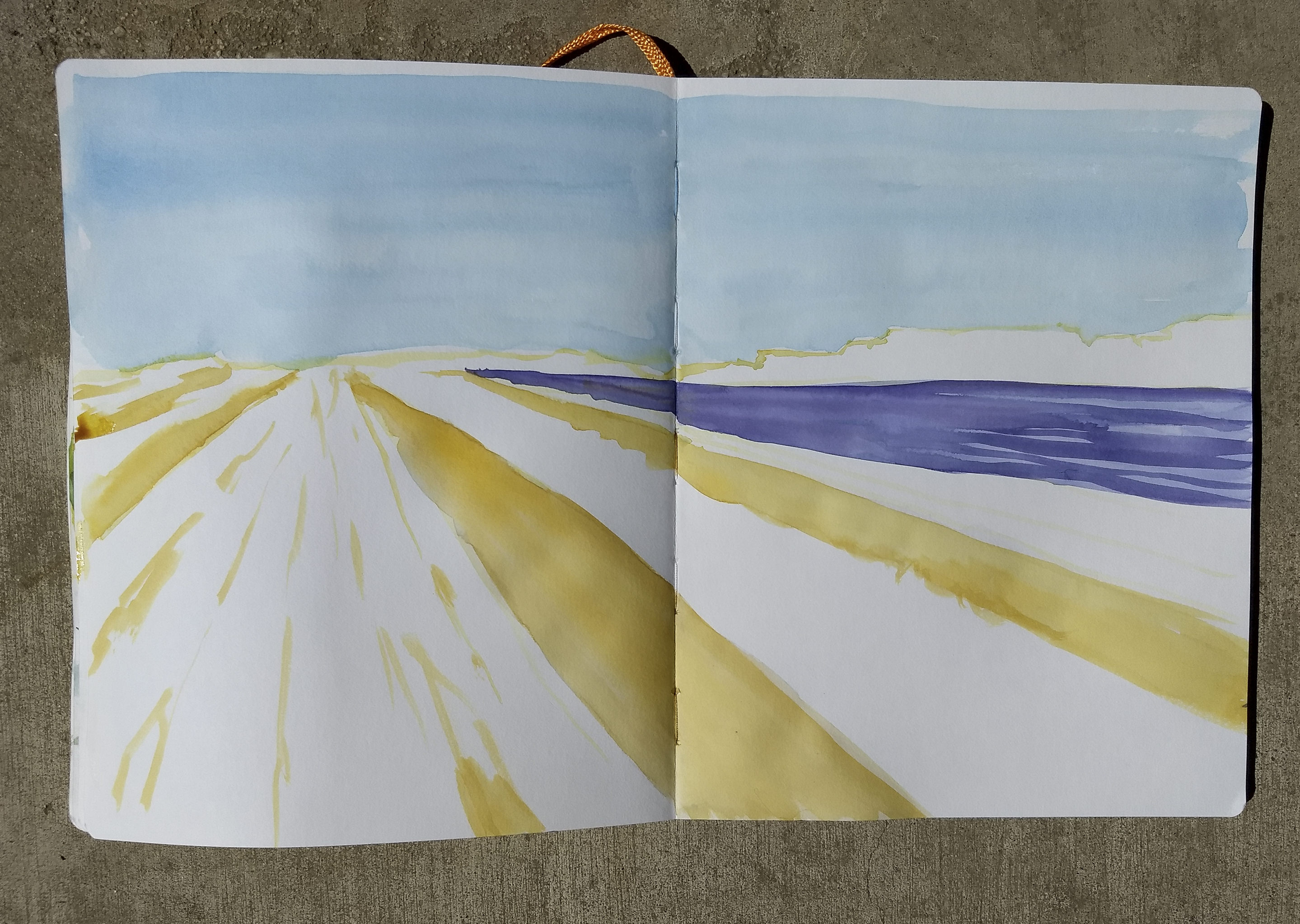
The first step was to choose the paper.  In the end, I chose a Handbook across two pages.  I had read somewhere about using a light color to create the outlines one might make with a pencil, so I used Quinacridone Gold and laid down the foundational lines.


At this point I worked out the building structure, horizon, and vanishing point, more by eye than using anything scientific like a ruler.

The next step was to add vast washes of color for the sky and field debris between the flowers.  The brushwork was done wet-on-wet for the sky.  A clear wash was followed by a sky of cerulean.  The same was done with the purple flower field on the right, which was then overlaid with a wet-into-kinda-wet mix of Alizarin Crimson and Carbazole Violet.  The gold between the long white was also wet-into-wet using Quinacridone Gold in varying strengths.  Then I let it all dry.

The next step was to create the pink flowerbeds. I used a mixture of Quinacridone Gold, Quinacridone Rose, and Alizarin Crimson. I really pushed the colors here, laying down values far darker than I would if I was working toward what I wanted – I really need to remember than watercolors dry about 30% lighter than the wet paint!

As you can see, I worked to create white space in the pink flower beds, and tried to add depth as they move toward the horizon.  From this point, the painting continued, and I didn’t stop to take pictures.  I read my novel as different layers dried.

As each step of proceeded – from initial lines of the sketch to the flower field – I thought about brush strokes.  The lines of the initial sketch were simple lines with the tip of the brush.  The washes for the sky used the side of the brush.  The fields of gold and violet were done as washes and as brush tip lines.  The pink flowers were a combination of lines and curves and dots.

Below is the final image.  The sky is vastly different than the flat wash, which I initially had planned on retaining, but as the outlines on the building were not strong, and the whites too pale and lacking in contrast, I turned the painting upside down and used a mix of Cerulean and Ultramarine to make edges pop.  This led to just doing the sky all over.  Imagine my surprise when I saw not only lines in my brushwork, but the lines in the composition!  The way the fields of flowers create a diagonal motion matches the opposite movement of the sky and clouds.

Altogether, I am really pleased with this study.  It took about 2 hours, with layers drying and my thinking and reading my novel.  Certainly an afternoon well spent, I think.

Penstemon

Penstemons are simple flowers – tall, elegant, plain – with an incredibly beautiful red-orange flower.  They are another one I photographed last weekend at the botanical garden.  Maybe today I’ll venture out to the cactus garden to see what blossoms may be up there!

Here, I decided simply on using a brush, a stiffer one than a red sable, to focus on how the brush responds to pressure, paint, and amount of water.

Remembrance of Things Past

If I want to be honest – which sometimes I don’t want to be! – I never realized that in watercolor, as in sumi-e painting (which I haven’t done for a few years), the brush is important.  In sumi-e, brushwork is important as it expresses what color cannot – color is not found in sumi-e, only shades of blacks and greys and white, with the subject hinted at, not indicated in boldface!  Playing with leaves made me remember this . . .

Because my chronic struggle in watercolor always seems to be overworking and mixing too many colors together, I decided to pick up a book called Everyday Watercolor:  Learn to Paint Watercolor in 30 Days, by Jenna Rainey.  I figured some kind of disciplined plan could work.  Her style of painting is not necessarily my style of painting, but that was not important as far as I am concerned.  My concern was to stop making mud and to relearn what I have forgotten over the years.  The examples in Rainey’s book are pretty basic, pretty straightforward, and actually, a lot of fun to do.  It has helped me drop that little, nagging, nasty perfectionist who always criticizes.  Rather, it is far better to just do, and quit the role of critic.   She does studies such as shapes, allowing colors to bleed into one another; she discusses design in the abstract exercises with squares and circles.  There are simple exercises in drawing and painting trees with foliage in shadow, and depth, with lighter pine trees in the distance, and darker ones in front.

What do I find the most valuable in this book?  Crazily simple lessons.  Step 1.  Step 2.  Step 3.  Limited palettes of color.  Most how-to-watercolor books are wonderfully full of tantalizing pictures, but few that I have seen really drill down to making it simple.  I enjoy the work of watercolorists such as Winslow Homer – people with a loose, free style which I would love to emulate.  I am not a contained person in the sense of wanting to fill in the lines, like in a coloring book, but I also appreciate the disciplined approach of people like Birgit O’Connor, who paints huge flowers, beach debris, and so on.  I am still struggling with watercolors enough to have no style of my own – I am still attempting to master the brushwork, water, and colors.

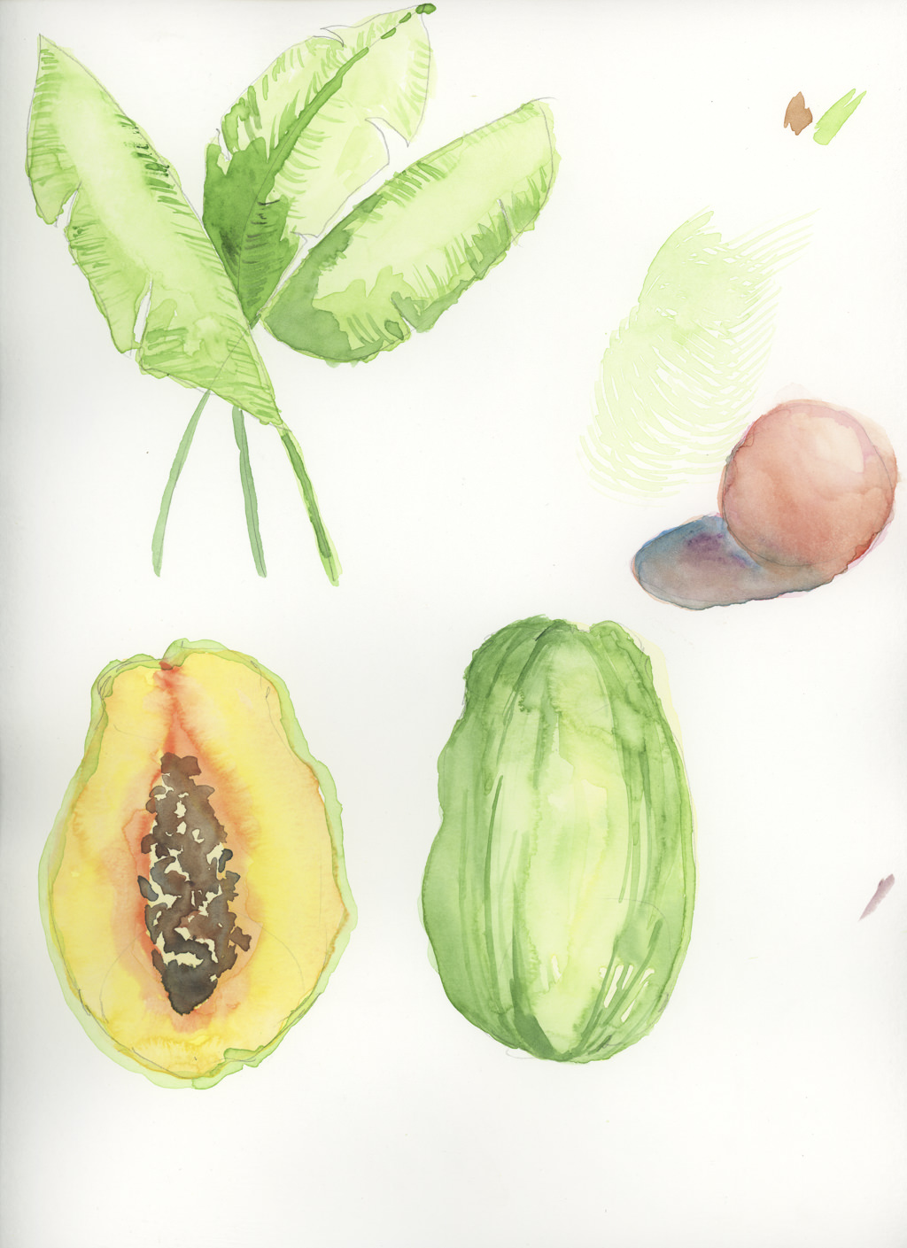
Currently, I have just finished Day 11, which is wet-into-wet and some dry brush.  Like in dry-into-wet.  Something like that.  It’s a papaya.

I’m looking forward to 19 more days … sort of a diet!  And to date, no mud!