Thoughts on Brushwork

In my last post, I looked at both portraits and brushwork. Doing both is sort of a new adventure for me – portraits, certainly, but brushwork is something I play with periodically. Two artists I admire for both their subject matter and brushwork are Maggie Siner and Hashim Akib. Both have very clear brush marks as well as a strong sense of graphics and color. Siner’s work often displays wide swaths of color and Akib’s often does the same, as well as creates movement and light with brush strokes. Their portraits are striking.

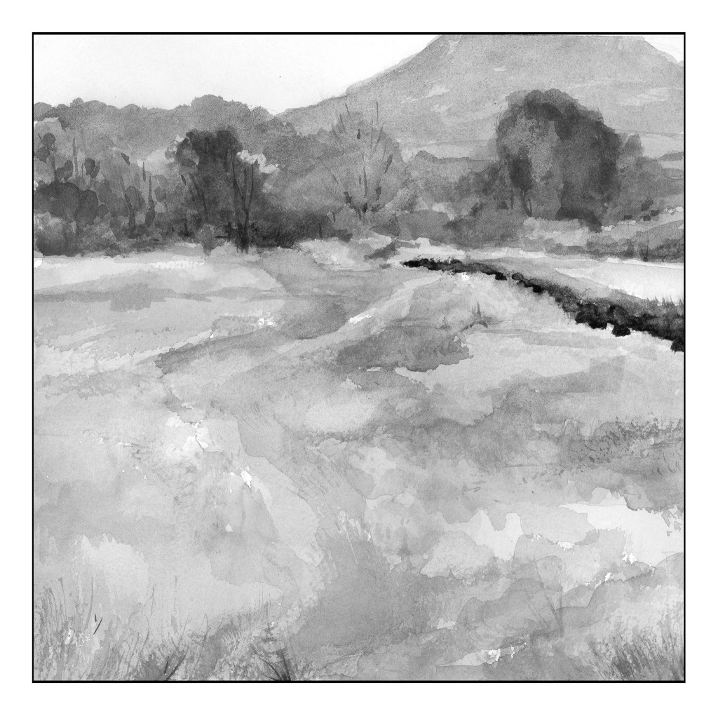
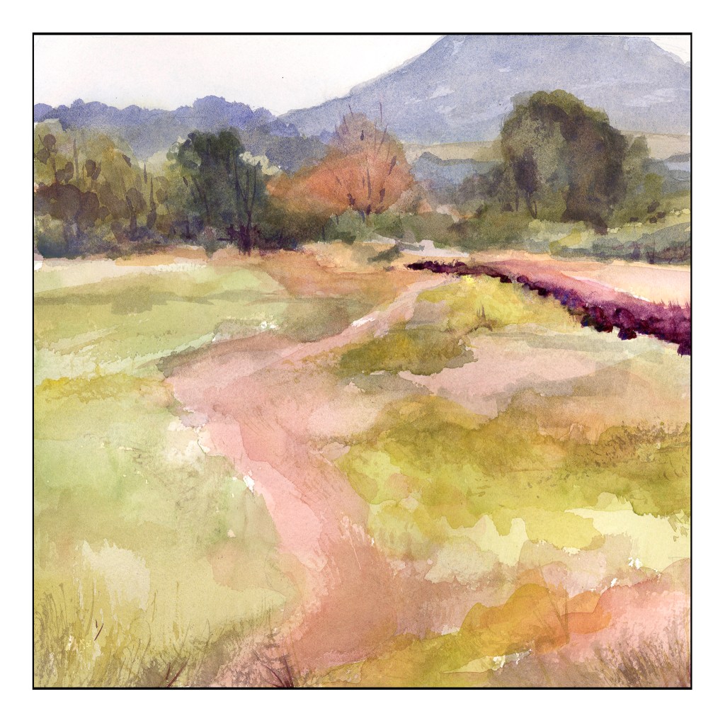
That said, I am a dabber and a rather haphazard (okay, very haphazard) painter in my approach. I paint and putz, sometimes getting it right, sometimes getting it wrong. I will draw in a general idea, but don’t do much more. In particular, I don’t do value studies as I want to look and decide on the scene. I want to train my eye to see them in the picture or landscape or person. It is far more difficult than I think it will be. Slowing down helps, looking and then going into the painting process.

I did the painting below vaguely based off a paining by Siner called “Golden Cumulus”. You can find it on her website. Siner’s brushwork is deliberate, and she says she scrapes her oils off until her brushstroke is as she wants it. She doesn’t paint over things.

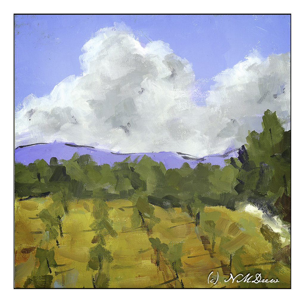
What I was looking at in her painting were her brushstrokes. They are directional, sometimes heavy with paint, sometimes not. At times she smudges and edge into another to break things up. For my variant, a wide brush, a square canvas, and either oils or acrylics using the colors found in Siner’s palette, which is very limited.

A lot was learned here: A limited palette makes color choices easy and harder – gotta mix those colors! A big brush – here a flat – allows far more mark making than I thought possible. And a big brush forces me away from my dab-dab-dab with a pointed round.

I don’t remember when I did this painting nor what media I used, or even if I published it here before. I found it the other day and remembered what my goals were. Brushwork then, brushwork now. I’m trying to clean up my oils / acrylic painting skills like I worked on with (and sort of succeeded with ) watercolors.

Oil or acrylic on cotton canvas board, 12 x 12, sort of a master copy of Maggie Siner’s “Golden Cumulus” ca. 2018.

Autumn Trees, with Apologies to Wolf Kahn

Color always fascinates me, and two modern painters, Richard Mayhew and Wolf Kahn, are masters of it. They pay tribute to the natural world with their colors and whether or not the landscape is based on reality doesn’t matter. The subject matter and the colors are the point, just as the squares and rectangles of color are of such importance in the work of Mark Rothko.

For this study, I looked at several of Kahn’s pastels of trees and woodlands. His color choices range from contrasting and bright to subdued. Sometimes the trees are distinct from the background, other times almost camouflaged into the surrounding foliage. I decided to continue using linseed oil here and soft colors to see what I could do with blending and creating lines for tree trunks within the the woodland while keeping the visuals of Kahn’s woodlands in mind.

This was painted in one sitting, and as the paint was damp and pliable, it was fun to move it around, wipe some off, add more, and then use the brush to create lines and dots to suggest trees and leaves and open field before entering the woodland. As I painted, I realized that I could place lighter colors in vertical strokes between darker areas to create tree trunks. I used short horizontal strokes to suggest foliage.

Again, I painted on the linen-textured Canson XL Oil-Acrylic paper. Linseed oil allowed for easy movement of the paint. And, again, this painting has been taking forever to dry out in my chilly garage, but I scanned it anyway, and cleaned up the glass afterward.

I really like Kahn’s work, especially in his later years. I also want to explore color as Mayhew and Rothko have used it. Besides exploring colors, exploring the subtleties of one color and its variants within a given area will be fun. Mayhew and Rothko will be fun to emulate, as has Kahn, because the experience of copying is a form of exploration that adds to knowledge by doing, and that, to me, is the best part of all.

Practice

With any art or craft, familiarity with it makes it easy to do. With familiarity and understanding comes the ability to explore using the knowledge you have acquired. I am pretty comfortable with watercolors and oils, but acrylic has always been a point of frustration as it dries so quickly and, to me, doesn’t have the qualities of oil paints. Gouache can be opaque or transparent, depending on how used; acrylics can be used in the same way. The difference between artists gouache (vs acryl gouache) is that the colors underneath the other colors can be re-moistened, and used to dissolve and create other colors. Acrylics, while they can work similarly to artists gouache, once dried, are dried, and there is no going back.

What I am trying to learn is how to use acrylics in ways that make sense to me. This is not coming easily. I like being able to sprawl my colors all over the place without drying, but this doesn’t work quite well with acrylics – unless using the heavy body paints on a sta-wet palette, the fluid acrylics I am using dry very quickly. To use them well I am trying out different ways of painting and mixing paints. Above, on the left, are colors straight out of the bottle and then mixed with white on the palette, increasing the amount of white with each brush dab. From there, I played a bit with painting cone flowers; the one on the lower right is more successful.

Playing is a way to explore. Above was play. Below is a “more serious” foray into painting with acrylics. I worked hard to make layers, and then return to add more color as I moved along. I just painted directly onto paper in a sketch book and practiced both painting and blending, painting directly on other areas, and bouncing around to work at making a bit of a harmonious or connected picture with similar / same colors used in various parts of the painting.

There used to be 4 trees in a row on the top of the cliffs – but then I looked at it and they were all the same shape and height. I decided to paint out the 3rd from the left. I had to paint the sky in a number of times, building up layers to hide the tree. It worked pretty well. I also played with my brush – I tend to dab, using the point of the brush – but here, especially for the tree foliage, I worked on using the sides of the brush. Additionally, I changed between very soft brushes and more firm brushes. These change how the paint moves and blends over the paper.

Practice can be fun – in any art – and by practicing and playing, new doors and experiences add to the skill set of the artist or craftsman.

Morning Sketch 10 – More Roses

More roses – more C strokes – and then other kinds of strokes to make leaves. For the leaves, brush point on paper, squish down and move, bring brush up to another point. Just as in sumi-e! Then, while the paper and paint are still wet, take the tip of the brush and create little points around the outer edge of each leaf. Some roses have pointy leaf edges, others do not. I don’t think the Rose Police will come knocking on my door, though, so I am safe.

Roses in these kinds of sketches are easy enough to do. However, creating a successful painting of more than one sketchy rose is another story. Light, shadow, shape all begin to play together, and sometimes not very nicely.

Here, a rose with a simpler petal style than the classical tea rose. As a kid in the midwest there were deep red wild roses throughout the countryside, and here in California there is a bush as above along a local trail. There are about 5 petals around a yellow center, and the wild roses are messy things that are such a pleasure and delight to encounter.

Painting a white rose is not easy because white is influenced by light and shadow and shade. Instead, you have to look at the colors in the white – light? dark? cool? warm?

The above little painting was a success, but it is only a sketch. A bouquet of roses will be far more challenging and I really doubt my ability to succeed there.

Hue, Value, Intensity

Since February or March of this year I have been taking a series of online classes, complete with live Zoom meetings, with Ian Roberts. He has been the best online teacher because he is so diverse in his interests and he brings them into the world of creativity. I admire his artwork, too, and think his book on composition is an excellent resource. For me, art is more than a pretty picture – it is an expression of a person, a skill, a view point. All of this, in a painting, is more akin to me than any other form of art, such as photography or music. While I enjoy them, I just am not as I entranced by them as I am by color, paint, and the process of painting.

That said, the first of the three courses was about drawing and values, not as an art in and of itself, but as a means to move forward into preparing for a painting. Next came brushwork, using black and white to render shades of grey and to learn about value. By adding yellow ochre, the next step was discerning warm and cool variants of color – or monochrome. Finally, we have come to the third and final class in this series – colorwork.

What is color? As the title says, color varies with hue, value and intensity. This week our job is to mix greys from complementary colors. Easy enough – or is it? Part of it will depend on medium used, and then, it also depends on warmth and coolness of colors. Our preliminary palette begins with a warm and cool color of each of the primaries, along with white if necessary. Cool colors are Cerulean Blue, Alizarin Crimson, and Cadmium Yellow Lemon. Warm colors are Ultramarine Blue, Cadmium Red Light, and Cadmium Yellow Deep. I have stuck with these three colors and a bit of titanium white gouache where I couldn’t keep the highlights, or lost them in my painting, or forgot about them altogether!

Pretty dull painting! It makes me think of the Upside Down. The point of this study was to take the clashing and garish still life Ian Roberts provided and tone it down – dull down the colors. I am using watercolors here, and I used complementary colors to tone things down but still leave the original color recognizable. The foreground cloth was bright lavender-violet; back behind squash a dark blue, wall on the left a sea green. Bowl is pinkish rose, apples green, and squash an orange with ridges casting shadows. Some shadows were hard edges, others blurred together. It was a hard exercise because I had to test my colors over and over again on a piece of scrap watercolor. This was on Arches 140# CP.

Our next study was a very low key (low key in color intensity) landscape. Evidence of a hazy day dulled all the colors so that while they were warm and cool, they all were similar in tonality. The above scan of my painting in black and white showed me I did accomplish by and large, especially in the field that makes up the lower 2/3 of the painting. The colors were very soft without a lot of bright or intense colors; rather, they all sort of blended into each other when I squinted my eyes. Only a few areas of dark contrast stood out – on the right of the field in the curve, and the bottoms of the trees at the edge of the field.

As you can see, there are no colors of high intensity. They are soft and subtle, even when dark. Hue means variations of color – and there are several, and as this is watercolor the colors are transparent and can be laid over one another or blended, depending on the wetness of the paper. The values are all in the middle of the spectrum. I used Kilimanjaro 300# Bright White paper, and this is a 10×10 inch square. My palette here are only the 6 colors I mentioned above, without any white at all.

In many ways, the still life is more “my style” insofar as the colors are laid in rather heavily. The landscape involves a more delicate and patient approach to the colors. Both were very challenging in their own way, but each taught me a lot. I liked the limited palette as I was forced to stay within its parameters, but could still achieve a lot of lovely colors, as well as darks and lights.

More to come . . .