12 / 30

Day 12

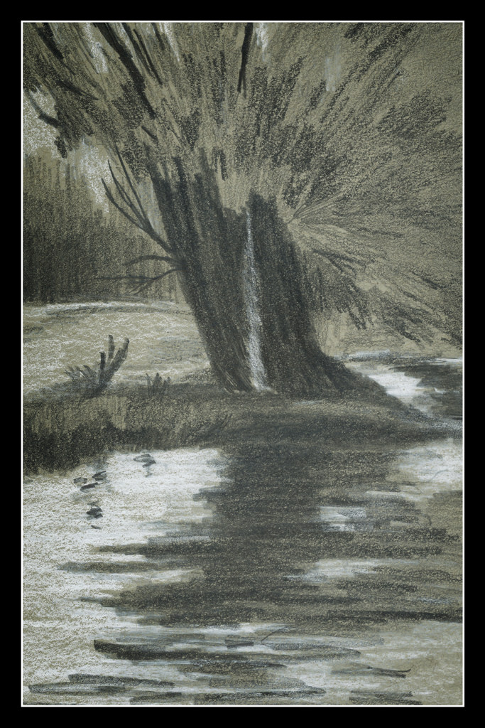
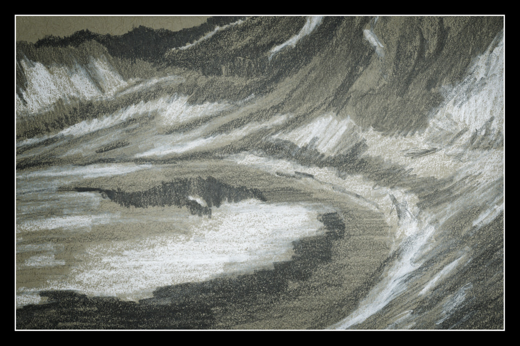
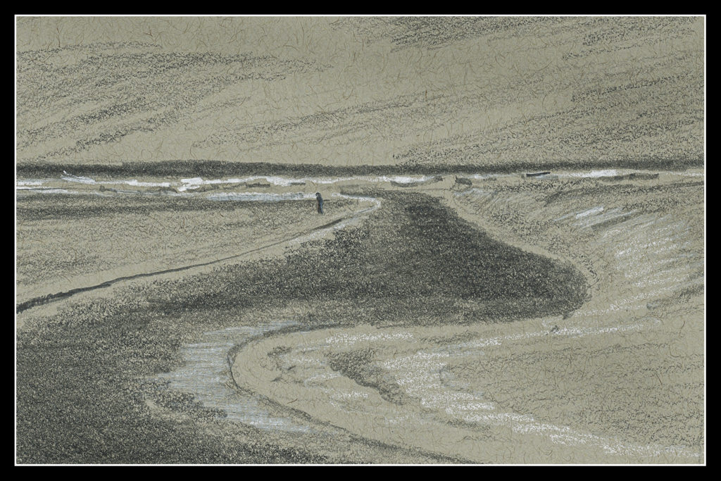
Again, behind on the 30-Day Challenge. I do see the results. For instance, this drawing is very simple, done on grey-toned paper. It’s not an especially exciting picture, but I am beginning to think differently! That is the whole point.

What are the changes?

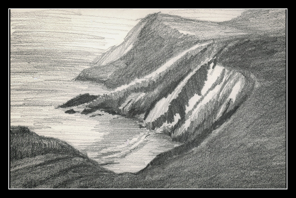
  • Focal point of the picture. Here, the lone figure.
  • The lines of the estuary into the distance.
  • Contrast – white (light) sand, crashing waves on shore.
  • Line direction to show changes in terrain, vertical, horizontal.

This paper – the grey – is very toothy, and the result is the lines are not very smooth. Midtones are a bit difficult to achieve – that is supposed to be represented by the plain paper – but that just doesn’t really seem to fit into my brain. This makes it difficult, challenging, and rather a bit of a visual tweak.

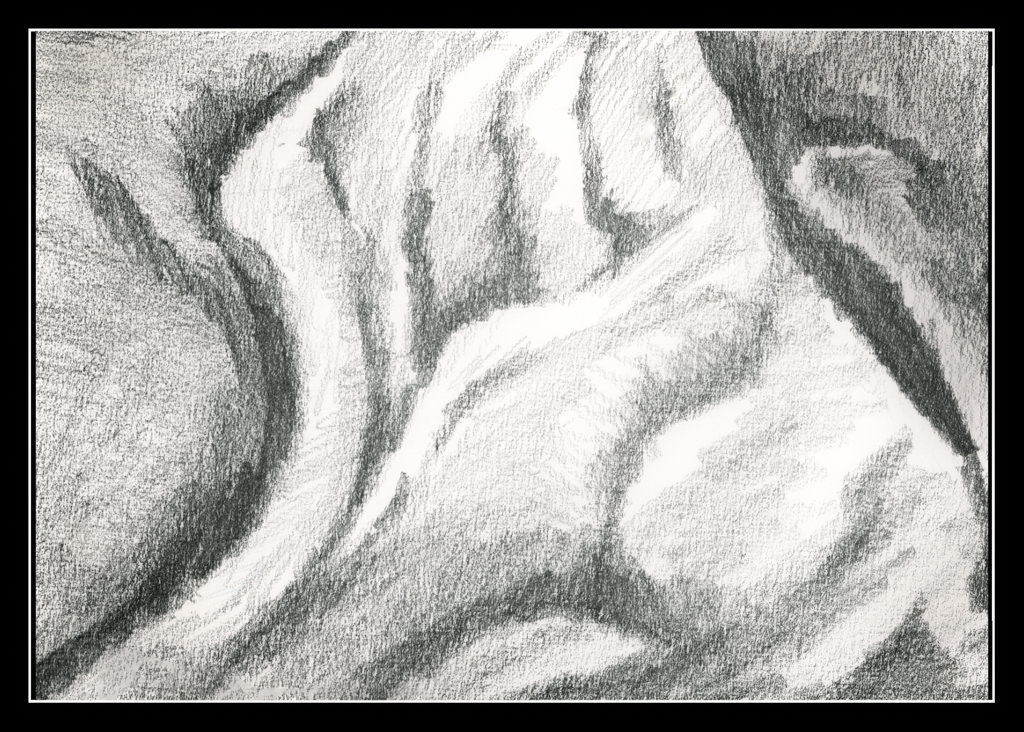
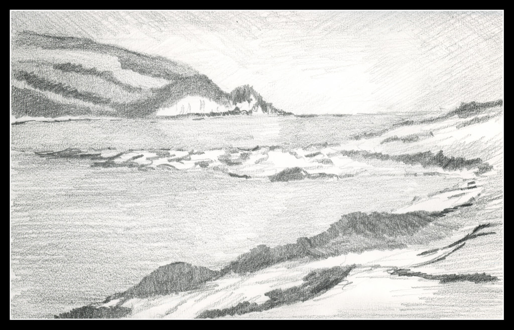
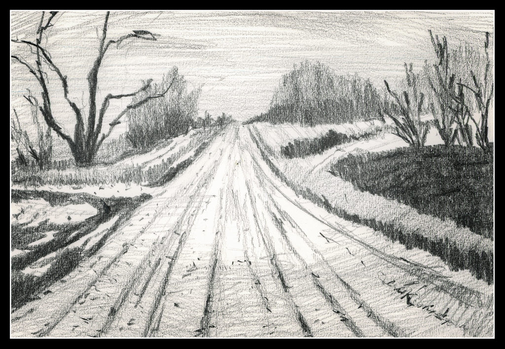
Overall, the point in these studies is to look at values, and to simplify. It is not easy as I am used to doing detailed work in pencil. Making simple marks on the paper which interplay well is difficult. “Noisy” marks distract from the point of the value study. In other words, lines which are scribbled and curly distract from the values. Value, value, value!

Onward!

7 – 11 / 30

I got behind! So here we go – the 30-day challenge.

Day 7

I found some grey stock when rummaging around. Graphite and white chalk pencil on grey paper.

Day 8

More of the same media as Day 7. This is a glacial lake with snow. Does it look like it or not?

Day 9

I like this one the best out of this series. It looks like it is supposed to be – a chicken!

Day 10

A candle, and back to graphite on white paper, just like Day 9.

Day 11

The soft melted wax dripping down the side of the candle for Day 10 made me think that perhaps some fabric would be another good exercise in soft surfaces in pencil. Again, graphite on paper.

And there we are – caught up. I couldn’t get to anything until this afternoon, so a daily drawing was not possible. The 30-day challenge is to do as many images, up to 30, in 30 days, but without the caveat that it has to be one a day at the most. In a way this really made for a sort of evolution in the drawings. Day 7 and Day 8 had the same idea – grey paper, graphite, and white chalk. It had its good points, but I think I prefer the graphite on white paper. The midtones are more easy to think about. I think these two studies helped make Day 9 as good as it is. From there, two subjects I never have considered – the candle and the fabric. Both work and don’t.

Again – how will I translate these value studies into color??!!

6 / 30

Day 6

I think I am getting some of the points of this course and the usage of pencil to create value studies. First, I changed simply to an HB pencil and a smooth paper with a tiny bit of tooth. The bristol was too smooth a paper and the 2B and 4B pencils just smudged too easily despite my best efforts.

The teacher, Roberts, speaks of structure, rather than subject or detail, as the purpose of these drawings. This means masses of value, not picky details. The details can come in the painting, more so as it becomes larger. The value studies help sort out directing the eye to the point of interest.

The white cliff across the water is the focal point of the drawing, and, ostensibly, the painting. To lead the eye there I vignetted as one does in photography, but this time with graphite. The corners of the drawing are deliberately darker. A sort-of cloud or fog bank is light against the sky in the distance. I tried to use the pale reflection of the cliff in the water to draw the eye as well. Finally, I reworked the piles of sea weed and flotsam to aim the viewer toward the cliffs. The same can be said of the vegetation on the land above the cliffs.

I am beginning to get more comfortable with this approach to painting using a value study. 30 days of value studies is changing my eye and thought processes. Hopefully it will pay off in the future.