Knowing that we would be visiting the Ness Botanic Gardens while moored in Liverpool (the Land of the Scousers), I decided to go into town in Liverpool in search of another set of pan paints. We went to Cass Art (see above!) and found a lovely set made by Rosa, an artist supply manufacturer in the Ukraine. I chose the “botanical set” that has colors found obviously in nature, and flowers in particular. It includes the reds and pinks and violets that I couldn’t make in my other little set with its 12 colors. While those 12 colors are good for mixing almost anything, there was absolutely nothing that would provide a lovely violet of any shade or any pinks. So, if you’re in a garden, what are you going to do? Well I know what I would do: Go shopping!

As you can see, this botanical set has some really beautiful colors in it as well as multiple greens. A lot of artists like to mix their greens, and while I find mixing greens is fun, having a few pre-made ones from which you can make even more greens is even better. Yes, I am breaking all those artistic rules someone has determined, but so what?!
The first thing I did during this non-taken vacation fantasy was to just look at the different flowers that are available throughout the year at the Ness Gardens. They have lots of flowers, trees, open space, buildings, and just about anything you could think of, as well as walkways and paths and places you can wander in. A good botanical garden is always a pleasure, and one needs color to do it justice in paint.

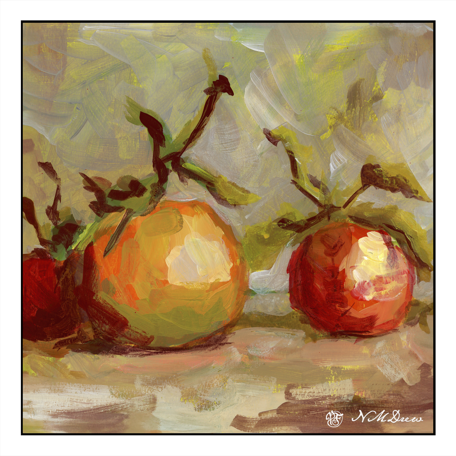
So, since I was griping about a lack of pinks and lavenders or purples, why not do hydrangeas? White, pink, lavender, and blue. The color depends on the acidic or basic qualities of the soil. I just mixed these vaunted colors together and had a good time.

Sadly, I could not find any map online of the Ness Botanic Gardens, but I can assure you there are buildings to go into as well as pathways to follow. One such building is this one, whose purpose remains a mystery me (shown above), but I thought rather lovely as it had woods behind, and colorful trees and flowers in front of it.

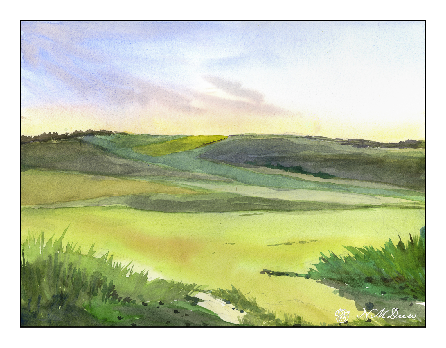
And, relying on photos for my fantasy walk, I took this pathway into the woods beyond. You can see just how beautiful it is with layers of colorful flowers, shrubs, trees, and everything in between.
The Ness Botanic Gardens was going to be one of my high points of our voyage – that and being driven on the left hand side of the roadways! I always enjoy going to botanical gardens because it’s so much fun to learn about plants, see plantings both formal and informal, as well as the variety of trees, flowers, birds and insects. It is all too easy to forget the abundance and beauty of Mother Nature.
Next stop: A Coruña, Spain.