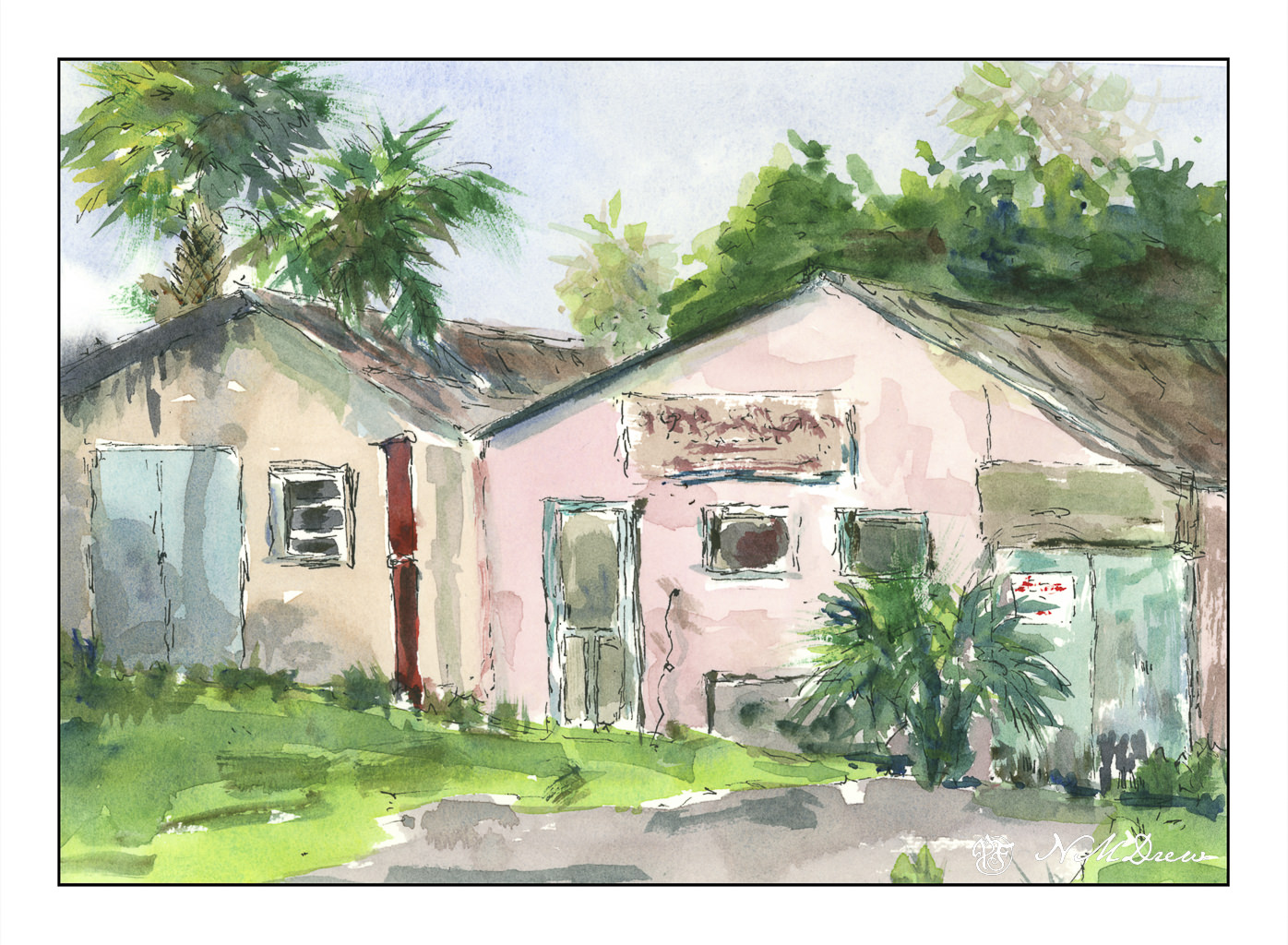
Heavy rains and foreboding skies give way to ragged clouds and brilliant blues as the storms recede. No snow here, but memories will do! I tried to express this sky in the distance, beneath the blue and white with the dark clouds moving away. Not so sure how it reads, but you can decide that. Could be trees, could be clouds, could be space ships. And there is a river behind the trees and the snow across the way.
Kilimanjaro Natural White Rough, 300#, Rough, 12×16.
Today the rains are pouring down. The backyard is flooded and the pump is working to keep the water levels acceptable by shunting it out to the the street and into the storm drains. This is the second of the two Pineapple Express atmospheric rivers causing concern and evacuations throughout the county and elsewhere in California. There is charm to living up a canyon until the rains erode it all – I live on a small hill in a tract with a creek in a park a ways down the hill. I’ll settle for that! Our clay soil and poor landscaping creates a boggy lake in the backyard, held in place with our clay soil, but we are lucky overall.
And on a rainy day, oil painting is not something I want to smell throughout the house even though I did think about it. Watercolors called – because of all the water around me? Who knows – but rain brings green growth and soggy ground, and that is a delight in our dry, dry land.
Sounds like the name of some pub . . . but in reality, this is a macro with my Nikon Z 50mm macro lens. 
Anyone who does post production with photo editing software knows about pre-sets. I have a lot I have made over time and it can be a lot of fun to manipulate a picture. The original of this was in color, so I converted it to black and white and then used a high-key preset I have made. I like the way it has softened the feather but retains enough detail to let you know what things are.
On an aside, I need to cut some new quills and brew some new ink. I am using fountain pens right now to write, but do like the tactility of a quill pen! However, my fountain pens are a lot of fun, too, and with different pens and inks, the variety is equally pleasant . . .
In the past several weeks, airplanes of a certain manufacture have had problems. Faulty door bolts allowed an exit fly off midflight and luckily no one went flying out into the atmosphere. In another incidence, the front wheel of the plane fell off before taking flight. And, apparently, airplanes and jets are not the only large craft with problems – ships, too, can be poorly built and / or designed.
What is this world coming to with such shoddy workmanship?
Over the next several weeks I am enrolled in a couple of oil painting classes. Acrylic paints really do frustrate me in a lot of ways, and please me in others, but it is time to work with oil paints on a more serious level. Let’s see where it goes.
To get ready for these classes, I pulled out some of my supplies. Of course, the oil paints come out – I have a smaller selection of colors than any other medium! I also have canvases in panel and mounted format. However, I did need to stock up on linseed oil, solvent, and other such stuff. And then paint.
Canvas mounted on panels is actually, I think, the easiest way to go. Canvas pads flop around and easily bend. Mounted canvas on stretcher bars takes up a lot of space but can provide a gratifying surface to paint on if properly and tightly mounted and prepared. For now I am using canvas panels which, while not super high quality, are relatively inexpensive and easy enough to prepare, if at all, prior to painting. 
I love pears! Painting them is far less tasty than eating them, but they are by far one of my favorite winter fruits. Here, some d’Anjous, all cuddled together. My focus here was brushwork and getting a sense of the unctuous quality of oil paints. Some people use the paints straight out of the tube, but I like mine to slide around a bit. It really makes for fun blending. The colors, too, were rather limited here for the purpose of seeing how they can interact. 
Here, more lavender fields. Why so many? It is because lavender and purple are honestly rather nasty colors to create from the standard mixes. I find that I like to have “convenience colors” on hand – namely, a good violet such as carbazole or dioxazine. Mixed with other colors and / or white, I get lavenders and such that appeal to me. I initially tried to just use variants of red, blue, and white for the lavenders, but gave up with frustration. Not worth the sweat! Maybe later I will master a good orchid lavender, but for now . . .
As with the pears, playing with the things you can add to the oil paints to thin them out. I used Gamsol and Soy-Thin, both low odor solvents. I didn’t use any linseed oil in either painting – that will come later – as will other things, such as drying agents like alkyds. 
The pears and the lavender field were painting on pre-gessoed 10×10 cotton canvas panels measuring 10×10 inches square.