I look at YouTube in the morning after reading the news. The problem is that it is an addicting site. I look at it for art techniques, sewing information, photography, and when it pops up, history. I do enjoy history, modern history probably more than ancient.
When you come across films from different time eras and different places, there is a sense of reality that photos and stories cannot elicit. Here we have one from Berlin, Germany, during what is obviously the 1920s, probably before the depression set in. People are well-dressed (everyone looks well-dressed compared to today’s sloppy standards) – and, it seems, comfortably well off.
Wealthy, middle class. Life in the better parts of the city.
As you may recall, my Pencil Portraits class will begin again, on 2/17/21. It’s a lovely class with a great instructor, social distancing, real people! None of this virtual stuff, which has its place, but doesn’t cut it for me. However, that is another story.
For my previous two Pencil Portrait classes, I spent the entire time – 2 hours a day in class for 5 weeks to do one portrait in each session. I learned a lot and got some good results. This time around, though, I am actually “prepping” for the class. I want to be able to render a likeness that is recognizable, but I want to try to do a portrait in each session. That means a portrait in two hours, for a total of 4 portraits (we are meeting for 4 weeks this time, with a possible 5th depending on what the class wants).
Thus, I have decided to refer to various how-to books in my library, as well as work with other resources, such as YouTube. With as many resources at hand, I just need to sit down and work on things. Today’s focus is on proportions and positions of the eye, nose, ears, and mouth in a frontal view and in profile, as well as some practice with shading – as I’ve noted, my ability to render shadows and contrast gets lost when I work with color.
Above are studies from the book Drawing Portraits for the Absolute Beginnerby Mark and Mary Willenbrink.
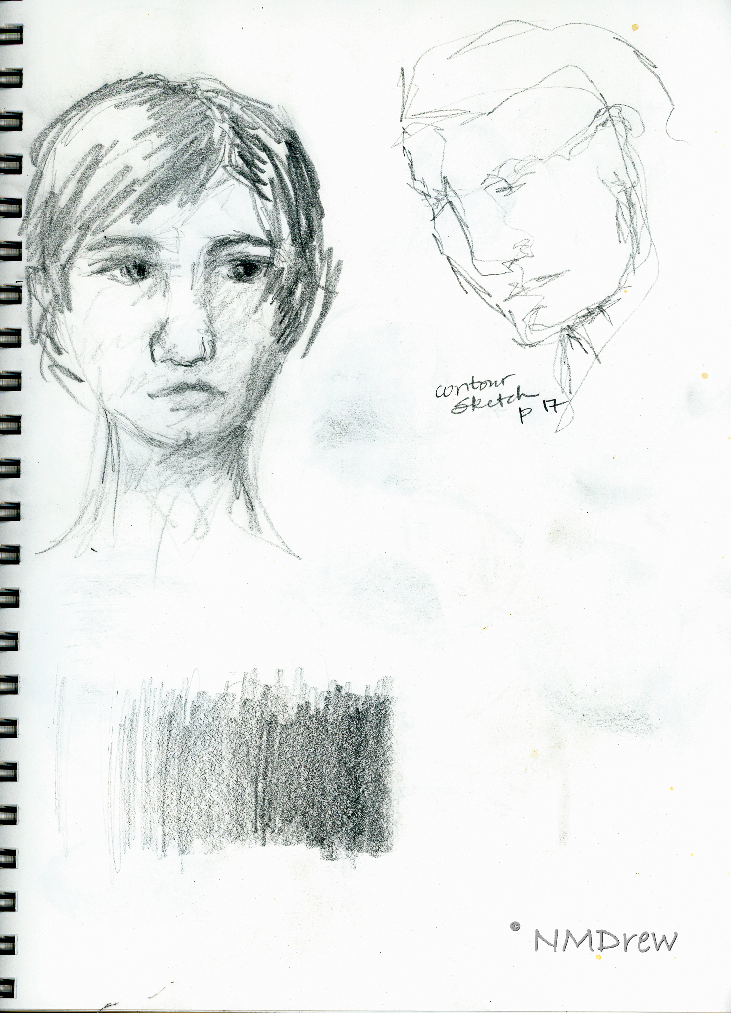
More from the Willenbrink’s book as well as a face I drew the other day.
Shading studies with a look at where light hits a sphere from different directions. Not too sure how realistic my results are, but in a way, just doing it and thinking about it is perhaps more important. Being conscious of shadows is the whole point. I learned a lot from a video by Xabio Arts, which is below:
Solving the problems of drawing means putting tools in your art supplies – mental ones for reference with a pencil (or pen, or brush!).
More shading, and a face. Per the Willenbrinks, the face is about 5 eyes wide – which I know – and 7 eye-widths high – which I never learned. Now that is a good trick. From there – a couple of faces and shadows.
A face on a singe sheet of paper, using guides from the Willenbrink’s book as well as from a video on YouTube from Xabio Arts on drawing the face straight-on.
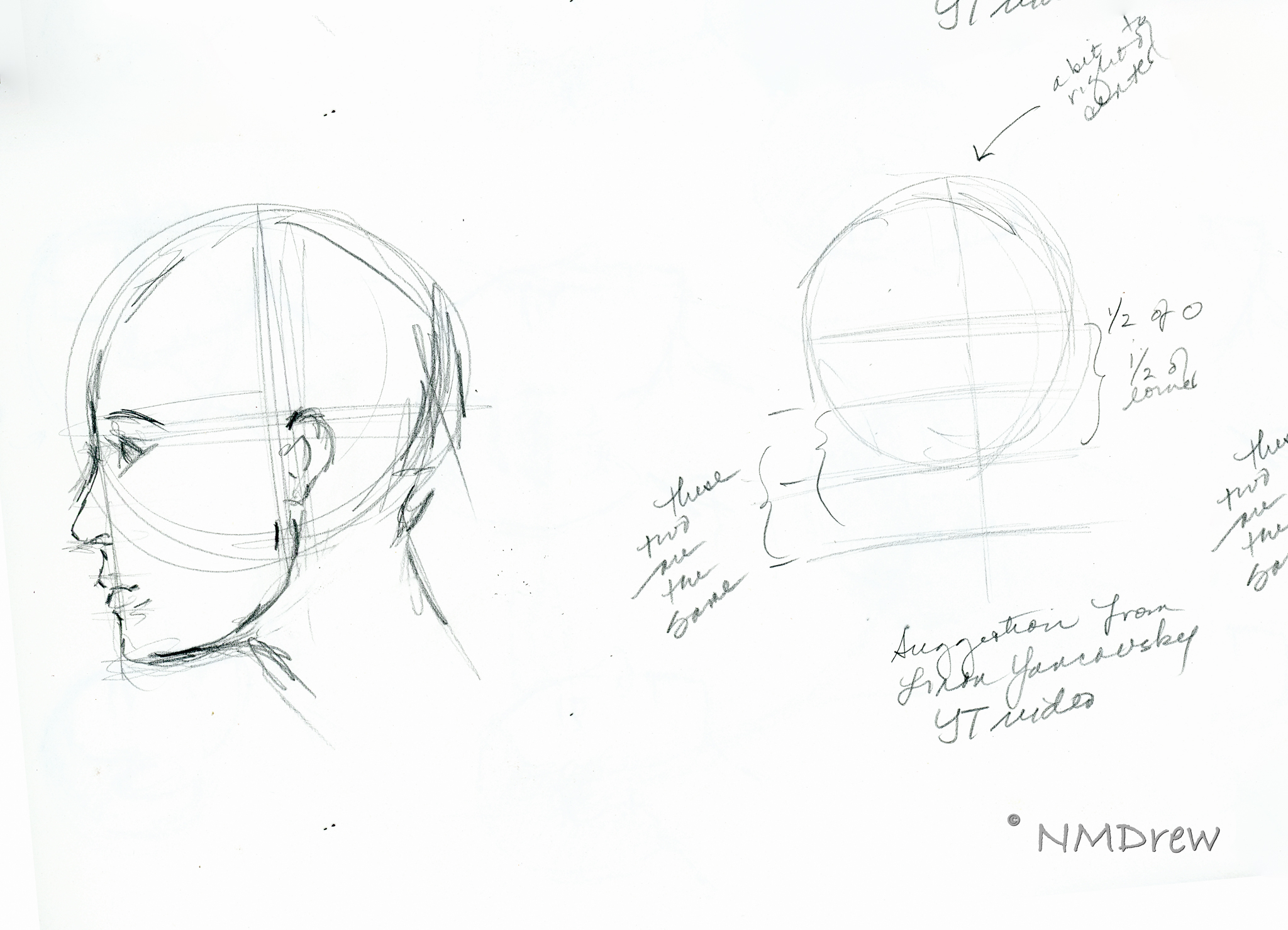
Now, profiles. I really did not get the Willenbrink’s proportions very well. Something eluded me. The heads just don’t seem in proportion. Thus, some YouTube videos on drawing the head in profile. Not much hit me until . . .
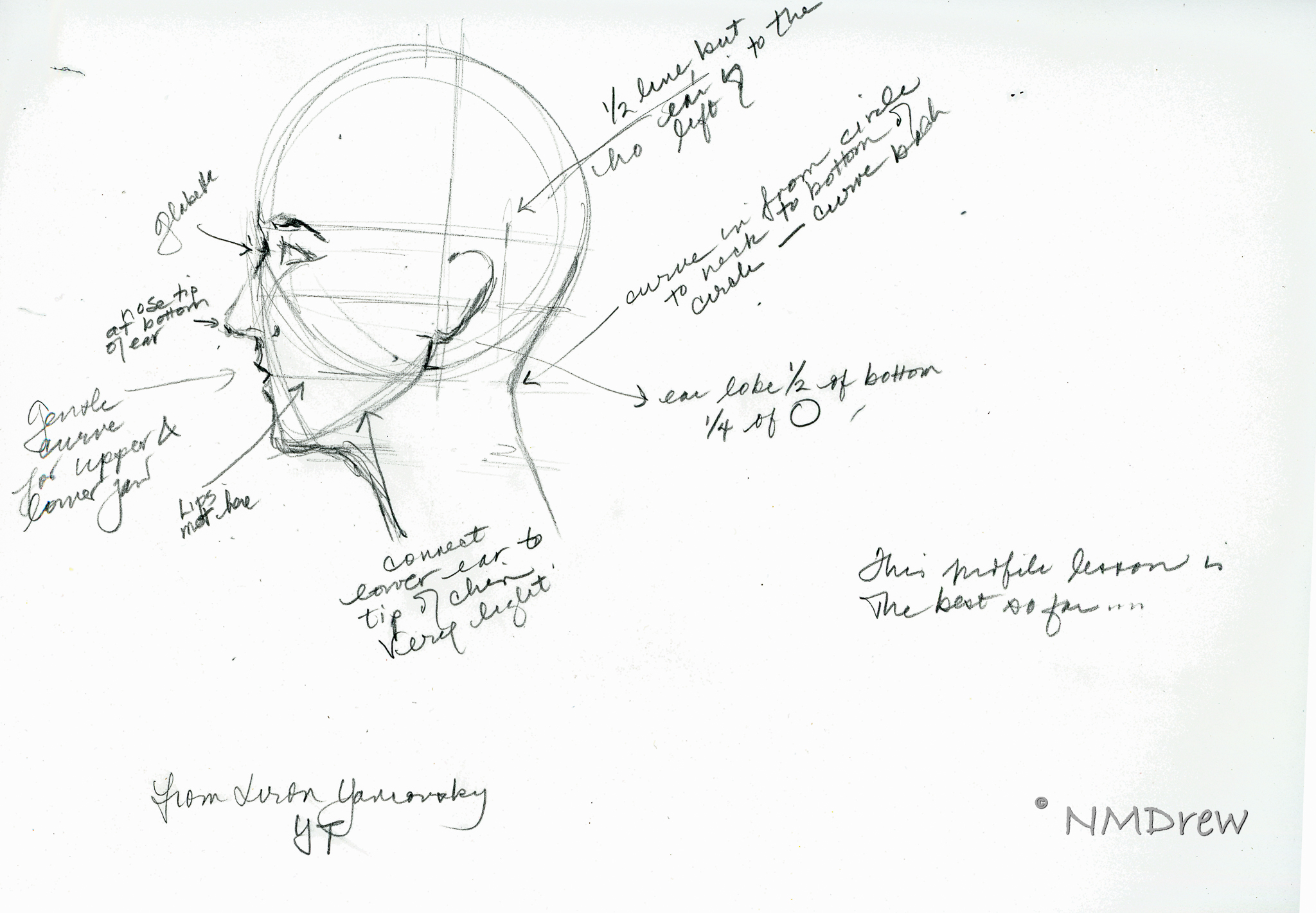
. . . I came across a profile video done in 2015 by Liron Yanconsky on YouTube. These are his proportions, and they work a lot better for me and how I want to set up proportions. You can see his video below.
And the final drawing of the day is below.
Art is personal and we all have our own way of doing things. It’s so interesting that, although we are taught the same thing, how our minds and bodies put it out on paper can be so different.
I’ve also realized that I never have had a drawing course, or read a book, that says “Do it this way!” Technical mastery is not just in knowing how your medium works, but also how to render the real world around you. This mastery becomes a jumping-off point to your own adventrues.
This is getting to be a rather fun project. No pressure, either. I am sort of documenting bits of my daily life with the Instax Printer Project. I am also finding out that my scanner was filthy, and probably the lens of my X100V needs a bit of dusting. Spot removal in post has been a major time sucker. Despite that, I am looking at photography as a fun adventure again! That is rather nice IMO.
After my attempts at a portrait of a person, the realization was that my shading skills are not really good. Also, my Pencil Portraits class recommences on 2/17, so I thought it might be a worthwhile endeavor to work with a pencil, and work on value with the pencil. This certainly will benefit any studies I do in the Pencil Portraits class, and perhaps get it into my thick skull to think a lot more about gradation and value than I do! (Magpie Brain loves bright colors.)
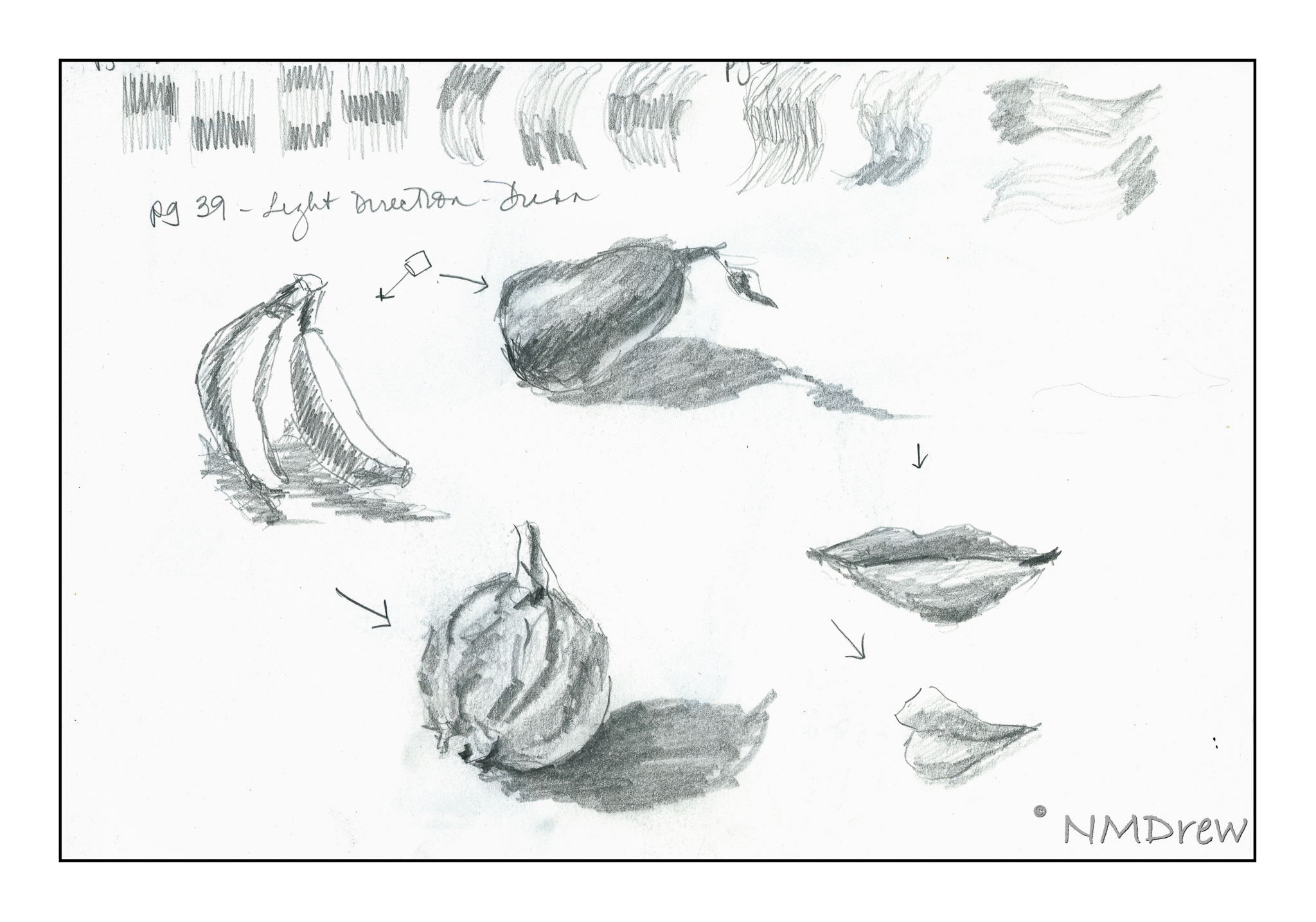
I am very fond of the books by Alphonso Dunn on ink drawing. His work is phenomenal, and I have learned a lot through his exercises. Given this, I decided to apply some of his studies to pencil work rather than ink. All of these exercises come from his Pen and Ink Drawing Workbook.
Above, is the first one I attempted. If you look closely, you can see the page numbers in the sketches (enlarge the images by clicking on them). These studies were outlines with a choice of light direction. You have to use your imagination!
Shapes and shadows – reflected light, cast shadows, highlights. Simple forms and then a rather pathetic toucan.
I particularly enjoyed employing the pen-into-pencil of these drawings in Mr. Dunn’s book. His are obviously rendered in black and white, with shades of grey determined by pen strokes. Here, I took his studies and applied pencil – graphite – to them. They include a cabbage (I know, it looks like a brain), mushroom, hammer, and bow tie. Each has a different set of textures. I started to visualize where the light source was, and that really helped me start thinking more about what I was doing.
For all of these, I used a 2B pencil and a sketchbook, along with referring toPenn and Ink Drawing Workbookexamples.