A Palm Tree, ii

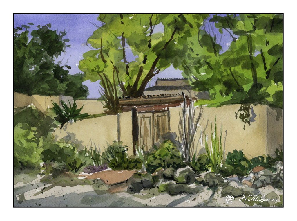
After my satisfaction with yesterday’s watercolor and my ongoing interest in palm trees, I thought about a couple of things. First, I need to get over my fear of buildings. Second, I need to paint more palm trees! So, I decided to use a photo I took awhile ago and posted here to use as subject matter. Below is the original photo which was taken at the Santa Barbara Zoo, near the condors (I think). The zoo itself is a wonderful resource and is always undergoing change and development. I’ve been going there for decades and always like it as it is large enough for a good visit and small enough so you don’t have to move in for a few days!

A Palm Tree

The photo itself is nothing especially exciting but it does give a good display of palm fronds. I am not sure what species this palm is, but it so classical! As well, there are some dracena palms on the right by the lights, which are very different in growth pattern that the one front and center.

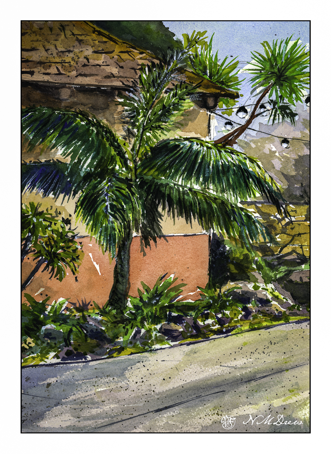
Part of me wanted to make the painting simpler, but I also wanted to suggest a bright, sparkly day. The photograph was of a rather hazy day so I had to use a bit of imagination to get the fronds to catch the glittery appearance such palm fronds can have, especially in intense light with a bit of a breeze.

Overall, I like the way this painting turned out. I had to do a bit of glazing to tone things down here and there. Splattering helped for texture. White gouache to do a bit of glare here and there. Yesterday’s painting of an adobe reminded me how easy buildings can be, and today, though simple areas exist in the form of walls, the roof was a bit mossy from the damp of being a few blocks from the Pacific Ocean.

As a quick after thought, I think that the palm tree – the dracena – emerging from the right side of the building is perhaps unnecessary. Into Photoshop and tree removal very poorly done with generative fill – just because I can and could.

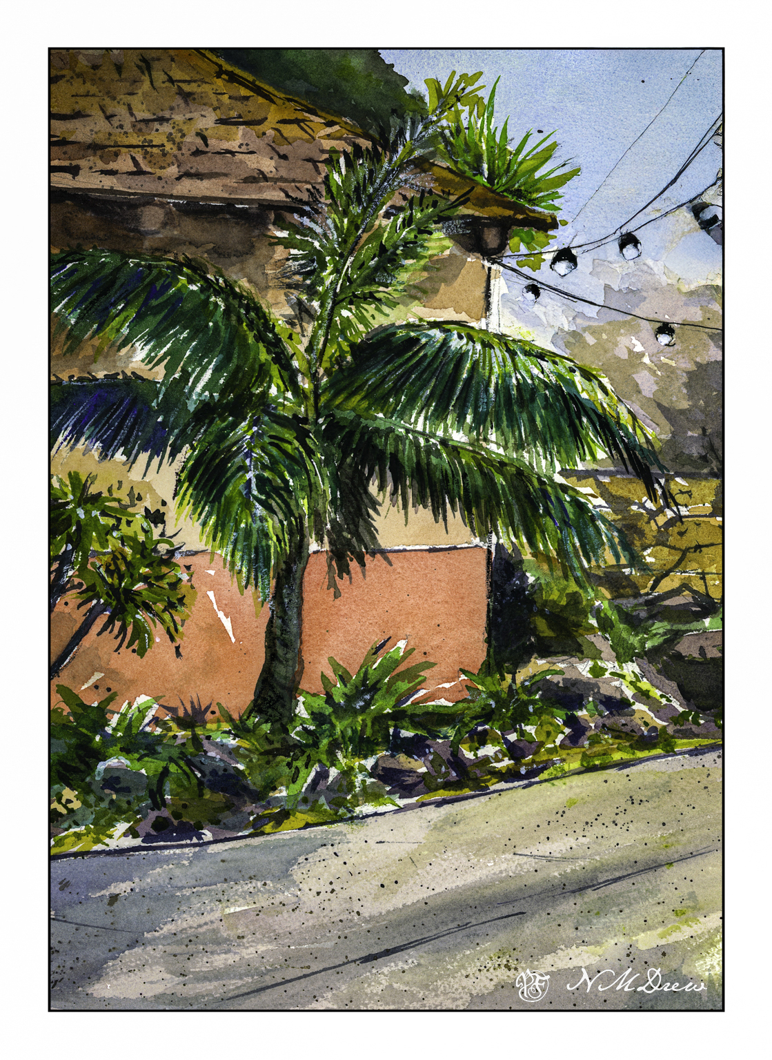
Watercolor, Arches 140# CP paper, 9×12.

Adobe

Yesterday was Easter, a quiet time for us. The day was gorgeous and the weather so pleasant – perfect Spring. I love the way the light catches as the seasons turn, and the clear, dry air of the southwest pushes colors to a harshness which at high noon can be glaring, but early or late in the day, when the shadows are long, the light is clear and bright but doesn’t hurt your eyes.

For the past several days I have been working in watercolors on smooth paper to practice pale colors which would work well with ink. I think I am getting it. Easter Sunday, though, I was getting a bit bored with the colors I was using as well as the lack of papery tooth to hold colors. As a challenge, I decided to paint a building. I realized why I am intimidated by buildings – they have straight lines and a jerk of the brush can ruin a good, hard edge.

A few straight line glitches, but I will say I am pleased with what I did here. I took my time and tried to create a simplification of a complex structure that works well with shape, shadow, contrast. I know where I messed up my straight lines, but you can find them and tell me if you like!

Watercolor, Arches CP 140# paper, 9×12.

Sunday Afternoon

After working on pen and ink and watercolor wash from the short course I took, I decided to sit down, pull out some watercolor sketchbooks, and choose one for A Project. And that project will be to try to do a daily – or more than one daily – sketch following certain steps: pencil drawing, ink, erase pencil lines, watercolor, and then more ink. And maybe no ink. The idea, though, is to draw and paint the real world just to see where it goes.

Today it was pushing 80F, and after days of 60F or so, it has gone from cold and damp to warm and hot. Hard transition! So, I sat at the patio table and looked around me. Not excited by much of anything, but here we go!

We have a small mandarin tree in a pot. This year, about 10 little delicious mandarins. Here I used a water soluble disposable fountain pen so there is some bleeding of ink and watercolor. This is the first one.

And here is the second rendition of the mandarin. I used Carbon Ink in a fude fountain pen. This ink is a bit more waterproof than the disposable fountain pen. The fude pen is by Sailor, and the pen nib is both wide and angled to about 90 degrees. Depending on how you hold the pen the lines will be fat or thin. The trunk is made up of the fat lines, and I think you can figure which ones are the thin lines!

Not quite ready to retreat from my experiments, I used the fude and the disposable pen to create this portrait of Miracle Gro potting soil (my all-time fave). Ink applied, painted around, and more ink afterward. This was sitting just next to me, ready and waiting!

And finally, one of the many podocarpus trees along the back wall. Here, pencil outline, then plain watercolor. No ink. Not great but an exercise focused on areas of color – as in the mandarin tree drawings – to show warmth and depth – as well as simplification of groups of color.

There is a little thing in my brain right now that is sensing a change in how I see things I want to draw. It feels good. You probably know that feeling – something is changing with a more sophisticated or skillful – but new – approach. Let’s see where it leads.

140# CP watercolor sketchbook, about 5-8, Carbon Ink in Sailor Fude pen, Pilot Varsity disposable fountain pen, watercolors.

Sketching with Shari, iv

The very last lesson in this delightful class on ink and color sketching by Shari Blaukopf. As soon as I saw it I knew it was La Super-Rica Taqueria on Milpas Street in Santa Barbara, CA. Excellent food – it opened years ago and was a walking dinner destination when I lived in the area.

Anyway, this drawing is a culmination of drawing people and buildings, learning a bit about perspective and thoughts about how to do things. I enjoyed this one a lot even in my moments of frustration. Rather than using Bristol paper, I used 140# CP watercolor paper. The first frustration was the texture of the paper and my pencil – a lot of smudges. Still, I continued and laid down the ink lines after I had it limned out. Then, erasing all that smudging with the kneaded rubber eraser, and it cleaned up very well.

As you can tell by the shadows, this is either early morning or late afternoon – and it is late afternoon. The sun is to the left, which is in the west toward the Pacific. This is an older section of Santa Barbara, and because it is not filled with new and modern buildings, it is charming and pleasant, and certainly a break from modern suburban architecture.

When I started inking the outlines, I began with the stop sign on the right. Can you see how stupidly out of proportion it is? You could knock an elephant out with it! The people and the rest of the drawing are in decent relationships to each other. Unfortunately, I used colors which are rather saturated and did not pay attention to the fact that the ink bleeds a lot. When I painted the major tree to the left of the building, the trunk should have been very light. The same with the mountains above the taqueria itself. Despite that, I like the way it turned out overall. A word of caution – don’t drive the cars as they look quite unsafe.

Ancient Copper ink; fountain pen; 140# CP watercolor paper; brush and watercolors. About 11×13.

Flat

I normally tend to use pointed round brushes for watercolors, but every now and then I pick up a flat brush and use it throughout a painting. The other day I noticed some inexpensive flats on sale in a variety of sizes, so I picked up a couple to add to my collection. Now I have .25, .5, .75, and 1.0 inch flats, some firm, some soft. And tested them out.

Epson Scan used here – too lazy to putz around. The blue in the sky is granulated and light in color, but the blue in the water is too blue. The rest of the colors seem to be okay.

A flat brush is rather versatile. The longer edge makes for wider strokes, obviously. You can also load your brush with one color on one side and another color on the other side, and when you paint on wet paper, the results can be interesting. I didn’t do that here, but am writing this to remind myself I need to do it a bit more! The narrow side of the brush can give very nice straight lines, as you can see in the hay canopy in the mid-ground. Sharp edges, like in rocks can be easily expressed. Squiggly lines can also be achieved as seen in the too-blue-to-be-true water.

Watercolors, flat brushes, limited palette.