Sunday Afternoon

After working on pen and ink and watercolor wash from the short course I took, I decided to sit down, pull out some watercolor sketchbooks, and choose one for A Project. And that project will be to try to do a daily – or more than one daily – sketch following certain steps: pencil drawing, ink, erase pencil lines, watercolor, and then more ink. And maybe no ink. The idea, though, is to draw and paint the real world just to see where it goes.

Today it was pushing 80F, and after days of 60F or so, it has gone from cold and damp to warm and hot. Hard transition! So, I sat at the patio table and looked around me. Not excited by much of anything, but here we go!

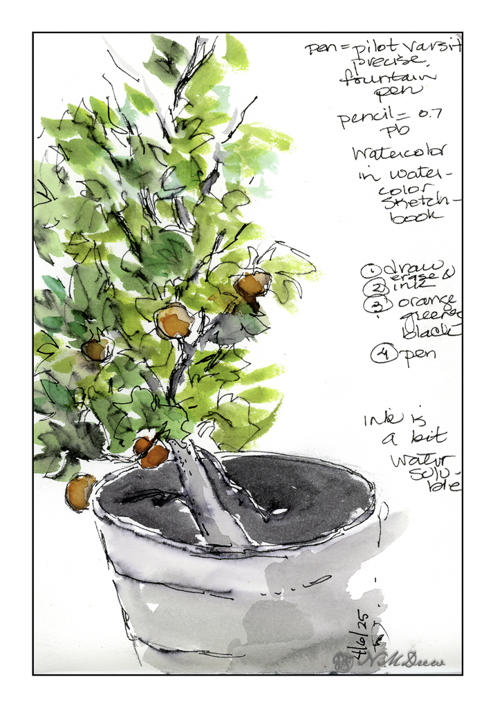
We have a small mandarin tree in a pot. This year, about 10 little delicious mandarins. Here I used a water soluble disposable fountain pen so there is some bleeding of ink and watercolor. This is the first one.

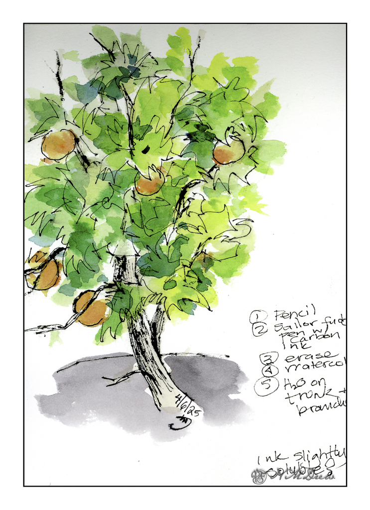
And here is the second rendition of the mandarin. I used Carbon Ink in a fude fountain pen. This ink is a bit more waterproof than the disposable fountain pen. The fude pen is by Sailor, and the pen nib is both wide and angled to about 90 degrees. Depending on how you hold the pen the lines will be fat or thin. The trunk is made up of the fat lines, and I think you can figure which ones are the thin lines!

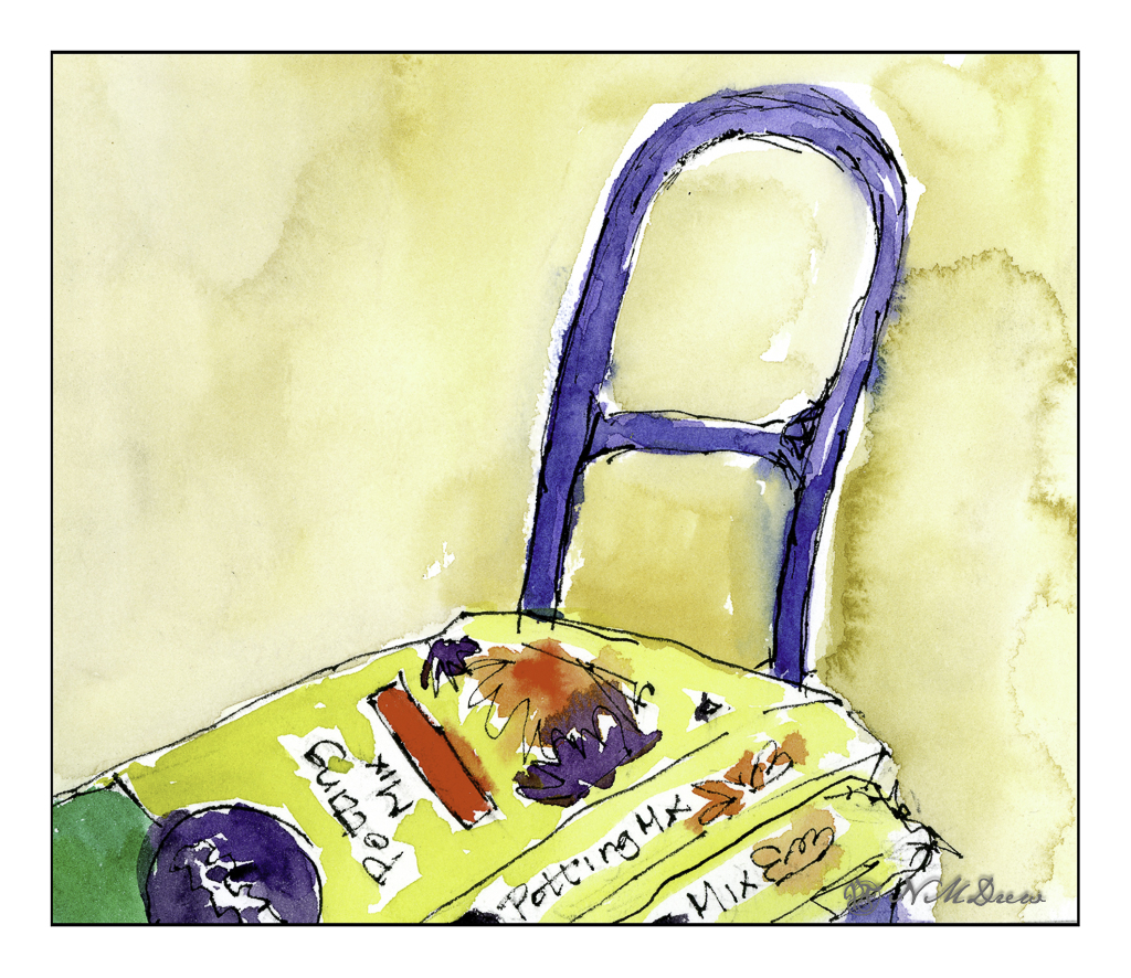
Not quite ready to retreat from my experiments, I used the fude and the disposable pen to create this portrait of Miracle Gro potting soil (my all-time fave). Ink applied, painted around, and more ink afterward. This was sitting just next to me, ready and waiting!

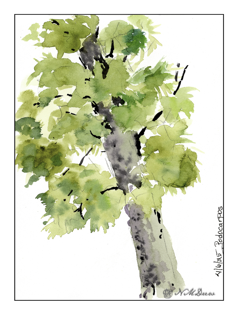
And finally, one of the many podocarpus trees along the back wall. Here, pencil outline, then plain watercolor. No ink. Not great but an exercise focused on areas of color – as in the mandarin tree drawings – to show warmth and depth – as well as simplification of groups of color.

There is a little thing in my brain right now that is sensing a change in how I see things I want to draw. It feels good. You probably know that feeling – something is changing with a more sophisticated or skillful – but new – approach. Let’s see where it leads.

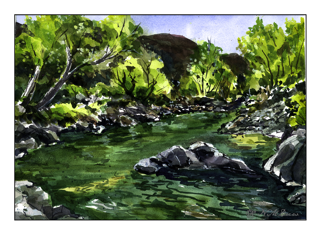
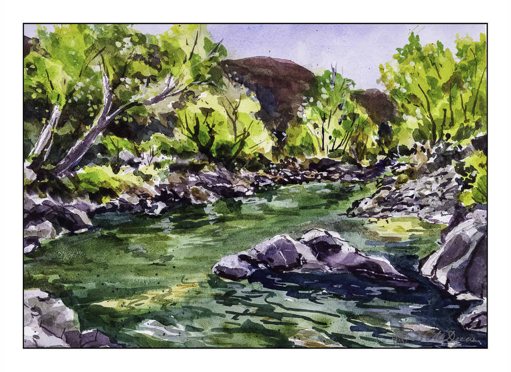
140# CP watercolor sketchbook, about 5-8, Carbon Ink in Sailor Fude pen, Pilot Varsity disposable fountain pen, watercolors.

Sketching with Shari, iv

The very last lesson in this delightful class on ink and color sketching by Shari Blaukopf. As soon as I saw it I knew it was La Super-Rica Taqueria on Milpas Street in Santa Barbara, CA. Excellent food – it opened years ago and was a walking dinner destination when I lived in the area.

Anyway, this drawing is a culmination of drawing people and buildings, learning a bit about perspective and thoughts about how to do things. I enjoyed this one a lot even in my moments of frustration. Rather than using Bristol paper, I used 140# CP watercolor paper. The first frustration was the texture of the paper and my pencil – a lot of smudges. Still, I continued and laid down the ink lines after I had it limned out. Then, erasing all that smudging with the kneaded rubber eraser, and it cleaned up very well.

As you can tell by the shadows, this is either early morning or late afternoon – and it is late afternoon. The sun is to the left, which is in the west toward the Pacific. This is an older section of Santa Barbara, and because it is not filled with new and modern buildings, it is charming and pleasant, and certainly a break from modern suburban architecture.

When I started inking the outlines, I began with the stop sign on the right. Can you see how stupidly out of proportion it is? You could knock an elephant out with it! The people and the rest of the drawing are in decent relationships to each other. Unfortunately, I used colors which are rather saturated and did not pay attention to the fact that the ink bleeds a lot. When I painted the major tree to the left of the building, the trunk should have been very light. The same with the mountains above the taqueria itself. Despite that, I like the way it turned out overall. A word of caution – don’t drive the cars as they look quite unsafe.

Ancient Copper ink; fountain pen; 140# CP watercolor paper; brush and watercolors. About 11×13.

Flat

I normally tend to use pointed round brushes for watercolors, but every now and then I pick up a flat brush and use it throughout a painting. The other day I noticed some inexpensive flats on sale in a variety of sizes, so I picked up a couple to add to my collection. Now I have .25, .5, .75, and 1.0 inch flats, some firm, some soft. And tested them out.

Epson Scan used here – too lazy to putz around. The blue in the sky is granulated and light in color, but the blue in the water is too blue. The rest of the colors seem to be okay.

A flat brush is rather versatile. The longer edge makes for wider strokes, obviously. You can also load your brush with one color on one side and another color on the other side, and when you paint on wet paper, the results can be interesting. I didn’t do that here, but am writing this to remind myself I need to do it a bit more! The narrow side of the brush can give very nice straight lines, as you can see in the hay canopy in the mid-ground. Sharp edges, like in rocks can be easily expressed. Squiggly lines can also be achieved as seen in the too-blue-to-be-true water.

Watercolors, flat brushes, limited palette.

Winter Valley

Today I thought I would be a bit self-disciplined and work with only two colors to create a winter landscape. I used MaimeriBlu’s “Faience Blue” and somebody’s artist quality Burnt Umber. Add to that, as needed, some white gouache.

I have never used MaimeriBlu paints, much less Faience Blue. This blue seems a bit of a cold one, which is perfect for a winter day. The Burnt Umber, mixed with the blue, produces a nice dark as well as plays into the coldness I am trying to express.

The first part of the painting was done with the sky – start at the top and work down. This is pure color, diluted, to create a sky. First the paper in the area of the sky was wet, and then the blue brushed in. Before the paper dried I lifted out the color.

Next I painted the distant hills and background area, solid in color, but varying the intensity of the colors and mixes of brown and blue. I painted through where the trees in the mid-ground would be as I knew the tree branches would be a bit darker once painted. Next came the trees in the foreground right and shrubs and grasses on the left as well as under the trees. All dried with the hair dryer. The middles areas were done after these dried.

Finally, the snow was tinted with blue in varying strength, bits of grasses, and final details. The snow on the trees was done with white gouache, as in the front left shrubs. Once the gouache dried, a mix of blue and brown was glazed over it to tone it down. Finally, a light wash was put into give a sense of dimension to the snow.

In the end, I am rather pleased with this painting. Using triads made me recall some other watercolor exercises I have done with limited palettes of color. The cold is much to my liking as is the complexity of the foreground giving way to simpler forms in the distance.

Arches 140# CP paper, MaimeriBlu “Faience Blue” and Burnt Umber. 10×14 inches.

Sparkly Day

The way the light shimmers through leaves on a bright day is something so difficult to capture in a photograph or a painting. The contrasts between light and dark shift and change to be almost blinding.

This is a creek running through the Coconino National Forest in Arizona. It is near Flagstaff and Sedona, and the terrain varies from alpine to the red rocks of Sedona and creeks and forests of Ponderosa pines. The above scan is a VueScan image with some corrections. Below is one using Epson Scan.

Neither scan really does justice to the colors, but the sparkle is caught. I think like a camera a scanner and software has difficulty with subtle variations from light to dark.

Sigh.

So, what did I try to do today? First, a bit of a limited palette. I didn’t do a triad, as with yesterday’s painting. I used (off the top of my head) mostly ultramarine blue, cadmium yellow, and burnt sienna, but into that mix I added Hooker’s green, cobalt teal, phthalo blue. The greys of the rocks came mostly from ultramarine and burnt sienna. Hooker’s provided a basis for some of the more obvious greens, but the cobalt teal mixed with yellow were used for the lighter, brighter greens you seen in springtime. Some titanium white gouache was applied here and there.

Additionally, besides limiting my colors, I tried some of the techniques for the water. Here, there were swaths of shallow water with an ochre coloring, reflections of rocks and trees in the water, and shadows beneath the rocks in the foreground and lower right. I didn’t use enough color and water to create a bead to allow blending – I have been told I would make a stingy bartender! – but still managed to get some of the colors to blend with one another. I also did glazes to show direction of water and movement. It turned out better than I thought it would – if nothing else, I need to be more generous and allow more paint and water than I think I will need. This something we all need to learn – how much is too little, how much is too much. Of course, the Goldilocks effect is best!

Watercolor, Arches 140# CP paper, 10×14.

Oh, hell – here’s another scan!!