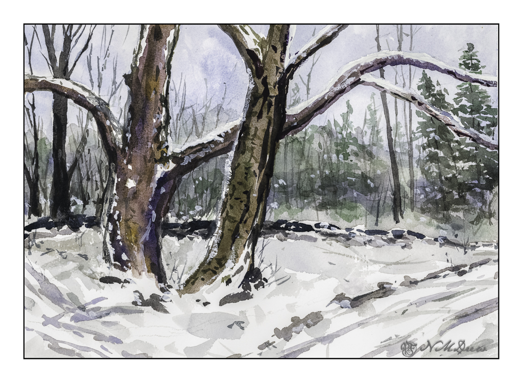
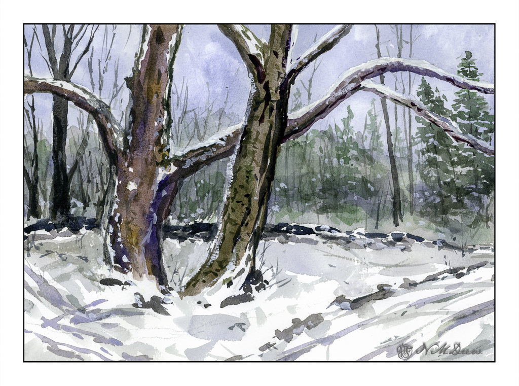
Well, the electricity is off again. I feel like I am living on a little island because only a few people in my neighborhood are affected. Fortunately, we have our generator! So, light, electricity, internet, and the opportunity to continue with my course on color triads by Shari Blaukopf.
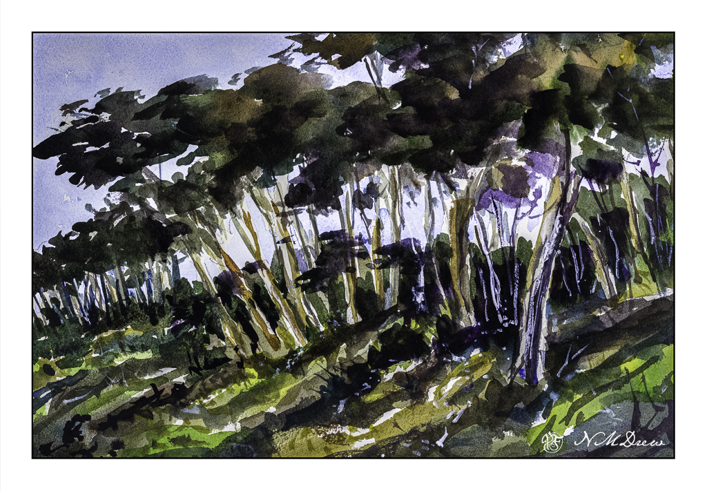
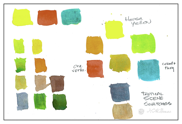
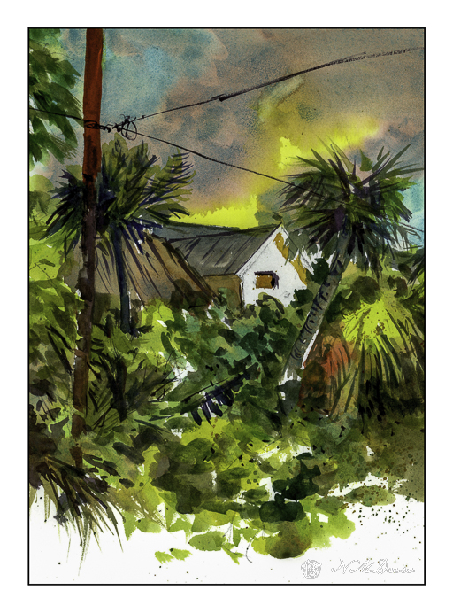
I did the first one, a tropical scene in Florida, and this is the third, the Arizona desert. The second one is winter and since it is cold and rainy outside, the desert appealed to me a bit more. The color triad used here – and easily, too – consisted of New Gamboge (yellow), Ultramarine Blue, and Burnt Sienna. I did not have the New Gamboge, so I mixed Cad Yellow Medium with a bit of Pyrrole Orange to get the color she suggested. These colors are perfect for a late evening in the Arizona desert.
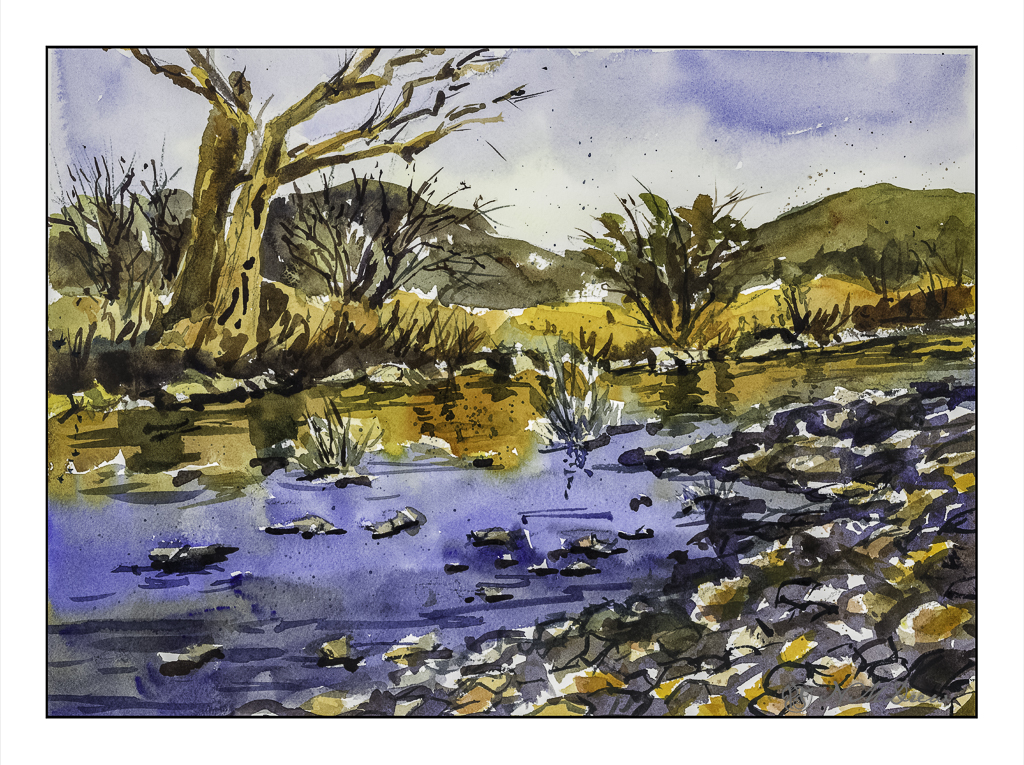
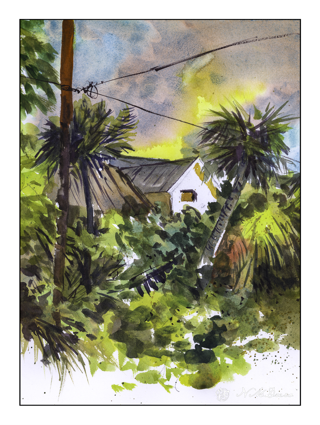
The above scan is with VueScan. It is a bit more subdued than the one below, scanned with Epson Scan. I like both of them, but think the richer colors of the Epson Scan are a bit more to my liking. The warmth of the scene is well done here, and matches my own colors perhaps more closely.
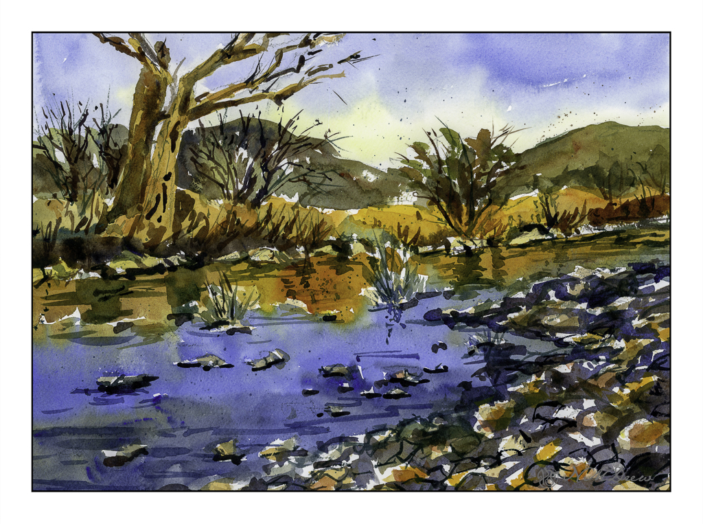
All of Blaukopf’s courses have been a real pleasure to follow. If you like watercolor, I suggest her more than any other online teacher. I never fail to learn something new. For instance, in this class, the golden middle ground, just above the opposite shoreline, included painting the colors up into the trees on the left. From there, at a later point, more detail was added.
The other thing I learned was a really interesting and unique way to do reflections in water. The two colors – golden yellow and then blue – were mixed up in big puddles. First the golden yellow was laid in, with a bead of color at the bottom. Then, with the blue, with space between it and the gold, the blue was brushed in with only a touch onto the golden yellow here and there. This allowed the colors to merge, but not become murky or form blooms. Finally, the darker water of pure ultramarine was mixed with a bit of the golden yellow mixed with burnt sienna.
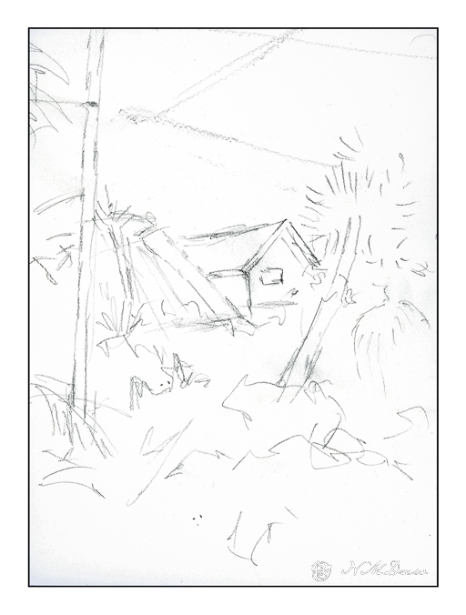
This triad study was so much fun to do! Time to try some of my own from my own photos.
Watercolors, Arches 140# CP, 9×12. Cad Yellow Med, Pyrrole Orange, Ultramarine Blue, Burnt Sienna.