Color Triad, i

With the threat of fires and losing our house, I feel a bit crazy. We ordered a generator, but it would be ironic that it gets burnt up and our house. No, our house is not in danger, but it is so scary to be contemplating its loss, as well as realize people have died and lost everything. So, it is as if I have to grab onto life and what I love, from people and pets to things I love to do. Watercolor painting is one of them, and the artist whose work I enjoy the most is that of Canadian watercolor artist Shari Blaukopf. Her colors are fresh and cheerful, her personality soothing and calm, and her mini online workshops are always a pleasure.

So, today, her most recent one: Expressive Triads. In painting, a triad is three colors, all primary, but within that the colors vary. This first one, for her tropical scene, consists of Cobalt Teal, Hansa Yellow, and Organic Vermilion. We begin with mixing color swatches.
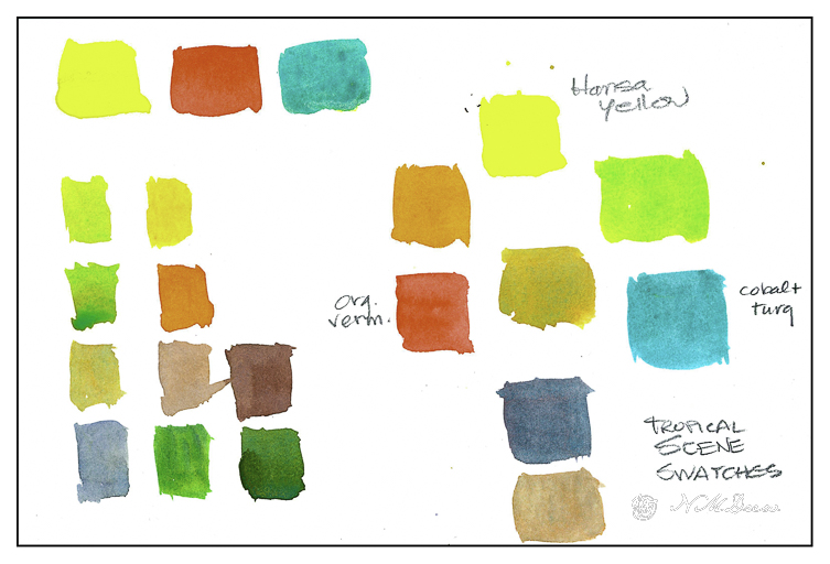
She also adds ultramarine blue at times, toward the end, to mix really dark values which can vary depending on how much yellow or vermilion you add to the mix. I normally don’t swatch but today it just seems so important to attention to details and savor them.
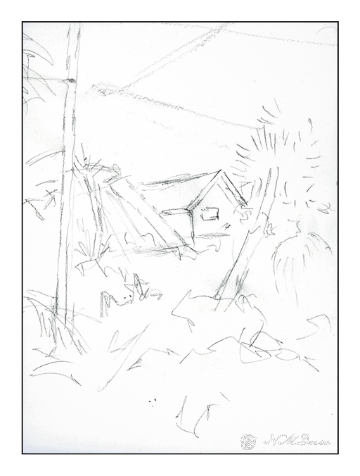
From there, a piece of 10×12 paper and a pencil sketch for the general shapes of the scene. This is from a trip Shari took to Florida. She points out the warmth and colors of the scene – yellow clouds, teal sky, grey sky / clouds. As she paints, she explains what she does, colors used, brushes, talking as she paints. She suggested that you watch her video and then paint along after watching it. It is a good idea!

Her first scene – one of three – is this one. Her videos explain each section as she does it. So this scene itself has three sections – the sky, the foliage, and finally details. I don’t want to give away her course details, but suffice it to say she is clear. I learn a lot from watching and then doing. The beauty of her video courses is their clarity and brevity and extremely reasonable pricing. I spent about 2 hours with this first painting – watching and then painting.
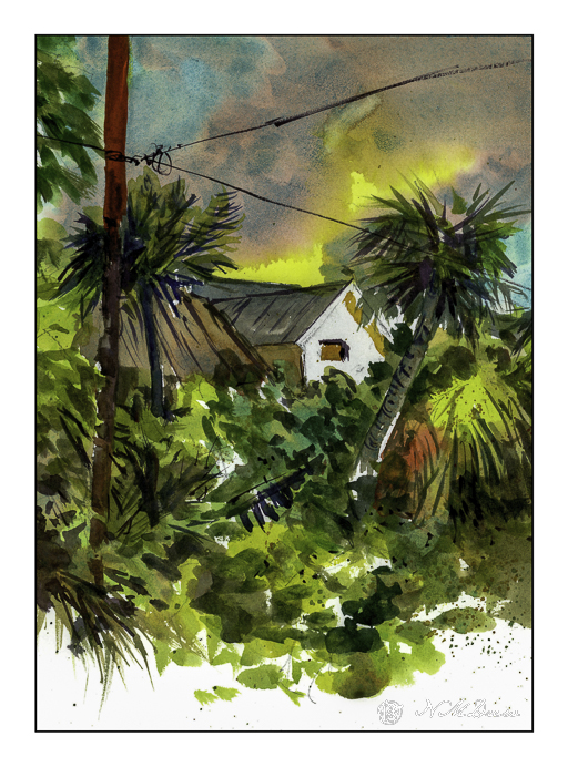
While her sky is representation of the tropical skies in Florida, here, in the midst of the fires in LA, this sky makes me think of the conflagrations flooding the news. Palm trees and semi-tropical vegetation is common here, so the yellow clouds and sky mixed with grey make me think of smoke and fire on the horizon. Our sky is clear, and let us hope it stays that way. The above picture is scanned unedited with Epson Scan software.
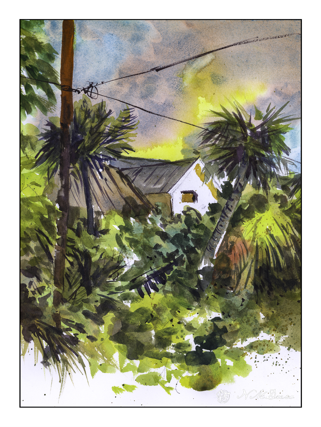
The above scan is with VueScan and is less intense – especially in the yellows. I wonder if I need to permanently switch the software to VueScan as it seems more accurate, at least with this painting.

Final Touches

Below, some final touch-ups to the painting. I blurred out the bloom in the sky below the upper telephone wire, added shadows to the eaves of the house, and painted in some lines to the trunk of the left side palm tree. Once more, scanned with VueScan.
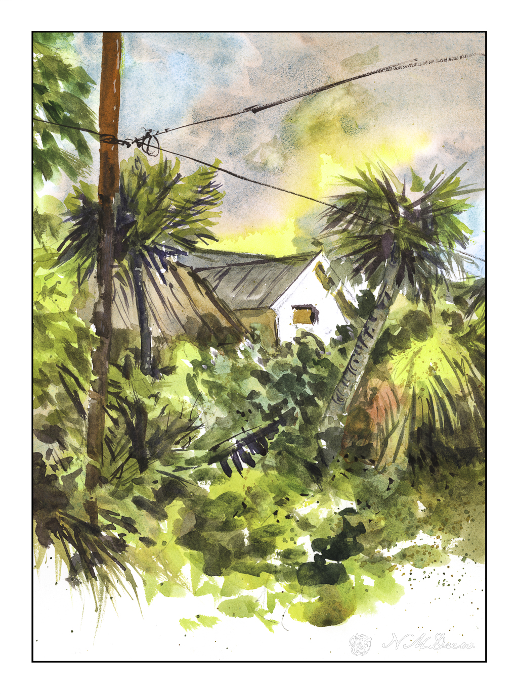
Watercolor, Arches 140# CP paper, short course by Shari Blaukopf.
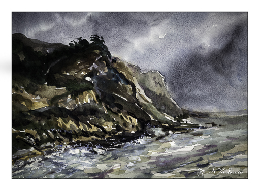
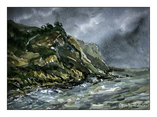
Impressions of San Gregorio State Beach

Scanning – sometimes I love it, sometimes I hate it. It is usually better than trying to take a photo of a painting though . . . .

I used Epson V600 Epson Scan on one of these; VueScan on the other.

Above was done using VueScan. It captures the colors better but is a bit dark. Below, the greens of the trees and bushes are better captured.

More of the colors show up using Epson Scan, but they are a little too intense.

Sigh.

The fact is that scanning and post-production can really influence how a painting looks. This goes whether the painting is scanned and interpreted using software, or photographed, and then interpreted and adjusted using software. If you look up a painting on the internet and then look at all the images of it, you know what I mean – colors can vary dramatically.

All this techno speak aside, I like them both for different reasons. Both do capture the moodiness of the original watercolor, which I like. Perhaps that is the most important thing – the mood is caught?

Watercolor, Arches 140# CP, 10×14.

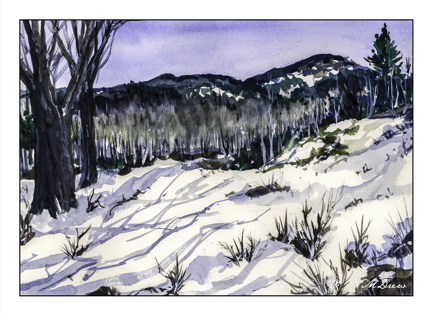
Winter in the White Mountains

It is exactly a week before Christmas. Today, in SoCal, the wind is blowing, there are fire warnings, and it is about 77F (25C). It is a bit warm. Snow seems to be a good subject to watercolor!

The focal point of painting this picture, besides wanting a bit of snow for the season, is to see if I could catch the softness of the bare birch trees that act as a barrier between the snowy foreground and the mountainous background. Anyone who has seen the leafless birch trees at a distance knows that there is a sort of haziness as all their branches overlap and merge into a softness with some detail and without much detail at all.

I used a relatively limited palette – mostly ultramarine, Hooker’s green, burnt sienna and umber. In some areas I used titanium white gouache, partly to place definite snowy details as well as to blur into the birch branches to create that softness I wanted to express.

Not a bad way to spend an afternoon out of the wind!

Watercolors, Arches 140# CP, 10×14, some gouache.

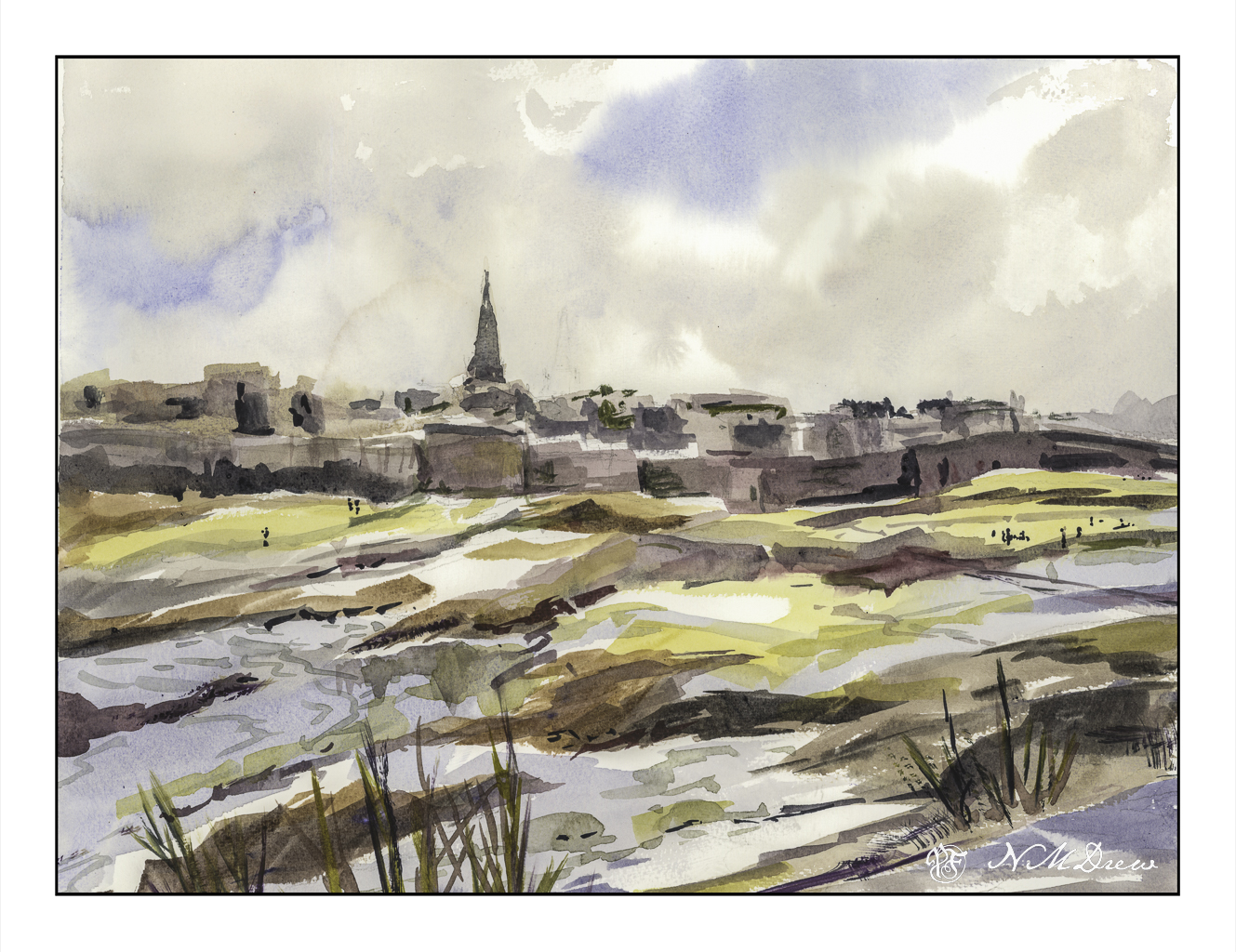
Beach at Saint-Malo

Remember the story All the Light We Cannot See? Ever since, the city has intrigued me. The story is worth reading, and if I remember, the movie was decent as well.

This painting was a quick one, and it turned out pretty good in my opinion. The point was to just paint, as well as to try out a new-to-me watercolor paper. This paper is St. Cuthberts Mill’s Bockingford paper. It seems to be a fairly soft paper as the tape around the edges of the painting pulled up some of the paper even though the tape was on the paper itself for only a short time. Using the heat of a hair dryer solved this problem, like it usually does. I liked this paper, though it does buckle a bit more than I expected when wet, but in the end it has proven to be well behaved.

Initially I scanned this painting on my Epson V600 scanner using the Epson software. Contrast was harsh and the sky barely showed up. I have had issues with watercolors and the software before – not at all pleasant to see – and then I suddenly remembered I have VueScan by Hamrick. I closed out the Epson software and fired up VueScan – and, oh, what a beautiful difference! This software is something I bought years ago, and I never really thought about using it for watercolors – I use it for photos I plan to run through Negative Lab Pro. Well, I guess I will have another use for it as well! Sheesh.

Watercolor, St. Cuthberts Mill Bockingford, 12 x 16, CP 140#.

How Busy Can It Get?

No, I don’t mean life. I mean trees and piles of leaves and undergrowth – all the stuff that makes up a good fall scene! Some trees have dropped a bazillion tons of leaves and others are hanging on to them. Years of detritus build up on the ground, creating a fertile place for new growth, plant, fungal, insect, which in turn supports other life in the wilder world outside the super market.

Anyone who has taken a walk in the woods or tried to photograph or paint this jumble knows exactly what I mean – it is really a busy-ness of color and texture and shape.

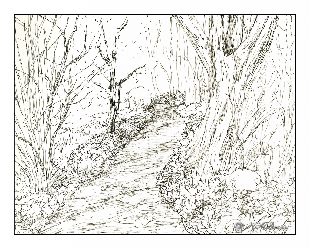
This is my sketch, done with a fountain pen and some Carbon Ink by Platinum. The paper is a bit rough so it could be what caused some difficulties with the pen nib – or the pen itself is not the best – or both. I tried to convey light and dark and texture with different pen marks. Straight lines to show trees and texture and the shadows of the trees across the pathway. Contrast is suggested rather than emphasized as I wanted to use paint to give the sense of shadows and so on. With that in mind, I pulled a palette of my out-of-the-tube paints rather than pan paints, cleaned them up and went to work.

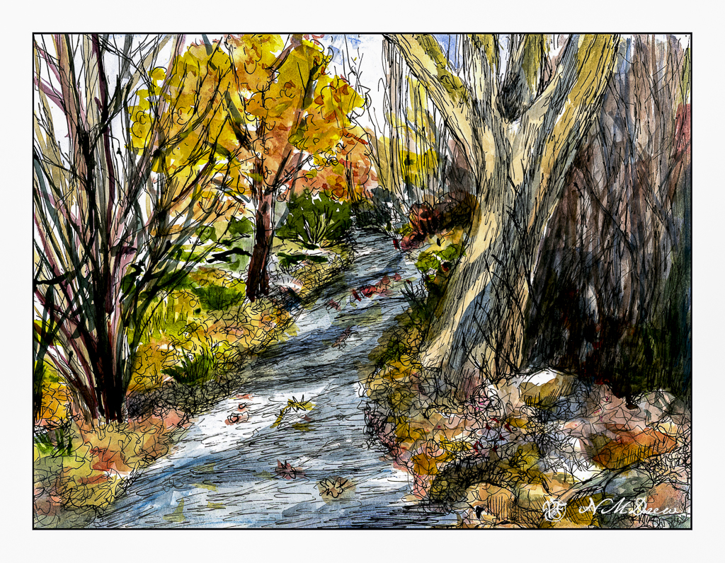
As you can see, light and dark are more emphasized with the use of color, as are the colors of the leaves and the complex shapes of trees on the left and undergrowth on the right. The leaves that have fallen have some variegation, depending on when they fell and how long they have been there. Green grasses and weeds peek through. There are a few rocks, too, and leaves on the pathway. Tree shadows fall across the trail and up onto the tree on the right. There is a brightness to the day despite the murk of the undergrowth.

After adding color, I waited for the picture to dry. I made some color adjustments. And then, back to the waterproof ink pens. This time I used Micron pens and my Uniball waterproof pens. Micron pens come in different nib widths (here 0.1, 0.2 and 0.5) and the Uniball is labelled as “fine” but in reality makes a darker, thicker mark than the Micron pens.

Overall, I am more pleased with today’s ink and wash sketch than the one I did yesterday of the plumeria. As usual, I did not do a preliminary pencil drawing but just worked from the end of the path and then moved back and forth to establish areas. I really like my tangled tree in the lower left and the shadows on the big tree on the right. The brightness of an autumn day is expressed. Now all I have to do is get to scuffling through those leaves and it will make my day.

Pen, ink, watercolor wash, on Strathmore Vision 140# CP paper, 9 x 12.