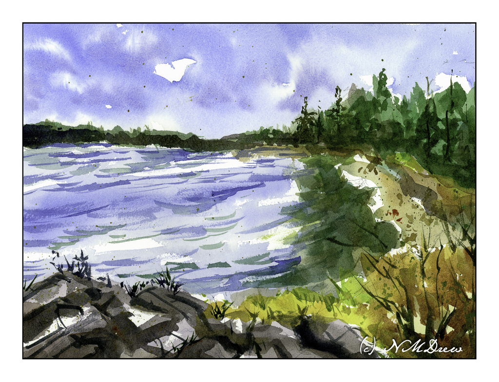
Lately I am not interested in pretty pictures so much as I am in simplifying or working on specific techniques in watercolor. Here, the main goals were the foreground rocks – making simple but still suggestive of a bit of an outcropping – and a sense of wind on the water and reflections of the trees. Well, the rocks turned out to my liking, the waves on the water okay, but the reflections are a total flop. More careful planning next time around!
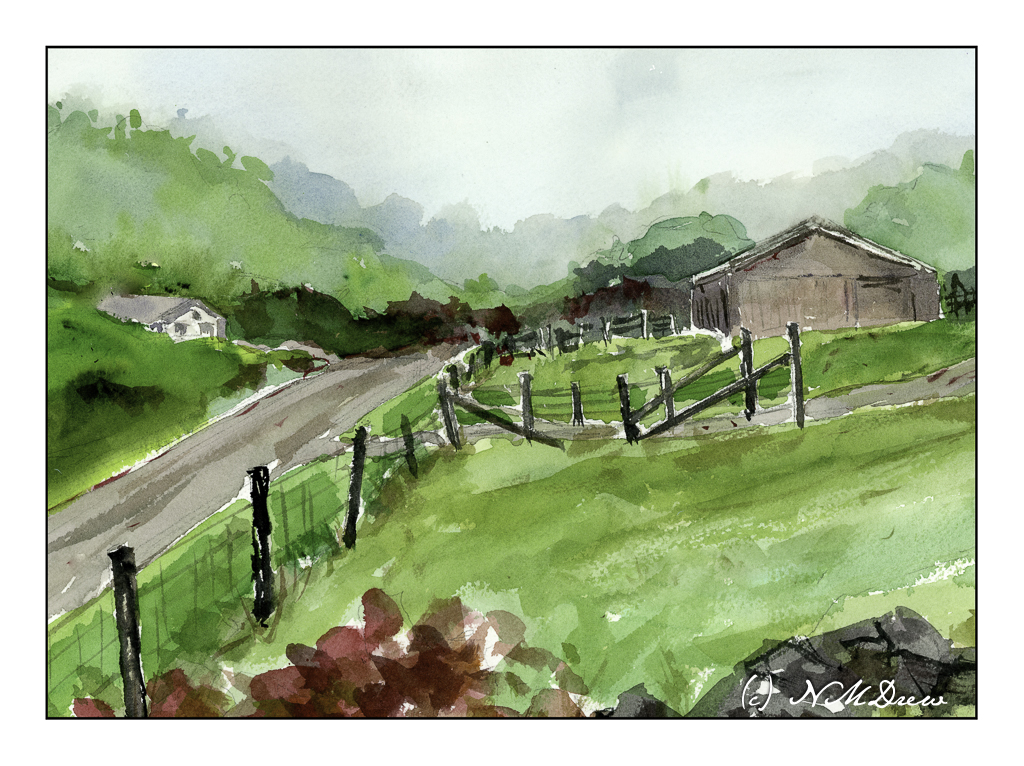
The Great Smoky Mountains get their name from the mists that rise up from the hollows. The park was established in the 1930s and are part of Appalachia, itself which covers parts of New York south into the Carolinas, Georgia, Alabama, and more. My own family on my father’s side can trace itself back through many areas, in particular Tennessee. As a kid, my family traveled through these mountains a bit, but I have never had the opportunity to spend a lot of time exploring them.
Here, I tried to work with a limited palette as well as a wet-in-wet technique to create the sense of fog and mistiness of the distant trees. The sense of just a wetness to the landscape – lush greens, trees, mists – is another thing I wanted to convey. I think it works.
When we lived alongside the Rancocas Creek in New Jersey, the shores of the creek were slick and muddy and the underbrush along the edges of the creek were thick and tangled and nearly impossible to get through. Of course, kids worked their way in – as did I – and paths led to some wonderful places. We had a tree house in a huge willow tree and a rope swing over the creek. If you were brave enough, or foolish enough, you could jump into the creek from the rope. I never did that! Instead, I traipsed around in the mud, pushing my way through stink weed and elephant ears (our names), losing my shoes in the mud (and getting spanked for that!), and getting bitten by mosquitos.
Such memories are the inspiration for this watercolor. I wanted to show the crowded growth along the banks, the greenish water, et cetera, et cetera. I also wanted to make it a simpler painting, trying to do masses of color without all these details. I don’t know if that would have been possible but I think I will try this painting again, but I need to think about it and play a bit to get it. As well, the whitish bark of the trees, living and dead, were hard to paint – decisions to paint around, then tint, or tint and then paint around them drove me a bit to the frantic side of my personality, which already tends towards hysteria.
Anyway!
I also used a new-to-me watercolor paper, made by St. Cuthbert’s Mill in England. I am not sure as to its fiber content, but it is archival. The texture is nice, size is good at 11×15 inches, and worked really well with the paints and water. Color could be lifted, as in the reflections of the trees on the left in the creek. So far I am pleased with this paper and definitely plan more paintings using it.
Colors were, again, of a more limited and older tradition: Hookers, ultramarine and cobalt blues, yellow ochre, siennas. A bit of alizarin and both cad red and yellows were thrown in for mixing.
While this painting is busy, it works okay for me. I think the challenge to simplify it will be worth the time and energy I spend to do it.
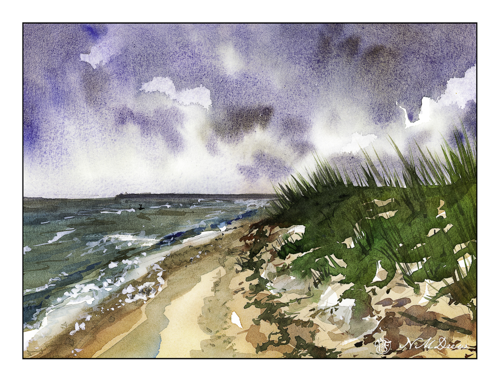
Beaches differ so much, but one thing they have in common – the ocean! The shore between land and ocean can vary, from rough and rocky, to wide and sandy and flat, and everything and anything else.
Once more, the simplicity of Seago’s watercolors was in mind, but my own rather picky or detail-oriented tendencies made simplification really hard to achieve. Along this shoreline is seaweed and other detritus, differing levels of shoreline, dunes and grasses. In the distance is an opposite shore – island or land arm of a bay? I had to force myself to stop!
And there is a giant bird shape in the middle of the sky . . . funny how you don’t see these things – at least I don’t – until I scan the painting and look at it days later. Maybe I’ll fix it, maybe I’ll leave it.
Again, a limited palette of ultramarine, Hooker’s, ochre and sienna. I also used a bit of phthalo blue, an as a touch-up, white gouache. Hahnemuhle 9×12 140# CP paper.
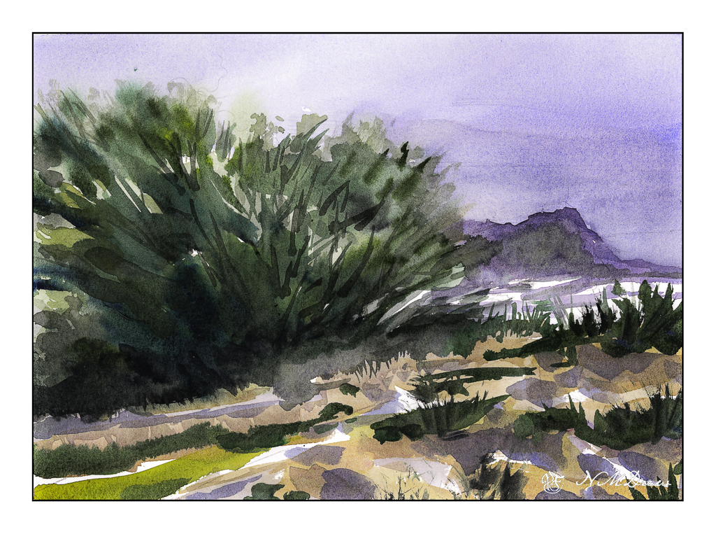
Up north along the Pacific are many beaches with dramatic cliffs, sandy beaches, fog, and it is always exciting to drive along the coastal route – usually Highway 1 – to enjoy the scenery. Sometimes you need to wander a bit off the beaten path to find a bit of paradise, but exploration is always fun!
I don’t remember what colors I used specifically, but I do recall ultramarine and cobalt blues, burnt sienna, yellow ochre, cadmium yellow, Hooker’s green, and possibly a bit of alizarin. The scene is a bit soft because the coastal fog, prevalent along the California coast, is in the distance. The air is moist. And, it is chilly! Mark Twain supposedly said the coldest winter he ever spent was a summer in San Francisco. You know what I mean if you have experienced it!
We all have our own styles and methods of painting, and in some ways I like the way I paint, in other ways I dislike it a lot. Here, I focused on simplification but in some areas did a bit more working of a subject than I should have, such as on the right distant cliffs, ocean, and sky. The estuary below the headland is simple enough – at least I realized that and didn’t do anything more to it. My bush is also okay, but perhaps it could have been simpler – or the foreground, too – but when something is close to the viewer, details do become important. Each leaf and blade of grass, though, would be excessive.