Coastal Grassland

Another landscape, another limited palette.  For this painting I used ultramarine blue, burnt sienna, burnt umber, sap and cobalt greens, a splash of raw sienna.  9×12 Fabirano Artistico.

I wanted to see if I could convey a good sense of depth, moving from the foreground with warmer colors to the distance with more neutral and greyish colors.  Contrast, too, was considered for eye appeal, leading lines, depth.

If you look at the grasses in the foreground, you can see grass blades.  I used a very dry flat brush to accomplish this, sometimes using a lighter green and brushing upward, or darker green to brush into the lighter green.  Negative painting!

Caribbean Cool

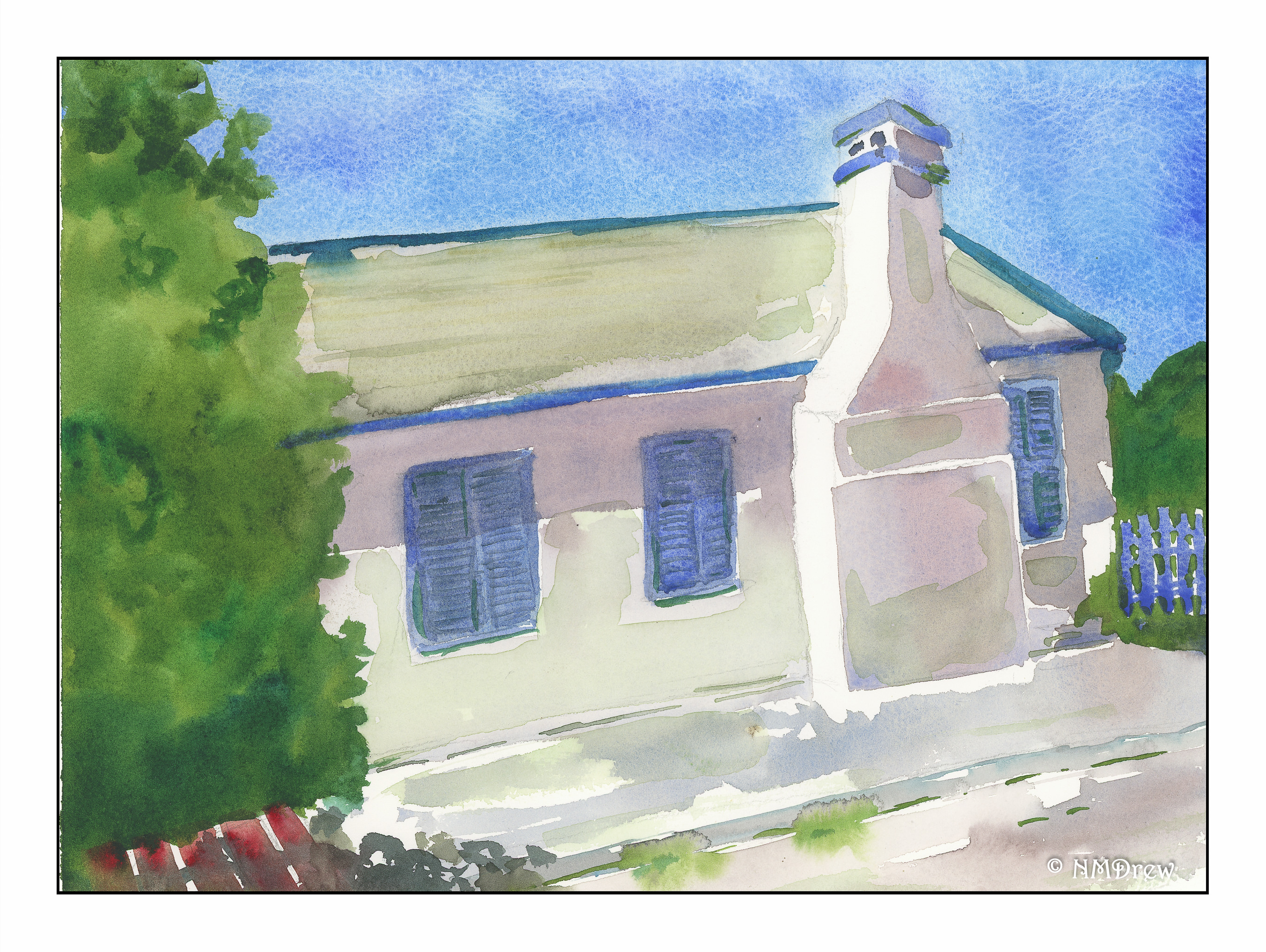
I love the colors of houses seen throughout the Caribbean.  Brilliant sunshine sets them off beautifully.  The same with white – it becomes so bright it can be as blinding as snow in the sunshine.  Where I live, if anyone paints their house anything other than beige or some other neutral color, they sort of get a weird look, like “what’s wrong with them,” so the colors you see in the Caribbean is eye candy.

Of late, I have painting snow and water.  And skies.  Now, I am looking to trying to include buildings in my paintings.  I want to improve my perspective (the chimney here is cock-eyed) and to make them focal points.  At some point I may even brave putting people into my paintings.

Here, the study was not just architecture, but white and how to express it as something other than just white.  Fabriano Artistico, cobalt and ultramarine blue, sap and Hooker’s green, yellow ochre, and red oxide (I think).

Winter Sunset

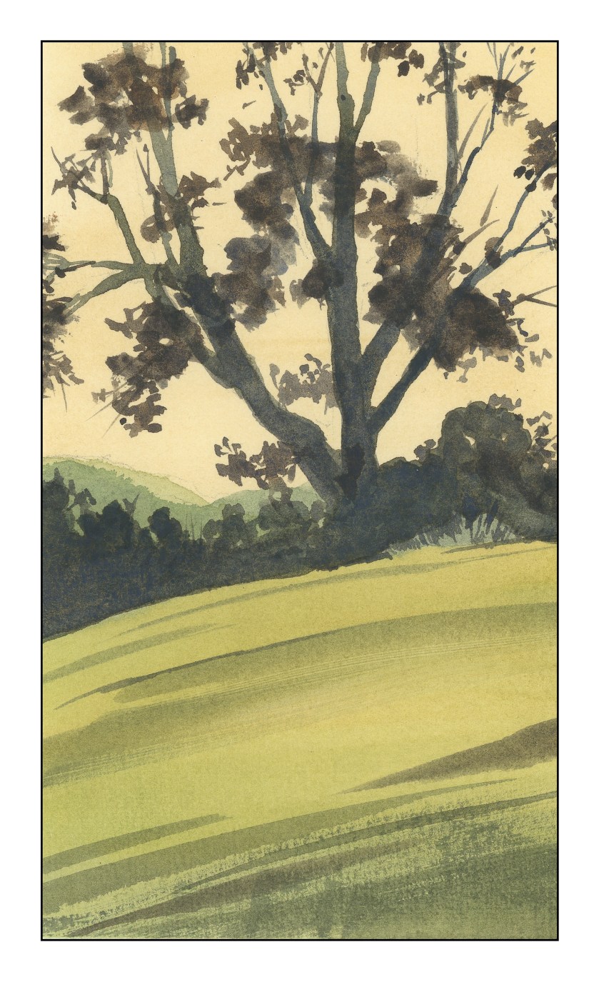
I took this picture awhile back in the local botanical garden.  It is an oak against the sky, with the Santa Monica range in the distance.  In the photo, the tree is silhouetted against a yellow sky, and the foreground is mottled with dried grasses.  The California oak is not deciduous, but shows leaves year round.

The process here is along the lines of yesterday’s post, and is more successful I think.  It is very simple.  The steps I took began with a wash on the entire paper (8×10) in raw sienna.  The mountains on the left were done next using a bit of sap green with the raw sienna, followed by some cobalt blue for the darker range.  After that, the lower half of the painting had a wash of a greenish color, later followed with a darker green of sap green and cobalt blue.  The tree and brush in the center were of burnt sienna and cobalt, with perhaps a bit of ultramarine as well.

That’s it.  Fairly successful in moving from light to dark, general to specific.  The simplicity of the subject matter makes it an easy painting to do – yesterday’s fig tree through the window was more complex, and accordingly more difficult.  I really wonder if I will ever successfully paint complex scenes, such as a forest and creek or a city street filled with cars, people, buildings, and whatever – rather daunting, actually.

Through the Window

I’ve been doing a bit of reading . . . the gist of which is work light to dark, then general to detailed, and the last is more important than the first.  It is from Tom Hoffman’s excellent book on watercolor, should you wish to know.

Anyhoooo, following this advice, I made a foray into a rather abstract painting.  The corner of my house has two windows, set perpendicular to one another, and are furnished with plantation shutters – wooden shutters with wide slats.  This is from a photo I took.  I tried to catch the graphic lines of the shutters in contrast to the curves of the fig tree and its autumnal leaves outside, next to the sidewalk and street.