By Flashlight

With winds blowing at 40mph, the fear of fires was intense. Electrical lines spark, grasses and brush catch fire, and before you know it, the world is lit, not with electricity, but with flames. As a result of this – PSPS (Public Safety Power Shut-off) – we had no electricity for about 36 hours. What do you do when the sun goes down, there is no phone, no TV, no electricity? You read, you chat, you play games by candle, and paint by flashlight.

Rather than try to be creative, I got out a couple of art instruction books, one by Geoff Kersey, and one by Ted Kautzky. All of these paintings were done with limited palettes and by following some instruction to create a painting from the book.

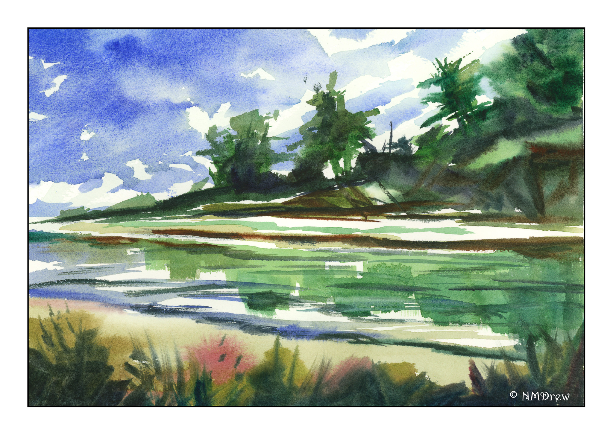
The one above is from Geoff Kersey’s book, using only red, blue, and yellow. No more. It was the first one I did, and there was still some daylight, but very little, in my darkish studio. It was evening, and the studio window faces east. I used manganese blue, cadmium lemon, and cadmium red.

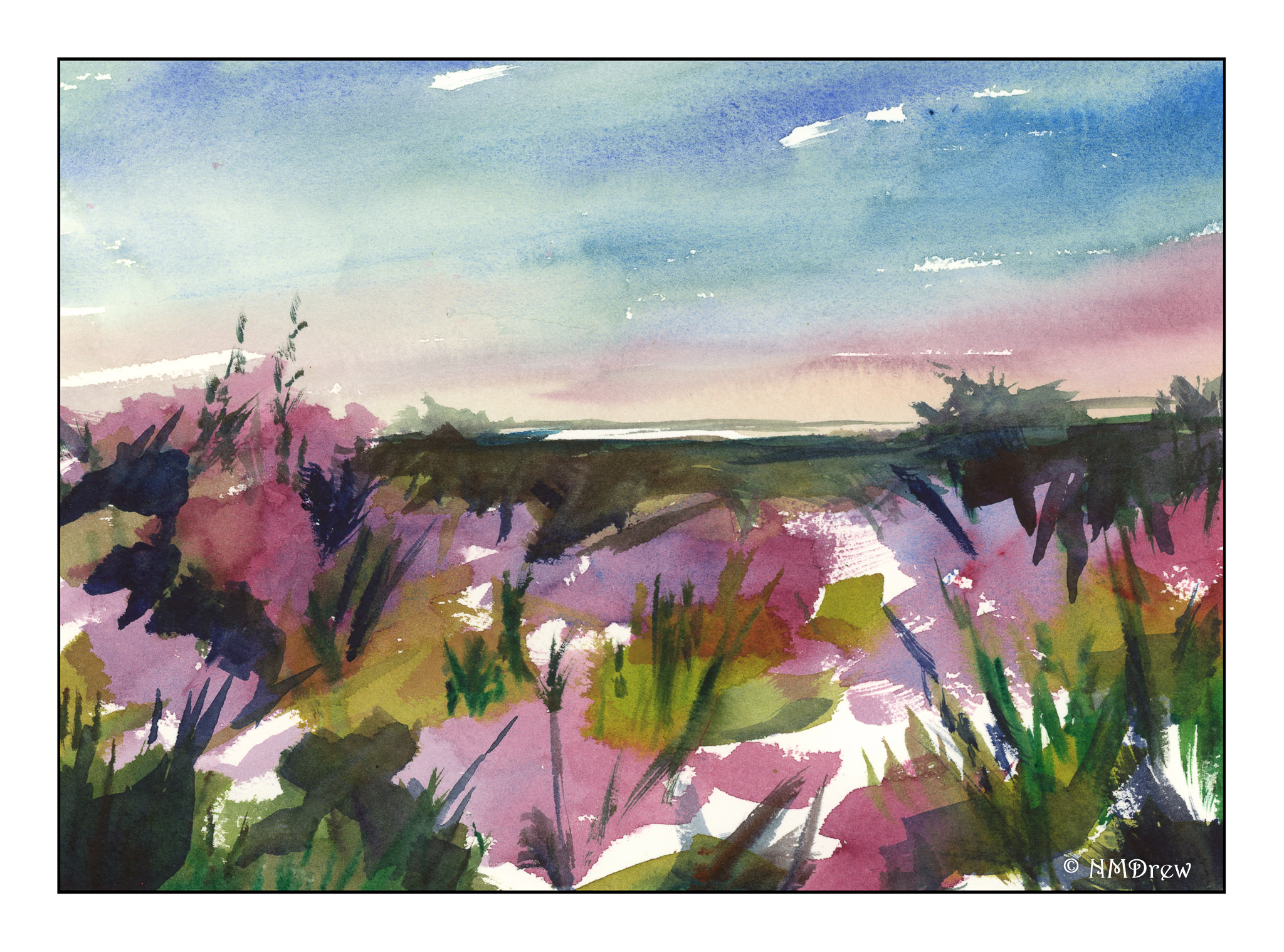
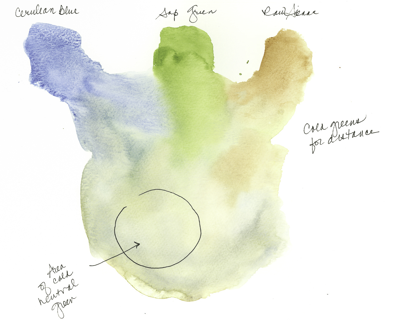
This one is from a Ted Kautzky study. Less light and more moving my little flashlight from book, to watercolor paper and drawing, to palette. Colors were verditer blue, cadmium red, Hooker’s green, and raw sienna. Verditer blue doesn’t seem to mix well with other colors, but is a lovely blue by itself. Four colors!

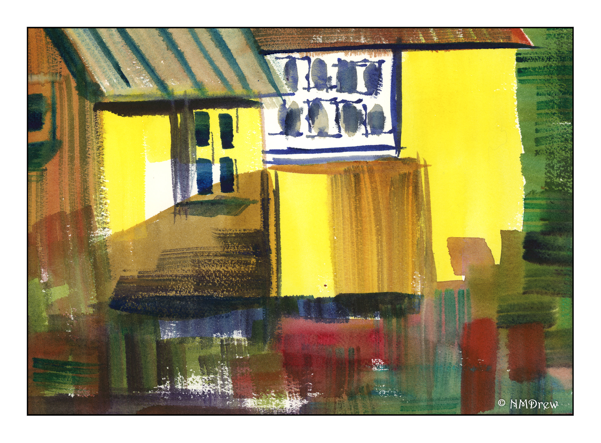
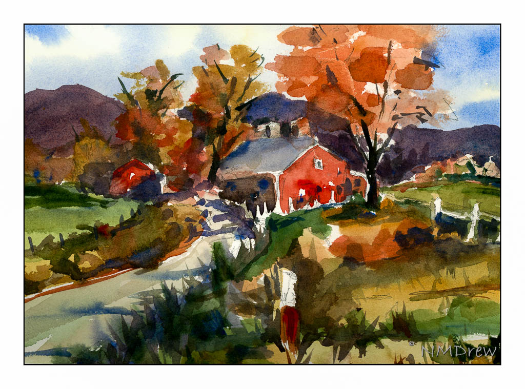
Now we are moving into big time! Here, five colors. Payne’s grey, ultramarine blue, aureolin yellow, Hooker’s Green, and burnt umber. Another study from Ted Kautzky.

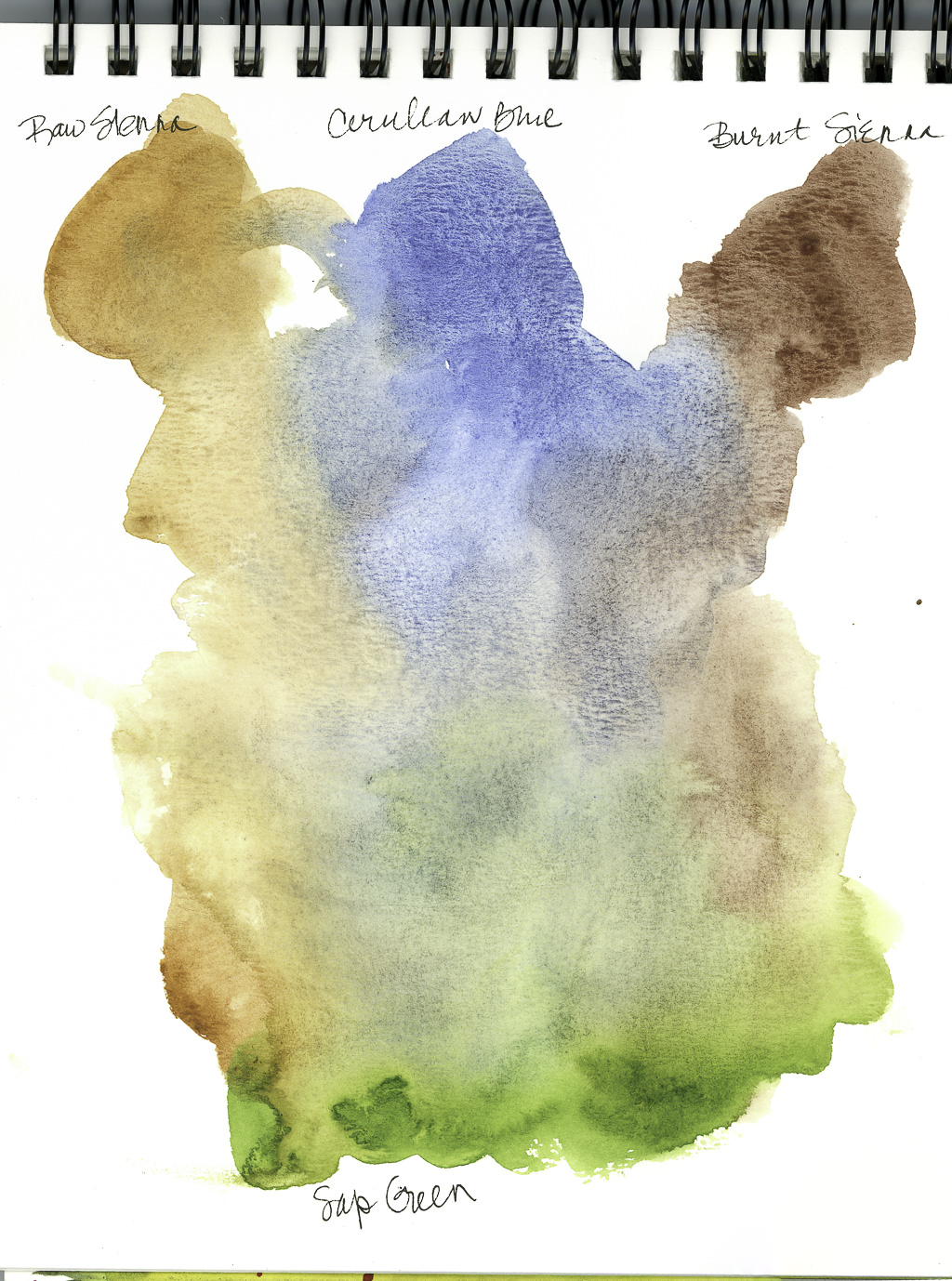
I enjoy doing studies from books – it helps focus a bit. I also realized that daylight is a better way to paint, or using diffused electrical lighting. Flashlights are good to see with, but their light is not diffuse, but sharp and focused. I think I would have had better lighting with a few candles. Anyway, it was a good way to pass some time when the sun set and the vampires weren’t yet out.

Abstraction

If you follow my all-purpose art blog, Journey By Paper, you know that I have been slithering around with pastels, gouache, and watercolors as a theme for a painting called “The Slough” – sort of an evolutionary adventure. In doing so, I began to move into a kind of abstraction, painting without lines.

Generally, I tend to paint watercolors without any lines on the paper. I don’t know why, but the lines too often act as a cage, and keep me from just exploring color. I really love the way colors and water react on good paper, and I think the lines make me think I need to produce a “perfect” painting, whatever that is. So, here are some abstractions I did, all in one afternoon, in the order I did them. Comments about each panting are below them. All were painted with a 1/2 inch or 1 inch flat brush.This one I wanted to work on contrast, saving white paper, and creating shapes with the 1/2 inch brush. I was pretty pleased with the results, but the foreground was a bit of a puzzle.The above is an abstraction of heather. The sky doesn’t match the heather. This one I need to re-think.I really like this one – the colors just are so beautiful (to me). I think the abstraction worked to catch trees and snow in the spring, although perhaps I could redo it more simply.Finally, this yellow house has been calling out to me, but a yellow house is not that interesting in and of itself. But, a series of shapes to make a house became the idea after doing all those abstractions before it. Here, a 1 inch brush and a bit of thought. I like this one because it is cheery, has white paper showing through, and is showing me what I can do with pure colors.

A Class with Rick Surowicz: “Abandoned” (Day 3)

One thing that makes Surowicz’s online YouTube videos, and now his class “Abandoned”, is the fact he is very informative about color mixing.  Color is essential to convey distance – foreground and background – light, warmth.

Today I worked through 4 studies of color, using for the greens cerulean blue, raw sienna, burnt sienna, and then some pyrrol red to help temper the green.  The neutral color is made up of burnt sienna and ultramarine blue.

This scan is of the first study.  The cerulean and siennas were at the top, sap green at the bottom.

Surowicz says he mixes his color on the palette, which he demonstrates, using large areas to get a lot of color.  He rinses his brush, blots his brush, and varies the amount of color on a brush to determine how light (more water) or how dark (less water).

These little swatches show not only color that is strong, but how they merge and blend when more water is added.  The studies are for warm and cool greens, but I find it hard to determine them.  The following studies are supposed to demonstrate the warmth and coldness a bit more.

Here we have a formula for a cooler green mixture:  Cerulean blue, Sap Green and Raw Sienna.  The area circled is demonstrably a cold green.

Here we now have a formula for a warm green:  Raw Sienna and Sap Green.  The addition of the Cerulean Blue is what makes the mixture cold.  The two colors by themselves create a warm green, and the formula is not one I would have considered prior to this class.  The Pyrrol Red is used to move the green to a more neutral state (red and green are complementary, and can negate each other when combined), but more green may be needed to return it to green – Pyrrol Red is intense! The red is also warm, so the green remains warm, even if neutral.

Finally, the well-known (at least to watercolorists) combination of Burnt Sienna and Ultramarine Blue.  This is one of the most useful color combinations as it can range from pale to almost black.  Many watercolorists use the two as a replacement for black.

Thoughts

This section of the class is really valuable to me.  I actually can see the warmth and coldness of the greens in these color combinations.  That is very important.  Conceptually it is very important for me as I lack depth perception and am a magpie when it comes to colors.  Subtlety is not in my vocabulary.  However, that doesn’t mean I do not have an appreciation of soft colors – they just are not my first choice!  The neutral tones with the Burnt Sienna and Ultramarine Blue are some of my favorites, but it was a good study to remember the softness they can achieve as well.

Note

Because of Inktober 2019, I may not get a chance to view “Abandoned” every day and practice, but I don’t want to allow more than one day pass between sessions.  I am really into this class and enjoying it a great deal!

The Muddy Palette

Before I knew that gouache works best fresh out of the tube, I filled a palette up just as I do with watercolors.  Let’s face it, paint ain’t cheap, so I wet these paints over and over.  Finally, most of the colors are used up and it is into the sink to soak for now!  In the future, fresh paint.  That will be a really new event for me because I don’t tend to paint like that.  I made swatch cards of all my gouache colors (more than 20, less than 1000), so I plan to use those as I consider paints in future paintings.

WWM #12: Blossoming

Old country houses, castles, abandoned churches – all returning to the earth – and the abundance and destructiveness of nature, relentlessly taking over that which is not cared for, in Nature’s own fecund rabidity.

Okay, enough of that!  Rambling vines and roses, grapes, trellises – flowers cascading everywhere in profusion and fragrance.  That’s my kind of garden.  If there is a relic or two along with the plants, I think that is a pretty cool mix!