Negative painting is painting around an object, usually using darker paint around a more lightly painted object. Anyone who paints finds this quite often to be a bit of a mind tweak, so it is always worthwhile practicing. For me, negative painting is best done with the subject matter, if a photograph, done upside down. Then it – and everything else – just becomes a shape. Shapes are easy to relate to, more so than a flower or a whatever.
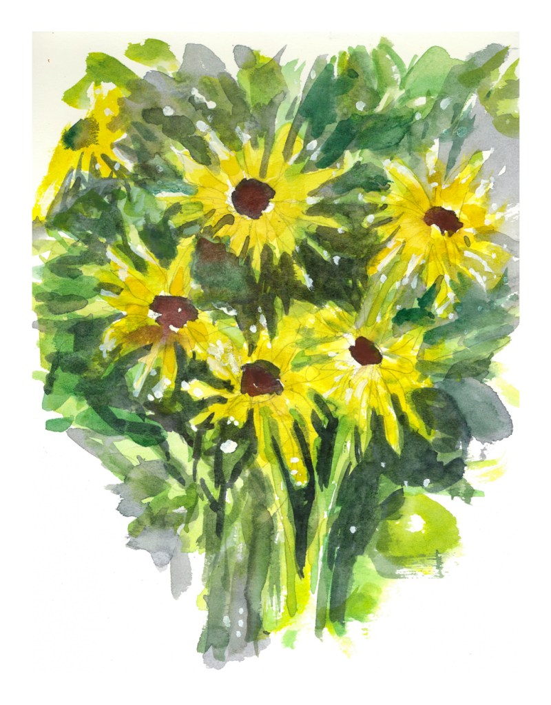
I really cannot paint flowers easily. I don’t want to create realistic paintings of flowers, but impressions of flowers. Being able to express a flower and to know what it is appeals to me far more to me than a scientific flower illustration. Don’t get me wrong – botanical illustration is stunning and something I love to see and admire them – but I want a looser style.
One way to express a flower is to create it in its environment. A field of flowers can dance in the wind. A bouquet of either one type of flower or many has its own beauty – the shape of petals and leaves and stems creating their own designs. Stems and leaves seen through clear glass are distorted fascinating to see.
For now, though, I just wanted to practice negative painting. I drew my flowers, and went to work, laying down basic colors and then coming in with darker colors to create shapes, such as leaves and stems. I did the daisies first, and they are rather crude. The poppies were next, and while the colors are muddy in places, it was more successful as far as what I was trying to accomplish.
My all time favorite palette is the Quiller palette, available in porcelain or plastic. Plastic does stain, especially with phthalo colors it seems, so after a few years – 3 or 4? – it was time to buy a new one, and to fill it with colors. I like the plastic – or acrylic – palettes over porcelain because, if they are dropped, they don’t break into a bazillion pieces. It’s always a job to fill up a palette unless you are replenishing old favorites and standbys, but I decided to change a lot of my colors as I’ve bought colors over the past several months and want to put them to use. So, here we go – my new palette and the watercolors therein.
The outer corners of the Quiller palette are put to good use – 8 large wells. Beginning in the upper left corner and moving clockwise, I labeled them, for my purposes, A, B, C, D, E, F, G, H. Color name and manufacturer are listed. Abbreviations: S = Schmincke Horadam, DS = Daniel Smith, H = Holbein, WN = Winsor Newton, MG = M. Graham, S = Sennelier.
A. Cadmium Yellow Lemon – SH
B. Lemon Yellow – DS
C. Permanent Yellow Deep – DS
D. Pyrrol Orange – DS
E. Italian Burnt Sienna – DS
F. Burnt Sienna – DS
G. Cobalt Teal – mixture of MG and DS to use up MG
H. French Ultramarine – DS
Next, if you look up into the upper left corner, you will see a spot marked on the palette with a rather long, pointy thingy. It is a yellow next to a rather periwinkle color on its left. That yellow is #1 in the following list, and clockwise around, ending in #24.
1. Hansa Yellow – MG
2. Hansa Yellow Deep – DS
3. Gamboge – MG
4. Naples Yellow – MG
5. Quinacridone Gold – MG
6. Translucent Orange – SH
7. Cadmium Red Light – H
8. Cadmium Red – WN
9. Permanent Alizarin Crimson – DS
10. Pyrrol Red – DS
11. Quinacridone Coral – DS
12. Raw Sienna – DS
13. Raw Umber – DS
14. Burnt Umber – DS
15. Cerulean Blue – MG
16. Cobalt Blue – DS
17. Prussian Blue – S
18. Manganese Blue Hue – DS
19. Phthalo Green, Yellow Shade – DS
20. May Green – SH
21. Hooker’s Green – WN – the only one for me!
22. Cobalt Violet – MG
23. Carbazole Violet – DS
24. Lavender – H
Sometime over the next few days I am going to paint out a sample of the palette and colors, copy it, and paste it to the lid of the palette. This way I have a copy on hand, and if the one on the palette gets messed up, I can print out another. I also like to read up and do a bit of research about the colors, and often refer to the Dick Blick site to get pigment information and Jane Blundell’s site to read up on her comments.
It’s nice to know a bit about colors, and with so many new formulations on the market this becomes a good thing to do. What I think a color is may be very different than what a color is – such as granulating or not, fugitive or not (I try not to buy those, but I do have some normal alizarin crimson and rose madder genuine), warm or cool. Besides this, it is good to know in which direction a color “leans” – that is, does the red I am looking at lean to the blue or yellow side of the palette. Such things affect color mixing. As there are lot of new-to-me colors, it is good to become acquainted with my new friends.
Well . . . I prefer the land, the tree, the ocean, the field. I prefer not people or buildings.
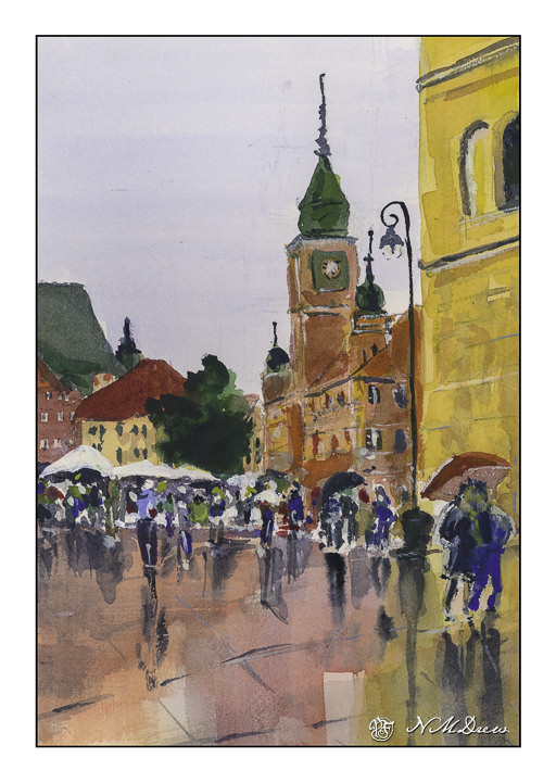
But, I must put aside my prejudices to progress in painting. Andy Evansen’s watercolor course has challenged me to such. I did people, reviewing proportions and where the elbow ends and the knee. People are 7.5 to 8 heads tall, depending.
Buildings and people – crowds – hmm. I usually avoid them, being the reclusive and exclusive and somewhat misanthropic. Nonetheless, they exist. So do buildings. And value studies! This is like trying to fit my tiny foot into a tinier shoe – painful, painful.
I tried this painting in watercolor by starting out on used paper – the reverse of other studies or failed paintings. Cheapness does not do me any good. I was not getting anywhere except PO’d.
I do not like being PO’d.
A new sheet and voila! Life, while not sweet, definitely improved. And I did a crowd of people, and buildings in a plaza, and only one solitary, lonely tree suffocating in the midst of civilization.
This was probably the most challenging painting I have done so far in any class . . . but I lived! Any good? Who knows.
I feel like a school kid – classes are taking up so much of my life! It is keeping me off the streets, so I am sure a few people are glad to know that! The classes are a series with Ian Roberts (online), Andy Evansen (online), handsewing 18th stays with Burnley & Trowbridge (far behind!), and a local class in oils / acrylics with a good teacher. Housework is falling by the wayside!
The above is a watercolor exercise from Evansen’s class. It’s a year-long course in watercolor, and the content needs me, the student, to work hard at the lessons. We began with skies – I am pretty comfortable with those. This module works with values, and I think I did a pretty good job with it.
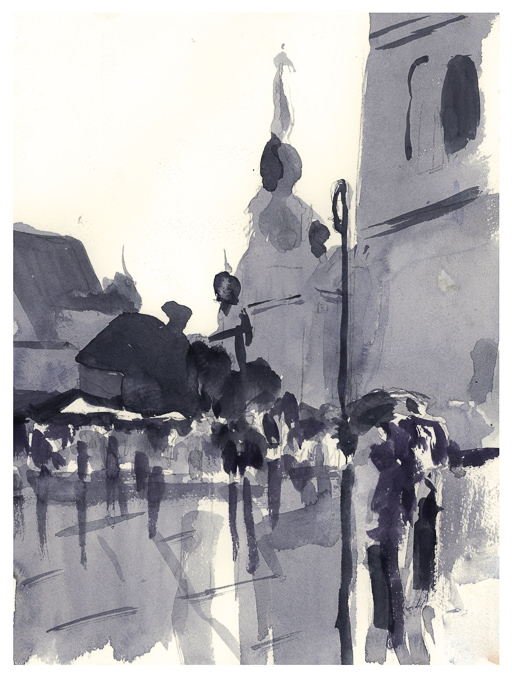
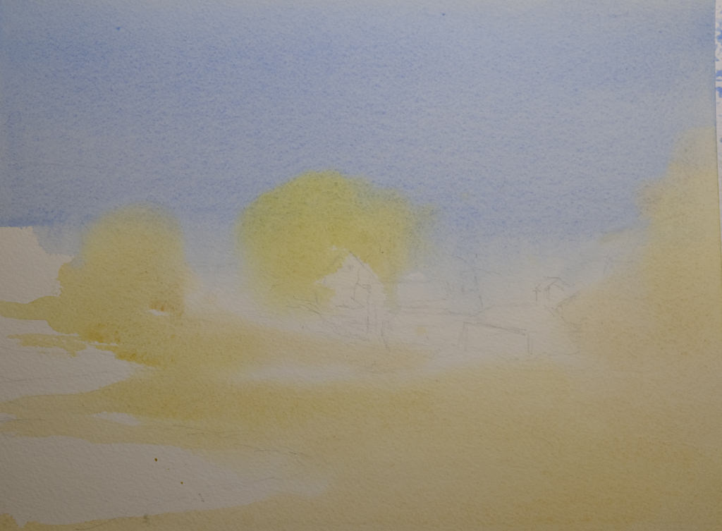
What I found especially interesting was the beginning of the value study. Unlike Roberts who puts in all values in a pencil sketch, Evansen puts the middle value only as the first step. The white areas are bright spots and the sky, but the middle values are all created as one big shape. That was quite interesting, and not the usual route one takes with value studies.
Pencil drawing with middle value only added as a shape.
I messed up a bit, but it did lay out a map that was more clear to me than also including the darks. Once I got the idea in my head, the next step was to lay in soft colors on paper that was wetted on both front and back with a natural sponge. I used 9×12 140# CP Kilimanjaro paper here.
After doing the middle value shape, both as a prelim and then on the final painting, you are supposed to go back and add the dark areas to the prelim. I didn’t get there – I was too involved in the final product!
Light areas filled in on dampened paper. Includes the sky, white areas for buildings, and field and trees.
Doing the light areas on dampened paper allows the colors to bleed a bit, and create soft edges.
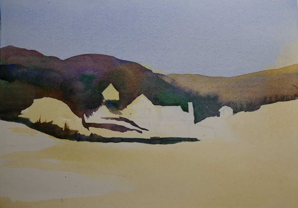
Thicker paint added once the light areas have been worked.
The next step was to work left to right so that the shape created for middle values in the preliminary study could be made on the painting. The idea is to work in one movement – left to right since I am right handed, but right to left if you are left handed. The idea is to create a bead of color that varies as you paint in a continuous design.
To me, this was really a dark based on the reference photo, but that is life! As I did this, I worked around the buildings and structures, as well as roads. The thicker paint and dryer paper allowed this to happen to create hard edges. I was happy with how easy it was to do!
Almost done!
This was perhaps the 3rd stage in my painting. I added furrows to the field and details to the structures. I scraped in tree branches and such with my finger nail only to realize I keep them trimmed too short to be of any use there!
After all the layers were dried, I did the heavier dry brush as well as glazes over the field and hills to create areas of warmth or coolness. I also did it on some of the structures to keep them from dominating .
Some thoughts . . .
It is really a lot of work to do these classes. My whole purpose is to stop my old ways of approaching painting and create some kind of shift so that I can become a better painter in my opinion. Also, I need to stay busy. I have felt like I have been floundering a bit, so an area of focus was important, especially in an arena I wanted to learn. I am still adjusting to all this, but in the big picture, I am happy I made the commitments.
I am trying to change my slap dash approach to watercolor that occurs when I don’t paint with them for awhile. Then I need to redevelop the discipline and forethought required for the medium. It’s aggravating, but necessary, and if I don’t make it a serious endeavour, it is very rewarding. I learn something each time.
I decided to begin with boats. The shape of boats is really not logical unless you break down the shape into squares or rectangles connected with curved lines. Then it can work. Here I focused on the shapes and shadows of two rusted old girls. Not a great study, but I really tried to see light and dark, searching for warm and cool as well.
Another beached wreck. This one is obviously of wooden construction – the slats along the sides. Building wooden boats is fascinating. I’ve watched some being built as well as seen videos about the process. Where I live, boats live in nice marinas, and sometimes in dry docks, but never are they left moored with an anchor or buoy to rest on the sand when the tide goes out. Of course, the California coast is not full of inlets and bays that are protected – there are a few, such as San Francisco Bay – but that is like a giant lake!
Here, I tried to catch the algae on the hull of the boat as well as the shadows. I didn’t do a very good job with the lines of the slats which make up the shape of the boat itself. I did try to catch her character and age as she lies abandoned on the shore.
After “Fishing Boats, Key West” by Winslow Homer
Finally, I decided to see what I could learn from Winslow Homer. He paints boats with abandon! New England boats, sail boats, row boats. Having lived during the 1800s, he saw sails to power boats more than steam or coal. His paintings are filled with detail and, to me, his watercolors are so alive I feel I am in the middle of them.
I don’t think a seaman would approve of my renderings – I am pretty much a landlubber, but I have sailed a bit in my younger days. There is something about the wind and the sea and the speed of it all – but it scares the hell out of me as much as it thrills!